Showing posts with label indigo blu. Show all posts

Friday, 14 April 2023

Bloom and grow

Dawn is setting our challenge at Daring Cardmakers this week — she’d like to see what we have planned for the garden as we move in to spring and then summer. 

We have a glorious poppy patch just at the front of our house, I look forward to them bursting forth each year (usually early to mid May so not too long to wait now, the leaves are up already). That made me chose this lovely Indigo Blu stamp to make a card for my aunt who has a round number birthday coming up. I stamped once, masked and stamped again for extra abundant poppies!

A base layer of Copic colour got topped up with pencil shading and a few pearl dots to finish it off.

Stamps:
Poppycock (Indigo Blu)
Big Day Today (Waltzingmouse Stamps, no longer with us)

Paper:
Bristol board

Ink:
Brilliance by Tsukineko (Graphite Black)

Other:
Coloured pencils
Copic markers 
Pearl pen by Viva Decor (Ice White)
Corner Chomper 

Friday, 16 September 2022

Words of comfort

At Daring Cardmakers this week, we’re reflecting on the UK’s national sense of loss and mourning as we say farewell to Queen Elizabeth II. We’d like to see cards offering comfort for those experiencing loss or a difficult time in their lives.

I tend to opt for simplicity when I make sympathy cards and this is no exception, just simple stamping, inking and a tiny bit of pattern added with a stencil.  

Stamps:
Nature I (Indigo Blu)
Sentiment from Big Day Today (Waltzingmouse Stamps, no longer with us)

Paper:
Bristol board

Ink:
Brilliance by Tsukineko (Graphite Black)
Tim Holtz Distress ink by Ranger (Tumbled Glass, Bundled Sage)

Other:
Cressida Stencil (Memory Box)
Corner Chomper
 

Thanks for stopping by.  


Friday, 9 September 2022

Into the woods

Miri is setting our challenge at Daring Cardmakers this week — she’d like to see woods and forests represented in some way. I decided to combine with the current challenge at Lost Coast where the team would like to see at least three stamps being used on our cards. 

I stamped the trees background directly onto the card base and brushed on a little ink in blue shades, stamped and cut out the owl and tucked him behind a die cut frame (black card dusted with Perfect Pearls in autumn shades). I coloured the card outside the frame with a black marker and added oak leaves cut from a larger stamped image. I was aiming for foreground with leaves then owl, background with bare trees but I can’t quite convince myself the oak leaves look right — maybe it will grow on me!

Sorry the photo looks a bit washed out, it was the best I could manage on a particularly dreary morning here in Northumberand. Hopefully any owls around here have good shelter - apparently they're not waterproof!

Stamps:
Trees backgrounder (Cornish Heritage Farms, no longer with us)
Oak branch (Beeswax Stamps)
Twit Twoo (Indigo Blu)

Paper:
Bristol board
Black

Ink:
Brilliance by Tsukineko (Pearlescent Chocolate, Graphite Black)
Tim Holtz Distress ink by Ranger (Tumbled Glass, Peacock Feathers)

Other:
Stitched square frame die (Paper Rose)
Copic markers
Perfect Pearls by Ranger (Heirloom Gold, Bronze, Copper)
Black Fineliner


Friday, 24 April 2020

Creative Chaos

Svenja is setting our challenge over at Daring Cardmakers this week - she'd like to see some sheet music on our projects.

I couldn’t find my book of old and damaged sheet music so I printed a freebie score onto copy paper (it’s Beethoven —Für Elise— if any musically literate folk are trying to make it out through the other stuff here!)

I use my Gelli plate to do a print from a magazine onto the musical score, tinted it with Distress inks, stamped some circles and a sentiment (which I curved slightly before stamping to follow the shape of her face a bit more closely). The circles have a tiny bit of grey shading to give them some depth.

Creative chaos is a polite term for the usual state of my craft room!

Stamps:
Limor Circles (Indigo Blu)
Creative Chaos (Visible Image)

Paper:
Plain copy paper
Black

Ink:
Brilliance by Tsukineko (Graphite Black)
Tim Holtz Distress ink by Ranger (Tattered Rose, Picked Raspberry)
Tim Holtz Distress Oxide by Ranger (Wilted Violet)

Other:
Copic markers
Gelli plate 
Black acrylic paint
Brayer

Thanks for stopping by, I hope you and yours are keeping safe and well.

Friday, 3 April 2020

Card Chain Challenge - March reveal!

I'm a day late but the Card Chain Challenge reveal for March is up. My card went to Linda in Minnesota this time.

From the options on offer I went for the colour scheme (lemon. lime, sky blue) and the theme of "things with wings" to make a clean and simple card that was good for airmail.

The butterfly is coloured with a Zig Clean Colour marker and a damp paintbrush to spread the colour for varied intensity.

The fact that there are three different sizes of each circle in the Indigo Blu stamp set means you can compose your own background quite easily with just a bit of masking.

Stamps:
Wings (Darkroom Door)
Limor Circles (Indogo Blu)

Paper:
Bristol board

Ink:
Versafine by Tsukineko (Onyx Black)
Tim Holtz Distress Oxide by Ranger (Twisted Citron)
Jenni Bowlin ink by Ranger (Lemon Drop)

Other:
Spellbinder die (Phrases Set 1)
Corner Chomper
Zig Clean Colour marker

Hope you and yours are staying safe and well in these strange times. Thanks for stopping by!

Friday, 21 June 2019

Midsummer!

As it’s the longest day today for those of us in the northern hemisphere, Nat’s challenge for us over at Daring Cardmakers this week is to celebrate summer, bonus brownie points for inspiration from Shakespeare’s A Midsummer Night’s Dream.

As it was one of the very first Shakespeare plays I saw on stage (although strictly speaking it wasn’t on stage - it was a promenade performance in a park) I decided to go that way. Titania says this to Bottom after he has been transformed and she enchanted - Bottom really isn’t very bright and since he’s sporting a donkey’s head at this point he’s not terribly handsome either. If you ignore the original context though, it just sounds like a nice thing to say to somebody!

I had a go at some lettering to make a feature of the quote (Act 3, Scene 1 if you were wondering!). I looked at lots of fonts online, sketched the large words and filled in with a pen. It's a bit wibbly but it's OK for a first attempt! The smaller words I printed out, transferred onto the card with the trusty old "scribble on the back with a pencil" method and went over with a pen so they still have a handrawn quality. I could be happier with the line spacing too but you live and learn!

I’m also playing along at Retro Rubber who currently have an “anything goes” theme - just use stamps that are older than a year.

Stamps:
T’wit T’woo by Indigo Blu (approx 2015)
Flowers from Bird Paradise by Bloom Art Stamps (2016)
Shakespear's name from Wild Flower by Crafty Secrets (approx 2009)

Paper:
Bristol board

Ink:
Brilliance by Tsukineko (Pearlescent Chocolate)
Adirondack dye ink by Ranger (Latte)

Other:
Copic markers
Coloured pnecils
Fineline marker
Gold gel pen

Thanks for stopping by! We'd love to have you play along at DCM!


Friday, 2 November 2018

October's link in the chain

I joined in again with the Card Chain Challenge for October.

From the options for the month I chose the sketch and the theme of clocks and made this one layer card which has gone to Cat. A one layer card is ideal if you're airmailing something, I find!

I stamped the top leaf and masked it, then the second leaf and the sentiment, masked those and stamped the clock. Lastly I masked clock and the edges of the card and sponged with Antique Linen before stamping the flourishes in the same colour for a tone-on-tone effect.

Fineline marker pen defines the sentiment strip and Copics add colour to the leaves and drop shadows to the various elements to give it some illusion of depth. I added a bit of sparkle with some Wink of Stella on the leaves, too.

There are still a few days to sign up for the November challenge (the last one of the year) if you fancy being a link in the chain. It's lovely to get a special hand-made card as well as sending one you've made.

Stamps:
Time to Stamp (CHF, sadly no longer with us)
Falling Leaves (Tim Holtz/Stampers Anonymous)
Vintage Flourish and Dinkie Vintage Flourish (Indigo Blu)

Paper:
Bristol board

Ink:
Brilliance by Tsukineko (Pearlescent Chocolate)
Tim Holtz Distress ink by Ranger (Antique Linen)

Other:
Copic markers
Low tack tape
Brown fineline marker
White paitn pen by Posca
Clear Wink of Stella pen

Thanks for stopping by!

Friday, 2 February 2018

February flamingo

It's the first Friday of a brand new month. That means it's time for an "elemental" dare over at Daring Cardmakers and Dawn has chosen the inspiration picture (it's at the end of this post) this time. It could lend itself to Valentines cards if you have those to make but equally could provide inspiration for any sort of project. As ever, just choose at least three elements from the picture to kickstart your project.


I sort of deconstructed a bit on this one! Rather than going with a flamingo, I zoomed in on the feathers and the concentric circles of its eye for two of my elements.

The third element is the coloured foil appearance of the balloons - I used silver mirror card and some alcohol ink for the die cut feathers. A very light rub over with a sanding block made silvery highlights for the embossed veins on the feathers.

Stamps:
Limor Circles by Indigo Blu
Big Day Today by Waltzingmouse Stamps (no longer with us)

Paper:
Smooth white
Silver mirror card

Ink:
Tim Holtz Distress ink by Ranger (Tumbled Glass, Peacock Feathers)
Versafine by Tsukineko (Onyx Black)

Other:
Feathers Duo die/folder by Tim Holtz/Sizzix
Fucshia Copic Various refill ink
White Enamel Accents by Ranger
Corner Chomper

Here's this month's inspiration photo, we'd love to see you at DCM if you fancy playing along!

Thanks for stopping by!

Friday, 29 September 2017

Harvest Home

Another Friday, another challenge from Daring Cardmakers. Shabneez is setting this week's theme and she'd like to see fruit, vegetables or grain on our projects as it's harvest time.

I'm easing myself back in to crafting after a couple of weeks' holiday. I'm never quite satisfied with the first thing I make after a break from my crafty stash but doing a bit of colouring was relaxing so I'll just settle for "hmm, that's OK".

I've combined digi and rubber here and pulled out the kraft cardstock for a rustic base with a bit of scuffing, tearing and wonky piercing done with a tracing wheel.

The kraft means it fits this month's challenge at Power Poppy, too.

Stamps:
Fall Haul digi by Power Poppy
Vintage Flourish by Indigo Blu
Sentiment from old CHF set

Paper: kraft

Ink:
Brilliance by Tsukineko (Pearlescent Chocolate)
Tim Holtz Distress ink by Ranger (Tea Dye)

Other:
Coloured pencils (Prisma and Coloursoft)
White Posca pen
Tracing wheel 

Many faith and community groups use their harvest collections these days to boost their local food bank - do consider dropping something off if you possibly can, it will be hugely appreciated.

Thanks for stopping by!

Friday, 1 September 2017

September elements

Unbelievably it's September - eek! Kathy has chosen our "elemental inspiration" picture at Daring Cardmakers as it's the first Friday of the month and she found herself unable to resist one last mood board of soft, summery shades. As ever, just choose at least three elements from the picture to kick-start your project.

I'm afraid pastel shades are always difficult for me and I struggled more than usual with this one - the circular file in the craft room saw quite a lot of action!

From the picture, I chose the overall colour palette (making it a bit deeper because, well, pastels!), a frilly flower (I don't have a ranunculus stamp so I went for a poppy instead), the herringbone tiles and a splash of shiny gold.

I raided my scraps folder for bits of cardstock in soft mauve, pink and blue-grey and cut little rectangles to stick onto a chocolate brown base - fiddly but quite satisfying! They're 4x1cm and yes, I really did study the picture to figure out those rectangles were four times as long as wide!

I ended up painting the die cut leaves with acrylic paint because they were already out on my desk but not the right shade of green at all. I could have just cut another out of a different cardstock, I know!

The dots are "waste" circles from various die cuts that were lying about on the desk - I covered them with Zig two-way glue and then added gilding flake before doming them with an embossing stylus. Adding them with glue gel is a good idea as it stops them flattening if you put pressure on them (inevitable if you're posting your card).

Stamps:
Poppycock by Indigo Blu
Sentiment from Say It Loud by Waltzingmouse Stamps (no longer with us)

Paper:
Bristol board
Chocolate brown
Scraps!

Ink:
Brilliance by Tsukineko (Graphite Black and Pearlescent Chocolate)

Other:
Copic markers
Palm Fancy Die by  Hero Arts
Acrylic paint
Chariots of Fire Mega Flake by Indigo Blu
Zig two-way glue pen
Pinflair glue gel

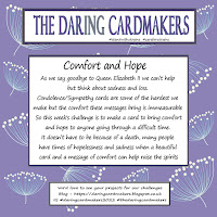
Here's the inspiration picture


Thanks for stopping by!

Friday, 28 July 2017

Wonderland

It's Svenja's turn to set the challenge over at Daring Cardmakers - the Disney film of Alice in Wonderland celebrates its birthday today so she'd like us to make cards inspired by wonderland or its beloved characters.

I love the original Tenniel illustrations more than the Disney ones. They're old enough I had a hunch they'd be public domain by now so I decided to go down that route. I found this version of the dodo here and had some fun with an image transfer. If you're new to the world of transfer, this video from Andy Skinner is a good introduction to the technique of making areas opaque.

The background is re-inkers on watercolour paper with water droplets and a few circles stenciled in white pigment ink over the top. I didn't decide to stamp the flourishes until after I'd done the image transfer so those are stamped with Stazon as it had to be something that would be OK on the surface that had been coated with satin glaze.

I've absolutely no idea what I'll do with this card but it was fun to make!

Supplies:

Digital image (laser printed)
Cold press watercolour paper
Tim Holtz Distress inks by Ranger (Peacock Feathers, Salty Ocean, Blueprint Sketch)
Adirondack Pigment ink (Snowcap)
Stazon (Teal)
Vintage Flourish stamp by Indigo Blu
Dymo labeller
Font One dies by Spellbinder
Little Stars die (comes with embossing folder) by Marianne Designs
Wink of Stella pen (clear)
White acrylic paint
Satin Glaze by DecoArt

Thanks for stopping by! Do have a look at the ideas from the DT, some of which go to show you don't necessarily need stamps or other "specific" Alice in Wonderland stash to evoke the story!

Friday, 12 May 2017

All that glitters...

Shabneez is setting this week's challenge at Daring Cardmakers and she'd like us to use plenty of glitter - the only catch is that it can't be gold!

I decided to go all-out with the glitter and do a whole sparkly panel. I stamped the stylised flowers first and then covered the whole piece with double sided tape sheet and smothered it with Glamour Dust. Both the tape and the glitter are transparent so the stamping shows through.

If you burnish the glitter into the tape, you get a sort of velvety-feeling surface. Then, just because I haven't played with my air brush and Copics for ages, I sprayed graduated colour over the sparkle. I did then use a black Copic to dot over the flower heads, just to boost the contrast.

Given that much glitter, I decided a simple treatment would be best so the piece just got a narrow black mat and a die cut sentiment.

Stamps:
Stylised Flowers by Indigo Blu

Ink: Brilliance by Tsukineko (Graphite Black)

Paper: smooth white

Other:
Double sided tape sheet
Crystal Glamour Dust by Deco Art
Copic markers
Airbrush and compressor
Hello die by Waltzingmouse stamps (no longer with us)

Thanks for stopping by!

Thursday, 2 March 2017

Sombody to love...

I've managed to play along again in The Craft Barn's Song Title Challenge - this month's song is Somebody to Love by Queen.

Queen were one of my favourite bands when I was in my teens, I had all the albums up to The Works and can still remember being so excited to find an original copy of their very first album in a record shop in Morecambe after the (flimsier!) one had been released under the "Fame" branding.

When I saw the challenge, an image popped into my head straight away, inspired by the lyric that says "I just gotta get out of this prison cell". I've decided to make a postcard for each of these challenges and this time I had fun with cocktail sticks, corrugated card, die cuts and dry brushed acrylic paint! 

As the challenge wants us to include the artist as well as the song title, I made a little plaque for the cell door by hammering letter punches into a scrap of mountboard before giving it the acrylic paint treatment.

Dry brushing is probably not the technique for you if you're in a hurry but it's great to watch details emerging if you have time - I used some texturising paste for a corroded effect in places as well as the die cuts and embossed plaque.

Stamps: Jane by Indigo Blu

Paper: 
Black
Corrugated card
Mountboard 

Ink: Brilliance by Tsukineko (Graphite Black)

Other:
Cocktail sticks
Copic markers
Typeset strip die by Tim Holtz/Sizzix
Letter punches
Texturising medium by DecoArt
Pewter and Silver acrylic paints 

Thanks for stopping by!

Friday, 3 February 2017

February elements

It's the first dare of the month at daring Cardmakers and Svenja has provided our "elemental" photo this time. As usual the dare is to take at least three elements from the picture to use in your card.

I chose the cogs, the diamond shape and the loose coil of wire as my elements and made a clean and simple, masculine-looking card.

I have no idea what happened with the Enamel Accents - it went on looking like enamel dots, nice smooth domes. I left the card aside to dry overnight and discovered all the dots had a central dimple the next morning! It's done it very neatly so I decided it could just be considered "supposed to be like that"!

For the diamond frame, I used a knife and ruler to cut around the aperture left after die cutting one of the solid shapes.

I used a red Spica glitter pen to go over the stamped sentiment which probably just about shows on the detail shot.

Stamps:
Cogs background by Indigo Blu
Essential Messages by Hero Arts

Paper: Bristol Board

Ink:
Shadow ink by Hero Arts (Soft Granite)
Memento Luxe by Tsukineko (Love Letter)

Other:
Geometric shape dies by Hero Arts
Enamel Accents by Ranger (white)
Spica glitter pen by Copic (red)
Silver metallic thread
Corner Chomper

Thanks for stopping by!

Friday, 20 January 2017

A stitch in time

It's dare day over at Daring Cardmakers and Nat is asking us to "stitch it!" - use stitching as a prominent feature in your design.

This is absolutely not what I intended to make when I sat down at the craft table and I'm not sure how prominent the stitching really is but it's what happened so I'm going with the flow!

I'm still without my sewing machine which is on loan to a friend so I decided to do something I could hand stitch. Each of the stars has a slightly wonky line of stitching through it and the sequins are stitched on as well (just a knotted thread on the small ones but through the centre and out to the edges on the larger ones).

The stars were punched from a scrap of watercolour paper that had orange and purple re-inkers on it that has been lying around for ages.

I find the best strategy for hand stitching on card is to pierce holes first rather than trying to do it with the needle as you go.

Stamps:
Bubble background by Indigo Blu
Big Day Today by Waltzingmouse stamps (retired)

Ink:
Memento Luxe by Tsukineko (Bahama Blue)
Tim Holtz Distress ink by Ranger (Spiced Marmalade)

Other:
Clean Color markers (Cobalt Blue and Light Blue)
Spica glitter pen (Turquoise)
Star punches
Sequins
Corner Chomper
White and silver threads


Friday, 24 June 2016

Glorious gardens

I've just managed to sneak in under the wire for this month's postcard swap on UKStampers where Jilly set the theme flowers/gardens.

We have a couple of patches of glorious poppies in our front garden which inspired my choice of stamp. They're just past their best now but we've had a couple of days where the sun has shone through the petals and really set them ablaze.

Things got a bit out of hand with my first attempt but I'd spent time colouring the poppy and liked the way it came out so I cut it out and used it, even though my original intention was to do my usual one layer job.

I found a masterboard sheet of A4 (using resist techniques) while looking for something else so I decided to use that as a base and go mixed media style. I added the stamped poppy, some rub ons, a bit of stencilling and some charcoal pencil.

I made the masterboard long enough ago that my list of supplies might involve a bit of guesswork this time but here it is in case anyone's interested in any of the elements.

Stamps:
Poppycock by Indigo Blu
Numbers border by Kaisercraft

Paper: Smooth white 

Ink:
Tim Holtz Distress ink by Ranger (Barn Door, Mowed Lawn)
Versamark
Brilliance By Tsukineko (Graphite Black)

Other:
Copic markers
White Posca pen 
Fineline marker
Charcoal pencil
Sequin Waste stencil by Tando Creative
White embossing powder
Gesso
Microglaze by Judikins
Dylusions (Fresh Lime, Vibrant Turquoise)
Rubons by Tim Holtz (Apothecary and Words) 
Brick stencil by Dutch Doobadoo


Thanks for stopping by - if you're in the UK, please remember to be especially kind to each other (actually, that applies wherever you are - kindness costs nothing - but it seems particularly important that the UK should remember it at the moment).


Monday, 20 June 2016

Masculine Mechanical

Father's Day seems to be the same date on both sides of the Atlantic (unlike Mother's Day) so I'm guessing quite a few of us were making masculine cards last week!

 I was reminded by Sabrina's sample for the "Make It Masculine" challenge over on Splitcoast Stampers on Thursday that I haven't played with foil tape in an age so that's what I did for my dad's card.

I stuck die cut lettering and dry wall tape to a rectangular base and covered in a patchwork of foil tape pieces. I burnished it all with a paper stump to stretch the tape over the textured bits and added more surface texture with a ball point pen (for "rivets"), a stylus and a pin for fine scratches in one area. The whole lot then got a coat of black acrylic paint that was wiped back when almost dry. I added a tiny hint of colour with some Teal gilding wax on the lettering.

Perhaps because of all the texture on the foil panel, the cogs looked a bit "flat" stamped on the card base so I used a fine line marker and did some crosshatch shading on the cogs themselves and used a charcoal pencil and lots of smudging to shade around them.

Stamp: Mechanics by Indigo Blu
Ink: Brilliance Graphite Black

Other:
Font One dies by Spellbinder
Dry wall tape
Foil tape
Black acrylic paint
Fineline marker
Charcoal pencil
Creative Expressions gilding wax (Teal)


Thanks for stopping by!

Friday, 5 February 2016

Coffee lover!

Inspired by a mixed media challenge on Splitcoast Stampers, I've been having a little play with coffee!

We don't usually have instant coffee but I got a small jar a while ago when we had workmen around who preferred it to "proper" coffee! The bit left in the bottom of the jar came in useful.


I made a strong coffee mix to start and used it at different dilutions - weak on a flat brush through the stencil to start off with and to sponge the edges of the card, strong to tint some gesso to paint over the hearts and also to add shading. I smeared some of the full-strength solution onto a craft mat, dabbled the flourish stamp into it and stamped around the edges. I finished by stamping a coffee-related quote with pigment ink.

I made a more conventional card with the same stencil for the Bubbly Funk blog too - you can see that here if you're interested!

Stamps:
Dinkie Vintage Flourish by Indigo Blu
My own design coffee sentiment

Ink:
Instant coffee/water!
Brilliance by Tsukineko (Pearlescent Chocolate)

Other:
Love Post 6x6 stencil by the Crafters Workshop
Gesso

Thanks for stopping by!

Friday, 15 January 2016

Resolutions!

I don’t make New Year’s resolutions but I do often take part in the postcard swap at UK Stampers and that’s what Jill has chosen for January's theme. I decided to use what is apparently the most popular resolution (lose some weight) as inspiration and added the sentiment as I think it's something that might well be appropriate as a resolution for many of us!

I put a piece of low-tack tape across the top of the upright on the stencil before inking the mannequin body in raspberry ink and adding shading with currant, then swapped the position of the tape to ink the stand in brown. I’ve stamped through the stencil after inking the focal point mannequin, using the same flourish as I used to “frame” the card.

I drew round the inside of the body shape on the stencil and cut a mask so that I could put the grey, shadowy mannequin “behind” the main one. As the postcards go to their recipients as traditional postcards (no envelope to protect them) this kind of layering with inks, stencils and stamps is perfect to create interest without adding layers and embellishments that will be exposed to the rigours of the postal service!

Stamps:
Vintage Flourish Dinkie by Indigo Blu
Journaling Words 3 by The Artistic Stamper

Ink:
Adirondack dye ink by Ranger (Raspberry and Currant)
Brilliance by Tsukineko (Graphite Black)
Shadow ink by Hero Arts (Soft Granite)
Tim Holtz Distress ink by Ranger (Vintage Photo)

Other:
Modern Dressmaker stencil by Memory Box
Corner Chomper

Thanks for stopping by, hope you have 2016 off to a great start!

Friday, 18 December 2015

More Brushos!

I needed a card for a friend with a Christmas birthday - her favourite flowers are poppies so this still looks a bit Christmassy because of the red/green combo and it would be easy to substitute a poinsettia if you were that way inclined.

I played with Brusho again to make the background, stenciling over the top after it was dry for a bit of subtle "texture" and to tie it together a bit. The poppy is coloured with Copics with layers cut out and stacked for a bit of dimension.

Stamps:
Poppycock by Indigo Blu
Sentiment from Say It All by Hero Arts

Paper: Bristol Board

Ink:
Brilliance by Tsukineko - Graphite Black
Tim Holtz Distress ink by Ranger - Mowed Lawn and Peeled Paint

Other:
Copic markers
Brusho - Leaf Green
Pinflair gel glue
Cressida stencil by Memory Box

Thanks for stopping by!