Showing posts with label Carmen’s Veranda. Show all posts

Monday, 28 February 2022

Keep moving...

I managed to get some work done a bit faster than expected today so that meant I was able to get this idea out of my head and onto paper just before the end of the current challenge at Lost Coast Designs where the theme is Steampunk/Vintage.

I thought I was going to have to sit this one out but while trying to get to sleep last night I remembered this emobssing folder and thought it would probably do a lot of the work for me - I made this in about 40 minutes which is incredibly fast for me! Remembering I had an Einstein quote in my stash of stamps meant I didn't faff around trying to make a quote with die cuts or alphabet stamps etc, too!

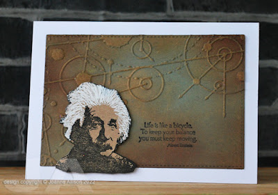
Einstein was stamped on Kraft card and I thought it would be fun to give him his famous shock of white hair with fairly rough and ready strokes of a white paint pen. He's cut out and stuck on with a bit of gel glue for some lift. The background is the same Kraft card, embossed and then inked with brushes and some gold ink swiped directly from the pad over the high spots.

Stamps:
Einstein (Carmen's Veranda)
Bicycle Life (Cornish Heritage Farms, no longer with us)

Paper:
Recycled Kraft board envelope (well known online retailer!)
Bristol board

Ink:
Versafine by Tsukineko (Onyx Black)
Tim Holtz Distress ink by Ranger (Vintage Photo) and Oxide (Evergreen Bough)
Adirondack dye ink by Ranger (Espresso)
Delicata by Tsukineko (Golden Glitz)

Other:
Uber embossing folder (Couture Creations)
White paint pen by Posca
Stitched rectangle dies, A6 size (Paper Rose)
Pinflair gel glue


Friday, 29 October 2021

Uh oh... here comes trouble

The end of the month is almost upon us so Dawn is asking us to be inspired by all things Hallowe'en for this week's challenge at Daring Cardmakers. If you don't want to make something spooky, you might choose something like the colours usually associated with Hallowe'en to inspire an autumn or even Christmas card.

As Lost Coast Designs is nearing the end of their annual 31 Days of Hallowe'en celebration, I thought I'd play along there as well so I've used Frankenstein and gone with a black and white theme since the classic film is B&W.

It’s a one layer card with just simple stamping and masking and minimal supplies here but I think it's got impact - what do you think?

Stamps:
Frankenstein (Carmen's Veranda)
Sentiment from Little Monsters (Technique Tuesday, retired)

Paper:
Bristol board

Ink:
Brilliance by Tsukineko (Graphite Black)
Shadow ink by Hero Arts (Soft Granite, Charcoal)

Other:
Copic markers (Cool Grey 1, 3 & 5)
Shattered stencil (Tom Holtz)
Black fineliner
Corner Chomper

Come play…if you dare!


Wednesday, 25 August 2021

Fearless and powerful

I’d been meaning to play along with the current challenge at Lost Coast Designs which is asking us to feature a human face. A couple of projects got started but ended up in the circular file. Then Gail, who facilitated me getting him as part of my recent prize when my name came out of the hat on a Lost Coast challenge, suggested using Frankie. It was an idea I’d already considered but got no further with, but something about her suggestion made this idea emerge and refuse to go away. 

I guess some might argue that Frankenstein’s monster is not human (I’m sure Mary Shelley would approve of the philosophical debate arising from that) but I think it’s easily countered in this case by arguing that it’s Boris Karloff playing Frankenstein’s monster in any case. Of course the English Literature graduate in me balks slightly at the fact the stamp is called “Frankenstein” but others might use the word “pedant”!

Let’s Squash It is currently asking us to emboss something other than paper or card and I decided to combine challenges by putting Frankie on a backdrop made from a thick aluminium tray (the sort you might get to serve food at a big party - remember those? Your local pound shop probably has the trays if you’re in the UK). I dabbed a thin coat of black acrylic paint on there and wiped back over the high spots to bring out the design. As the novel has unease at industrialisation as an underlying theme, I thought this folder would be appropriate. 

The quote is actually from the novel, done with a Dymo label maker. 

ETA - I've corrected an earlier "oops"  where I stuck the words down in the wrong order, changing the meaning entirely. Why don't you see these things until you're looking at a photo of the finished project?! Apologies to Shelley and to the monster (and to you if you saw an image with an incorrect quote!). I'm afraid that means there's now sun glare off one corner but I'm happier to live with that!

Stamps:
Frankenstein (Carmen’s Veranda)

Paper:
Bristol board

Ink:
Brilliance by Tsukineko  (Graphite Black)

Other:
Aluminium tray
Uber embossing folder (Couture Creations)
Black acrylic paint
Copic markers
White paint pen by Posca
Pinflair glue gel
Dymo label maker


Thanks for stopping by!