Showing posts with label beeswax stamps. Show all posts

Friday, 9 September 2022

Into the woods

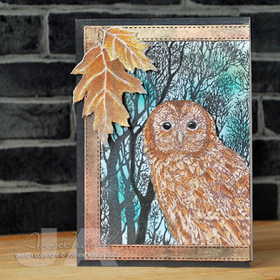
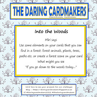
Miri is setting our challenge at Daring Cardmakers this week — she’d like to see woods and forests represented in some way. I decided to combine with the current challenge at Lost Coast where the team would like to see at least three stamps being used on our cards. 

I stamped the trees background directly onto the card base and brushed on a little ink in blue shades, stamped and cut out the owl and tucked him behind a die cut frame (black card dusted with Perfect Pearls in autumn shades). I coloured the card outside the frame with a black marker and added oak leaves cut from a larger stamped image. I was aiming for foreground with leaves then owl, background with bare trees but I can’t quite convince myself the oak leaves look right — maybe it will grow on me!

Sorry the photo looks a bit washed out, it was the best I could manage on a particularly dreary morning here in Northumberand. Hopefully any owls around here have good shelter - apparently they're not waterproof!

Stamps:
Trees backgrounder (Cornish Heritage Farms, no longer with us)
Oak branch (Beeswax Stamps)
Twit Twoo (Indigo Blu)

Paper:
Bristol board
Black

Ink:
Brilliance by Tsukineko (Pearlescent Chocolate, Graphite Black)
Tim Holtz Distress ink by Ranger (Tumbled Glass, Peacock Feathers)

Other:
Stitched square frame die (Paper Rose)
Copic markers
Perfect Pearls by Ranger (Heirloom Gold, Bronze, Copper)
Black Fineliner


Friday, 28 May 2021

Molly’s makeover

Today, Molly has had a mermazing makeover for Daring Cardmakers. Jenny has set our challenge and as May is apparently the month of mermaids, she’d like to see these mythical creatures inspiring our cards. 

So, Molly thought it would be fun to dress up for the occasion. She found some sea-inspired colours in her eyeshadow palette, created a seaweed tangle wig, a coronet of shells and pearls and finally projected some fish, seaweed and bubbles onto a watery background. 

Molly’s streaming hair is created with hot glue with various shades of Perfect Pearls brushed over (I used black glue as it creates a lovely effect when you put mica powders over the top). I used blue and green metallic gel pens to add some finer lines between the ribbons of glue. Copic markers, various inks, glitter, pearl pen and Glossy Accents make this a genuinely mixed media makeover for Molly!

I’m also playing again at Lost Coast Designs where the current challenge theme is “under the sea”. 

Stamps:
Molly (Beeswax Stamps)
Under the Sea (Darkroom Door)
Seaside (Crafty Secrets, no longer with us)
Antique Engravings (Hero Arts, retired)

Paper:
Bristol board 

Ink:
Brilliance by Tsukineko (Graphite Black)
Hero Arts shadow ink (Soft Granite)

Tim Holtz Distress ink by Ranger (Tumbled Glass, Peacock Feathers)
Tim Holtz Distress Oxide by Ranger (Cracked Pistachio)

Other:
Hot glue (black)
Perfect Pearls (shades of green and blue, I lost track!)
Copic markers 
Glossy Accents
Pearl Pen by Viva Decor (Ice White)
Metallic gel pens (blue and green)
Fibres stencil (Visible Image)
White paint pen by Posca
Glamour Dust (Crystal)
Corner Chomper 


Wednesday, 21 April 2021

Nature walk

With the early morning light bathing everything in a soft glow, Molly set off along the woodland path, enjoying the sunbeams slanting through the gently swaying leaves. At the top of the cliffs, a single perfect feather lay across the path, pointing to the beach. Smiling quietly, Molly followed its suggestion, snaking through the dunes. High tide had left a jumble of shells on the sand, each glistening with highlights of gold as the sun climbed higher in the sky. 

Molly’s nature walk was prompted by the current challenge at Let’s Squash It - use at least three embossing folders and a person. She enjoyed the peace and quiet, just the sounds of surf and gulls!

For some reason the Pumice Stone ink has come out looking rather blotchy in the photo, it’s much smoother in real life, honest!

Stamps:
Molly (Beeswax Stamps)
Landscape sentiments (HobbyCraft)

Paper:
Bristol board
Strathmore toned grey

Ink:
Hero Arts Shadow ink (Soft Granite)
Tim Holtz Distress ink by Ranger (Pumice Stone)
Versafine by Tsukineko (Onyx Black)

Other:
Fallen Leaves embossing folder (Sizzix)
Shell Beauty embossing folder (Spellbinder)
Feather Duo die/embossing folder (Tim Holtz/Sizzix)
Tomato paste tube 
Enchanted gold wax (Cosmic Shimmer)

Thanks for joining me and Molly on our nature walk! If you fancy rising to the challenge and dusting off multiple folders, here's the challenge link


Friday, 2 August 2019

Link in the Chain - July

It's time for another reveal at the Card Chain Challenge. My card has gone to Gail this month. Gail is part of the team that does a fabulous job organising the Chain each month so it's a particular pleasure to be able to send her a card.

From the options on offer this month I chose the theme of faces and also the product options of watercoluring and stencils.

I have to confess to a slight cheat this time - Molly was already watercoloured and mounted on another card that I had never used so I pulled it apart and made a new one since I liked the way she turned out and it seemed a shame not to have sent her to anybody! She's stamped in a very light ink so I could do some "no line" colouring.

I had a stencil out on my desk that was cut with the Spellbinder fancy lattice die - I used that to add a bit of background with Tumbled Glass ink and then ran a glitter pen around the edge of a few shapes and smudged it for some shimmery shading.

Stamps:
Molly (Beeswax Stamps)
Sentiment from Journaling Words 3 (Artistic Stamper)


Paper:
Cold press watercolour
Bristol board


Ink:
Tim Holtz Distress ink by Ranger (Antique Linen, Vintage Photo, Walnut Stain, Black Soot, Pumice Stone, Tumbled Glass)
Brilliance by Tsukineko (Pearlescent Chocolate)


Other:
Circle Nestabilities and Fancy Lattice die (Spellbinder)
White paint pen by Posca

Turquoise Spica glitter pen
Charcoal pencil
Corner Chomper


There are still a few days to sign up for the August chain if you fancy it - just make one card using one or more of the challenge options, send it out and get a handmade card from the next person in the chain.

Tuesday, 26 March 2019

Oak leaves

I was lucky enough to be chosen as a favourite at the Retro Rubber Challenge a while back and so I'm joining them as a guest designer on the current challenge which has just gone live here.

The idea at RR is to show some love to stamps that are at least a year old so it's a great chance to look back over your stash for toys you might have ignored for a while!

It's a tic-tac-toe challenge this time, see the end of this post or visit the Retro Rubber blog for the grid if you'd like to play along! I chose the middle column of the grid: sparkle-leaves-heat embossing.

I embossed the sentiment with a detail white powder and then smooshed on some ink using a piece of acetate. The oak branch stamp has acorns on it which means it always seems to be an autumnal kind of image but I thought that if I coloured the leaves green and only used part of the image it would be more suited to spring and summer. The sparkle comes courtesy of my "go to" embellishment when I want just a touch of glitz: nail art gems.

Stamps:
Oak Branch (Beeswax Stamps - I've had mine since 2012)
Say It All (Hero Arts, retired)

Paper:
Bristol board

Ink:
Brilliance by Tsukineko (Pearlescent Chocolate)
Versamark by Tsukineko
Tim Holtz Distress ink by Ranger (Tumbled Glass)

Other:
Detail white embossing powder
Copic markers
White paint pen by Posca
Fine frames die by Altenew
Nail art gems
Pinflair glue gel
Corner Chomper

Here's the tic-tac-toe grid, why not head over and play?!


Thanks for stopping by!

Sunday, 5 November 2017

Autumn Leaves

I'm doing my usual last-minute-minnie act here - today is the last day for this month's Song Title Challenge at the Craft Barn and I've just made my postcard this morning!

This month's song is Autumn Leaves. I have to confess it wasn't one I knew so off I went to YouTube. Mickie had recommended the Eric Clapton version but the one that really stood out for me was Eva Cassidy so it's her name I used on my card. Both song title and artist name are hand written into two of the leaves at bottom right.

I think this face has a rather wistful, meloncholy air about her which seemed perfect for somebody thinking about lost love. I did some masking and planned a one layer card but a dropped marker meant a little bit of camouflage became necessary so I've added a couple of extra leaves that have been cut out and stuck on.


Stamps:
Molly (Beeswax Stamps)
Autumn Leaves (Sheena Douglass)

Paper: Smooth white

Ink:
Adirondack dye ink by Ranger (Espresso)
Brilliance by Tsukineko (Pearlescent Chocolate)

Other:
Copic markers
Clear Wink of Stella
Fine line brown marker

Thanks for stopping by!

Friday, 20 October 2017

City or country?

It's Friday so it must be challenge day over at Daring Cardmakers. Miri is setting this week's challenge and she'd like to know: city or country? Which are you?

I'm very definitely a country girl. I have done city living (Manchester being the biggest) but I'm now firmly back in a rural location.

As well as the obvious trees, fields, wildlife, birds etc, one of the things I love about where we live is the dark skies. Northumberland International Dark Sky Park has gold tier status from the  International Dark Sky Association, making us "officially the best place in England for people to go to enjoy the heavens" according to the Northumblerand National Park website.
 
So I wanted my card to reflect something of the night sky we enjoy in the country, hence the dark background and the splatters of "starry" light behind the glowing autumn oak leaves.

I did the thing of overstamping the coloured image with Versamark and clear embossing to resist the watercolour - I gave it the tiniest of offsets to get moolight glints along the top edges of the leaves. A MISTI makes this easy to do! I actually broke out the iron and ironed off the clear embossing once I'd done with the rest of the card.

Stamps:
Oak Branch by Beeswax Stamps
Say It Loud by Waltzingmouse Stamps (no longer with us)

Paper:
Bristol board

Ink:
Adirondack dye ink by Ranger (Espresso)
Versamark by Tsukineko
Tim Holtz Distress ink by Ranger (Blueprint Sketch, Black Soot)

Other:
Copic markers
Watercolour pencil
Detail silver and clear embossing powders
White paint pen by Posca
MISTI

Thanks for stopping by!

Friday, 7 July 2017

Elemental July

Dawn is setting the challenge this week at Daring Cardmakers and of course because it's the first one of a new month, it's an "elemental" dare - just choose at least three elements from the inspiration photo to kick-start your project. The picture's at the end of this post if you didn't arrive here from the DCM blog and want to see it.

I chose: girl's face, pastel colours and sequins (after the fact I realised the ones I chose had the same iridescence as the material behind the plates top right).

Molly is delightful and she's a lovely big stamp so you don't need to do much else really. I masked her off, sponged on some pastel inks and then used a piece of acetate with circles punched in it as a stencil to sponge on a bit of white paint for a sort of bokeh effect.

Stamps:
Molly by Beeswax Stamps
Journaling Words 3 by The Artistic Stamper

Paper: Bristol Board

Ink:
Brilliance by Tsukineko (Graphite Black)
Tim Holtz Distress ink by Ranger (Tumbled Glass, Spun Sugar, Scattered Straw)

Other:
Sequins
White acrylic paint

Here's the picture Dawn chose to inspire us this month:


Do pop by to see which elements inspired the DT and we'd love to see your take on it, too!

Thursday, 19 January 2017

Autumn anniversary

This was made for my mum and dad's wedding anniversary. I did the leafy stamping and painting without any particular plan in mind. When I came to trim it to make a card I decided it looked elegant as a tall, slim design with lots of white space so I went with that - it's a DL card.

This stamp is very detailed and the watercolour paper is a bit textured - my newly-acquired MISTI came into its own since I could just re-ink and stamp again to make sure I got a good impression despite the bumpy surface.

I think this image is good for an autumn anniversary without being too in-your-face about things - two acorns carries a suggestion of two people who can grow together.

Stamps:
Oak branch (Beeswax Stamps)
Sentiment from Putting on the Ritz (Waltzingmouse Stamps, retired) 

Paper:
Watercolour

Ink:
Brilliance by Tsukineko (Pearlescent Chocolate)
Tim Holtz Distress ink by Ranger (various autumn tones, I lost track!)

Other:
Watercolour pencils
MISTI

Thanks for stopping by!

Friday, 20 March 2015

Postcard Time

It's been ages since I managed to play along in the regular postcard swap at UK Stampers but I've finally managed it this month.

Because the clocks go forward this month, Sam chose "time" as our theme.

Postcards go "naked" to their recipient so light and flat is good. I've gone totally single layer with this one - just stamps and ink using some basic masking and then a tiny bit of Copic coloring for her lips, eyes and some shadows to give things a bit of depth. I have ready-cut masks for everything I used here (I just keep them in the CD cases with the stamps any time I cut a mask and use it until it falls apart!) so it came together quickly.

Stamps:
Molly by Beeswax Stamps
Time to Stamp by CHF (and it's one of the sets that's available from the "new" CHF)

Ink:
Brilliance Graphite Black by Tsukineko
Soft Granite by Hero Arts

Other:
Copic markers
Corner Chomper

There are still a few days to play if you fancy getting a time-themed postcard on your doormat - just make a card and post a picture to the thread and come the 25th, Sam will tell you who to send it to and who will be sending you one in return.

Thanks for stopping by, hope everyone has a lovely weekend!

Friday, 21 June 2013

Eagle for dad

I've just realised I meant to blog this at the start of the week and forgot to make the post live! This is the card I made for Dad for Father's Day. A quick one layer card but one that still has impact, I hope!

The handsome eagle head doesn't need a lot doing to it - just a touch of colour for the beak and eye and a few strokes of grey pencil to shade the head a bit. I masked him and stamped the script at an angle, added some smudged Pan Pastel and then stamped the sentiment (the only father's day one I could find in my stash, as it happens!).

Stamps:
Eagle Profile (Beeswax Stamps)
19th Century French Script (Hero Arts)
Father's Day Centers (CHF, retired)


 Paper: smooth white

 Ink:
Onyx Black Versafine by Tsukineko
Stonewashed Adirondack dye ink by Ranger


 Other:
Prismacolor pencils (yellow and a couple of greys)
Pan Pastel (turquoise)
Corner Chomper


The theme this week at Pan Pastels UK challenge blog is an open masculine theme so I'm hooking up there.

Thanks for stopping by!

Tuesday, 15 January 2013

New beginnings

It's a new year as well as a new month so that means the theme for January's postcard swap over at UK Stampers is "new beginnings". It's been so long since I managed to blog anything that it feels like a new beginning here too!

In deciding what to do for this theme, I kept thinking about things that start small and become something fantastic. Having no caterpillar stamps to go with the obvious butterfly, I turned to seeds and plants and thence to trees. So although this is an autumn image, it does represent new beginnings with those little acorns!

My transfer of ink from transparency to postcard for the sentiment didn't work as well as I would have liked so I decided to give it a hand lettered feel by going over in fine line pen and a touch of brown pencil (apart from anything else, I'd already coloured the leaves and didn't want to waste them!).

As ever, our cards for this swap will be posted as genuine postcards (no envelope) so this is completely flat, not embellishments or bits to get stuck in sorting machines! If you fancy getting some happy mail why not come and join us - just make one card and get one in return.

Stamps:
Oak Branch by Beeswax stamps
Tiny "dream"sentiment from Mini Memories set by Crafty Secrets

Ink:
Adirondack dye ink by Ranger (Espresso)
Tim Holtz Distress ink by Ranger (Antique Linen)

Other:
Copic markers
Prismacolor pencil
Computer and inkjet printer
Copic Fineliner
Sequin waste mask by Tando Creative

Thanks for stopping by!

Wednesday, 10 October 2012

Ghostly and gothic

Time for a new monthly theme for the regular postcard swap at UKStampers. I didn't manage to play in September so I was determined to get to it this month even though the theme is a tough one for me! As ever, cards are to be posted "naked" and must include stamping.

The theme is "spooky" and for me it's a tough one because I don't have any Halloween stamps or anything vaguely scary! I managed last year with some digi elements combined with some "filler" stamps and this year decided to see if I could take it a step further and just use colour and composition to set a spooky mood with otherwise non-spooky stamps.

I got some new stamps at the weekend so I set about giving "Molly" a ghostly makeover.

She's stamped and masked so she kept a ghostly pallor while the rest of the card got sponged with purple and black inks. I concentrated black at bottom left so Molly's head is looming out of the dark. I added some scripty writing and bare branches (which actually made me think of capilliaries or nerves once I'd stamped them!) and then stamped selected bits of a drippy frame stamp along the top.

A tiny bit of Copic colouring finished it off (green for her eyes and some grey shadow down the side of her face).

Stamps:
Molly by Beeswax Stamps
Sarah's Choice and Nature by Indigo Blu


Paper: smooth white

Ink:

Versafine by Tsukineko (Onyx Black)
Tim Holtz Distress by Ranger (Dusty Concord, Black Soot)

Other:

Copic markers


Thanks for stopping by!