Showing posts with label Male birthday. Show all posts

Friday, 16 June 2023

Make it masculine

Dawn is setting our challenge at Daring Cardmakers this week and she’d like to see some more masculine makes.

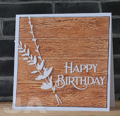
The Tim Holtz lumber folder makes a good base for a masculine card, I think. I cut an extra “plank” to extend it for the proportions of the card. As there’s a join between each plank in any case, it’s not too difficult to make it look fairly seamless.

I rubbed a Neocolour water soluble crayon over the embossing (keeping it on the folder so it has support underneath is a good idea) and then smudged with a damp finger. 

Simple white die cut foliage tied with a tomato paste dot and a scripty sentiment finish it off. 

Supplies:
Tim Holtz/Sizzix embossing folder (Lumber)
Tim Holtz/Sizzix Wildflower dies
Poppystamps die (Happy Birthday Poe Script)
Neocolour crayons
Bristol board
Kraft card
Brown fineliner
Tomato past tube


Friday, 19 August 2022

Cake and candles

I’m combining challenges again today! Shabneez has chosen our theme at Daring Cardmakers and as she has lots of family birthdays to celebrate in August, she’d like to see birthday card ideas featuring candles and/or cake.

Let’s Squash It’s challenge of a shaped card combined with any embossing folder is ongoing so I decided to play again there — the cabinet card shape I made last week was looking very lonely in the challenge gallery until the lovely Robyn joined me on Wednesday but I'm sure Jo and Gail would love to see a few more shaped cards!

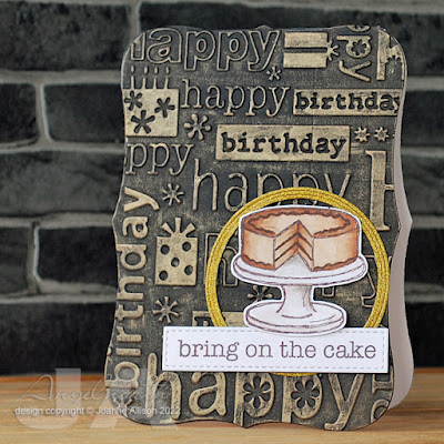
I kept the shape really simple this time, using the largest die from a really old Spellbinder set, but it still looks a bit different than your regular straight edges. Wafer thin dies tend not to want to go through two layers of base weight cardstock — I ran the folded base through the machine once which cut the top layer and made a good indentation in the bottom one. You can then flatten it out and use the indentation to reseat the die and place your top plate so it lines up along the fold of the card to make sure you don’t cut more than you intended. I then die cut a full front out of black cardstock, embossed it, dry brushed with metallic acrylic paint and stuck to the card base. 

The cake is stamped, coloured with Copics and fussy cut then stuck on with gel glue with a glittery gold frame to spotlight it. The sentiment is cut with a small rectangle, modified make it longer.

I realised when dry brushing the card front that there is even a cake with candles (top left) in the embossing so it’s double cake all round!

Stamps:
The Cafe (Cornish Heritage Farms, no longer with us)
Sentiment from Essential Messages (Hero Arts, retired)

Paper:
Bristol board
Black
Gold glitter

Ink:
Brilliance by Tsukineko (Pearlescent Chocolate)

Other:
Birthday embossing folder (Cuttlebug)
Copic markers
Labels 8 dies (Spellbinder)
Fine frames die, circle (Altenew)
Stitched rectangles A6 size (Paper Rose)
Espresso metallic paint (DecoArt)

Thursday, 9 June 2022

Make it Manly

It’s time for a new challenge at Let’s Squash It and I’m delighted to be joining Gail and Jo as guest designer for this one. You can use any embossing folder you like as long as your card is manly! All the details are here.

My hubby is a bit of a wine buff so when I saw this stamp and die set at a bargain price a few months ago I knew I had to get it! Several other family members and friends will likely be seeing it too. There’s a die as well but I actually cut the row of corks out by hand as I wanted to make it shorter by cutting one off the end - it's an easy shape to cut. The word is die cut from tomato paste tube and has come out very shiny on the photo! 

The embossing folder seemed appropriate as I thought the circles might be a bit reminiscent of cork ends and the optical illusion of them bulging in the centre might be an indication of a glass too many!

I find keeping a limited, neutral colour palette is always useful when you’re trying to make a more masculine card.

Stamps:
Wine corks (Spellbinder, stamp and die set)
Paper:
Bristol board and smooth black

Ink:
Brilliance by Tsukineko (Graphite Black)

Other:
Copic markers
3D Circles embossing folder (cArt-US)
Stitched rectangles dies, A6 size (Paper Rose)

Thanks for stopping by - we'd love to see you over at Let's Squash It with some manly makes!


Friday, 21 January 2022

Think of a number

Over at Daring Cardmakers this week, Kathy is asking us to think of a number - it could be a big number for a birthday or anniversary, a background of numbers, even a number shaped card.

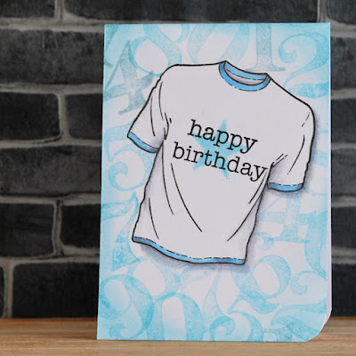
I opted to combine with the current challenge at Lost Coast Designs which is sending us to the Man Cave and made a one layer masculine card - suitable for one of those pesky in-betweeners!

I stamped and masked the T-shirt and then stamped numbers randomly to make a background. A sentiment and star on the shirt and a tiny bit of Copic colouring, some ink brused around the edges of the card and call it done. I don't know about you but I find most of the men (and boys) I send cards to tend to like them plain!

Stamps:
Nothing to Wear (Visible Image)
A&P Numbers (Ma Vinci's Reliquary, no longer with us)
Essential Messages (Hero Arts, retired)

Paper:
Bristol board

Ink:
Brilliance by Tsukineko (Graphite Black)
Tim Holtz Distress ink by Ranger (Tumbled Glass, Speckled Egg)

Other:
Copic markers
Corner Chomper

Thanks for stopping by!


Wednesday, 22 September 2021

Got your number

The current challenge at Let’s Squash It wants us to use an embossing folder featuring numbers or letters and then sand the embossed surface. 

I went back to an offcut of the heavyweight disposable aluminium platter I used for the last challenge, embossed a square of it in the part of the folder that has numbers (and the Roman numerals on the clock face, too) then painted it with gesso.  Once it was dry, I added drops of alcohol ink in various greens and blues and spread them into all the nooks and crannies. More drying time and then bring out the sanding block to expose the silver metal of the high spots. 

I did a bit of stamping on the card base, messed up the sentiment and so added a separate strip to cover the booboo. Finished with some Enamel Accents dots and I have a masculine birthday card to add to the stash.

Stamps:
Numbers border (Kaisercraft)
Essential Messages (Hero Arts, retired)

Paper:
Bristol board

Ink:
Versafine by Tsukineko (Onyx Black)

Other:
Aluminium platter
Patchwork embossing folder (Tim Holtz/Sizzix)
Gesso
Alcohol inks
Black Enamel Accents by Ranger
Black fineliner
Corner Chomp
er 

Thanks for stopping by!


Friday, 30 April 2021

Vellum

Dawn has set the challenge for us at Daring Cardmakers this week. She says she finds vellum tricky to work with so she'd like to see some ideas.

My instinct with vellum is to go for soft and pretty so I decided to challenge myself a bit extra and see if I could do something more masculine. I ended up using it as an overlay to tone down a busy background to make more of a feature of a sentiment. 

I couldn't actually find my vellum so I used a sheet of heavyweight tracing paper - this is some that has draughstman's markings on it so I kept that part as a sort of base line for my piece.

The age old question of how to attach vellum is solved here by wrapping it round the panel and sticking to the back . I also added a few dots of glue and then used black enamel dots to hide those spots.

The background has been in my scraps box for years - it was part of a masterboard for resist techniques but I stand little chance of remembering what was on it - spray inks, acrylic paint, white embossing powder and gesso at a guess! 

Stamps:
Numbers border (Kaisercraft)
Birthday (Letter It range by Ranger)
Essential Message (Hero Arts)

Paper:
Bristol board
Black
Mixed media piece from scraps box
Heavyweight tracing paper

Ink:
Brilliance by Tsukieko (Graphite Black)

Other:
Pearl pen by Viva Decor (Anthracite)

Thanks for stopping by!

Friday, 26 March 2021

Say it loud

Nat has set our challenge over at Daring Cardmakers today and she’d like to see words take centre stage - oversized, mixed fonts, negative die cuts, just choose a way to make the words the focal point of your design. 

I opted for a subtle image in the background with a bold word on top for a card with a masculine feel. I added some grounding with a regular pencil, a few pearl dots and some white highlights on the lettering just to accentuate it a bit more.  

Stamps:
Birthday (Letter It range by Ranger)
Champagne Celebration (Crafters Companion)

Paper:
Bristol board

Strathmore toned grey

Ink:
Shadow ink by Hero Arts (Soft Granite)
Versafine by Tsukineko (Onyx Black)

Other:
Stitched rectangle dies A6 size (Paper Rose)
Black fineliner
Pearl pen by Viva Decor (Ice White)
White paint pen by Posca

Thanks for stopping by!

Friday, 24 July 2020

Power of three

It's my turn to set the challenge over at Daring Cardmakers this week. As it’s the anniversary of the birth of Alexandre Dumas, I thought we might celebrate The Three Musketeers by featuring threes on our projects this week.

I opted for three circles and three dots of Enamel Accents on a masculine birthday card. I got some toned grey paper for Christmas having seen some lovely pencil colouring done on it and I’m ashamed to say I’ve only just had a first play with it! I’ve opted for more of a simple sketch book look, too.

Embossing adds some textural interest for a limited colour palette. I inked the folder so there’s a bit extra shading going on, too. I still had the pearlescent watercolours out on my desk from last week's card so I spattered some gold on the panel before sticking down the elements.

Stamps:
Antique Engravings and Say It All (both Hero Arts, retired)

Paper:
Toned grey (Strathmore)
Bristol board 

Ink:
Shadow ink by Hero Arts (Soft Granite)
Versafine by Tsukineko (Smokey Gray)

Other:
Coloured pencils (white and two greys)
Charcoal pencil
Circles dies by Spellbinder
Fine frames circle die by Altenew
Stitched rectangles A6 dies by Paper Rose Studio
Shell Beauty M-Bossabilities by Spellbinder
Metallic gold pen
Metallic gold paint
Enamel Accents by Ranger

Thanks for stopping by, please do continue to take care as we ease out of lockdown and, if you’re in England, don’t forget your mask from today if you’re heading out to the shops!

Friday, 30 August 2019

Resist if you can

Nat has set the challenge for us over at Daring Cardmakers this week and she’d like to see a resist technique on our cards.

I’ve been meaning to have a go at Debossed Die Resist for a while so I pulled out a Hero Arts die I thought might work and got busy with a wax crayon and a couple of Brusho powders. I think it looks kind of like batik fabric.

I did an extra resist as well - after my fern and background were dry, I rubbed some microglaze onto the leaves and then spritzed and splattered Dylusions spray for some extra speckles.

Supplies:
Fancy Palm die (Hero Arts)
Watercolour paper
White crayon
Sentiment from Say It All (Hero Arts, retired)
Versafine by Tsukineko (Onyx Black)
Brusho (Leaf Green, Turquoise)
Dylusions spray (Vibrant Turquoise)
Judikins microglaze (now rebranded as Distress microglaze)

Thanks for stopping by!

Friday, 1 March 2019

Marching on...

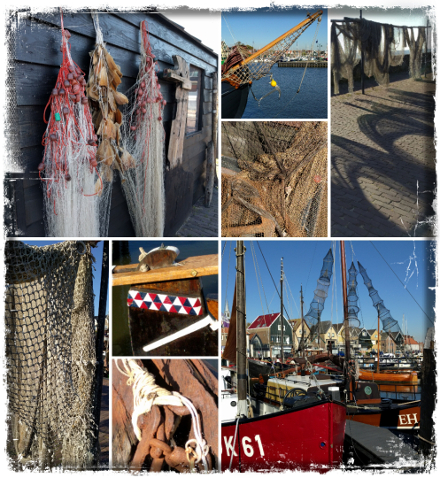
Hard to believe it's the first day of another new month! Svenja is setting our challenge over at Daring Cardmakers this week - it's an "elemental" one as it's the first of the month. Just choose at least three elements from the inspiration photo to kick start your project.

I love the montage of photos Svenja put together from a trip to the Netherlands but for some reason I just couldn't get a card to come together. I decidd to share the best of a bad lot!

I chose black wooden planks, netting and little pops of colour inspired by the floats on the nets.

Stamps:
Wood Grain (Darkroom Door)
Sentiment from Big Day Today (Waltzingmouse Stamps, no longer with us)

Paper:
Brsitol board
Dark blue

Ink:
Tim Holtz Distress ink by Ranger (Black Soot)
Versafine by Tsukineko (Onyx Black)

Other:
Square Nestabilities by Sepllbinder
Enamel dots
Gauze

Here's Svenja's lovely picture for inspiration and it's well worth a look at the blog to see what my teamies made of it!


Thanks for stopping by!

Friday, 22 February 2019

Oh man!

Kathy is setting today's challenge over at Daring Cardmakers - she'd like some inspiration for all the masculine cards she needs to make with the focus on the men, not the boys!

I think my make would work for teens upwards if you have a drummer or music fan in your life.

I used an embossing folder to "stamp" the background and added some shading with a Copic marker. The "happy" is glittery for an extra bit of rockstar glam!

Stamps:
Feel the Beat (Visible Image) 
Happy Stamp & Cut (Hero Arts - both bits of the sentiment)

Paper:
Bristol board
Silver glitter

Ink:
Versafine by Tsukineko (Onyx Black)
Shadow ink by Hero Arts (Soft Granite)
Tim Holtz Distress Oxide by Ranger (Twisted Citron)

Other:
Rays embossing folder (Tim Holtz/Sizzix, retired)
Copic marker
Black fineliner

Thanks for stopping by!


Friday, 17 August 2018

What’s cooking?

It’s my turn to set the challenge over on Daring Cardmakers this week. I’d like to see images of food or see you use something from the kitchen to make your project. Extra brownie points if you manage both, a food image and use of a kitchen item!

I raided the kitchen for food colouring and washing up liquid and had some fun making bubble backgrounds. I guess I could count the disposable plate, too!

I had some black food colouring that has been in my pantry forever (it had a best before date in 2003!) and I guessed it might look either grey or brown used for this technique. I think it turned out quite a stylish colour and I made a little stack of prints on different sorts of paper so I've got some to use in future projects.

The pear I chose for my food image is one of the very first stamps I bought and is a “no name” design. I used neutral Copics to keep the colour palette quite masculine, cut it out and stuck it down with gel glue so the leaves are a bit raised. A die cut and stamped sentiment and a doodled frame finish it off.

If you fancy having a go at bubble backgrounds you just need a colouring medium with plenty of pigment (ink, watercolour or acrylic paint, or food colouring should all work). Add it along with a bit of water and a generous squirt of washing up liquid onto a plate (I used a disposable one so I didn’t have to worry about staining) and stir it up. Use a straw to blow into the mixture and make plenty of bubbles - be careful not to suck! Then gently swipe paper over the bubbles so that they pop against the surface. You can repeat the blowing of bubbles as many times as you like and keep layering the prints until you have the effect you want. Every piece will be unique.

Stamps:
Pear (unnamed maker)
Happy Stamp n Cut and Essential Messages (Hero Arts)

Paper:
Bristol board

Ink:
Brilliance by Tsukineko (Pearlescent Chocolate)

Other:
Black food colouring
Washing up liquid (that’s dish soap to my American friends)
Copic markers
Brown fine liner
Pinflair glue gel

Thanks for stopping by!

Friday, 10 August 2018

Life on the ocean wave

Shabneez is setting the challenge over at Daring Cardmakers today and she'd like us to go nautical.

A few years back my hubby spotted some interesting printing blocks on a  stall in Covent Garden and bought a couple for me including this ship. I'm not sure how they're intended to be used but I found that with a little bit of jiggery-pokery it's possible to run them through the Big Shot as a kind of letterpress. The printing lines are etched into a metal plate so you can't just use it like a rubber stamp, it needs some pressure.

I've added just the slightest hint of colour around the ship using dots of Copic marker that get more widely space as they get further out. I thought the plank embossing could represent the ship's deck.

Supplies:
Printing block
Sentiment words from Say It Loud (Waltzingmouse Stamps, no longer with us)
Bristol board
Versafine by Tsukienko (Onyx Black) 
Memento Luxe by Tsukineko (Love Letter)
Copic marker
Silver mirror card
Pinewood Planks embossing folder (Stampin' Up!)
Rectangle Nestabilities by Spellbinder
White Enamel Accents by Ranger
Corner Chomper

Thanks for stopping by!

Friday, 13 July 2018

A sporting chance

Kathy has set this week's challenge over at Daring Cardmakers. She's like us to be inspired by the summer of sport happnening and make a card with a sporting theme.

I'm possibly the least sports-oriented person ever. DH's grandsons, however, play football, cricket, ice hockey etc and I have a nephew and friend's son who do martial arts so kids card it was...

The football was simple clip art, I shaded it with Copic markers, cut out with a circle die and popped up slightly with gel glue. Other than that it's just a bit of inking on the green panel and a heat embossed sentiment.

Supplies:
Clip art football
Sentiment from Essential Messages (Hero Arts)
Green cardstock
Bristol board
Tim Holtz Distress ink by Ranger (Peeled Paint) 
Versamark by Tsukineo
Detail white emobssing powder
Copic markers
White gel pen
Black fineliner

Thanks for stopping by!

Friday, 6 April 2018

April elements

It's the first Friday of another new month and Kathy is setting our "elemental" challenge over at Daring Cardmakers - just choose at least three elements from the inspiration picture to kickstart your project.

I chose the colours, an embossed white feather, overlapping rectangles of different sizes, gold accents (some metal dots, some doodled gel pen) and a white script style sentiment.

The smaller rectangles are made with an acrylic block tapped onto a blue ink pad and spritzed with water before pressing it onto the card base.

Stamps:
My Island (mine is the original Waltzingmouse Stamps set, the same is now available from Gina K)
Happy Stamp & Cut by Hero Arts (die cut sentiment as well)

Paper:
Bristol board

Ink:
Shadow Ink by Hero Arts (Mint Julep)
Tim Holtz Distress ink by Ranger (Chipped Sapphire)

Other:
Tom Holtz/Sizzix Feather duo die/folder
Circles punched from tomato paste tube metal
Gold gel pen
Pinflair glue gel
Corner Chomper

Here's the inspiration picture - we'd love to have you play along!


Thanks for stopping by!

Friday, 2 March 2018

On the March!

Can you believe it’s a new month already?! That means it’s time for an “elemental” challenge at Daring Cardmakers - choose at least three elements from the picture Miri has for us this month as a kickstart for your card.

I really struggled with this! In the end, I put an extra restriction on myself and that seemed to do the trick: make it masculine (or at least not girly)!

I chose the dark wood grain (floor bottom left), denim, flash of yellow, circular frame (chair backs bottom right) and silver accents (chair legs bottom left). I carried the wood grain patterning over into the embossed texture on the base layer as well.

Stamps:
Country Charm Textures (Cornish Heritage Farms,  no longer with us)
Essential Messages (Hero Arts, I believe this set is retired)

Paper:
Smooth white
Silver glitter (10 sheets in a pack from my local £1 shop and the perfect weight for punches!)
Scrap of yellow DCWV

Ink:
Brilliance by Tsukineko (Pearlescent Chocolate)
Tim Holtz Distress ink by Ranger (Vintage Photo, Mustard Seed)

Other:
Denim fabric
Nestabilities by Spellbinder (large and small circles)
Pine planks embossing folder by Stampin Up!
Small circle punch
Star squeeze punches by Fiskars
Glue gel by Pinflair
Brown fine line marker
Corner Chomper

Thanks for stopping by! We’d love to see you over at Daring Cardmakers and the team has made lots of lovely samples - looks like it was just me who struggled! Here's Miri's inspiration picture if you'd like to show us what you make of it - which three elements inspire you?!


Friday, 12 January 2018

New year elements

A third of January gone already - eek! Hope it's not too late to wish everyone a very happy and peaceful new year.

Of course a new month means an "elemental" challenge at Daring Cardmakers, see the end of this post for the lovely inspiration picture Shabneez chose for us this month. As ever, just choose at least three elements from the picture to kickstart your project.

I chose the shell, burlap, coiled white thread and a translucent circle to make a masculine birthday card. The burlap is stamped through an aperture cut with a Nestie so it's directly on the card base rather than being a separate layer.

Stamps (all retired or from companies sadly no longer with us):
Antique Engravings by Hero Arts
Burlap backgrounder by Cornish Heritage Farms
Big Day Today by Waltzingmouse Stamps

Paper:
Bristol board
Kraft
Vellum

Ink:
Adirondack dye ink by Ranger (Latte)
Brilliance by Tsukineko (Pearlescent Chocolate)

Other:
White crochet thread
White Enamel Accents by Ranger
Circle Nestabilities by Spellbinder
Corner Chomper


Thanks for stopping by!

Friday, 20 October 2017

City or country?

It's Friday so it must be challenge day over at Daring Cardmakers. Miri is setting this week's challenge and she'd like to know: city or country? Which are you?

I'm very definitely a country girl. I have done city living (Manchester being the biggest) but I'm now firmly back in a rural location.

As well as the obvious trees, fields, wildlife, birds etc, one of the things I love about where we live is the dark skies. Northumberland International Dark Sky Park has gold tier status from the  International Dark Sky Association, making us "officially the best place in England for people to go to enjoy the heavens" according to the Northumblerand National Park website.
 
So I wanted my card to reflect something of the night sky we enjoy in the country, hence the dark background and the splatters of "starry" light behind the glowing autumn oak leaves.

I did the thing of overstamping the coloured image with Versamark and clear embossing to resist the watercolour - I gave it the tiniest of offsets to get moolight glints along the top edges of the leaves. A MISTI makes this easy to do! I actually broke out the iron and ironed off the clear embossing once I'd done with the rest of the card.

Stamps:
Oak Branch by Beeswax Stamps
Say It Loud by Waltzingmouse Stamps (no longer with us)

Paper:
Bristol board

Ink:
Adirondack dye ink by Ranger (Espresso)
Versamark by Tsukineko
Tim Holtz Distress ink by Ranger (Blueprint Sketch, Black Soot)

Other:
Copic markers
Watercolour pencil
Detail silver and clear embossing powders
White paint pen by Posca
MISTI

Thanks for stopping by!

Friday, 25 August 2017

Fast Frankie!

Our challenge today at Daring Cardmakers is "Fast food and coffee to go".

I reckon pizza is perfect food for a party and so this happened!

Fast Food Frankie is a digital image. I printed him on Neenah cardstock (because that will go through my printer OK!)  coloured with Copics, cut out and stuck onto an inky background on a DL card. I went dark with the blues to make it look like perhaps night is falling and Frankie is keen to find the party before it's too late!

I'm not sure whether he's pulling a wheelie because he's setting off at speed or whether the weight of all those pizzas is to blame!

Supplies:
Fast Food Frankie by Dr Digi - printed on a laser printer
Neenah cardstock
Copic markers
Posca white paint pen
Tim Holtz Distress inks (Salty Ocean, Blueprint Sketch, Chipped Sapphire)
Triple Thick glaze by DecoArt (on his goggles)
Typeset strip die by Tim Holtz/Sizzix
Fineline black marker
Nail art gems
Pinglair glue gel

Thanks for stopping by!

Friday, 14 July 2017

If you go down to the woods...

It's Enfys's turn to set the challenge at Daring Cardmakers and she's sending us down to the woods - make a card featuring anything that makes you think of the great outdoors: camping trips, woodland walks, picnics....

I went a bit "Victorian naturalist" on this one with a little watercolour study on a clean and simple card.

I stamped with Antique Linen and used the faint lines to do some borderless colouring. It's always useful to have the index image or to stamp the image in a dark ink on scrap paper to refer to when you do this, it lets your eye see the faint imprint better somehow.

Once the mushrooms were painted, I masked them and stamped in some grass and then added a weeny sentiment.

Stamps:
Mushrooms by Deep Red
Grasses by Inkylicious
Sentiment from Big Day Today by Waltzingmouse Stamps (no longer with us)

Paper: cold press watercolour

Ink:
Tim Holtz Distress ink by Ranger (Antique Linen and Peeled Paint to stamp, plus Vintage Photo and Tumbled Glass for the watercolouring)
Pearlescent Chocolate Brilliance by Tsukineko

Other: Corner Chomper

Thanks for stopping by! Do have a look at the variety of ideas from the Daring Cardmakers - lots of fab takes on this theme!