Showing posts with label spellbinder. Show all posts

Friday, 12 July 2024

Cheers!

It's my turn to set our challenge at Daring Cardmakers and we’re raising our glasses to our shared hobby this week. Cocktail, mocktail, beer or orange juice — show us what you’re drinking!

My hubby is somewhat of a wine buff so this is the card I made for his birthday.   It’s one layer, no frills which is pretty much how all the men I make cards for like their cards!

Stamps:
Wine Corks (Spellbinder)
Ink Splats (Visible Image)
Celebrate (Letter It range by Ranger)
Essential Messages (Hero Arts)

Paper:
Bristol

Ink:
Adirondack dye ink by Ranger (Espresso, Cranberry)
Versafine by Tsukineko (Onyx Black)

Other:
Copic markers
Charcoal pencil
Corner Chomper

Thanks for stopping by!

Friday, 1 March 2024

Elements for March

First Friday of the month is always an "elemental" challenge at Daring Cardmakers — choose at least three elements from the inspiration picture to kickstart your project.

This month's picture has a very serene quality. I decided that leant itself to sympathy cards and since they're rarely in my stash and you inevitably don't really feel like making one when you need it, I went that way.

From the inspiration picture I chose some of the colours, the feathers from the dream catchers, the macrame made me think of this embossing folder and I used twine to tie the feathers together. The feathers are gently edged with Vintage Photo ink. 

Stamps:
Big Day Today (Waltzingmouse Stamps, no longer with us)

Paper:
Bristol board
Kraft

Ink:
Brilliance by Tsukineko (Pearlescent Chocolate)
Tim Holtz Distress ink by Ranger (Vintage Photo)

Other:
Feathers
Linked circles
Nail art pearls
Crochet thread
Cropadile

Here's our inspiration this week:


Thanks for stoppig by!

Friday, 13 January 2023

New year, new crafty things

Miri is setting our challenge over at Daring Cardmakers today — it's a new year and so she'd like to see something you've not used before on your card. It might be newly acquired, or just something in your stash that you haven’t got round to using yet!

I've used this row of corks stamp before but not the die that coordinates with it. The real "new" element though is the embossing folder - I've seen lots of cards with this Tim Holtz folder and find it hard to resist woodgrain so it made it on to my Christmas wish list and I was lucky enough to find it under the tree! I thought it would make a good wine crate background for the corks. To personalise the card, I stamped the vintage before embossing in the folder. For some reason the camera has made it more prominent than it looks in real life where it’s more of a background element. 

Oh, I used a new square die as well! Perhaps not the most exciting shape but I got a new set for Christmas that gives me bigger squares as well as more options than the Nesties I’ve had for a long time. 

Stamps:
Row of corks (Spellbinder, set with dies)
My Type (Ma Vinci's Reliquary, no longer with us)

Paper:
Bristol board
Ivory flecked

Ink:
Brilliance by Tsukineko (Graphite Black)
Adirondack dye ink by Ranger (Latte, Espresso)

Other:
Lumber embossing folder (Tim Holtz/Sizzix)
Plain square nesting dies (Presscut)
Copic markers
Tomato paste tube
Fineline marker


Friday, 10 June 2022

Pearls of widsom

It's my turn to set the challenge at Daring Cardmakers and as one of June’s birth stones is pearl I thought we’d take our inspiration from all things pearly.

I started with a piece of pearlescent cardstock in a pale silvery grey, embossed and sprayed it with some ink and then polished some of that off the high spots of the embossing. 

I decided I wanted to stamp a sentiment round the curve of the shell which was a bit fiddly but made possible with the MISTI. I couldn’t get it quite as dark as I wanted though so I ended up going over it (very carefully) with a very fine marker.

I gave the whole thing a bit extra pearliness by adding some dots in different sizes along the bottom with a pearl pen and finished by drawing a wonky frame round the square with a metallic pencil. 

I’m guest designing with Let’s Squash It for the month of June and took inspiration from the challenge there too — hop over to see what it is! The sample I made in advance is here.

Supplies:
Shell Beauty embossing folder (Spellbinder)
Pearlescent silver and black cardstock
Adirondack dye ink spray (Stream)
Brilliance by Tsukineko (Graphite Black)
Sentiment stamp from Seaside set (Crafty Secrets, no longer with us)
Viva Decor pearl pen (Ice White)
Fineline marker
Metallic pencil (Lyra)

Thanks for stopping by!


Thursday, 9 June 2022

Make it Manly

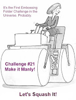
It’s time for a new challenge at Let’s Squash It and I’m delighted to be joining Gail and Jo as guest designer for this one. You can use any embossing folder you like as long as your card is manly! All the details are here.

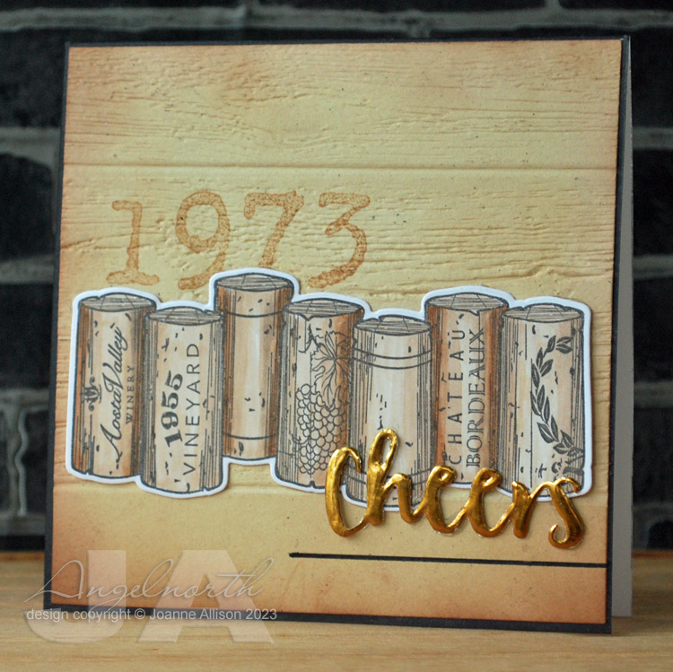
My hubby is a bit of a wine buff so when I saw this stamp and die set at a bargain price a few months ago I knew I had to get it! Several other family members and friends will likely be seeing it too. There’s a die as well but I actually cut the row of corks out by hand as I wanted to make it shorter by cutting one off the end - it's an easy shape to cut. The word is die cut from tomato paste tube and has come out very shiny on the photo! 

The embossing folder seemed appropriate as I thought the circles might be a bit reminiscent of cork ends and the optical illusion of them bulging in the centre might be an indication of a glass too many!

I find keeping a limited, neutral colour palette is always useful when you’re trying to make a more masculine card.

Stamps:
Wine corks (Spellbinder, stamp and die set)

Paper:
Bristol board and smooth black

Ink:
Brilliance by Tsukineko (Graphite Black)

Other:
Copic markers
3D Circles embossing folder (cArt-US)
Stitched rectangles dies, A6 size (Paper Rose)

Thanks for stopping by - we'd love to see you over at Let's Squash It with some manly makes!


Friday, 24 July 2020

Power of three

It's my turn to set the challenge over at Daring Cardmakers this week. As it’s the anniversary of the birth of Alexandre Dumas, I thought we might celebrate The Three Musketeers by featuring threes on our projects this week.

I opted for three circles and three dots of Enamel Accents on a masculine birthday card. I got some toned grey paper for Christmas having seen some lovely pencil colouring done on it and I’m ashamed to say I’ve only just had a first play with it! I’ve opted for more of a simple sketch book look, too.

Embossing adds some textural interest for a limited colour palette. I inked the folder so there’s a bit extra shading going on, too. I still had the pearlescent watercolours out on my desk from last week's card so I spattered some gold on the panel before sticking down the elements.

Stamps:
Antique Engravings and Say It All (both Hero Arts, retired)

Paper:
Toned grey (Strathmore)
Bristol board 

Ink:
Shadow ink by Hero Arts (Soft Granite)
Versafine by Tsukineko (Smokey Gray)

Other:
Coloured pencils (white and two greys)
Charcoal pencil
Circles dies by Spellbinder
Fine frames circle die by Altenew
Stitched rectangles A6 dies by Paper Rose Studio
Shell Beauty M-Bossabilities by Spellbinder
Metallic gold pen
Metallic gold paint
Enamel Accents by Ranger

Thanks for stopping by, please do continue to take care as we ease out of lockdown and, if you’re in England, don’t forget your mask from today if you’re heading out to the shops!

Friday, 2 August 2019

Link in the Chain - July

It's time for another reveal at the Card Chain Challenge. My card has gone to Gail this month. Gail is part of the team that does a fabulous job organising the Chain each month so it's a particular pleasure to be able to send her a card.

From the options on offer this month I chose the theme of faces and also the product options of watercoluring and stencils.

I have to confess to a slight cheat this time - Molly was already watercoloured and mounted on another card that I had never used so I pulled it apart and made a new one since I liked the way she turned out and it seemed a shame not to have sent her to anybody! She's stamped in a very light ink so I could do some "no line" colouring.

I had a stencil out on my desk that was cut with the Spellbinder fancy lattice die - I used that to add a bit of background with Tumbled Glass ink and then ran a glitter pen around the edge of a few shapes and smudged it for some shimmery shading.

Stamps:
Molly (Beeswax Stamps)
Sentiment from Journaling Words 3 (Artistic Stamper)


Paper:
Cold press watercolour
Bristol board


Ink:
Tim Holtz Distress ink by Ranger (Antique Linen, Vintage Photo, Walnut Stain, Black Soot, Pumice Stone, Tumbled Glass)
Brilliance by Tsukineko (Pearlescent Chocolate)


Other:
Circle Nestabilities and Fancy Lattice die (Spellbinder)
White paint pen by Posca

Turquoise Spica glitter pen
Charcoal pencil
Corner Chomper


There are still a few days to sign up for the August chain if you fancy it - just make one card using one or more of the challenge options, send it out and get a handmade card from the next person in the chain.

Friday, 12 July 2019

Tying the knot

It's that wedding time of year and Ruth is asking us to celebrate those tying the knot with this week's challenge over at Daring Cardmakers.

I played with a Celtic knot embossing folder and some copper engraving board (what I would have called scraper board as a kid). I read somewhere that you can use nail polish remover rather than sanding off the black coating.

I tried it and I have to admit it was too successful! Even though I was careful not to have to the pad too wet it still took off too much black in the recessed areas of the design. I ended up putting some black acrylic paint back over some areas and using a sanding block anyway!

I aslo added a bit of gold Rub n Buff in places so the knot has more than one metallic tone. I cut the design apart and reassembled bits of it so that I had some white space to work with. I think Kathy and I must be two halves of a whole - she gets jittery about white space, I get jittery about a lack of it!

Supplies:
Celtic knot embossing folder (Spellbinder)
Copper Engraving Art Scraper Foil (Royal and Langnickel)
Nail polish remover
Black acrylic paint
Sanding block
Rub n Buff by Amaco (Gold Leaf)
Sentiment from a smal Kaiser Craft set
Versafine Onyx Black ink
Corner Chomper

Thanks for stopping by!

Friday, 29 June 2018

Tying the knot

It’s that time of year and Ruth is getting into the wedding mood on Daring Cardmakers this week - our challenge is to make a card with a wedding or anniversary theme.

I needed a card for a friend’s civil partnership - the couple in question has been together over 20 years! At the start of their time together they wouldn’t have been allowed to marry so at least we can say hurray for progress in that department.

With two grooms I didn’t want anything too flowery and since one is Irish and “tying the knot” is something we say to mean getting married I thought maybe a Celtic knot would do the trick. I embossed black cardstock, cut out the central knot from the bigger design and gilded with some silver Rub n Buff wax.

Some Brusho splatters and a simple stamped sentiment are the only other things going on here. I think it’s suitably understated (they were keen to keep the whole thing low key)!

Stamps:
Say It All by Hero Arts

Paper:
Bamboo Mixed Media by Hannemuhl
Smooth black

Ink:
Versafine by Tsukineko (Onyx Black)

Other:
Brusho crystals (Turquoise)
M-bossabilities folder by Spellbinder (Celtic Knot)
Rub n Buff by Amaco (Silver Leaf)

Thanks for stopping by!

Friday, 15 June 2018

ABW!

It's my turn to set the challenge over at Daring Cardmakers this week and I'd like to see ABW - anything but white! I've fallen into the habit of using white as my card base so I thought I should challenge myself at least.

Of course, being a last minute minnie it had to be a father's day card. I was in the mood for texture so I decided to emboss rather than stamp this week.

I swiped charcoal grey ink onto the folder before embossing some mid grey cardstock and then rubbed silver ink and two shades of Perfect Pearls over the large shell.

The embossing is deep enough that it's really easy to reseat the piece in exactly the same place on the folder so I swiped the inkpad around the large shell area again and put it back through the Big Shot to redefine the inking after adding the pearl effect.

The die cut word has the same Perfect Pearls and silver ink treatment and the rest of the sentiment is stamped onto the torn vellum strip to finish it off.

Stamps:
Happy Stamp & Cut (Hero Arts)

Ink:
Delicata by Tsukineko (Silver Shimmer)
Shadow ink by Hero Arts (Charcoal)
Brilliance by Tsukineko (Graphite Black)

Paper:
Stormy Medium (an ancient Prism papers one!)
Vellum

Other:
M-bossabilities folder by Spellbinder (Shell Beauty)
Perfect Pearls by Ranger (Blue Patina and Blue Raspberry)

Here's a close up that shows the depth and detail of the embossing a bit more clearly.

We'd love to have you join us with your ABW creations - just have a look at the lovelies the rest of the team came up with if you're looking for ideas to get you started!

Friday, 4 August 2017

Elements for August

It's the first challenge of August over at Daring Cardmakers and of course that means we have an"elemental" dare - just choose at least three elements from Miri's picture to kickstart your project.


I rebelled against the flamingo trend and chose hibiscus flower, hot pink and turquoise from the color palette and a script style sentiment!

This is a quick and easy card - central panel masked with low tack tape and sponged with inks, splashed with water droplets for some interest and then overstamped with the bold, graphic style hibiscus image. Die cut sentiment and doodled border to finish.

Stamps:
Emerging Hibiscus by Cornish Heritage Farms (no longer with us)

Paper: Bristol board 

Ink:
Tim Holtz Distress ink by Ranger (Picked Raspberry)
Adirondack dye ink by Ranger (Pool)
Versafine by Tsukineko (Onyx Black)

Other:
Fine line black marker
Phrases Set 1 by Spellbinder
Low tack tape

Here's the summery picture Miri chose for this month, it would be lovely to see your take on it - the DT cards feature lots of flamingos!


Thanks for stopping by!

Friday, 10 July 2015

Welcome Alice!

Friends along the road have just welcomed a new baby; this is the card I made for them.

This "quilt" technique is really useful for baby cards - just sponge off the edge of a piece of acetate, move it along and sponge again until you have diagonal lines right across the card in one direction then flip it through 90 degrees and repeat so you get squares. I used the tiny heart from the set to stamp in some of the squares for a quilt pattern. With a bit of judicious masking, you can make a one layer card with plenty of interest.

I used Mega Flakes on die cut lettering for a slightly shabby-chic look on baby's name to personalise the card.

Stamps:
Hello Baby Vol 1 by Darkroom Door

Ink:
Brilliance by Tsukineo - Pearlescent Chocolate
Tim Holtz Distress ink by Ranger - Antique Linen

Other:
Font One upper and lower case dies by Spellbinder
Flitter Glu by Indigo Blu
Mega Flake by Indigo Blu - Chariot of Fire
Copic markers
Black fineline marker
White Posca paint pen

Thanks for stopping by!


Wednesday, 12 February 2014

Experimental hearts

I had a little play with various bits and pieces today. This week's MixAbility challenge at Splitcoast Stampers calls for the use of hearts (here) and the Pan Pastels challenge blog has another anything goes week with the option to join the DT in using fabric on your project (details here).

Very little stamping on here and more die cuts than I'd usually use! I started with two primitive hearts cut from mount board and lettering to spell the word LOVE (I cut the word twice and stacked the layers for a bit extra depth since Spellbinder dies don't cut thick materials). Then I covered the lot with double sided tape sheet and put fine-weave cotton fabric over it. I ran it through my Big shot with an embossing mat to make sure everything was stuck down well. I'd have liked a few more wrinkles in the fabric but never mind, the texture is still interesting!

Then I went to town with Pan Pastels and a charcoal pencil. The only stamping is some Hero Arts brush strokes stamped in the corners in Versamark and rubbed over with more pastel for slightly more intense colour. I left the edges of the fabric deliberately a bit frayed before sticking it to a card base.

I used my finger to apply the white Pan Pastel over the lettering as it seemed to give me most control.

What I learned - Mod Podge doesn't take Pan Pastel very well (I originally Mod Podged the fabric rather than using sheet adhesive); I love the look of fabric over die cuts; you need to make sure there's a support under the overhang of the second die cut to bring it to the same level as the other one before running it through the Big Shot. I'm also extremely pleased with my new fixative - it's a natural substance (based on casein, the protein found in milk and apparently the fixative preferred by Degas!) and it's in a pump bottle so there's no solvent smell or hazard if you're spraying indoors.

Materials:
Mount board offcuts
White cardstock
White cotton fabric
Primitive Hearts Bigz die by Sizzix
Spellbinders Font One dies
Pan Pastels (Turquoise, Permanent Red, Permanent Red Shade, White)
Charcoal Pencil
Brush Strokes stamps by Hero Arts
Versamark ink
SpectraFix Degas fixative spray

Thanks for stopping by!

Tuesday, 17 December 2013

'Tis the season

I haven't played in the Splitcoast Stampers Mixed Media challenge for ages so I thought I'd get a Christmas card done using Birgit's challenge to go bright.  I've used pigment ink, dye ink, glitter and sequins to add bright colours to my card - the green glitter and green stars are a better match in real life, it just proved impossible to get them matching on a photo.

It was only after I'd finished that it occurred to me the only stamping is the sentiment which is unusual for me!

I punched the stars in a sheet of acetate and used it as a stencil to sponge on green and pink inks and then doodled round them with both black and silver. The fancy lattice die cuts are stuck onto double sided tape sheet and the glitter burnished into the sticky apertures.

Stamps:
Sentiment from Miracle of the Holidays by Hero Arts

Paper: smooth white and black

Ink:
Brilliance Graphite Black by Tsukineko
Shadow ink Mint Julep by Hero Arts
Adirondack Raspberry by Ranger

Other:
Fancy lattice die by Spellbinder
Fiskars squeeze punches (small and medium star)
Hot pink and mint green glitter
Silver gel  pen
Black fineliner
Sequins
Double sided tape sheet
Corner Chomper

Thanks for stopping by!

Tuesday, 6 August 2013

Tag - you're it!

I was delighted to have a couple of projects accepted for the PaperCrafts Holiday Cards and More special issue and even more delighted to discover today that Cath (PaperCrafts Trends Editor) has picked one of them to show on the Moxie Fab blog to highlight the gift tag challenge!

Here it is! I haven't seen the issue yet but apparently it's on p.98. The lovely sentiment (it's from the Waltzingmouse Stamps Compliments of the Season set) makes a perfect centrepiece for a chalkboard style and this is a really quick and easy tag to make since it's a single stamp and no complicated colouring or cutting out!

If you're trying to get ahead with Christmas crafting, do check out the Moxie Fab blog this week for challenges and some inspiration from the publication. All the posts based on this Holiday Cards and More special issue are here. There are copies of the special issue to be won if you fancy playing along with the challenges.

Thanks for stopping by!

Monday, 12 March 2012

Floral gift tag

Here's another guest project for the Chocolate Baroque Design Team blog.

While I had the Copic and Prismacolor pencils out to color the image on the seed packet I shared last week {here if you didn't see it and would like to}, I also coloured the floral spray from the Fragrant Honeysuckle set and turned it into a pretty tag. I think this would be a lovely addition to a gift of a bunch of flowers - perhaps for Mothers Day?

I stamped and cut out with a Beaded Oval Nestability die and then carefully cut the beads off, cutting round the flower head and leaves that extended beyond the basic oval shape. I coloured the image with Copics and Prismacolor pencils and then sponged ink round the edge. I stuck the coloured piece onto a second beaded oval die cut and finished with a simple ribbon at the top.

I used a Copic marker to colour white silk ribbon on this and the seed packet project - it's a great way to get a match for the colours in your image.

Stamps:
Fragrant Honeysuckle (Chocolate Baroque)

Paper:
Cryogen White

Ink:
Adirondack by Ranger (Espresso)
Jenni Bowlin ink by Ranger (Soap Powder)

Other:
Copic markers
Prismacolor pencils
Beaded Ovals Nestabilities by Spellbinder
Silk ribbon


Thanks for stopping by today!

Monday, 25 April 2011

New nest!

I needed a quick new home card last week - this is what I came up with. The kraft card base came from a huge rigid envelope that was supplied with the calendar we got for our kitchen this year. Obviously we weren't sending it anywhere so I chopped up the envelope for crafting :o) I love coloured pencils on kraft cardstock and I thought it would give a nice look to the eggs in this nest - a quick and simple card, appropriate for a spring move of house! It's a small one layer card (10.5cm square) with just a touch more interest added by embossing a frame for the image with a Nestie. Stamps: Nest and sentiment both CHF (retired) Paper: Kraft Ink: Adirondack by Ranger (Espresso) Other: Prismacolor pencils Nestabilites by Spellbinder (Large Square) Thanks for stopping by, hope you're all having a lovely Easter weekend!

Tuesday, 19 April 2011

Birthday poppies

I'm sharing the birthday card I made for my mum today - happy birthday Mum!

I'm also hosting the challenge at the Crafty Secrets member forum over at Splitcoast stampers and I'm asking players to use something pearly on their projects. I've used a pearlescent cardstock and lots of little pearls along the top of the lace trim.

This is a slightly larger size than I usually do at 7" x 5" but the poppy stamp is substantial enough to carry it. I coloured and cut out the third poppy head so that I could make it overlap the tip of the sentiment panel.

Stamps:
Poppy plus sentiment from Sweet Kids set (both Clear Art Stamps by Crafty Secrets)

Paper:
Cryogen white
Dark red

Ink:
Adirondack by Ranger (Espresso)
Tim Holtz Distress ink by Ranger (Antique Linen, Vintage Photo)

Other:
Copic markers
Vintage lace
Pearls
Nestabilities Labels four
Sewing machine and thread


Thanks for stopping by!

Thursday, 17 March 2011

Golden Santa

I've combined a couple of challenges today - Hazel's Christmas challenge this week is to "go for gold" and I used the sketch from Splitcoast Stampers' regular Wednesday challenge. I did a mirror image of the sketch provided as my Santa needed to face into the card to look right.

My background piece was made by sponging ink onto milky white cardstock and then dragging the edge of an old credit card over an ink pad and onto the panel. I used some variegated metal leaf to make a random frame round the Santa image and rubbed some Rub n Buff wax over it to blend the colours a little and make it a bit more subtly golden rather than very bright in-your-face metallic! As it is, the golden splodge combined with the glitter framing made it very difficult to get a decent photograph.

The sentiment is embossed with white powder onto a piece of metal from a tomato paste tube cut with a Spellbinder die and aged with a Copic marker and a little more Rub n Buff.

I was aiming for a bit random and worn with the glittered border but I'm not sure that it doesn't just look a bit slapdash- ah well!

Stamps:
Noel 2 (Paperartsy)
Sentiment from Season's Greetings (Technique Tuesday)

Paper:
Cryogen White

Ink:
Adirondack by Ranger (Espresso)
Distress ink by Ranger (Vintage Photo)
Versamark by Tsukineko

Other:
Detail white embossing powder
Rub n Buff by Amaco (Gold Leaf)
Copic markers (Santa is slightly tinted with Eggshell, Pale Cherry Pink and Warm Grey 1)
Easy Metal by Eberhard Faber
Tomato paste tube
Fancy labels dies by Spellbinder
Sewing machine and thread
Spica glitter pen (red and green)
Fine gold glitter


Thanks for stopping by!

Tuesday, 15 March 2011

Take flight!

I'm hosting the challenge this week in the Crafty Secrets member forum over at Splitcoast Stampers. I've asked people to Take Flight and use anything on their projects that can fly!

I went a little bit quirky today – the lady is cut out from one of the vintage advertising images in the Earthy Paper Pad and I stamped the butterfly wings from the Altered Art set for her to try for size. I stamped Dream/Imagine/Beautiful randomly over the background and sponged over a clock mask as well. After stamping I decided I wanted to accentuate the word Believe so I went over it carefully with a Zig fine point drawing pen.

When I make a shaped card like this I like to get the full shape on the front so I make a card base by putting the fold of the blank just inside the top cutting edge of the die and then cut a separate piece and stick it over the top so it covers the fold.

Stamps (all Crafty Secrets):
Altered Art
Believe
Mini Memories

Paper:
Earthy Paper Pad (Heartwarming Vintage)
Cryogen White

Ink:
Brilliance by Tsukineko (Graphite Black)
Adirondack by Ranger (Espresso and Latte)

Other:
Copic markers

Timeworks mask by Tim Holtz
Nestabilities by Spellbinder (Labels 1)
Rub n buff by Amaco (Gold Leaf)
Zig drawing pen
Foam pads


Thanks for stopping by!