Friday 31 December 2021

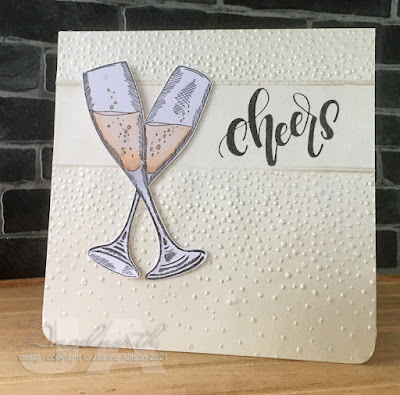
Raise a toast

It's the last day of the year and I'm just managing to squeak in with an entry for December's challenge at Let's Squash It!

Gail and Jo gave us free rein this time - any folder, any technique. I went back to May's challenge to find a way to create white space alongside the embossed texture. I did it this time by laying my top plate part way up the folder so I didn't get the full impression. Then I turned the paper and did the same the other end, leaving a clear strip across for stamping the sentiment.I used a score board to create more defined edges for the embossed areas.

This folder is intended as snow but it's always made me think of champagne bubbles so I used some ivory pearlescent paper and teamed it up with champagne flutes to make a card that could toast the New Year.

Stamps:
Champagne Celebration (Crafters Companion)
Birthday (Letter It by Ranger) 

Paper:
Stardream
Bristol board

Ink:
Brilliance by Tsukineko (Graphite Black)

Other:
Softly Falling embosing folder (Stampin' Up!)
Scor ItCopic markers
Copic Spica glitter pen (gold)
Corner Chomper

Thanks for stopping by - whether you're raising a glass of champagne tonight or celebrating some other way, cheers! Let's hope 2022 is a bit kinder to us all.

Friday 10 December 2021

Through the trees

The challenge at Daring Cardmakers this week has a focus on trees - one tree, a whole forest, Christmassy or not - up to you!

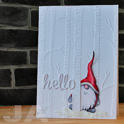
It's white-out conditions in the birch forest - it's lucky that gnomes have a good sense of direction! This one is standing in a sparkly snowdrift (not sure how well that shows up on the photo) and peeping round a tree trunk to say a seasonal hello.

The card front is embossed and I used a craft knife to cut slits either side of one of the trunks so that I could slot in the little fussy cut gnome behind the trunk.

Lost Coast Designs have a gnome theme for their currect challenge so I'm linking up there too, all the challenge details are here.

Stamps:
Pointy Hat Gnome (Lost Coast Designs)

Paper:
Bristol board

Ink:
Brilliance by Tsukineko (Graphite Black)

Other:
Woodland embossing folder (Stampin' Up)
Copic markers
Pearl pen by Viva Decor (Ice White)
Glamour Dust by Deco Art (Crystal)
Hello die (Waltzingmouse Stamps, no longer with us)

Thanks for stopping by!

Thursday 2 December 2021

Link in the chain - November

It's reveal day at Card Chain Challenge. Mine has gone over the Pond to Greta this time. 

I intended to use the sketch but I did it from memory rather than actually looking at it as I created so it’s an approximation! I also used the themes of polar animals and snowflakes. I think you can just about see the silvery stamped snowflakes on the right hand side of the card, they show up better at some angles than others. 

I used an oval die to cut an aperture to ink my central “frame” for the penguins and doodled round it with a gel pen just to add some extra definition. The sentiment is a die cut but other than that it’s a single layer card again, my usual preference for Card Chain Challenge cards!

Stamps:
Bundled Penguins (Stampendous)
Flurries (Waltzingmouse Stamps, no longer with us)

Paper:
Bristol board
Black

Ink:
Brilliance by Tsukineko (Graphite Black)
Tim Holtz Distress ink by Ranger (Tumbled Glass)
Delicata by Tsukineko (Silvery Shimmer)

Other:
Copic markers
Pearl pen by Viva Decor (Ice White)
Glamour dust by DecoArt (Crystal)
Hello die (Waltzingmouse Stamps, no longer with us)
Oval Nesatbilities (Spellbinder)
Corner Chomper

Thanks for stopping by!

Friday 26 November 2021

Show us your stockings!

The latest challenge in Daring Cardmakers' run up to Christmas is to show us your stockings - if you don't feel like making festive projects, perhaps you'll go for fishnets instead!

I made a few tiny tags - just enough room to write names of recipient and giver.

Alongside the traditional stockings here there are a few pale blue snowflakes - it's looking like we'll be getting some of those for real later today if the forecast is to be believed!

Lost Coast Designs has “it’s a wrap” as the current theme so I’m playing there too (tags, bags, wrapping paper, boxes etc - basically stamp something gift-related that’s not a card)  

Stamps:
Stocking from a magazine freebie set (Making Cards, I think)
Flurries (Waltzingmouse Stamps, no longer with us)
Vintage Christmas Expressions (Cornish Hreitage Farms, no longer with us)

Paper:
Bristol board

Ink:
Brilliance by Tsukineko (Graphite Black)
Tim Holtz Distress ink by Ranger (Tumbled Glass)

Other:
Fiskars squeeze punch
Crop-a-Dile
Crochet cotton

Thanks for stopping by!

Tuesday 2 November 2021

Link in the chain - Octobter

It's reveal day at Card Chain Challenge. Mine has gone over the Pond to Linda this time.

From the options on offer for October I chose the colour palette (ruby, amber, sapphire) and the theme of shoes. Those things combined in my head to make a Wizard of Oz vibe so yellow brick road it had to be! That meant my usual one layer creations for CCC fell by the wayside as I wanted to use this brickwork embossing folder. 

The shoes have some glitter pen on them for a bit of glamour and the tiny nail art gems add a bit extra in that department. 

Stamps:
Wizard of Oz (Crafty Secrets, no longer with us)

Paper:
Bristol board
DCWV

Ink:
Brilliance by Tsukineko (Graphite Black)
Tim Holtz Distress ink by Ranger (Wild Honey)

Other:
Copic markers
Circle Nestabilities by Spellbinder
Brickwork 3D embossing folder (Tim Holtz/Sizzix)
Nail art gems
Spica glitter pen (red)

Thanks for stopping by! There are still a few days to sign up for the November chain if you fancy it, all the details here


Friday 29 October 2021

Uh oh... here comes trouble

The end of the month is almost upon us so Dawn is asking us to be inspired by all things Hallowe'en for this week's challenge at Daring Cardmakers. If you don't want to make something spooky, you might choose something like the colours usually associated with Hallowe'en to inspire an autumn or even Christmas card.

As Lost Coast Designs is nearing the end of their annual 31 Days of Hallowe'en celebration, I thought I'd play along there as well so I've used Frankenstein and gone with a black and white theme since the classic film is B&W.

It’s a one layer card with just simple stamping and masking and minimal supplies here but I think it's got impact - what do you think?

Stamps:
Frankenstein (Carmen's Veranda)
Sentiment from Little Monsters (Technique Tuesday, retired)

Paper:
Bristol board

Ink:
Brilliance by Tsukineko (Graphite Black)
Shadow ink by Hero Arts (Soft Granite, Charcoal)

Other:
Copic markers (Cool Grey 1, 3 & 5)
Shattered stencil (Tom Holtz)
Black fineliner
Corner Chomper

Come play…if you dare!


Monday 25 October 2021

New home

I needed a new home card with a masculine vibe and thought the current challenge at Let's Squash It would provide a good starting point.

Gail and Jo would like us to double emboss this time - use one folder over another or heat emboss a piece that's been squashed in a folder or squash a piece that's been heat embossed. 

I used a brick folder to emboss a piece of white cardstock and then ran that through another folder to get the keys. I thought bricks and keys made the perfect combination for a new home! 

The bricks squashed a bit flatter than I would have liked but they're still there enough to be picked up with some Rub n Buff for a subtle dackdrop. I did beef up the silver of the keys a bit with a gel pen.

Supplies:
Bristol board
3D Brickwork embossing folder (Tim Holtz/Sizzix)
Great Babette embossing folder (Couture Creations)
Silver Leaf Rub n Buff by Amaco
Silver gel pen
Black fineliner
Essential Messages (Hero Arts, retired)
Versafine by Tsukinko (Onyx Black)

Thanks for stopping by!


Friday 22 October 2021

Penguins in pink

It's my turn to set the challenge at Daring Cardmakers - as October is breast cancer awareness month and today is "wear it pink" day I thought we'd focus on people or things wearing pink.

I've opted to try to get going with Christmas cards and dressed a couple of penguins in pink hats and scarves using several shades of pink Copic marker along with a couple of greys for shading and the obligatory orange for beaks and feet.

A pearl pen has given them some dimensional snow to stand in and I added it over the stamped dots above their heads, too. I used chalk to add a bit of cloudy background blue for the image.

Stamps:
Bundled penguins (Stampendous)
Sparkle all the way (Crafter’s Companion)

Paper:
Bristol board 

Ink:
Brilliance by Tsukineko (Graphite Black)

Other:
Copic markers
Pearl pen by Viva Decor (Ice White)
Chalk
White paint pen by Posca
Corner Chomper

Thanks for stopping by!

Friday 15 October 2021

Candy corn colours

Svenja has set the challenge for us at Daring Cardmakers this week - she's giving us sweet inspiration with either candy corn or peppermint fondant, extra virtual browine points if your card relates to sweets.

I didn't manage the confectionary theme, I just opted for candy corn colours of orange, yellow and white.

An acrylic block with curvy sides provided the "stamp" for my colour block base - I tapped the ink pads onto it, spritzed with water and pressed it onto the card base. I did give it a little help with a damp brush as the coverage was just a bit too hit and miss.

I stamped the sentiment then stamped the flower to grow out of it. I stamped again on a scrap of white and cut out the flower head, gave it a bit of shading with a couple of grey pencils and stuck it over the top. A tiny bit of detail stamped with yellow ink at the bottom of the card and call it done.

Stamps:
Creative Chaos (Visible Image)
Birthday (Letter It range by Ranger)
Essential Messages (Hero Arts, retired)

Paper:
Bristol board

Ink:
Tim Holtz Distress ink by Ranger (Mustard Seed)
Tim Holtz Distress Oxide by Ranger (Carved Pumpkin)
Versafine by Tsukineko (Onyx Black)

Other:
Grey pencils

Thanks for stopping by!


Saturday 2 October 2021

Link in the chain - September (and August!)

It’s reveal day at Card Chain Challenge. Mine travelled around the globe to Suze in New Zealand this time and I chose the colour palette and the theme of flowers from the options on offer.

The first hollyhock stem was stamped and masked before stamping a second behind it. I coloured the flowers with Copics and then added some extra shading and detail with coloured pencils. It was one of those cards that doesn’t like having its photo taken, I did my best!

Stamps:
Jumbo hollyhocks (Stampendous)
Landscape quotes (HobbyCraft)

Paper:
Bristol board

Ink:
Tim Holtz Distress ink by Ranger (Spun Sugar)
Shadow ink by Hero Arts (Soft Granite)
Versafine by Tsukineko (Onyx Black)

Other:
Copic markers
Coloured pencils
Corner Chomper

I realised I forgot to blog August’s card which went to the lovely Jo. From the options on offer I chose the theme of the sea, the colour pallet and the technique of stamping (it’s almost guaranteed I’m going to hit that any time it’s one of the options, it’s rare indeed for me to make a card with no stamping!). 

Stamps:
Create Your Own Calm (Visible Image)

Paper:
Bristol board

Ink:
Brilliance by Tsukineko (Graphite Black)
Tim Holtz Distress ink by Ranger (Spun Sugar, Tumbled Glass)

Other:
Copic markers
Fibres stencil (Visible Image)
Stickles
Silver gel pen
Corner Chomper


Friday 24 September 2021

Wild hare day

Nat is setting the challenge at Daring Cardmakers this week and she'd like to see animal prints or wild animals. I suspect she was thinking lions and tigers (oh, my!) but I've gone a bit closer to home. I've never seen a domesticated hare so it must be a wild animal, right?

This lino cut style hare is actually sold as a Christmas stamp (it has a festive sentiment along with it) but I figure it's really a year-round image, just switch out the sentiment.

I stamped in black on the card base then again in chocolate brown, cut out the hare and raised him just a bit on some gel glue. Some dots with a couple of Copic markers to fill in some sky and a stamped sentiment and call it done.

Stamps:
Start Gazer (Woodware)
Sentiment from Big Day today (Waltzingmouse Stamps, no longer with us)

Paper:
Bristol board

Ink:
Brilliance by Tsukineko (Graphite Black, Pearlescent Chocolate)

Othe:
Copic markers
Pinflair glue gel
Corner Chomper

Thanks for stopping by!


Wednesday 22 September 2021

Got your number

The current challenge at Let’s Squash It wants us to use an embossing folder featuring numbers or letters and then sand the embossed surface. 

I went back to an offcut of the heavyweight disposable aluminium platter I used for the last challenge, embossed a square of it in the part of the folder that has numbers (and the Roman numerals on the clock face, too) then painted it with gesso.  Once it was dry, I added drops of alcohol ink in various greens and blues and spread them into all the nooks and crannies. More drying time and then bring out the sanding block to expose the silver metal of the high spots. 

I did a bit of stamping on the card base, messed up the sentiment and so added a separate strip to cover the booboo. Finished with some Enamel Accents dots and I have a masculine birthday card to add to the stash.

Stamps:
Numbers border (Kaisercraft)
Essential Messages (Hero Arts, retired)

Paper:
Bristol board

Ink:
Versafine by Tsukineko (Onyx Black)

Other:
Aluminium platter
Patchwork embossing folder (Tim Holtz/Sizzix)
Gesso
Alcohol inks
Black Enamel Accents by Ranger
Black fineliner
Corner Chomp
er 

Thanks for stopping by!


Friday 17 September 2021

Circles and words

Jenny is setting the challenge for us today at Daring Cardmakers and she’d like to see circles featuring as a design element. I wanted to use this Bubble Border stamp as it has loads of circles and so decided to combine with the latest challenge at Lost Coast Designs which wants us to use sentiments of at least five words. 

It really is a champagne celebration - this border stamp has been in my stash for 10 years this month! It’s seen a fair bit of use in that time so I reckon it was money very well spent as I don't think it has dated at all (and looking on the Lost Coast shop now I see it’s still only $4!). I heat embossed with gold powder and then used several shades of gold watercolour paint to fill in the circles. I used a couple of pen caps as stamps to add bubbles breaking out from the central column and finished with some sequins and the simply matted sentiment panel. 

Stamps:
Bubble border (Lost Coast Designs)
Putting on the Ritz (Waltzingmouse Stamps, no longer with us)

Paper:
Bristol board 

Ink:
Versamark by Tsukineko
Delicata by Tsukineko (Golden Glitz)
Versafine by Tsukineko (Onyx Black)

Other:
Gold detail embossing powder
Gansai Tambi Starry Colours
Stitched rectangle dies (Paper Rose)
Sequins
Corner Chomper


Sunday 12 September 2021

Movie mania

The current Lost Coast challenge has us focusing on the wonderful world of the cinema with Movie Mania.

My first idea was to turn the Showgirls stamp into a whole row with a bit of masking (to represent the movie A Chorus Line) but Riet beat me to the same idea and I didn't want to look like a copycat! I went through several other ideas (Gnomeo and Juliet, anyone?) but then another idea for the same stamp popped in to my head. Can you spot the movie reference?

Using some dragonfly wings (and a piece of acetate to reverse them since they pointed the wrong way) I've transformed the girls into Absinthe fairies and given them extra Parisian flavour with a misty Eiffel Tower in the background. There's some fairy sparkle on wings and costume accents, courtesy of Spica pens.

Stamps:
Showgirls (Lost Coast Designs)
French Mail and Poppies (both Crafty Secrets, no longer with us)

Paper:
Bristol board

Ink:
Brilliance by Tsukineko (Graphite Black)
Versafine by Tsukineko (Onyx Black)
Shadw ink by Hero Arts (Soft Granite)

Other:
Copic markers
Flim strip ribbon (Tim Holtz)
Spica glitter pens (green and turquoise)
Glossy Accents (to stick the film ribbon down invisibly)

Got the movie? Get your best Kylie impression out for the Absinthe fairy from Moulin Rouge!


Wednesday 25 August 2021

Fearless and powerful

I’d been meaning to play along with the current challenge at Lost Coast Designs which is asking us to feature a human face. A couple of projects got started but ended up in the circular file. Then Gail, who facilitated me getting him as part of my recent prize when my name came out of the hat on a Lost Coast challenge, suggested using Frankie. It was an idea I’d already considered but got no further with, but something about her suggestion made this idea emerge and refuse to go away. 

I guess some might argue that Frankenstein’s monster is not human (I’m sure Mary Shelley would approve of the philosophical debate arising from that) but I think it’s easily countered in this case by arguing that it’s Boris Karloff playing Frankenstein’s monster in any case. Of course the English Literature graduate in me balks slightly at the fact the stamp is called “Frankenstein” but others might use the word “pedant”!

Let’s Squash It is currently asking us to emboss something other than paper or card and I decided to combine challenges by putting Frankie on a backdrop made from a thick aluminium tray (the sort you might get to serve food at a big party - remember those? Your local pound shop probably has the trays if you’re in the UK). I dabbed a thin coat of black acrylic paint on there and wiped back over the high spots to bring out the design. As the novel has unease at industrialisation as an underlying theme, I thought this folder would be appropriate. 

The quote is actually from the novel, done with a Dymo label maker. 

ETA - I've corrected an earlier "oops"  where I stuck the words down in the wrong order, changing the meaning entirely. Why don't you see these things until you're looking at a photo of the finished project?! Apologies to Shelley and to the monster (and to you if you saw an image with an incorrect quote!). I'm afraid that means there's now sun glare off one corner but I'm happier to live with that!

Stamps:
Frankenstein (Carmen’s Veranda)

Paper:
Bristol board

Ink:
Brilliance by Tsukineko  (Graphite Black)

Other:
Aluminium tray
Uber embossing folder (Couture Creations)
Black acrylic paint
Copic markers
White paint pen by Posca
Pinflair glue gel
Dymo label maker


Thanks for stopping by!


Friday 20 August 2021

Ten green bottles

Ruth is setting the challenge for us at Daring Cardmakers this week and she'd like to see bottles - any sort, any quantity!

I decided to go not only for 10 green bottles but the wall as well! The bottles (eight of them) are all in a row on one stamp but I decided it would be fun to have them a bit more random so I cut them out individually.

The current challenge at Let's Squash It wants us to emboss something other than paper or card to include on our cards so my wall is made of the metal from a tomato paste tube, I painted it with gesso and then wiped back to leave white "mortar" and slightly glamorous bricks! Gel glue is pretty much essential here as the 3D embossing folder leaves such a deeply textured impression you need something that will stick securely despite all the cragginess.

Stamps:
Hot Picks 1109 (Paper Artsy)
Letter It range Birthday (Ranger)

Paper:
Bristol board

Ink:
Adirondack dye ink by Ranger (Pitch Black)
Versafine by Tsukineko (Onyx Black)

Other:
Tomato paste tube
Brickwork 3D embossing folder (Tim Holtz/Sizzix)
Gesso
Copic markers
Pinflair glue gel
Black fineliner

Thanks for stopping by!


Friday 13 August 2021

Very superstitious

Hello, my turn to set the challenge over at Daring Cardmakers this week and as it’s Friday the 13th I thought we’d take inspiration from superstitions this time. No need to try to represent the superstition itself (although you could if that's the way the muse takes you!), just pick an element to use on your card (see the blog for more details!).

Spoiled for choice I considered shoes (don't put new shoes on the table), a monkey with a banana (don't take bananas on board a boat) and various others before settling on a very old superstition - apparently women in Ancient Britain often carried an acorn in a pocket in the belief it would keep them looking young. A lot cheaper than all the anti-aging products around these days! 

I chose to make a clean and simple scrapling and to throw the acorns into the spotlight a bit more, I stamped a second image on a scrap of cardstock, cut out just the acorns and used a bit of gel glue for some lift.  

As I chose an older stamp I’m playing along at Retro Rubber too as there’s an anything goes theme for the current challenge

My teamies have been knocking on wood, encountering black cats, umbrellas and horseshoes - check out the blog for more superstitious inspiration!

Stamps:
Fall Harvest (Cornish Heritage Farms, no longer with us - set dated 2009)
Say It All (Hero Arts, retired)

Paper:
Bristol board

Ink:
Versafine by Tsukineko (Vintage Sepia)
Adirondack dye ink by Ranger (Espresso)

Other:
Copic markers 
Coloured pencils
Pinflair glue gel
Corner Chomper

Thanks for stopping by, I hope life is being kind to you.


Monday 2 August 2021

Link in the chain - July

It's reveal day at Card Chain Challenge. My card went to Janis in Idaho this time.

From the options on offer I chose the themes of summer and snacks (although I do wonder whether three scoops counts as a meal!).

Bright, citrusy colours seemed to go with a summer vibe and I couldn't find a suitable stamp with the word "summer" so I ended up using die cut lettering for that bit. There's Spica glitter pen on various elements for a bit of subtle sparkle. The cone is cut out and popped up with some gel glue.

Stamps:
Layering Ice Cream (Hero Arts)
Birthday (Lettering range by Ranger)

Paper:
Bristol board

Ink:
Brilliance by Tsukineko (Pearlescent Chocolate)
Tim Holtz Distress and Oxides by Ranger (Twisted Citron, Spice Marmalade, Mustard Seed, Tea Dye)
Adirondack dye ink by Ranger (Sunshine Yellow, Sunset Orange, Latte)

Other:
Typewriter font dies (Tim Holtz/Sizzix)
Brown fineline pen
Spica pen (Gold and Turquoise)
Pinflair glue gel
Corner Chomper

Thanks for stopping by!

Friday 30 July 2021

Tag team

Dawn has set our challenge at Daring Cardmakers this week. She’d like to see some pretty gift tags, perhaps using up some paper scraps if you have them. 

As a patterned paper denier (I usually experience brain freeze if I try to use it) I went for a different sort of scrap - my tag is made from the thick card on the back of a board-backed envelope - and prettied it up with a stamp.

In travels around the interweb recently I saw some things that reminded me I haven’t used my letter punches for ages (the sort you hit with a hammer to emboss into metal etc) which prompted this tag. I layered so the circle with the lettering doesn’t have the back showing (it can get bumpy!). I added just a touch of brown and white pencil colouring and a few dots of gold gel pen in the very centres of the flowers and gave the edges some depth by brushing with Distress ink.

Stamps:
Soothing Sympathy (Power Poppy, retired I believe)

Paper:
Board-backed envelope

Ink:
Versafine by Tsukineko (Vintage Sepia)
Tim Holtz Distress ink by Ranger (Vintage Photo)

Other:
Metal letter punches
Circle dies
Coloured pencils 
Gold gel pen
Ribbon
Crochet thread

Thanks for stopping by!

Monday 26 July 2021

Squash, shimmer and shine!

I'm not sure where this month has gone but I am managing to play before the deadline for the current challenge at Let's Squash It - any embossing folder plus shimmer and/or shine.

I ended up having a bit of my "patterned paper syndrome" here - I made my embossed piece and then  dithered for ages suffering brain freeze on what to do with it! In the end I decided whimiscal foliage might suit a whimsical image and picked up Pointy Hat Gnome.

I got my shimmer by applying Rub n Buff over my embossed piece using the universal craft tool (my index finger). I did then use a silver gel pen on some of the finer lines to make sure they were properly highlighted. I also coloured a few of the low sections with a Copic marker just a shade or two darker than the cardstock.

Stamps:
Pointy Hat Gnome (Lost Coast Designs)
Essential Messages (Hero Arts, retired)

Paper:
DCWV textured
Bristol board
Dark chocolate brown

Ink:
Brilliance by Tsukineko (Graphite Black)

Other:
Grand Fubu embossing folder (Couture Creations)
Rub n Buff by Amaco (Silver Leaf)
Copic markers
Silver gel pen
Circle frame cut from mirri card with Fine Frames dies (Altenew)
Ultra white embossing powder (Wow!)
Tracing wheel

Thanks for stopping by!


Friday 23 July 2021

Splish splosh

Svenja has issued our challenge at Daring Cardmakers this week - she's sending us splish sploshing around to cool off!

I made a sploshy background and added a fish for good measure on the watery front! The background is just Distress ink smooshed onto a piece of acetate, spritzed with water and dabbled onto the card base. I layered up the colours going from light to dark.

The fish is stuck down with the exception of the two little fins on his underside, I left those free for a tiny bit of dimension.

Stamps:
Under the Sea (Darkroom Door)

Paper:
Bristol board

Ink:
Brilliance by Tsukineko (Graphite Black)
Ti Holtz Distress ink by Ranger (Tumbled Glass, Salty Ocean, Blueprint Sketch)

Other:
Copic markers
White Enamel Accents by Ranger
Corner Chomper

Thanks for stopping by - hope the weather is manageable for you wherever you are.

Friday 16 July 2021

Sunglasses weather

Miri's chosen the challenge at Daring Cardmakers this week and it’s a perfect one for the weather we’re having at the moment - feature (sun) glasses on your card!

I’m still revisiting old stamps - this little fella made his debut in 2010! He’s Copic coloured, cut out and popped up over the stencilled background. I gave him a grounding shadow, coated the die cut sentiment in some Enamel Accents for a glossy, dimensional look, rounded one corner and called it done (other than dropping it face down and having to fix the Enamel Accents, that is!). 

Stamps:
Cool Dudes I (Cornish Heritage Farms, no longer with us)

Paper:
Bristol board

Ink:
Brilliance by Tsukineko (Graphite Black)
Jenni Bowlin by Ranger (Lemon Drops)

Other:
Copic markers
Strobes stencil (Visible Image)
Phrases dies (Spellbinder)
White enamel accents (Ranger)
Corner Chomper

Thanks for stopping by!

Tuesday 13 July 2021

Gnome for Christmas

There are plenty of Christmas in July challenges around at the moment - as I was lucky enough to win some stamps from Lost Coast in a recent challenge I thought I should try to play along with theirs using part of my prize! Although I haven’t played at Less is More in several years, I still check out the challenge every time so I’m going to link up there too!

I chose Pointy Hat Gnome as one of my prize stamps so I thought I should ink him up sooner rather than later and dress him in festive colours so he could play along. He's decided to go into the lucrative business of Christmas tree sales this year and is looking forward to the smell of fresh pine resin as people saw through the skinny trunk of thier chosen tree!

This is just simple stamping and masking, colouring with a few Copics and some little wiggles of dimensional pearl paint around the base of the sign and below his feet to suggest some snow - light and flat for easy postage!

ETA: just realised I left a strip of tape over the lower portion of the post after inking so if you’re seeing a slightly weird line down his mitten, imagine it gone now! I hand drew that bit of the sign as the original didn’t have a long enough stem so I couldn’t cut a mask from the stamped image for that bit. Funny how a it takes a photo to show up an imperfection sometimes!

Stamps:
Pointy Hat Gnome (Lost Coast Designs)
Bear Hugs and Vintage Winter Signage (both Cornish Heritage Farms, no longer with us)

Paper:
Bristol board

Ink:
Brilliance by Tsukinko (Graphite Black, Pearlescent Chocolate)
Tim Holtz Distress Oxide by Ranger (Cracked Pistachio)

Other:
Copic markers
Pearl pen by Viva Decor (Ice White)
Corner Chomper


Friday 2 July 2021

Link in the chain - June

Time for the June reveal at Card Chain Challenge - mine has gone to LaVon in Illinois this time. 

From the choices on offer this month, I chose the sketch, the colours and the theme of things that fly to put together a clean and simple design. I didn’t quite stick to my one layer principle for CCC cards as I did stamp the ballon separately, cut it out and pop it up on a bit of gel glue. The sentiment got similar treatment. The cloudy sky is created with ink applied with a blending brush over a torn edge. 

Stamps:
Past Times and Essential Messages (Hero Arts)

Paper:
Bristol board

Ink:
Brilliance by Tsukineko (Graphite Black)
Adirondack dye ink by Ranger (Stonewashed)

Other:
Copic markers
Stitched rectangle dies A6 size (Paper Rose)
Sequins
Pinflair glue gel

There are still a few days to sign up for the next chain if you fancy it

July's elements

It's the first Friday of a new month so of course that means an "elemental" challenge at Daring Cardmakers - just choose at least three elements from the picture to kick start your project.

Kathy has gathered supplies to make a lovely inspiration picture for us this month. From it I picked the Eiffel Tower, a daisy, washi tape, clear domes and the rich teal blue of the ribbon for a little collage of elements on a small card (this is 10.5cm square).

Stamps:
French Mail (Crafty Secrets, no longer with us)
Build a Bouquet (Stampendous)

Paper:
Bristol board

Ink:
Brilliance by Tsukineko (Pearlescent Chocolate, Graphite Black)
Tim Holtz Distress ink (Peacock Feathers)

Other:
Copic markers

Glossy Accents
Washi tape
Corner Chomper

Here's the inspiration photo Kathy has put together for us this month, what inpsires you here?


Friday 25 June 2021

In the garden

Nat has set our challenge at Daring Cardmakers this week. As gardens and outdoor spaces became so important to so many people over the last year, she’d like to see us celebrating the garden.

My garden at the moment is a riot of flowers and foliage so I went down that route. I could also have opted for molehills but I figured that would make a less attractive card! Looking out of my lounge window, most of the flowers I can see are blue, hence the colour choice.

I’m playing again at Let’s Squash It where the current challenge is to combine a nature themed folder with a watercolour medium. I embossed my piece and then painted the raised areas and gave the background a very light wash of green, fading out to nothing in the middle.

Supplies:
Flower frame 3D folder (Nellie Snellen)
Watercolour paper
Winsor & Newton watercolours
Happy Stamp n Cut (Hero Arts)
Versafine by Tsukineko (Onyx Black)
Stitched rectangle dies A6 size (Paper Rose)

Thanks for stopping by. 


Tuesday 22 June 2021

Leafy greens

I was feeling a bit lacking in inspiration for a Father’s Day card and finally decided to kick start using a challenge. Let’s Squash It is currently challenging us to use a nature-themed folder along with some kind of watercolour medium so that was my starting point.

I used Memento markers and coloured directly on the folder, gave it a very light spritz with water and ran it through the machine. 

This is a lovely dramatic folder - it’s called “fallen leaves” which might suggest autumn but I thought using greens would give it a lush foliage feel more suited to summer. Dad's a careful gardener though, I don’t think his garden would ever look quite as unkempt as this might suggest!

Supplies:
Watercolour paper
Scraps of black cardstock and Bristol board
Versafine ink (Onyx Black)
Fallen Leaves 3D embossing folder (Sizzix)
Happy Stamp and Cut set (Hero Arts)
Memento markers (Pear Tart, Bamboo Leaves, Cottage Ivy, New Sprout)
Stitched rectangle dies A6 size (Paper Rose)