Showing posts with label stampin up. Show all posts

Friday, 31 December 2021

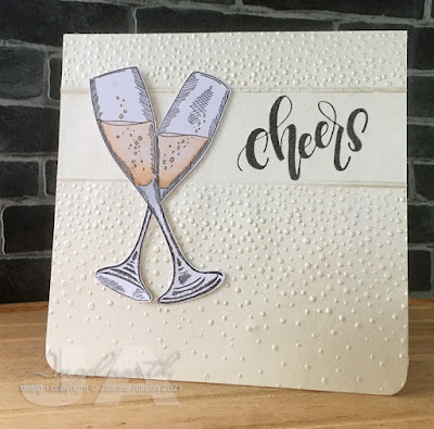
Raise a toast

It's the last day of the year and I'm just managing to squeak in with an entry for December's challenge at Let's Squash It!

Gail and Jo gave us free rein this time - any folder, any technique. I went back to May's challenge to find a way to create white space alongside the embossed texture. I did it this time by laying my top plate part way up the folder so I didn't get the full impression. Then I turned the paper and did the same the other end, leaving a clear strip across for stamping the sentiment.I used a score board to create more defined edges for the embossed areas.

This folder is intended as snow but it's always made me think of champagne bubbles so I used some ivory pearlescent paper and teamed it up with champagne flutes to make a card that could toast the New Year.

Stamps:
Champagne Celebration (Crafters Companion)
Birthday (Letter It by Ranger) 

Paper:
Stardream
Bristol board

Ink:
Brilliance by Tsukineko (Graphite Black)

Other:
Softly Falling embosing folder (Stampin' Up!)
Scor ItCopic markers
Copic Spica glitter pen (gold)
Corner Chomper

Thanks for stopping by - whether you're raising a glass of champagne tonight or celebrating some other way, cheers! Let's hope 2022 is a bit kinder to us all.

Friday, 10 December 2021

Through the trees

The challenge at Daring Cardmakers this week has a focus on trees - one tree, a whole forest, Christmassy or not - up to you!

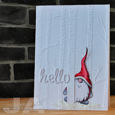
It's white-out conditions in the birch forest - it's lucky that gnomes have a good sense of direction! This one is standing in a sparkly snowdrift (not sure how well that shows up on the photo) and peeping round a tree trunk to say a seasonal hello.

The card front is embossed and I used a craft knife to cut slits either side of one of the trunks so that I could slot in the little fussy cut gnome behind the trunk.

Lost Coast Designs have a gnome theme for their currect challenge so I'm linking up there too, all the challenge details are here.

Stamps:
Pointy Hat Gnome (Lost Coast Designs)

Paper:
Bristol board

Ink:
Brilliance by Tsukineko (Graphite Black)

Other:
Woodland embossing folder (Stampin' Up)
Copic markers
Pearl pen by Viva Decor (Ice White)
Glamour Dust by Deco Art (Crystal)
Hello die (Waltzingmouse Stamps, no longer with us)

Thanks for stopping by!

Sunday, 2 May 2021

Link in the chain - April

It’s reveal day once again over at Card Chain Challenge - my how time flies! My card has gone to Nelleke in the Netherlands this time. 

From the options on offer I chose the sketch and the colour palette (oh, I used a die cut too!). I did try for a one layer card but I couldn’t get the embossing quite as I wanted it so I ended up cutting the embossed panel (with four “planks” to reflect the sketch) and sticking it to a card base. I used a fineline marker around the edge. The butterfly was stamped, coloured and cut out, the leaf sprig is die cut and coloured with a couple of Copics and the whole lot is assembled with some gel glue.

Stamps:
Antique Engravings, Say It All (both Hero Arts, retired)

Paper:
Bristol board

Ink:
Tim Holtz Distress ink
 by Ranger (Walnut Stain)

Other:
Pinewood planks embossing folder (Stampin Up)
Back to Nature dies (Sizzix, I suspect they're retired)
Copic markers
White crochet cotton
Pearl pen by Viva Decor (Ice White)
Brown fineliner

Friday, 13 December 2019

Oh, Christmas tree

Trees are taking centre stage over at Daring Cardmakers this week - Christmas trees, bare branched wintery trees, festive or not, just show us a tree or two.

It’s a double dose of trees from me! I used the technique of inking up and stamping onto an embossing folder before running it through the Big Shot to get the impression of fir trees behind the birch trunks. Adding a torn strip of paper inside the folder stops ink going onto to the lower portion of the cardstock and  gets you an easy horizon line. I then decided to step it up a notch and add colour to the embossed trunks with a teeny tiny paint brush and some inks - darker brown for the markings on the bark and a very light beige to add some shading down one side of each trunk.

I didn’t want to cover anything up really so I added a sentiment on a vellum strip so the scene is still visible behind it. The strip is stuck on with double sided tape sheet - covering the whole strip is a good solution to the age old problem of how to attach vellum without the adhesive showing! Gel pen lines give the strip a slightly more finished look.

Stamps:
Lovely as a Tree (Stampin Up!)
Sentiment from Noel (Waltzingmouse Stamps, now available from Gina K)

Paper:
Bristol board 
Vellum

Ink:
Tim Holtz Distress ink by Ranger (Tumbled Glass, Salty Ocean, Pine Needles, Vintage Photo, Antique Linen)
Versamark by Tsukineko 

Other:
Detail gold embossing powder 
Woodland embossing folder (Stampin Up!)
Gold gel pen
Double sided tape sheet
Corner Chomper 

Here's this week's cover sheet if you'd like to share it


Thanks for stopping by!

Monday, 2 December 2019

Link in the chain - November

It's reveal day for the final Card Chain Challenge of 2019. My card has gone across the Pond to Jeanne in Minnesota this time and I received a lovely card from Arlene.

From the options on offer I chose the colour scheme of silver, pine and ice blue and the theme of trees. The silver needs the right angle but it really is there, honest!

I used oldie but goodie Lovely As a Tree (a shock retirement from the Stampin' Up catalogue this year) and a sentiment from Hero Arts combined with some Distress inks used as watercolours and a silver gel pen for a simple, unembellished card that's easy to airmail.

Stamps:
Lovely As a Tree (Stampin' Up!)
Truly Appreciated (Hero Arts)

Paper:
Watercolour
Bristol board

Ink:
Versafine by Tsukineko (Onyx Black)
Tim Holtz Distress ink by Ranger (Tumbled Glass, Pine Needles)
Shadow ink by Hero Arts (Soft Granite)

Other:
A6 Stitched Rectangle dies (Paper Rose)
Silver gel pen

Big thank you to the Card Chain Challenge team for organising the challenges, it’s a lovely thing to take part in with the treat of receiving a hand made card each month. Maybe you’ll join us in 2020? Look out for January’s chain!

Thanks for stopping by!

Friday, 5 July 2019

July Elements

It's the first Friday of the month so that means it's an "elemental" challenge over at Daring Cardmakers. Dawn has chosen our inspiration picture and as ever, you just need to choose at least three elements from it to kickstart your project (if you choose the colour palette that counts as one element).

I chose five rectangles, raspberries and gingham for a clean and simple birthday card. How perfectly does that sentiment stamp fit the die cut rectangle?! It doesn't take much to have me grinning from ear to ear, does it?

The die set this one came from also had me grinning - I finally found a set of rectangles that's actually proportioned for A6 cards - hooray! Given that everywhere except north America uses ISO standard paper sizes, you wouldn't think it would be a problem but the standard seems to be very much based on US letter paper sizes. OK, I had to go to an Australian company for these but still...

Of course typical me, the first use of the die set is not one where I'm using the dies in the same orientation as the card and I used the smallest one so the relationship may not be obvious!

Stamps:
Sun Ripened (Stampin Up!, retired)
Sentiment from Big Day Today (Waltzingmouse Stamps, no longer with us)

Paper:
Bristol board

Ink:
Brilliance by Tsukineko (Graphite Black)

Other:
Stitched Rectangle Dies A6 size (Paper Rose)
Copic markers
Copic Spica glitter pen (red)
Gingham ribbon
Corner Chomper

Here's the summery inspiration picture if you'd like to play along and didn't arrive here via the DCM blog.


Thanks for stopping by!

Friday, 29 March 2019

Raspberries for Mum

Nat is setting the challenge for us over at Daring Cardmakers and she'd like us to celebrate special women. It might be a card for Mother's Day but equally it could be something to mark a special friendship, an acknowledgement of an inspirational woman or any other way you can dream up to celebrate special women.

I made a card for my mum featuring a favourite fruit. Right from being a little girl we always had raspberries in the garden and once I was old enough to understand that they squash easily I helped Mum with the picking!

Stamps:
Sun Ripened (Stampin' Up! retired)
Happy Stamp n Cut (Hero Arts)

Paper:
Bristol Board

Ink:
Brilliance by Tsukineko (Pearlescent Chocolate)
Adirondack dye ink by Ranger (Stonewashed)

Other:
Copic markers
Coloured pencils
Fine Frames die by Altenew
Rub n Buff by Amaco (Silver Leaf)
Corner Chomper

Thanks for stopping by!

Friday, 18 January 2019

Just stamping!

It’s Dawn’s turn to challenge us over at Daring Cardmakers this week - she’s asked us to use stamps and ink only, no embellishments, no die cuts, just stamps and ink.


Some of the team found this a real challenge but I must confess my biggest problem was deciding which stamps to use! Stamps and ink are right up my alley and I’m quite likely to make a card that doesn’t feature anything else even without being given a specific restriction! (witness last week's DCM card!)

Although I used an outline image that needed colouring, I stuck to the challenge by using ink as my colouring medium - I hope that’s in the spirit of the thing! I just squished Distress inks into the lid of the pad and used a small brush to paint the image with them.

Stamps:
Sun Ripened II (Stampin’ Up, retired)
Sentiment from. Hero Arts set

Paper:
Bristol board 

Ink:
Brilliance by Tsukineko (Graphite Black)
Tim Holtz Distress ink by Ranger (as watercolours, Mustard Seed, Shabby Shutters, Peeled Paint, Vintage Photo, Spun Sugar, Tumbled Glass)

Thanks for stopping by!

Sunday, 2 September 2018

Link in the chain

Visiting the lovely Jo's blog a while back I noticed a post about the Card Chain Challenge. It struck me as a such a lovely idea I signed up for the August chain.

From the options for the month I chose fruit and stencilling. I've recently got hold of an old Stampin' Up! set called Sun Ripened, primarily for this lovely rapsberry image. Raspberries have always been a family favourite and my folks have always grown them so when I saw a card made with this stamp, I just had to have it!

My card has gone to Janet in Mauritius - I have no idea whether raspberries seem very ordinary and pedestrian there, I'm thinking fruit might be quite different!

I’m not sure you can tell from the photo but the berries and leaves are slightly raised - I put the card on a piece of craft foam and used a fine tipped stylus to draw round the image then flipped it over and used the line to show me where to push the image out with a bigger stylus.

Stamps:
Sun Ripened (Stampin' Up! - long retired)

Paper:
Ribbed kraft

Ink:
Adirondack dye ink by Ranger (Espresso)
Adirondack pigment by Ranger (Snowcap)

Other:
Copic markers
Prismacolor pencils
White paint pen by Posca
Cressida stencil (Memory Box)
Phrases 2 dies (Spellbinder)
Corner Chomper
Charcoal pencil

Thanks for stopping by! The sign-up for the September chain is open for a few more days - details here if you fancy taking part!

Friday, 10 August 2018

Life on the ocean wave

Shabneez is setting the challenge over at Daring Cardmakers today and she'd like us to go nautical.

A few years back my hubby spotted some interesting printing blocks on a  stall in Covent Garden and bought a couple for me including this ship. I'm not sure how they're intended to be used but I found that with a little bit of jiggery-pokery it's possible to run them through the Big Shot as a kind of letterpress. The printing lines are etched into a metal plate so you can't just use it like a rubber stamp, it needs some pressure.

I've added just the slightest hint of colour around the ship using dots of Copic marker that get more widely space as they get further out. I thought the plank embossing could represent the ship's deck.

Supplies:
Printing block
Sentiment words from Say It Loud (Waltzingmouse Stamps, no longer with us)
Bristol board
Versafine by Tsukienko (Onyx Black) 
Memento Luxe by Tsukineko (Love Letter)
Copic marker
Silver mirror card
Pinewood Planks embossing folder (Stampin' Up!)
Rectangle Nestabilities by Spellbinder
White Enamel Accents by Ranger
Corner Chomper

Thanks for stopping by!

Friday, 22 June 2018

Wonderful world

Kathy has set the challenge for us at Daring Cardmakers this week - she'd like us to be inspired by the words of the song What a Wonderful World - pop over to the blog to see all the lyrics!

I've done a super-quick scrapling this week with inspiration from the blue sky and green trees mentioned in the song. I inked the trunk in brown and the foliage in green before stamping then added some Distress inks as watercolours - it really was a super-quick process since you can randomly dab in a couple of shades of green and get a lovely tree canopy in full summer leaf!

I die cut the word from the card front as well as a couple of extras from scrap card for an integrated look.

Stamps:
Lovely as a Tree (Stampin' Up)

Paper:
Bristol board

Ink:
Brilliance by Tsukineko (Pearlescent Ivy, Coffee Bean)
Tim Holtz Distress ink by Ranger (Shabby Shutters, Peeled Paint, Vintage Photo, Walnut Stain)

Other:
Hello die (Waltingmouse Stamps, no longer with us)
Zig Clean Colour marker (light blue)
Corner Chomper

Thanks for stopping by!

Friday, 2 March 2018

On the March!

Can you believe it’s a new month already?! That means it’s time for an “elemental” challenge at Daring Cardmakers - choose at least three elements from the picture Miri has for us this month as a kickstart for your card.

I really struggled with this! In the end, I put an extra restriction on myself and that seemed to do the trick: make it masculine (or at least not girly)!

I chose the dark wood grain (floor bottom left), denim, flash of yellow, circular frame (chair backs bottom right) and silver accents (chair legs bottom left). I carried the wood grain patterning over into the embossed texture on the base layer as well.

Stamps:
Country Charm Textures (Cornish Heritage Farms,  no longer with us)
Essential Messages (Hero Arts, I believe this set is retired)

Paper:
Smooth white
Silver glitter (10 sheets in a pack from my local £1 shop and the perfect weight for punches!)
Scrap of yellow DCWV

Ink:
Brilliance by Tsukineko (Pearlescent Chocolate)
Tim Holtz Distress ink by Ranger (Vintage Photo, Mustard Seed)

Other:
Denim fabric
Nestabilities by Spellbinder (large and small circles)
Pine planks embossing folder by Stampin Up!
Small circle punch
Star squeeze punches by Fiskars
Glue gel by Pinflair
Brown fine line marker
Corner Chomper

Thanks for stopping by! We’d love to see you over at Daring Cardmakers and the team has made lots of lovely samples - looks like it was just me who struggled! Here's Miri's inspiration picture if you'd like to show us what you make of it - which three elements inspire you?!


Friday, 14 October 2016

True colours

It's Friday which can only mean one thing: a new dare from the Daring Cardmakers! Svenja's "True colours" dare is asking us to go monochromatic with our cards.

I decided to try the "hidden sentiment" thing with a word die, combining it with a loose watercolour swoosh and a stamped image.

If the hidden inlaid sentiment is new to you too, I used this video tutorial to make sure my imagining of the process was actually what I needed to do to get the sentiment right!

This could be a Christmas card or just a wintery greeting, I think.

Also new to me - I've finally caved in and got a MISTI so I had a first play with it here by first stamping the trees in Distress ink and spreading it out, stamping again and spreading to intensify the colour and then stamping a third time on the wet paper for a slightly blurry image. Once dry, I over stamped with Versafine which gives a sharper image on top.

I die cut the sentiment from the image panel and then layered onto a couple more cut from cardstock. It's a bit fiddly but I think it's a nice effect.

Stamps:
Lovely As a Tree by Stampin' Up!

Paper: 
Hot press watercolour

Ink:
Tim Holtz Distress ink by Ranger (Peacock Feathers) 
Versafine by Tsukineko (Deep Lagoon)

Other: 
Sizzlets die by Sizzix (Serenity set, retired) 
MISTI
Corner Chomper

Thanks for stopping by!

Monday, 21 February 2011

Hello spring

Sadly, it's trying to snow here today but spring is the theme for this week's Less is More challenge (details here) so I'm continuing to hope that the weather will turn soon!

Spring flowers often have a particularly delicate and fragile quality about them, don't they? Crocuses, snowdrops and the lovely bulb flowers (with the exception of the somewhat sturdy-looking tulip!).

I made a scrapling today (a card made with the bit you trim off a standard sized sheet when you want to make a square card). This paper white narcissus is from an old Stampin' Up set called Long Stemmed and I think it's really pretty. I've used kraft on kraft layering and popped up the panel on some foam tape to avoid the ribbon bulging through the card. I punched a hole either side of the stem to thread the ribbon through.

Stamps:
Long Stemmed (Stampin Up!)
Setiment from Mini Memories set (Crafty Secrets)

Paper: Kraft

Ink: Memento by Tsukineko (Bamboo Leaves)

Other:
Inkssentials gel pen by Ranger
Prismacolour pencils (green and yellow)
Green gingham ribbon
Foam tape
Tags Trio dies by Spellbinder


Thanks for stopping by!

Monday, 7 February 2011

Inchie Tiles

My hubby and his sons share an interest in wine so when we needed a birthday card for son #1 recently I thought some "trattoria tiles" might do the trick. The inchies are cut from scrap mountboard with a Cuttlebug die and stamped while pushed up close together and then inked around the edges and slightly separated when sticking them down. Inking the edges just gives them a bit more depth, I think.

Try asking at your local framing shop for offcuts of mountboard - they'll often give it to you free or very cheaply. Most mountboard is white on the back so it doesn't matter what colour the front is if you want a white surface to work with, just flip it over.

Two step stamping is fun and it makes for a very quick card - no colouring or shading to do! I stamp a positioning sheet on vellum and keep it in the case with the set so I don't even need to do that step each time I use the stamps.

Stamps:
Gorgeous Grapevine (Stampin Up!)

Paper:
Kraft
Smooth white
Dark red
Mountboard

Ink:
Adirondack dye ink by Ranger (Raisin, Currant, Lettuce and Pesto)
Tim Holtz Distress ink by Ranger (Vintage Photo)

Other:
Cuttlebug die - square
Cuttlebug embossing folder (Victoria)
Scor It


Thanks for stopping by!

Thursday, 6 March 2008

Under the Weather

This week's Tanda Teaser is a challenge to make a get well card. I thought I'd make one to keep in my box of cards so I went for a unisex approach since I won't know who it's for until I need it!


I've always felt a bit odd about the phrase "Get well soon" - it sounds a bit like a command, I guess! So I used two sentiment stamps from the same set here. One is the single word 'Wishes' and I didn't ink the final word of "Get well soon" before I stamped.

Supplies: Stampin up! Gorgeous Grapevine, sentiments from a HOTP set, Whispers inks (Savoy Green, Sugarloaf Green, Rio Purple, Violet), Tim Holtz Distress inks (Antique Linen, Tea Dye), Clearsnap Fluid chalk ink (Dark Brown), linen texture paper.

Thanks for dropping by - hope none of you are feeling under the weather yourselves!

Saturday, 16 February 2008

Love and Friendship

This week's DCM dare has been set by Rachel and Keryn who are both building up their Stampin Up! businesses. Their theme for the dare is love and friendship. Here's my card (you can click through for a more detailed view if you want it):


The sentiment is computer generated and I positioned it inside a Nestability circle die and then stamped the design on the cut and embossed circle.

I used the leafy tree from the Lovely as a Tree set by SU!, stamped in Chestnut Roan and coloured by dusting with various shades of green chalk. I used a bit of blue chalk for the sky area and darker green and brown for the ground. The circle is popped up on foam tape so the jute string (which I unravelled for a softer effect) goes underneath it and is threaded through a couple of holes which are then 'plugged' with brads.

The wood grain background panel is stamped onto some paper that already has a fine wood grain effect (it came from The Papermill). It has torn edges that are further distressed with a bit of inking.

Supplies: Lovely as a Tree (Stampin Up!), Wood Grain backgrounder (Cornish Heritage Farms), various brown-toned Tim Holtz Distress inks, Clearsnap Fluid Chalk ink Chestnut Roan, blending chalks, jute garden twine, mini brads (Dovecraft Earth Tones), Nestabilities classic circle, foam tape

Thanks for looking, do let me know what you thought if you have a moment to leave a comment!

Tuesday, 12 February 2008

A shining example

OK, well I'm not sure that the card is a shining example of anything but that's the title of the challenge. For a while now, Tanda have had a weekly card making challenge on the forum but they're just starting to open it up by making it a blog challenge and this is the first theme.

My shining bits: acetate, gold lustre powder and a tiny gem (the sort sold for use on your finger nails!)


I stamped the lilies on acetate and then used watercolour pencils to colour the back of the sheet (the stuff designed for inkjet printers that has the slight 'tooth' on one side will take watercolour pencils OK). I also used a cheesecloth stamp and chalk ink to give a slightly 'crackled' effect. Then I covered the back with Versamark and brushed gold lustre powder over the whole surface.

The acetate panel is attached to a dark green matt with a square brad and I've added a tiny gem to the centre.

Here's a closer view of the flower heads so you can see how it all came together, you can click through for a better view:


Supplies: Calla Lilies from Long Stemmed set by Stampin' Up!, cheesecloth and rice paper backgrounders by Cornish Heritage Farms, Stazon Jet Black, Clearsnap chalk ink Chestnut Roan and Warm Green, Tim Holtz distress ink Peeled Paint, Versamark, acetate sheet, watercolour pencils, gold lustre powder, square antique brass brad, nailart gem.


The Tanda Teaser will usually appear on Wednesdays so keep an eye out if you fancy joining in with the challenge.

Thanks for looking!

Friday, 23 November 2007

I've come over all elegant!

I seem to have been going through a bit of a bright colour, funky image kind of phase just recently but I think I've been struck by a touch of elegantitis in the last day or so. Not like me at all, is it?!

A while ago, I saw a set by Stampin' Up! called Long Stemmed on eBay and thought it looked gorgeous. I've been on the lookout for one since then and finally managed to get one for only $6.50! That's four wood mounted stamps for just over three quid (OK, the shipping pushed it up some but still bargainous, I reckon).

I've been playing with the iris image first and there's something about the long curved stem that cried out for the elegant treatment so...


I'm really pleased with how this turned out. The stamped panel is made with the faux linen technique using glossy photo paper (from Aldi!). The iris is coloured with Copic Sketch markers with a little bit of white gel pen smudged over a few places for more 'painterly' highlights. I thought the Cuttlebug Textile Texture folder and ribbon would make nice textural elements here and I tried something a bit different by punching a hole near the edge of the stamped panel and threading the ribbon through so that the knot and loose ends overlap the panel a bit. I'm afraid I can't remember where I've seen this done - if it was you and you're reading this, let me know and I'll credit you properly, thank you!

See those tiny gems? They're the sort that are designed for sticking on your fingernails *lol*. My nails are plain and unadorned but I thought these would be perfect when you want to add just a little bit of subtle sparkle to a project and they're much cheaper than stuff packaged and sold to crafters! Asela on the Cornish Heritage Farms forum and gallery should take the credit for this one - thanks Asela!

Supplies: Iris from SU! Long Stemmed set, glossy photo paper, Tim Holtz Distress ink Weathered Wood, Nick Bantock inkpad Charcoal Grey, sandpaper, Copic Sketch markers (mallow, blue violet, cadmium yellow, pale yellow, lettuce green), white gel pen, Cuttlebug Textile Texture folder, acrylic nailart gems, ribbon from stash.


Thanks for looking!