Friday 29 January 2021

Whatever the weather

Our challenge over at Daring Cardmakers this week has been set by Svenja who would like us to focus on the weather.

Maybe it’s wishful thinking to be focusing on spring showers - we’ve had sleet, ice and a sprinkle of snow this week. My brother had about 7 inches of snow in his road last weekend! 

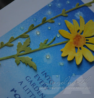
I’ve gone for an ink blended panel directly on my card base (edges masked off with low tack tape first), splattered with some water and dotted over with Glossy Accents for raindrops. I thought a sunny coloured flower would help to emphasise the thought behind the words. The die cuts are watercolour paper so I could add fairly loose colouring to them.

The stamp set that includes this sentiment is in my box of things that I’m considering letting go but I’m now thinking I might need to rescue it just for the sentiment which I think is lovely. 

Stamps:
Sentiment from Asian Gardens Additions (Waltzingmouse Stamps, no longer with us
)

Paper:
Bristol board
Watercolour

Ink:
Tim Holtz Distress ink and Distress Oxide by Ranger (Tumbled Glass, Blueprint Sketch, Salty Ocean)

Other:
Wildflower Stems #1 (Tim Holtz/Sizzix)
Winsor and Newton watercolours
Glossy Accents by Ranger
White crochet thread


Friday 22 January 2021

Square dance

Our challenge over at Daring Cardmakers this week is focusing on squares - Shabneez would like to see squares feature in any way in our cards. 

I opted for a small square card base, square image panel and hand painted some little square embellishments rather than adding sequins as I might have done - I think those are visible on the photo (I used white gold paint so they're pretty subtle!).

I tried something a bit different with an embossing folder this time and added watercolouring to the raised image. It was a bit fiddly but I think it’s a pretty effect and I found it quite a “mindful” process. Running it through the embossing folder does seem to change the properties of the paper a bit, I found the colour didn’t move quite as easily.

Stamps:
Sentiment from Say It All (Hero Arts, retired)

Paper:
Watercolour

Ink:
Brilliance by Tsukineko (Pearlescent Chocolate)

Other:
Winsor & Newton watercolours
Silver gel pen 
Gansai Tambi starry colours (white gold used here)
Flower Frame embossing folder (Nellie Snellen)

Thanks for dropping by, hope you are keeping safe and well. 


Friday 15 January 2021

Bagel day

Nat is setting our challenge over at Daring Cardmakers this week. Apparently it's national Bagel Day in the US so in celebration of the round food favourite Nat wants to see a circle, circle frame or aperture as the focal point for your design - baked goods are optional!

I brushed ink through my trusty acetate sheet with various circles die cut in it, stamped the dragonfly and added a bit of colour to his wings as well as some sparkle with a Spica pen, splattered with a couple of shades of gold paint and finished with a sentiment.

Stamps:
Wings (Darkroom Door)
Sentiment from an old HOTP set

Paper:
Bristol board

Ink:
Brilliance by Tsukineko (Graphite Black)
Tim Holtz Distress ink by Ranger (Tumbled Glass, Peacock Feathers, Salty Ocean)

Other:
Gansai Tambi Starry colours
Copic markers
Spica glitter pen (Turquoise)
Corner Chomper

Thanks for stopping by, hope you are keeping safe and well.

Friday 8 January 2021

January’s Elements

Happy New Year everyone, let’s hope that 2021 is a bit kinder to us all than 2020 turned out to be. 

Daring Cardmakers are back from a little festive break with the first elemental challenge of the year. As ever, just choose at least three elements from the inspiration picture (chosen by Dawn this time) to kick start your project. 

I chose a bird, bokeh background and colours. I could probably count squares too since I started with the intention of making this a standard A6 card but maybe looking at the inspiration pic cast a square spell since that’s what wanted to happen once the image was painted! Hubby got me some watercolours as a birthday gift and this is my first play with them. They do behave differently than the inks I’ve been using when I’ve done watercolour style projects and I need practise but it was fun to have a little try out with them. 

The bird was stamped with a light brown ink and used in much the way an artist might use a pencil sketch as a guide. The bokeh circles might be a bit subtle, I think I’d let the paint dry too much to have much success in lifting the colour with water so I used some white watercolour to add circles over the top of the base layer. I used Gansai Tambi White Gold (another birthday gift) for a few of them so they have a slight sheen.

The current Lost Coast Designs challenge is things that begin with B - I have a Brown Bird on a Bokeh background so I’m hooking up there. If you stamp a project featuring something that begins with B why not join in too, there are always prizes on offer!

Oh, Gundi (who often takes part in the Card Chain Challnge) just alerted me to a new-to-me challenge - thank you Gundi! The current theme at Day of the Month is National Bird Day so I’m entering this card there, too. I love bird images, I suspect they’re the second most common thing in my stamping stash (after florals). Our garden attracts a great variety of birds too - DH always jokes that the pheasants know they’re safe here as we’re vegetarian!

Here's this month's inspiration picture at DCM:


Stamps:
Perching Bird (Crafty Individuals)

Paper:
Watercolour
Kraft

Ink:
Tim Holtz Distress ink by Ranger (Antique Linen)

Other:
Winsor and Newton watercolours
Stitched Square frames dies (Paper Rose)
Gansai Tambi Starry Colours set


Thanks for stopping by, stay safe!

Saturday 2 January 2021

Link in the chain - December!

The Card Chain Challenge didn’t take its usual December break - 2020 was such a strange year that Gail and Jo decided to do a special challenge for December. The traditional format did get a break though and we got a tic-tac-toe board to play with. My card has gone to Mia in Greece this time.


Since it’s an extra challenge I thought I’d go the extra mile and play for a full house, although I confess it was partly that I was having trouble deciding which line to go for!

I thought a vintage photo might be a good way to incorporate black and white so decided to go down the collage route. This group having fun paddling in the river seemed like they’d hit the friendship theme too. I’m imagining they’ve just finished a lovely picnic on the sunny riverbank and they’re cooling off. There’s some watery ink dribbled on the card base as background colour and then some stencilling, some stamping, torn washi tape (I tore one piece in half to get two skinny pieces in case just tearing the ends seemed like too much cheating for the torn edges element!) and a bit of embossed trim and I think I managed to hit all the grid squares.

Stamps:
Bird Notes and Queen Bee (both Crafty Secrets, no longer with us)
Sentiment and bubbles/dots from Layering Octopus (Hero Arts)

Paper:
Bristol board
Premium weight copy paper (to print the photo)

Ink:
Tim Holtz Distress ink by Ranger (Mustard Seed) and Oxide (Blueprint Sketch)
Brilliance by Tsukineko (Graphite Black)

Other:
Vintage photo downloaded from The Graphics Fairy
Washi tape

Star Trim Embosslit and Mixed Media 1 dies (Sizzix)
Copic markers
White paint pen by Posca
Clear Wink of Stella pen

Happy New Year to all - here’s hoping that 2021 will be kinder than 2020.