Showing posts with label darkroom door. Show all posts

Sunday, 2 June 2024

Card Chain Callenge - May

It's reveal day at Card Chain Challenge where this month 30 participants sent and received hand made cards. Mine went to Karolina this time.

From the options on offer I chose the theme of men in hats and the product and technique options of stencil and scoring, sticking to my usual CCC aesthetic of one layer.

I masked the gent on the stamped image but not the background so the stencilling goes over that bit of the image and the rays come directly out of his head. There's a charcoal pencil drop shadow going on and some silver gel pen on the corner swirls in the image.

Stamps:
Dashing Gents (Darkroom Door)
Essential Messages (Hero Arts, retired)

Paper:
Bristol board

Ink:
Brilliance by Tsukineko (Graphite Black)
Tim Holtz Distress ink by Ranger (Salty Ocean, Blueprint Sketch)

Other:
Strobes stencil (Visible Image)
Silver gel pen
Corner Chomper
Scor It

Thanks for stopping by!

Wednesday, 2 August 2023

Link in the chain — July

Another month gone so once again we’re round to reveal day for the Card Chain Challenge. Mine went to Brenda this time.

From the options on offer I chose the themes of fish and circles. This is not the card I set out to make but all my crafting mojo seems to have left the building so I just had to go with whatever happened. 

Background is smooshed Distress inks with the weed and bubbles stamped with Distress Oxide over the top. I used a pen cap to stamp some slightly larger “bubbles” as well. Some are filled in with white pen and have Stickles for sparkle. Extra sparkle comes from some silver thread looped behind the fish which is left uncoloured to contrast with the background and has some scrap card behind it to raise it just slightly.

Stamps:
Under the Sea (Darkroom Door)
Essential Messages (Hero Arts)

Paper:
Bristol Board

Ink:
Tim Holtz Distress ink by Ranger (various blues)
Tim Holtz Distress Oxide ink by Ranger (Blueprint Sketch, Twisted Citron)
Versafine by Tsukineko (Onyx Black)

Other:
Silver thread
Stickles (Frosted Lace)
White paint pen by Posca
Corner Chomper

There are still a few days to sign up for the next chain if you fancy it - make one card and send it, receive a lovely handmade card for yourself. Thanks for stopping by!


Tuesday, 15 March 2022

Retro orchids

I’m delighted to be Guest Designer with Retro Rubber for the current challenge. It’s an “anything goes” theme this time around so as long as you use a stamp that’s older than a year, you’re good to go!

I needed a birthday card with a touch of elegance and figured orchids might fit the bill. It’s a good while since the orchid stamps came out to play! 

I stamped with pink ink, wiping most of it off the stem so I still got an impression but it was easier to cover with green pencil. The petals are coloured with white pencil which is opaque enough to lighten the base colour of the paper but still allows the pink “veins” to show through. I’d originally thought I would overstamp after colouring with the white but I liked the soft effect so left it alone.

Stamps:
Orchids (Darkroom Door, I’ve had mine since 2013)
Big Day Today (Waltzingmouse Stamps, no longer with us, had mine since 2014)

Paper:
Strathmore Toned Grey 
Bristol board

Ink:
Versafine by Tsukineko (Pearlescent Chocolate)
Memento Luxe by Tsukineko (Rosebud) 
Tim Holtz Distress ink by Ranger (Antique Linen)

Other:
Coloured pencils
Stitched rectangle dies, A6 size (Paper Rose)

If you need an excuse to break out the older stamps - come and join us!


Friday, 28 January 2022

Fish in the frame

It's Nat's turn to set our challenge over at Daring Cardmakers this week and she'd like us to put something or someone in the frame.

My crafty mojo seems to have taken a holiday and even my trick of combining with another challenge didn't really seem to drag it back. I combined with the current challenge at Let's Squash It which has an under water theme. I'm not all that happy with this but thought I'd share it anyway. Maybe it's the lack of white space bothering me. What do you think?

I don't have an embossing folder with a watery theme. I did consider using a woodgrain folder turned sideways and done in blues but in the end plumped for something that would echo the fish scale patterning on the stamped images. There's some shimmer on there courtesy of Perfect Pearls but of course that doesn't really show up on a still photo. The fish are shimmery too (Wink of Stella).

I scored the corners of the die cut frame to get the diagonals, stamped wood texture on there and accentuated the mitres with a few Copic pen strokes.

Stamps:
Under the Sea (Darkroom Door)
Weathered wood (Cornish Heritage Frams, no longer with us)

Paper:
Mixed media
Bristol board

Ink:
Brilliance by Tsukineko (Graphite Black)

Other:
Copic markers
Wink of Stella pen (clear)
Stitched frame square dies (Paper Rose)
Scales embossing folder (Marianne Designs)
Leaves dies (Sizzix)
Water colour paints
Perfect Pearls by Ranger (Turquoise)

Thanks for sopping by!

Friday, 23 July 2021

Splish splosh

Svenja has issued our challenge at Daring Cardmakers this week - she's sending us splish sploshing around to cool off!

I made a sploshy background and added a fish for good measure on the watery front! The background is just Distress ink smooshed onto a piece of acetate, spritzed with water and dabbled onto the card base. I layered up the colours going from light to dark.

The fish is stuck down with the exception of the two little fins on his underside, I left those free for a tiny bit of dimension.

Stamps:
Under the Sea (Darkroom Door)

Paper:
Bristol board

Ink:
Brilliance by Tsukineko (Graphite Black)
Ti Holtz Distress ink by Ranger (Tumbled Glass, Salty Ocean, Blueprint Sketch)

Other:
Copic markers
White Enamel Accents by Ranger
Corner Chomper

Thanks for stopping by - hope the weather is manageable for you wherever you are.

Friday, 28 May 2021

Molly’s makeover

Today, Molly has had a mermazing makeover for Daring Cardmakers. Jenny has set our challenge and as May is apparently the month of mermaids, she’d like to see these mythical creatures inspiring our cards. 

So, Molly thought it would be fun to dress up for the occasion. She found some sea-inspired colours in her eyeshadow palette, created a seaweed tangle wig, a coronet of shells and pearls and finally projected some fish, seaweed and bubbles onto a watery background. 

Molly’s streaming hair is created with hot glue with various shades of Perfect Pearls brushed over (I used black glue as it creates a lovely effect when you put mica powders over the top). I used blue and green metallic gel pens to add some finer lines between the ribbons of glue. Copic markers, various inks, glitter, pearl pen and Glossy Accents make this a genuinely mixed media makeover for Molly!

I’m also playing again at Lost Coast Designs where the current challenge theme is “under the sea”. 

Stamps:
Molly (Beeswax Stamps)
Under the Sea (Darkroom Door)
Seaside (Crafty Secrets, no longer with us)
Antique Engravings (Hero Arts, retired)

Paper:
Bristol board 

Ink:
Brilliance by Tsukineko (Graphite Black)
Hero Arts shadow ink (Soft Granite)

Tim Holtz Distress ink by Ranger (Tumbled Glass, Peacock Feathers)
Tim Holtz Distress Oxide by Ranger (Cracked Pistachio)

Other:
Hot glue (black)
Perfect Pearls (shades of green and blue, I lost track!)
Copic markers 
Glossy Accents
Pearl Pen by Viva Decor (Ice White)
Metallic gel pens (blue and green)
Fibres stencil (Visible Image)
White paint pen by Posca
Glamour Dust (Crystal)
Corner Chomper 


Friday, 15 January 2021

Bagel day

Nat is setting our challenge over at Daring Cardmakers this week. Apparently it's national Bagel Day in the US so in celebration of the round food favourite Nat wants to see a circle, circle frame or aperture as the focal point for your design - baked goods are optional!

I brushed ink through my trusty acetate sheet with various circles die cut in it, stamped the dragonfly and added a bit of colour to his wings as well as some sparkle with a Spica pen, splattered with a couple of shades of gold paint and finished with a sentiment.

Stamps:
Wings (Darkroom Door)
Sentiment from an old HOTP set

Paper:
Bristol board

Ink:
Brilliance by Tsukineko (Graphite Black)
Tim Holtz Distress ink by Ranger (Tumbled Glass, Peacock Feathers, Salty Ocean)

Other:
Gansai Tambi Starry colours
Copic markers
Spica glitter pen (Turquoise)
Corner Chomper

Thanks for stopping by, hope you are keeping safe and well.

Wednesday, 22 April 2020

More postcards

I'm still making postcards to send to my dad and brother during lockdown. I managed to forget to photograph last week's (featuring big fat bees) but remembered this week - butterflies to celebrate the little critters being back out in force in our garden and along the lane.


The usual postcard etiquette is at play here - single layer, no embellishments so there's no risk of anything coming loose and messing up sorting equipment etc. A bit of drop shadow on the big butterfly, done with a couple of grey markers, gives the design an illusion of depth.

Stamps:
Wings (Darkroom Door)

Paper:
Bristol board

Ink:
Brilliance by Tsukineko (Graphite Black)
Shadow ink by Hero Arts (Soft Granite)
Tim Holtz Distress Oxide by Ranger (Twisted Citron)

Other:
Copic markers
Cressida stencil (Memory Box)
Corner Chomper

Thanks for stopping by, hope you are staying safe and well.

Friday, 3 April 2020

Card Chain Challenge - March reveal!

I'm a day late but the Card Chain Challenge reveal for March is up. My card went to Linda in Minnesota this time.

From the options on offer I went for the colour scheme (lemon. lime, sky blue) and the theme of "things with wings" to make a clean and simple card that was good for airmail.

The butterfly is coloured with a Zig Clean Colour marker and a damp paintbrush to spread the colour for varied intensity.

The fact that there are three different sizes of each circle in the Indigo Blu stamp set means you can compose your own background quite easily with just a bit of masking.

Stamps:
Wings (Darkroom Door)
Limor Circles (Indogo Blu)

Paper:
Bristol board

Ink:
Versafine by Tsukineko (Onyx Black)
Tim Holtz Distress Oxide by Ranger (Twisted Citron)
Jenni Bowlin ink by Ranger (Lemon Drop)

Other:
Spellbinder die (Phrases Set 1)
Corner Chomper
Zig Clean Colour marker

Hope you and yours are staying safe and well in these strange times. Thanks for stopping by!

Friday, 1 March 2019

Marching on...

Hard to believe it's the first day of another new month! Svenja is setting our challenge over at Daring Cardmakers this week - it's an "elemental" one as it's the first of the month. Just choose at least three elements from the inspiration photo to kick start your project.

I love the montage of photos Svenja put together from a trip to the Netherlands but for some reason I just couldn't get a card to come together. I decidd to share the best of a bad lot!

I chose black wooden planks, netting and little pops of colour inspired by the floats on the nets.

Stamps:
Wood Grain (Darkroom Door)
Sentiment from Big Day Today (Waltzingmouse Stamps, no longer with us)

Paper:
Brsitol board
Dark blue

Ink:
Tim Holtz Distress ink by Ranger (Black Soot)
Versafine by Tsukineko (Onyx Black)

Other:
Square Nestabilities by Sepllbinder
Enamel dots
Gauze

Here's Svenja's lovely picture for inspiration and it's well worth a look at the blog to see what my teamies made of it!


Thanks for stopping by!

Friday, 21 September 2018

Beady fish!

Miri has set the challenge for us over at Daring Cardmakers this week - she'd like to see us using a bead or beads on our cards.

I found some tiny seed beads in my stash and this background was lying on my desk and the colours seemed to go. To me it said "seascape" so that's what happened. The beads are providing a bit of texture and sparkle - they're just sprinkled onto some Glossy Accents.

The fish have glittery scales if you get the light right - courtesy of clear Wink of Stella pen. I've left it with no sentiment so it can be an all-purpose card!

The background is one I made for a mixed media challenge at Splitcoast a few weeks back that's a slight twist on the old shaving foam marbling technique. Details here if you fancy a go!

Stamps:
Under the Sea (Darkroom Door)

Paper:
Smooth white
Oxidised shaving foam background (on premium weight copy paper)

Ink:
Brilliance (Graphite black, Pearlescent Ivy)
Distress Oxide (Cracked Pistachio)
Distress reinkers (Broken China, Salty Ocean, Blueprint Sketch - for the background technique)


Other:
Seed beads
Glossy Accents
Wink of Stella (Clear)
Fineline marker

Thanks for stopping by!

Friday, 21 July 2017

String theory

Kathy has set the challenge over at Daring Cardmakers this week and she'd like us to get tied up - use any sort of string, fibres, yarn etc on our projects.

I needed a baby card and as I didn't have any baby clothes stamps for my first thought of doing a washing line, I took the easy option of just using some white crochet cotton as a bit of an accent.

This bear is super-cute and the photographic detail stamps beautifully.

I was lucky enough to have my name come out of the hat for a challenge at The Craft Barn recently and I chose the Little Stars embossing folder plus as part of my prize - there's a matching die with the folder. I embossed the white section, used die cut stars on the pink for a slightly more scattered look and I have a border of outline stars to use on another project!

Stamps:
Hello Baby Vol 1 by Darkroom Door

Paper:
Bristol board
DCWV textured

Ink:
Brilliance by Tsukineko (Pearlescent Chocolate and Pearlescent Orchid)

Other:
Little Stars embossing folder plus by Marianne Design
Tags dies by Sizzix/Tim Holtz
Crochet cotton
Baby feet charm
Copic marker
Corner Chomper

Thanks for stopping by!

Friday, 31 March 2017

Grocer Jack?

Enfys is setting today's dare over at Daring Cardmakers and she's asking us to use packaging from a grocery item in our makes.

I used a bit of card from a box that held lasagne sheets to stamp the main image.

Thankfully I'd decided to use the MISTI so that I could paint the face and collar and then stamp again so the detail wasn't obscured. I say thankfully because (as I should have anticipated) the card was coated which meant it took several goes to get decent coverage on areas like his hat. Brilliance ink is great though - it will dry on a slick surface, no problem.

A couple of grocery extras round this out - my age-old trick of using tomato paste tubes gave me the frame (embossed in a folder and swiped with black acrylic paint). I also stuck some textured foil from the inner seal of a pot of spreadable cheese onto a scrap of card and punched out the star. A wee bit of "aging" with the paint brought out the texture nicely - might be more obvious on the detail photo.

A snippet of film ribbon and the "scrap" from between strips of stickers on a Tim Holtz "industrial" sheet finish it off.

The song "Grocer Jack" (proper name "Excerpt from a teenage opera", I believe) started running through my head as I edited the photos for this - who knows, maybe this gentleman really was!

Stamps:
Dashing Gents by Darkroom Door

Ink:
Brilliance by Tsukineko (Graphite Black)
Tim Holtz Distress ink by Ranger (Vintage Photo)

Paper:
Smooth white
"Kraft" from a lasagne box

Other:
Tomato paste tube
Foil seal from pot of spreadable cheese 
Diamonds embossing folder (Sizzix/Basic Grey)
Star punch (Fiskars)
Rectangle Nestabilities (Spellbinder)
Filmstrip ribbon (Tim Holtz)
Scrap from Industrious stickers (Tim Holtz)
White acrylic paint 

Thanks for stopping by!

Friday, 10 February 2017

Mirror, mirror

Sharon is setting this week's dare over at Daring Cardmakers and she's asking us to include a reflective element in our cards this week.

I started with some watercolour paper and stamped the seahorse then used a mask cut from a Post It to cover him up and stamped the streaks in three Distress inks. I spread the ink just a little with a damp paint brush and then added three stamped splashes.

There's just a tiny touch of Copic shading added to the seahorse before finishing with a stamped sentiment and the very shiny dots. They're the "waste" portion from various dies that include a hole which are domed with an embossing stylus on a piece of fun foam. The mirror card really is very reflective - you can see the window frame if you look carefully!

Stamps:
Under the Sea by Darkroom Door
Brush Strokes and Say It All by Hero Arts

Paper:
Watercolour
Silver mirror card

Ink:
Brilliance by Tsukineko (Pearlscent Chocolate)
Tim Holtz Distress ink by Ranger (Salty Ocean, Peacock Feathers, Broken China)

Other:
Copic marker (Eggshell)
Tag and bauble dies
Embossing stylus 
Corner Chomper 

Thanks for stopping by, hope you have a lovely weekend!

Friday, 4 November 2016

November inspiration

It's Friday so it's Daring Cardmakers day and despite having finished my month as Guest Designer I'm still here! I'm delighted to have been invited to stay on as a permanent member of the team which should give me a little prod to make something each week as well as being great fun!

Being the first week of the month it's an "elemental" dare - scroll down to see the picture Kathy chose or, even better, visit the DCM blog to see the picture and the different ways it inspired the team.

There are loads of possibilities in the picture so choosing three or more elements shouldn't be too difficult.

I chose the colours, butterfly (it seems a strange decoration for a Christmas tree but definitely there!), circular cushion and glitz (gold embossing and gems). I tried to keep some of the overall "busy" feel as well which made me a bit twitchy but I think there's enough white space here to counteract it!

My purple circles are domed to fit with the cushion element - I've got a couple of wooden implements that go with a dapping/doming block designed for shaping jewellery pieces which proved very useful on larger circles. An embossing stylus is great for tiny ones but not so much use when you go large!

Stamps: Wings by Darkroom Door

Ink: 
Adirondack by Ranger (Pool)
Tim Holtz Distress ink by Ranger (Picked Raspberry)
Versamark

Paper:
Bristol board
Textured purple

Other:
Gold detail embossing powder
Coloursoft pencil
Circle punches and die
Hello die by Waltzingmouse Stamps (retired)
Cressida stencil by Memory Box
Corner Chomper
Nail art gems
Pinflair glue gel

The elemental inspiration picture:

Thanks for stopping by!

Friday, 6 November 2015

Hugs for DCM

I'm delighted to be joining the Daring Card Makers as Guest Designer this month. There are so many challenges around now but DCM was at the start of it all in 2006 and is still going strong. I don't play as often as I used to but I still drop in every Friday morning to see what the new challenge will be.

The lovely Gez is setting this week's challenge and being the first week of the month it's an "elemental" one. The challenge is to incorporate at least three elements from the picture into your project.


I had a bit of a nightmare because my original idea (which involved coffee stirrers!) didn't work out but I clung to it rather doggedly and made a couple pf projects fit only for the bin. When I finally gave in to my natural impulse to use at least one stamp, I got something I'm happier with.

I managed four things from the picture: black chalkboard-type back wall, red heart shape, bright snippets of colour from the paint pots on the shelf and the blond wood flooring (although I'm not sure that the stamped woodgrain really shows up on the picture - the light for taking photographs was my second nightmare!).


Stamps:
Woodgrain by Darkroom Door
Sentiment from Say It Loud by Waltzingmouse Stamps

Paper:
Black
Cryogen White
Various DCWV white core

Ink:
Tim Holtz Distress ink by Ranger - Antique Linen
Brilliance by Tsukineko - Graphite Black 

Other:
My Heart dies by Waltzingmouse Stamps
Corner Chomper

Thanks for stopping by!

Friday, 10 July 2015

Welcome Alice!

Friends along the road have just welcomed a new baby; this is the card I made for them.

This "quilt" technique is really useful for baby cards - just sponge off the edge of a piece of acetate, move it along and sponge again until you have diagonal lines right across the card in one direction then flip it through 90 degrees and repeat so you get squares. I used the tiny heart from the set to stamp in some of the squares for a quilt pattern. With a bit of judicious masking, you can make a one layer card with plenty of interest.

I used Mega Flakes on die cut lettering for a slightly shabby-chic look on baby's name to personalise the card.

Stamps:
Hello Baby Vol 1 by Darkroom Door

Ink:
Brilliance by Tsukineo - Pearlescent Chocolate
Tim Holtz Distress ink by Ranger - Antique Linen

Other:
Font One upper and lower case dies by Spellbinder
Flitter Glu by Indigo Blu
Mega Flake by Indigo Blu - Chariot of Fire
Copic markers
Black fineline marker
White Posca paint pen

Thanks for stopping by!


Wednesday, 14 May 2014

Bright flowers

A friend asked me to make a card for her mum's 80th birthday. Her mum is a "young" 80, still an active member of her local badminton club etc, so I didn't want to do anything that looked too "old"! The only steer was "She likes flowers, especially poppies, and I'd like her age on there".

She also wanted a bigger format card - this is A5 size (for our North American friends, that's basically a whole sheet of cardstock folded in half to make the card base).

I did try something with an actual poppy stamp but I just couldn't make anything look right for some reason. I'd been experimenting with the carved flower stamps for something else so they were out on my desk and I thought if I stamped in red this one would look poppyish!

The vases are done by sponging through apertures cut with the Tim Holtz Apothecary Bottles die (small one done first and masked so it appears to be in front of the big one). As it's Distress ink, I was able to lift a bit of the colour with plain water to make highlights on the bottle shoulders - not sure how well that shows on the photo but it's quite effective IRL.

I kept her age subtle by stamping in Antique Linen and overstamping with the birthday sentiment. The panel is finished by adding a little patterning with a stencil and grounding the bottles with a darker ink before running a tracing wheel round the edge for a quick pierced detail and sticking to the card base with gel glue for a little "lift".

Stamps: 
Carved Flowers by Darkroom Door
A&P Numbers by Ma Vinici's Reliqary
Say It All by Hero Arts

Paper: Laid texture cardstock

Ink:
Brilliance by Tsukineko - Pearlescent Chocolate (for sentiment)
Distress ink by Ranger (Barn Door, Fired Brick, Antique Linen, Pumice Stone, Shabby Shutters, Peeled Paint, Walnut Stain)

Other:
Cressida stencil by Memory Box
Apothecary Bottles die by Tim Holtz
Tracing Wheel

Thanks for stopping by!

Sunday, 1 December 2013

Notecards

I made some notecard sets for last week's sale at the new village hall...

There are six cards in each pack (two fish, two seahorse and two scallop shell) with a variety of sentiments on the front so they'd make a good selection for people to dip in to whenever the need arose. I thought they'd make nice little gifts and indeed, a lady who who was about to pay for one set then said "Oooh, I'll have two more sets I think, they'd make lovely gifts" without any prompting from me!

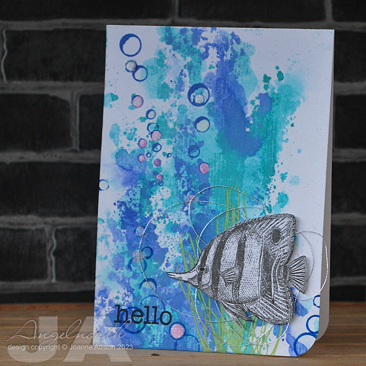
These are simply stamped with just a hint of Copic colouring on the images (very pale and very light-handed so there's no bleed-through on the single layer cards). I die cut a square in a piece of acetate to use as a mask and sponged on the ink for a block of colour. Acetate's great for this as it means you can see exactly where you're positioning the mask's aperture in relation to the image and the edges of the card.

I sold enough stuff that I was able to put just over £40 (my profits) into the village hall fund which was good. The fair seemed busy most of the day, with Santa's grotto doing a particularly brisk trade!

Stamps:
Under the Sea by Darkroom Door (fish and seahorse)
Antique Engravings by Hero Arts (scallop shell)
Say It All by Hero Arts (mixed sentiments)

Paper: Smooth white

Ink:
Pearlescent Chocolate Brilliance by Tsukineko
Blue-toned dye inks (Distess Salty Ocean, Adirondack Stonewashed and Pool if I remember rightly)

Other:
Copic markers (Eggshell and Cool Grey 1)
Cello bags and sheer ribbon for packaging

Tuesday, 13 August 2013

Lost for words

Time for another postcard swap on UK Stampers. Our only constraint this month is "no words".

I had a bit of a Darkroom Door fest on this one and it just sort of grew without any real plan, hence the fact you can see the background through the butterfy wings as there's no masking going on or anything - I decided to just go with it! I think it's probably OK for a late summer vibe!

Stamps (all Darkroom Door)
Woodgrain background 
Carved Flowers
Wings
Foliage

Paper: Smooth white

Ink:
Pumice Stone Distress ink by Ranger
Onyx Black Versafine by Tsukineko

Other:
Diarylide Yellow and Orange Pan Pastels
Blue, Intense Blue and Olive Green pencils
Uni Posca white pen
Krylon Matt sealer

Deadline for swap entries is the 25th of the month so if you fancy a low commitment swap that gets you some handmade happy mail (just make one card to get one card in return) why not come and join us?

Thanks for stopping by!