Friday, 29 July 2022

Stencil it

Nat is setting our challenge at Daring Cardmakers this week and she'd like to see us using stencils. All the details here.

I decided to try out some Oxide ink on a black background. I'm not sure the colour survives particularly well if you apply them with brushes — it may be better if you stamp — but I quite liked the effect, I think this would be a good masculine card.

Supplies:
Bristol board and smooth black cardstock
Alphabet Sprinkle stencil (That Special Touch)
Tim Holtz Distress Oxides by Ranger (Cracked Pistachio, Evergreen Bough)
Happy Stamp n Cut and Essential Messages stamp set (Hero Arts)
Stitched rectangle dies A6 size (Paper Rose)
Bright white embossing powder by Wow!
Versamark by Tsukineko

Thanks for stopping by!

Friday, 22 July 2022

Black, white and...

Shabneez is setting our challenge over at Daring Cardmakers this week and she’d like to see cards that are black and white with just one other colour.

Perhaps because there are lots of “Christmas in July” things happening in blogland, the first thing that popped in to my head for “black and white” was penguins. They’ve made the sartorial choice to colour coordinate their hats and scarves with their beaks and feet!

A fairly wide black mat and some Enamel Accents dots help to up the quota of black and I have another card to add to the Christmas stash. 

I’m also playing along with the lovely folk at the Lost Coast Challenge blog who have a Christmas in July event going on.

Stamps:
Bundled Penguins (Stampendous)
Sentiment from a magazine freebie set

Paper:
Bristol board
Black

Ink:
Brilliance by Tsukineko (Graphite Black)

Other:
Copic markers
Stitched rectangles A6 size (Paper Rose)
Enamel Accents by Ranger 


Friday, 15 July 2022

Clean and simple in the snow!

Enfys is setting our challenge over at Daring Cardmakers this week and she’d like to see clean and simple designs, lots of unpatterned, untextured white space. 

When I saw that the challenge this month at Let’s Squash It is “keep it CAS” I couldn’t resist combining. As I decided to cool off a little by imagining snow, I’m entering Jo’s Christmas Kickstart challenge too where snowfolk are the order of the day. 

I did start off with a (homemade) embossing diffuser to emboss the snowflakes directly onto the card base but things didn’t quite work out as intended so I ended up with a die cut circle that I embossed and stuck on. The little dancing snowman is stuck on with gel glue and his banner has the tiniest sliver of cardstock for an upright. I drew a silver gel pen circle round the embossed area, rounded a corner and called it done.

Stamps:
Dancing snowman (Cornish Heritage Farms, no longer with us)
Sentiment from a magazine freebie set

Paper:
Bristol board

Ink:
Brilliance by Tsukineko (Graphite Black)

Other:
Copic markers
Ice Crystals embossing folder (Cuttlebug)
Corner Chomper
Circle Nestabilites


Saturday, 2 July 2022

Link in the chain - June (and May!)

It's reveal day at Card Chain Challenge — mine is still en route to Lou I think, mail to Australia is being very slow at the moment, apparently! 

From the options on offer I chose the themes of fluffy and friendship. This little guy was the fluffiest thing I could think of in my stash! 

It’s my usual one layer card for CCC, just stamps, ink and some Enamel Accents for a finishing touch. I used my trusty piece of acetate that has various sized circles die cut from it to add the backdrop for the chick. 

Stamps:
Farm Chicks (Crafty Secrets, no longer with us)
Sentiment from Layering Octopus (Hero Arts)

Paper:
Bristol board

Ink:
Brilliance by Tsukineko (Pearlescent Chocolate)
Hero Arts Shadow ink (Soft Granite)
Tim Holtz Distress ink by Ranger (Mowed Lawn, Salty Ocean)

Other:
Copic markers
Enamel Accents

I realised I forgot to blog last month’s so I’ll do that now. It went to the lovely Jo and from the options on offer I chose the theme of desert and the colour scheme of pineapple, peach, terracotta. I sort of regretted that choice after I’d mentally committed to it since I didn’t really have ink colours that matched and ended up doing lots of blending with various inks to get somewhere close! My memory has probably failed on exactly what went in there but never mind, I’m sure nobody really cares!


Stamps:
Way Out West and Back in the Saddle (both Waltzingmouse Stamps, no longer with us)

Paper:
Bristol board

Ink:
Versafine by Tsukineko (Onyx Black)
Adirondack dye ink by Ranger (Sandal, Mountain Rose, Rust)
Jenni Bowlin dye ink by Ranger (Lemon Drop)

Thanks for stopping by!

Friday, 24 June 2022

Midsummer

Jenny is setting our challenge at Daring Cardmakers this week and as we've just celebrated midsummer's day, she'd like to see cards inspired by midsummer and all that nature has to offer at this time of year.

I decided to do a flower print. We have some beautiful deep magenta geraniums in our front garden so I picked a sprig from there — it's such a striking colour that walkers have been known to stop and ask if they can take a bit of a plant for their own garden!

This is one of those techniques where you never quite know what you'll get. You just sandwich the plant between two pieces of paper and run it through your die cutter to squish it. Strong colours and soft leaves/flowers tend to work best although don’t expect to get on paper what you see “in the flesh” — the deep magenta flowers gave a delicate purple print. Once you’ve squished, just leave it alone for a while to dry and then brush off the fragments of plant.

I needed a sympathy card recently and I told myself I really should have one or two in my stash as you often don't feel like making one when you need one. I thought this print looked as though it would be perfect with a sympathy sentiment so that's what I did and I now have a card for the box, ready if I need it. Of course you get two prints from one plant, I'll use the other one for something else. 

Supplies:
Watercolour paper
Flower sprig
Stitched rectangle dies (Paper Rose)
Sentiment from Big Day Today (Waltzingmouse Stamps, no longer with us)
Brilliance by Tsukineko (Pearlescent Chocolate)
Fineline marker (dark brown)

Thanks for stopping by!


Friday, 17 June 2022

Life's a beach

Miri is setting our challenge at Daring Cardmakers this week — Life's a beach. Sea, sand, flip flops, surf boards, palm trees or a bucket and spade — what do you associate with the beach?

I made a masculine card with one of my all-time favourite stamp sets, some card that made me think of sand and a die cut net. 

The shells have the tiniest touch of sparkle, courtesy of Spica glitter pen.

Stamps:
Antique Engravings (Hero Arts, retired)
Father’s Day Centers (Cornish Heritage Farms, no longer with us)

Paper:
Bristol board
Kraft selection pack

Ink:
Brilliance by Tsukineko (Pearlescent Chocolate)

Other:
Copic markers
Spica glitter pens (gold and turquoise)
Stitched rectangle dies
Netting die cut
Gel glue

Thanks for stopping by!

Friday, 10 June 2022

Pearls of widsom

It's my turn to set the challenge at Daring Cardmakers and as one of June’s birth stones is pearl I thought we’d take our inspiration from all things pearly.

I started with a piece of pearlescent cardstock in a pale silvery grey, embossed and sprayed it with some ink and then polished some of that off the high spots of the embossing. 

I decided I wanted to stamp a sentiment round the curve of the shell which was a bit fiddly but made possible with the MISTI. I couldn’t get it quite as dark as I wanted though so I ended up going over it (very carefully) with a very fine marker.

I gave the whole thing a bit extra pearliness by adding some dots in different sizes along the bottom with a pearl pen and finished by drawing a wonky frame round the square with a metallic pencil. 

I’m guest designing with Let’s Squash It for the month of June and took inspiration from the challenge there too — hop over to see what it is! The sample I made in advance is here.

Supplies:
Shell Beauty embossing folder (Spellbinder)
Pearlescent silver and black cardstock
Adirondack dye ink spray (Stream)
Brilliance by Tsukineko (Graphite Black)
Sentiment stamp from Seaside set (Crafty Secrets, no longer with us)
Viva Decor pearl pen (Ice White)
Fineline marker
Metallic pencil (Lyra)

Thanks for stopping by!


Thursday, 9 June 2022

Make it Manly

It’s time for a new challenge at Let’s Squash It and I’m delighted to be joining Gail and Jo as guest designer for this one. You can use any embossing folder you like as long as your card is manly! All the details are here.

My hubby is a bit of a wine buff so when I saw this stamp and die set at a bargain price a few months ago I knew I had to get it! Several other family members and friends will likely be seeing it too. There’s a die as well but I actually cut the row of corks out by hand as I wanted to make it shorter by cutting one off the end - it's an easy shape to cut. The word is die cut from tomato paste tube and has come out very shiny on the photo! 

The embossing folder seemed appropriate as I thought the circles might be a bit reminiscent of cork ends and the optical illusion of them bulging in the centre might be an indication of a glass too many!

I find keeping a limited, neutral colour palette is always useful when you’re trying to make a more masculine card.

Stamps:
Wine corks (Spellbinder, stamp and die set)

Paper:
Bristol board and smooth black

Ink:
Brilliance by Tsukineko (Graphite Black)

Other:
Copic markers
3D Circles embossing folder (cArt-US)
Stitched rectangles dies, A6 size (Paper Rose)

Thanks for stopping by - we'd love to see you over at Let's Squash It with some manly makes!


Friday, 6 May 2022

May elements

It’s the first Friday of the month so that means an “elemental” challenge at Daring Cardmakers. My turn to set it and I put together something for inspiration that I hope has a late spring vibe about it. 


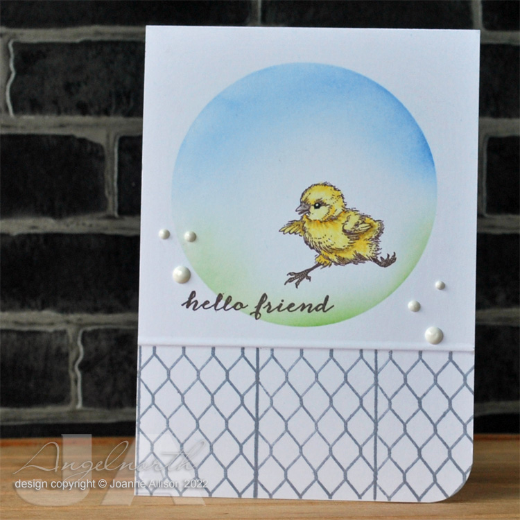
For my card, I chose a flower (it’s slightly tulippy!), smooshed Oxide ink for a background that I hoped might be a bit reminiscent of the wrinkles of the fabric, musical score, glassy domes and some of the colours. I stamped the flower directly on the card base and then again on a scrap, coloured and cut out the head to stick over the base, raising the top just very slightly with some scraps of card.

I decided I’d like my glossy dots to be green, as the glass pebbles are in the photo. Not having any clear green dimensional gunk, I drew dots with a green Copic then added Glossy Accents over the top.

Stamps:
Aged Sheet Music scrapblock (Cornish Heritage Farms, no longer with us)
Creative Chaos (Visible Image)
Happy Stamp n Cut and Essential Messages (both Hero Arts, retired)

Paper:
Bristol board

Ink:
Brilliance by Tsukineko (Graphite Black)
Memento by Tsukineko (Bamboo Leaves)
Tim Holtz Distress Oxide by Ranger (Cracked Pistachio)

Other:
Copic markers
Glossy Accents
Corner Chomper 

Thanks for stopping by, have a lovely weekend!

Monday, 2 May 2022

Link in the chain — April

It’s reveal day at Card Chain Challenge — mine went over the Pond to Linda G this time. 

From the options on offer I chose the sketch (mirror image because my stamp faces right) and the theme of “wild” as it gave me the chance to use this lovely leopard stamp that hasn’t had an outing for quite a while. He’s from the Saturday Evening Post line that Cornish Heritage Farms had and is based on a cover from 1931. 

The sentiment in the sketch really is there, I chose to do an eclipse one and the leopard’s spots do an excellent camouflage job on it!

Stamps:
Leopard Profile (Cornish Heritage Farms, no longer with us)

Paper:
Bristol board

Ink:
Brilliance by Tsukineko (Graphite Black)
Tim Holtz Distress ink by Ranger (Tumbled Glass, Vintage Photo)

Other:
Rays stencil (Visible Image)
Copic markers
Hello die (Waltzingmouse Stamps, no longer with us)

There are still a few days to sign up for the May chain if you fancy it - you just need to make and send one card, get a lovely handmade card from the next person in the chain! Sign up is here.