Tuesday, 11 March 2014
WMS - To Die For
I'm joining in with the Waltzingmouse Stamps Pajama Party for the first time - I finally managed to get things in order to get something made on the right day!
Challenge 1 is "To Die For" - Waltzingmouse has recently added their own Cutting Edge dies alongside the stamps and Claire's challenged us to use them in our creations.
I ended up doing something out of my comfort zone and probably not "typical" of WMS style! I actually intended to make something Christmassy with the lovely Bright Season Lantern die but of course I got distracted along the way - when cutting the lantern from kraft cardstock to use as a template, I noticed the "waste" from the centre of the lantern looked like an elegant vase or plant pot and that set me off in a totally different direction!
I've used a piece of paper that had been used to clean a painty brayer as my background with just a little doodling for a border and some splodgy white dots added through a stencil with a Posca pen (smeared while still wet) at top left.
I cut the top off a second "pot" with some pinking shears and added that as an extra detail, inking all the edges for a bit of depth. The "flower" is a heart cut with the smallest die from the "My Heart" set and coloured with Copic markers. I stamped leaves from Funky Flowers with acrylic paint for a splodgy look, cut them out and added them and a wire stem. Pot, heart and leaves are all stuck on with Pinflair glue gel for some dimension.
The sentiment is all from the Say It Loud set, snipped into individual words and finished with a little more doodling.
If you fancy playing along, you can upload entries for the Pajama Party until midnight tonight and there's a sketch challenge to play with for the rest of the week too - details here.
Supplies:
My Heart and Bright Season Lantern dies (Waltzingmouse Stamps)
Say It Loud and Funky Flowers stamp sets (Waltzingmouse Stamps)
Acrylic paints
Brilliance Graphite Black ink
Distress Vintage Photo ink
Copic markers
Copic fineliner
Posca white pen
Sequin waste mask (Tando Creative)
Pinking shears
Florist wire
Pinflair glue gel
Thanks for stopping by!
Labels:
die cuts,
mixed media,
waltzingmouse stamps
Friday, 7 March 2014
Experimenting with mono prints!
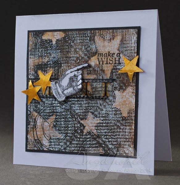
The Craft Stamper blog challenge has gone monthly so that means it's time for a new one!
This time we're using an acrylic block for mono printing (effectively using the block like a Gelli plate). I've resisted the lure of the Gelli, mostly because I suspected I'd make prints I liked and then my PPP (patterned paper problem) would kick in and I'd have no idea what to do with them.
When Trish told us what this month's challenge would be, I decided I'd have a go. Not sure if I set myself up for it but I proved myself right - made prints I liked and then couldn't use them! This is the attempt I'm happiest with.
I used Americana craft acrylic paints on the biggest acrylic block I own. If I remember rightly I did a layer of gold with plastic canvas pressed into it and lifted before taking a print, a layer of burnt umber and black with star masks scattered over and finally a layer of white with a piece of lace pressed in and lifted before taking the print (you can see the large diamond design of the lace as well as the overall texture if you let your eyes relax a bit!).
I've stamped a sentiment in one of the larger stars, some astronomy charts towards the bottom and then stamped and cut out a pointy finger to highlight the sentiment. The gold stars are punched from tomato paste tube metal (with the smaller punch I used when I made masks for the printed layer). A wee snippet of film strip ribbon seemed to tie it all together.
Not very typical for me but it was fun to get painty for a change! It may not be the perfect mono printing surface but the acrylic block made a good play surface if you're anything like me and just fancy a dabble!
Stamps:
Past Times by Hero Arts
Reach for the Stars by CHF (retired)
Other:
Large and small star squeeze punches by Fiskars
Lamp black, burnt umber and titanium white Americana acrylic paints by DecoArt
Dazzlong gold metallic acrylic paint by DecoArt
Tim Holtz Film Strip ribbon
Brilliance ink - Graphite Black
Tomato paste tube metal
As ever, there's the chance of a prize (lovely limited edition paints from PaperArtsy this time!) and of having your card in print in the magazine if you're the winner - we'd love to have you play along! All the details, including the deadline, can be found here.
This time we're using an acrylic block for mono printing (effectively using the block like a Gelli plate). I've resisted the lure of the Gelli, mostly because I suspected I'd make prints I liked and then my PPP (patterned paper problem) would kick in and I'd have no idea what to do with them.
When Trish told us what this month's challenge would be, I decided I'd have a go. Not sure if I set myself up for it but I proved myself right - made prints I liked and then couldn't use them! This is the attempt I'm happiest with.I used Americana craft acrylic paints on the biggest acrylic block I own. If I remember rightly I did a layer of gold with plastic canvas pressed into it and lifted before taking a print, a layer of burnt umber and black with star masks scattered over and finally a layer of white with a piece of lace pressed in and lifted before taking the print (you can see the large diamond design of the lace as well as the overall texture if you let your eyes relax a bit!).
I've stamped a sentiment in one of the larger stars, some astronomy charts towards the bottom and then stamped and cut out a pointy finger to highlight the sentiment. The gold stars are punched from tomato paste tube metal (with the smaller punch I used when I made masks for the printed layer). A wee snippet of film strip ribbon seemed to tie it all together.
Not very typical for me but it was fun to get painty for a change! It may not be the perfect mono printing surface but the acrylic block made a good play surface if you're anything like me and just fancy a dabble!
Stamps:
Past Times by Hero Arts
Reach for the Stars by CHF (retired)
Other:
Large and small star squeeze punches by Fiskars
Lamp black, burnt umber and titanium white Americana acrylic paints by DecoArt
Dazzlong gold metallic acrylic paint by DecoArt
Tim Holtz Film Strip ribbon
Brilliance ink - Graphite Black
Tomato paste tube metal
As ever, there's the chance of a prize (lovely limited edition paints from PaperArtsy this time!) and of having your card in print in the magazine if you're the winner - we'd love to have you play along! All the details, including the deadline, can be found here.
Labels:
CHF,
craft stamper,
DecoArt,
hero arts,
mixed media,
rubber stamping,
tomato paste tube
Monday, 24 February 2014
Atmospherics!
Lydia has set this week's Mixability challenge at Splitcoast Stampers - Through the Mist.
The idea is to clean a painty brayer by rolling on clean cardstock and use the resulting piece as the basis for something. The brayered prints are often reminiscent of a misty landscape. Lydia's put together a great little video, you can check it out of the SCS thread linked above.
When I watched the video, I kept mentally filling in bare tree shapes on the prints so that's where mine had to go, I'm afraid! I stamped the tree over the brayered base and added a bit of white pen for some moonlight highlights. I smudged a little charcoal pencil along some of those higlights to soften them.
I helped the brayering along just a tiny bit with a pen line under the tree to define the ground a bit more and stamped and white embossed the sentiment. The moon is finger-painted with silver acrylic paint and I added some lowlights with a Copic fine liner once the paint was dry (again smudging with my finger).
I kept the setting really simple, just sticking it slightly offset on the cardbase and running the fineliner round the edge of the panel - I thought the simplicity went with the tranquil feel.
Stamps:
Winter Trees by Stampendous
Scene-it Sentiments by Hobby Art
Paper: smooth white
Other:
Lamp Black Americana acrylic paint by DecoArt
Shimmering Silver metallic acrylic paint by DecoArt
Graphite Black Brilliance ink
Copic fineliner
Posca white pen
Bright white embossing powder by WOW!
Charcoal pencil
Thanks for stopping by!
The idea is to clean a painty brayer by rolling on clean cardstock and use the resulting piece as the basis for something. The brayered prints are often reminiscent of a misty landscape. Lydia's put together a great little video, you can check it out of the SCS thread linked above.
When I watched the video, I kept mentally filling in bare tree shapes on the prints so that's where mine had to go, I'm afraid! I stamped the tree over the brayered base and added a bit of white pen for some moonlight highlights. I smudged a little charcoal pencil along some of those higlights to soften them.I helped the brayering along just a tiny bit with a pen line under the tree to define the ground a bit more and stamped and white embossed the sentiment. The moon is finger-painted with silver acrylic paint and I added some lowlights with a Copic fine liner once the paint was dry (again smudging with my finger).
I kept the setting really simple, just sticking it slightly offset on the cardbase and running the fineliner round the edge of the panel - I thought the simplicity went with the tranquil feel.
Stamps:
Winter Trees by Stampendous
Scene-it Sentiments by Hobby Art
Paper: smooth white
Other:
Lamp Black Americana acrylic paint by DecoArt
Shimmering Silver metallic acrylic paint by DecoArt
Graphite Black Brilliance ink
Copic fineliner
Posca white pen
Bright white embossing powder by WOW!
Charcoal pencil
Thanks for stopping by!
Labels:
brayer,
DecoArt,
mixed media,
rubber stamping,
stampendous
Wednesday, 19 February 2014
Shabby chic(ish)
This is about as close as I'm likely to get to shabby chic and it just kind of evolved that way. I made the embellishment and then had no end of trouble figuring out how to use it!
If you choose to play along with the DT on the Pan Pastels challenge blog this week, the challenge is to use a stencil to create an embellishment (details here). It sounded like a challenging challenge and I'm up for that so I had a go!
I used a piece of metal from a tomato paste tube, cut with a Cuttlebug die (it started life as a tag but I snipped off the hanging loop as part of the evolution process!). On the back, I drew inside the circles of a sequin waste mask with a knitting needle, flipped it over and squashed the centres of the raised circles and refined it (again with the knitting needle!) to give a sort of rim. The whole lot is stuck to a piece of mount board and bashed with an embossing stylus for a beaten metal look. I used a bit of Copic ink to colour the centres of the circles and a dot of Glossy Accents for an enamelled finish. So far, so good - I liked the way it turned out.
Then I faffed for a couple of days and nothing looked right. I eventually ended up with this and I'm still not entirely happy but I decided to say enough is enough and call it done!
I used Versamark through the same sequin mask and added Pan Pastel on the card front. Then I added more Versmark and more pastel at the bottom for more solid coverage. The rose has some turquoise Pan Pastel brushed over the edges.
Supplies:
Tomato paste tube
Cuttlebug Tags die
Sequin Waste Mask by Tando Creative
Say It All stamp set by Hero Arts
Delicata Golden Glitz ink by Tsukineko
Copic Various ink (Holiday Blue)
Pan Pastels (Phthalo Green Tint, Turquoise)
Glossy Accents
Vintage Lace Decorative Strip Die by Tim Holtz/Sizzix
Versamark
Rose by Wild Orchid Crafts
Thanks for stopping by!
If you choose to play along with the DT on the Pan Pastels challenge blog this week, the challenge is to use a stencil to create an embellishment (details here). It sounded like a challenging challenge and I'm up for that so I had a go!
I used a piece of metal from a tomato paste tube, cut with a Cuttlebug die (it started life as a tag but I snipped off the hanging loop as part of the evolution process!). On the back, I drew inside the circles of a sequin waste mask with a knitting needle, flipped it over and squashed the centres of the raised circles and refined it (again with the knitting needle!) to give a sort of rim. The whole lot is stuck to a piece of mount board and bashed with an embossing stylus for a beaten metal look. I used a bit of Copic ink to colour the centres of the circles and a dot of Glossy Accents for an enamelled finish. So far, so good - I liked the way it turned out.
Then I faffed for a couple of days and nothing looked right. I eventually ended up with this and I'm still not entirely happy but I decided to say enough is enough and call it done!
I used Versamark through the same sequin mask and added Pan Pastel on the card front. Then I added more Versmark and more pastel at the bottom for more solid coverage. The rose has some turquoise Pan Pastel brushed over the edges.
Supplies:
Tomato paste tube
Cuttlebug Tags die
Sequin Waste Mask by Tando Creative
Say It All stamp set by Hero Arts
Delicata Golden Glitz ink by Tsukineko
Copic Various ink (Holiday Blue)
Pan Pastels (Phthalo Green Tint, Turquoise)
Glossy Accents
Vintage Lace Decorative Strip Die by Tim Holtz/Sizzix
Versamark
Rose by Wild Orchid Crafts
Thanks for stopping by!
Friday, 14 February 2014
Can you repeat that?
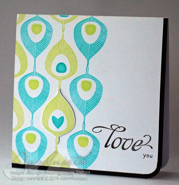
It's time for a new Take It, Make It challenge on the Craft Stamper blog and this time it's all about repeats! Take a stamp and use it several times over to make your design - it could be a background, a focal point or whatever you can dream up!
I chose a stylised peacock feather for a lovey-dovey card that could be used for those tricky occasions when hearts and flowers don't seem quite right! The little motif in the centre of the feathers is a separate stamp so I used the "eye" in most and a single heart to go with the love theme. I cut out the feather with the heart and used silicone glue to give it just a tiny bit of height to accentuate it, just sticking it over the one stamped on the base layer.
This is one of those occasions where I'm pleased I have both sizes of Corner Chomper even though it does seem extravagent! Being able to round that corner and have the white layer "nested" with the black border makes me happier than it should!
Stamps: Funky Feathers and Say It Loud (both Waltzingmouse Stamps)
Paper: Smooth white and black
Ink:
Versamagic by Tsukineko (Key Lime and Turquoise Gem)
Versafine by Tsukineko (Onyx Black)
Other:
Corner Chompers
Silicone glue
Check out the blog for details if you fancy joining the challenge - we'd love to see you and there's a prize of a couple of lovely stamps from Visible Image as well as the chance to see your card published in the magazine if you're the winner!
The challenge is going monthly from March so if you've been used to a two month slot to join in with us, remember you need to get your skates on this time - closing date is midnight on 26th February!
I chose a stylised peacock feather for a lovey-dovey card that could be used for those tricky occasions when hearts and flowers don't seem quite right! The little motif in the centre of the feathers is a separate stamp so I used the "eye" in most and a single heart to go with the love theme. I cut out the feather with the heart and used silicone glue to give it just a tiny bit of height to accentuate it, just sticking it over the one stamped on the base layer.
This is one of those occasions where I'm pleased I have both sizes of Corner Chomper even though it does seem extravagent! Being able to round that corner and have the white layer "nested" with the black border makes me happier than it should!
Stamps: Funky Feathers and Say It Loud (both Waltzingmouse Stamps)
Paper: Smooth white and black
Ink:
Versamagic by Tsukineko (Key Lime and Turquoise Gem)
Versafine by Tsukineko (Onyx Black)
Other:
Corner Chompers
Silicone glue
Check out the blog for details if you fancy joining the challenge - we'd love to see you and there's a prize of a couple of lovely stamps from Visible Image as well as the chance to see your card published in the magazine if you're the winner!
The challenge is going monthly from March so if you've been used to a two month slot to join in with us, remember you need to get your skates on this time - closing date is midnight on 26th February!
Labels:
craft stamper,
rubber stamping,
waltzingmouse stamps
Wednesday, 12 February 2014
Experimental hearts
I had a little play with various bits and pieces today. This week's MixAbility challenge at Splitcoast Stampers calls for the use of hearts (here) and the Pan Pastels challenge blog has another anything goes week with the option to join the DT in using fabric on your project (details here).
Very little stamping on here and more die cuts than I'd usually use! I started with two primitive hearts cut from mount board and lettering to spell the word LOVE (I cut the word twice and stacked the layers for a bit extra depth since Spellbinder dies don't cut thick materials). Then I covered the lot with double sided tape sheet and put fine-weave cotton fabric over it. I ran it through my Big shot with an embossing mat to make sure everything was stuck down well. I'd have liked a few more wrinkles in the fabric but never mind, the texture is still interesting!
Then I went to town with Pan Pastels and a charcoal pencil. The only stamping is some Hero Arts brush strokes stamped in the corners in Versamark and rubbed over with more pastel for slightly more intense colour. I left the edges of the fabric deliberately a bit frayed before sticking it to a card base.
I used my finger to apply the white Pan Pastel over the lettering as it seemed to give me most control.
What I learned - Mod Podge doesn't take Pan Pastel very well (I originally Mod Podged the fabric rather than using sheet adhesive); I love the look of fabric over die cuts; you need to make sure there's a support under the overhang of the second die cut to bring it to the same level as the other one before running it through the Big Shot. I'm also extremely pleased with my new fixative - it's a natural substance (based on casein, the protein found in milk and apparently the fixative preferred by Degas!) and it's in a pump bottle so there's no solvent smell or hazard if you're spraying indoors.
Materials:
Mount board offcuts
White cardstock
White cotton fabric
Primitive Hearts Bigz die by Sizzix
Spellbinders Font One dies
Pan Pastels (Turquoise, Permanent Red, Permanent Red Shade, White)
Charcoal Pencil
Brush Strokes stamps by Hero Arts
Versamark ink
SpectraFix Degas fixative spray
Thanks for stopping by!
Very little stamping on here and more die cuts than I'd usually use! I started with two primitive hearts cut from mount board and lettering to spell the word LOVE (I cut the word twice and stacked the layers for a bit extra depth since Spellbinder dies don't cut thick materials). Then I covered the lot with double sided tape sheet and put fine-weave cotton fabric over it. I ran it through my Big shot with an embossing mat to make sure everything was stuck down well. I'd have liked a few more wrinkles in the fabric but never mind, the texture is still interesting!
Then I went to town with Pan Pastels and a charcoal pencil. The only stamping is some Hero Arts brush strokes stamped in the corners in Versamark and rubbed over with more pastel for slightly more intense colour. I left the edges of the fabric deliberately a bit frayed before sticking it to a card base.
I used my finger to apply the white Pan Pastel over the lettering as it seemed to give me most control.What I learned - Mod Podge doesn't take Pan Pastel very well (I originally Mod Podged the fabric rather than using sheet adhesive); I love the look of fabric over die cuts; you need to make sure there's a support under the overhang of the second die cut to bring it to the same level as the other one before running it through the Big Shot. I'm also extremely pleased with my new fixative - it's a natural substance (based on casein, the protein found in milk and apparently the fixative preferred by Degas!) and it's in a pump bottle so there's no solvent smell or hazard if you're spraying indoors.
Materials:
Mount board offcuts
White cardstock
White cotton fabric
Primitive Hearts Bigz die by Sizzix
Spellbinders Font One dies
Pan Pastels (Turquoise, Permanent Red, Permanent Red Shade, White)
Charcoal Pencil
Brush Strokes stamps by Hero Arts
Versamark ink
SpectraFix Degas fixative spray
Thanks for stopping by!
Labels:
anniversary,
die cuts,
fabric,
hero arts,
mixed media,
pan pastels,
spellbinder
Thursday, 6 February 2014
Bright birthday
The weather is so awful here in the UK at the moment that I thought a bit of brightness might be in order in the craft room! I've just treated myself to a few new colours of Pan Pastels too so I chose the Bright Yellow Green and made a cheerful birthday card for my stash.
The Pan Pastels blog has another "anything goes" challenge with the option to join in with the DT in using a stencil (details here). I've actually used a mask but the terms seem to be somewhat interchangeable these days so I'm going to count it as playing along with the theme!
I loved how easy it was to feather out the edge of the pastel - quicker and easier than ink and sponge!
The pretty flowers are really quick and easy to do - they're a two step stamp and as they're clear, it's really easy to line up the various layers. I fussy cut by hand but Claire does have cut files available for this set if you have an electronic cutter and prefer to leave the scissors in the drawer!
The sequins are irridescent white and at certain angles they're almost exactly the same pink as the flowers!
Stamps (all Waltzingmouse Stamps)
Two Step Sprig
Leaf from Funky Flowers
Say It Loud
Paper: smooth white
Ink:
Adirondack by Ranger (Raspberry and Cranberry)
Versamark
Brilliance by Tsukineko (Graphite Black)
Other:
Pan Pastel (Bright Yellow Green)
Timeworks mask by Tim Holtz
8mm and 5mm sequins
Corner Chomper
Thanks for stopping by - hope you're staying safe and dry if you're dealing with extreme weather!
The Pan Pastels blog has another "anything goes" challenge with the option to join in with the DT in using a stencil (details here). I've actually used a mask but the terms seem to be somewhat interchangeable these days so I'm going to count it as playing along with the theme!
I loved how easy it was to feather out the edge of the pastel - quicker and easier than ink and sponge!
The pretty flowers are really quick and easy to do - they're a two step stamp and as they're clear, it's really easy to line up the various layers. I fussy cut by hand but Claire does have cut files available for this set if you have an electronic cutter and prefer to leave the scissors in the drawer!
The sequins are irridescent white and at certain angles they're almost exactly the same pink as the flowers!
Stamps (all Waltzingmouse Stamps)
Two Step Sprig
Leaf from Funky Flowers
Say It Loud
Paper: smooth white
Ink:
Adirondack by Ranger (Raspberry and Cranberry)
Versamark
Brilliance by Tsukineko (Graphite Black)
Other:
Pan Pastel (Bright Yellow Green)
Timeworks mask by Tim Holtz
8mm and 5mm sequins
Corner Chomper
Thanks for stopping by - hope you're staying safe and dry if you're dealing with extreme weather!
Thursday, 30 January 2014
"New" postcard
We've just had one of our occasional postcard swaps on Bubbly Funk. Our theme this time was "new" with interpretation completely up to the players! As ever, our cards are posted as genuine postcards so keeping it flat is good.
I tried to shoehorn in several "new" elements - a new technique, a New Year theme (it is still January - just!) and a new stamp (OK, not that new but the first time I've used it since it didn't get used for what I originally planned for it). I've gone a bit "eclectic mixed media" in the hope it will suit the recipient!
My new (to me) technique was to tint modelling paste with Pan Pastels. The dots on the left are made from the paste applied through a sequin waste mask so they have a bit of dimension. Tinting with acrylic paint can make the paste a bit sloppy but this worked brilliantly, especially as the pigment is so strong you don't need much. Just squeeze a little paste out onto a non-stick mat, rub a sponge over the Pan to dust some powder off onto the paste and mix with a spatula. The dots on the right are flat - I just inked the card and then used a babywipe through the mask to remove some of the Distress ink.
The Pan Pastel blog has another "anything goes" theme this week with an option to play along with the DT in using a metallic (details here). I don't have any of the metallic Pan Pastels (they do look lush though!) so although I incorporated the theme, I did it by giving the party puffin a sparkly crown with a metallic gold glitter pen. If you fancy playing, there's no requirement to use Pan Pastels or other Premium Craft Brands products, it's just that I tend to use the challenge as a push to use the Pans I have.
Stamps:
Party Puffin by Alice Palace at Crafty Individuals
Just My Type alpha stamps by Ma Vinci's Reliquary
Paper: Smooth white
Ink:
Graphite Black Brilliance by Tsukineko
Broken China Distress ink by Ranger
Other:
Maimeri Light Modelling Paste
Turquoise Pan Pastel
Black pastel pencil
White Posca paint pen
Copic fineline marker
Fiskars squeeze punch (stars doodled by drawing round a punched shape and cross hatching to fill)
Copic markers
Sequin Waste mask by Tando Creative
Gold Spica Glitter pen
Thanks for stopping by!
I tried to shoehorn in several "new" elements - a new technique, a New Year theme (it is still January - just!) and a new stamp (OK, not that new but the first time I've used it since it didn't get used for what I originally planned for it). I've gone a bit "eclectic mixed media" in the hope it will suit the recipient!My new (to me) technique was to tint modelling paste with Pan Pastels. The dots on the left are made from the paste applied through a sequin waste mask so they have a bit of dimension. Tinting with acrylic paint can make the paste a bit sloppy but this worked brilliantly, especially as the pigment is so strong you don't need much. Just squeeze a little paste out onto a non-stick mat, rub a sponge over the Pan to dust some powder off onto the paste and mix with a spatula. The dots on the right are flat - I just inked the card and then used a babywipe through the mask to remove some of the Distress ink.
The Pan Pastel blog has another "anything goes" theme this week with an option to play along with the DT in using a metallic (details here). I don't have any of the metallic Pan Pastels (they do look lush though!) so although I incorporated the theme, I did it by giving the party puffin a sparkly crown with a metallic gold glitter pen. If you fancy playing, there's no requirement to use Pan Pastels or other Premium Craft Brands products, it's just that I tend to use the challenge as a push to use the Pans I have.
Stamps:
Party Puffin by Alice Palace at Crafty Individuals
Just My Type alpha stamps by Ma Vinci's Reliquary
Paper: Smooth white
Ink:
Graphite Black Brilliance by Tsukineko
Broken China Distress ink by Ranger
Other:
Maimeri Light Modelling Paste
Turquoise Pan Pastel
Black pastel pencil
White Posca paint pen
Copic fineline marker
Fiskars squeeze punch (stars doodled by drawing round a punched shape and cross hatching to fill)
Copic markers
Sequin Waste mask by Tando Creative
Gold Spica Glitter pen
Thanks for stopping by!
Labels:
birds,
mask/stencil,
mixed media,
pan pastels,
postcard,
rubber stamping,
tando
Saturday, 25 January 2014
Warm hugs
I had such fun experimenting with Pan Pastels on canvas for my first foray into 2014 that I thought I'd have a go at something a bit bigger.
The weekly mixed media challenge at Splitcoast Stampers has been set by the very talented Dina who has asked us to concentrate on warm colours. As I'm usually drawn to the blue-green end of the spectrum it was fun to push the other way here! I combined with this week's PanPastels challenge again as I used something other than card as my substrate.
I played with PanPastels, acrylic paint, Posca paint pen, Versamark, pigment ink and Copic marker (on the sequins) to mix up the media. Colouring neutral embellishments with Copics (or other alcohol-based markers) is a great way to get coordinating elements without having to have every colour under the sun on hand!
Stamps:
Jumbo Rose by Stampendous
Truly Appreciated by Hero Arts
Paper:
Bitter choclate
Canvas (inkjet printer type from the £ shop)
Ink:
Pearlescent Chocolate Brilliance by Tsukineko
Versamark
Other:
PanPastels (Diarylide Yellow, Orange, Permanent Red)
Red acrylic paint
White Posca pen
Drywall tape
Sequins
Thanks for stopping by!
The weekly mixed media challenge at Splitcoast Stampers has been set by the very talented Dina who has asked us to concentrate on warm colours. As I'm usually drawn to the blue-green end of the spectrum it was fun to push the other way here! I combined with this week's PanPastels challenge again as I used something other than card as my substrate.I played with PanPastels, acrylic paint, Posca paint pen, Versamark, pigment ink and Copic marker (on the sequins) to mix up the media. Colouring neutral embellishments with Copics (or other alcohol-based markers) is a great way to get coordinating elements without having to have every colour under the sun on hand!
Stamps:
Jumbo Rose by Stampendous
Truly Appreciated by Hero Arts
Paper:
Bitter choclate
Canvas (inkjet printer type from the £ shop)
Ink:
Pearlescent Chocolate Brilliance by Tsukineko
Versamark
Other:
PanPastels (Diarylide Yellow, Orange, Permanent Red)
Red acrylic paint
White Posca pen
Drywall tape
Sequins
Thanks for stopping by!
Friday, 24 January 2014
Pastel Indigo?
Oh dear - a rather late "Happy New Year" on my blog! A horrible cough and cold put paid to crafting early in 2014 for me, I'm only just starting to feel human enough to venture into the craft room!
As a little kickstart, I visited a couple of challenges I haven't played for ages. This week's challenge at PanPastels is "anything goes" with an extra push to use something other than card as a substrate (here - challenge closes 12 noon on Tuesday). At IndigoBlu it's "from the heart" (details here - challenge runs to 20th of Feb).
I decided to try a little clean and simple with a side order of grunge and although I made a card I did use a couple of things other than cardstock with the pastels. I stamped the script in Versamark on a little piece of canvas and rubbed Turquoise over it - the colour sticks more intensely to the Versamark than the plain canvas so you get subtle patterning. I use cheapo canvas that's sold for inkjet printing photos for this kind of thing as you don't mind experimenting and maybe wasting some if things don't work out as you'd hoped!
The heart is done with modelling paste through a handcut stencil - I originally intended to go straight onto the card with it but the canvas was a bit too thick for that to work well (because of the "step") so I did it on a separate scrap of card, cut it out when dry and coloured it with PanPastels. It's the first time I've tried it and the "tooth" of the dried paste takes the colour really well.
Lots of reflection here this morning so I'm afraid the pearlescent ink looks very different on the card base than it does on the canvas - it's the same and looks better in real life, honest!
Stamps:
Sarah's Choice by IndigoBlu
Paper:
Smooth white
Canvas
Ink:
Pearlescent Chocolate Brilliance by Tsukineko
Other:
Diarylide Yellow, Oranage, Permanent Red and Permanent Red Shade PanPastels
Meimeri Light Modelling Paste
Corner Chomper
Thanks for stopping by, I hope 2014 is kind to you!
As a little kickstart, I visited a couple of challenges I haven't played for ages. This week's challenge at PanPastels is "anything goes" with an extra push to use something other than card as a substrate (here - challenge closes 12 noon on Tuesday). At IndigoBlu it's "from the heart" (details here - challenge runs to 20th of Feb).
I decided to try a little clean and simple with a side order of grunge and although I made a card I did use a couple of things other than cardstock with the pastels. I stamped the script in Versamark on a little piece of canvas and rubbed Turquoise over it - the colour sticks more intensely to the Versamark than the plain canvas so you get subtle patterning. I use cheapo canvas that's sold for inkjet printing photos for this kind of thing as you don't mind experimenting and maybe wasting some if things don't work out as you'd hoped!The heart is done with modelling paste through a handcut stencil - I originally intended to go straight onto the card with it but the canvas was a bit too thick for that to work well (because of the "step") so I did it on a separate scrap of card, cut it out when dry and coloured it with PanPastels. It's the first time I've tried it and the "tooth" of the dried paste takes the colour really well.
Lots of reflection here this morning so I'm afraid the pearlescent ink looks very different on the card base than it does on the canvas - it's the same and looks better in real life, honest!
Stamps:
Sarah's Choice by IndigoBlu
Paper:
Smooth white
Canvas
Ink:
Pearlescent Chocolate Brilliance by Tsukineko
Other:
Diarylide Yellow, Oranage, Permanent Red and Permanent Red Shade PanPastels
Meimeri Light Modelling Paste
Corner Chomper
Thanks for stopping by, I hope 2014 is kind to you!
Subscribe to:
Posts (Atom)