Rizwana is setting our challenge at Daring Cardmakers this week — as the Pantone colour of the year is Viva Magenta, she’d like to see magenta featuring on our creations.
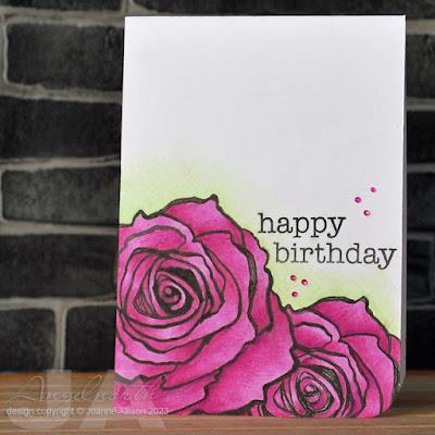
I confess I was relieved to see Rizwana’s mood board features what I think of as magenta. The Pantone colour looks too red to me and when I first saw it several weeks back my first thought was “yuk!” (partly influenced by the choice of image on Pantone’s own mood board, I suspect). As it is, I struggled a bit to find an appropriate colour in my stash. I managed to find a Copic that was ok to lay down a base layer of colour and then a couple of pencils to shade over the top. The rose is stamped once, masked and stamped again. I gave it just a bit of green pencil “halo” for some contrast and a few nail art gems for some glitz.Stamps:
Jumbo Rose (Stampendous)
Essential Messages (Hero Arts, retired)
Paper:
Bristol board
Ink:
Brilliance by Tsukineko (Graphite Black)
Other:
Copic marker
Coloured pencils
Nail art gems
Corner Chomper
Fineliner


.jpg)


3 comments:
Stunning roses, Joanne - love your coloring!!
I had to go look at Pantone-I had not seen it yet. Yeah, yuk about sums it up but I think that was just a terrible example maybe?
Their hope for it to be an empowerment color so expect it all over the place.
Your card is lovely. I like the green halo and tiny sequins.
hugs Margot
I totally agree with you as I struggled with this colour. This was a challenge for me too. I'm more of blues and greens person and not a fan of pinks and purples. I love the roses and your colouring is beautiful. The magenta really fits well with the green halo. Very pretty card x
Post a Comment