Friday, 25 June 2021

In the garden

Nat has set our challenge at Daring Cardmakers this week. As gardens and outdoor spaces became so important to so many people over the last year, she’d like to see us celebrating the garden.

My garden at the moment is a riot of flowers and foliage so I went down that route. I could also have opted for molehills but I figured that would make a less attractive card! Looking out of my lounge window, most of the flowers I can see are blue, hence the colour choice.

I’m playing again at Let’s Squash It where the current challenge is to combine a nature themed folder with a watercolour medium. I embossed my piece and then painted the raised areas and gave the background a very light wash of green, fading out to nothing in the middle.

Supplies:
Flower frame 3D folder (Nellie Snellen)
Watercolour paper
Winsor & Newton watercolours
Happy Stamp n Cut (Hero Arts)
Versafine by Tsukineko (Onyx Black)
Stitched rectangle dies A6 size (Paper Rose)

Thanks for stopping by. 


Tuesday, 22 June 2021

Leafy greens

I was feeling a bit lacking in inspiration for a Father’s Day card and finally decided to kick start using a challenge. Let’s Squash It is currently challenging us to use a nature-themed folder along with some kind of watercolour medium so that was my starting point.

I used Memento markers and coloured directly on the folder, gave it a very light spritz with water and ran it through the machine. 

This is a lovely dramatic folder - it’s called “fallen leaves” which might suggest autumn but I thought using greens would give it a lush foliage feel more suited to summer. Dad's a careful gardener though, I don’t think his garden would ever look quite as unkempt as this might suggest!

Supplies:
Watercolour paper
Scraps of black cardstock and Bristol board
Versafine ink (Onyx Black)
Fallen Leaves 3D embossing folder (Sizzix)
Happy Stamp and Cut set (Hero Arts)
Memento markers (Pear Tart, Bamboo Leaves, Cottage Ivy, New Sprout)
Stitched rectangle dies A6 size (Paper Rose)


Friday, 18 June 2021

Time for a check up

Our challenge at Daring Cardmakers this week is all about checks - backgrounds, accents, clothing patterns… there are lots of ways to add checks to your designs.

I opted for textured checks by using an embossing folder and went mixed media on this one. I rubbed a white crayon over the embossed piece (best done while it’s still on the folder as the support means you can press quite hard with the crayon) and then used a couple of Dylusions sprays. The crayon resists the spray but as you’ve generally got imperfect crayon coverage, you tend to get a nice slightly grungy effect.

The Party Puffin hasn’t been out to play for a while and I thought he’d be fun on the bright background. His crown and heart have some subtle sparkle courtesy of Spica glitter pens  

Stamps:
Party Puffin (Crafty Individuals)
Essential Messages (Hero Arts, retired)

Paper:
Bristol board
Black

Ink:
Brilliance (Graphite Black)

Other:
Dylusions sprays (Vibrant Turquoise, Fresh Lime)
Checkerboard embossing folder (Tim Holtz/Sizzix - retired)
White crayon
Black fineliner
Spica glitter pens (gold and red)
Copic markers
Stitched rectangle dies A6 size (Paper Rose
)

Thanks for stopping by!

Friday, 11 June 2021

Flag pole

Kathy has set the challenge for us at Daring Cardmakers this week and she'd like us to take inspiration from the flag of a country other than our own (we used this site for a guide to flags of the world).

I chose the flag of Estonia and in finding out a litte more about it, I discovered that the national bird is the barn swallow. I'm not sure mine is exactly the right type but it is a swallow so I thought it should see the light of day.

Representing a white stripe proved a bit difficult - I ended up doing a very, very light wash of colour underneath so hopefully the eye sees blue, black, white above the sentiment. The image is stamped on the card base and then again separately on Bristol and just the bird cut out and stuck on with gel glue for a bit of lift.

Maybe I was drawn to the Estonian flag because I've been listening to some Arvo Pärt recently (I'm in good company, he's apparently the most performed living composer). Spiegel im Speigel is just beautiful - if you have a few quiet minutes to spare, this version has the string part taken by cello rather than the more usual violin and I think it has a lovely, haunting almost hypnotic quality.

Stamps:
Joy (Carabelle Studio)
Say It All (Hero Arts, retired)

Paper:
Watercolour
Scrap of Bristol board

Ink:
Versafine by Tsukineko (Onyx Black)

Other:
Watercolors (Winsor & Newton)
Pearl pen by viva Decor (Ice White)
Copic markers
Pinflair glue gel

Thanks for stopping by!


Friday, 4 June 2021

June’s elements

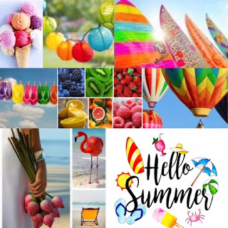
It’s the first Friday of another month so our challenge at Daring Cardmakers this week is an elemental one - choose at least three elements from Rizwana’s lovely summery mood board to inspire your project. 

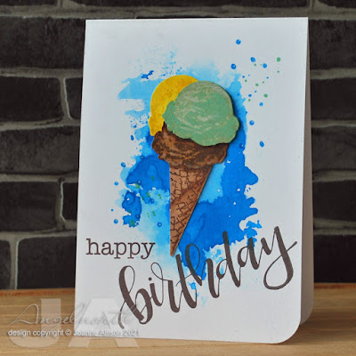
I chose ice cream in a waffle cone, blue background inspired by the clear summer skies and script style sentiment. As my ice cream cone is a set dated 2016 I’m also playing at Retro Rubber where there’s an “anything goes” theme at the moment. 

I smooshed blue ink onto the card base with a piece of acetate, stamped a double cone and cut it out, then decided it really should be a triple and stamped the yellow blob and tucked that in behind. Then for good measure I did the green blob again, cut it out and used glue gel to stick it on so the whole shebang has some dimension. A few stamped dots extend the background out a bit. The layering stamps do a great job but I did add a tiny bit extra shading with a couple of Copics.

Stamps:
Color Layering Ice Cream (Hero Arts, 2016)
Birthday (Lettering Range by Ranger)
Dots from Believe in Unicorns (Visible Image, 2017)

Paper:
Bristol board 

Ink:
Brilliance by Tsukineko (Pearlescent Chocolate)
Adirondack dye ink by Ranger (Latte, Espresso)

Jenni Bowlin ink by Ranger (Lemon Drops)
Tim Holtz Distress ink by Ranger (Salty Ocean, Vintage Photo, Walnut Stain, Bundled Sage, Mustard Seed)
Tim Holtz Distress Oxide by Ranger (Cracked Pistachio)

Other:
Pinflair glue gel
Wink of Stella pen (clear)
Copic markers 
White paint pen by Posca
Corner Chomper 

Here's our insipration pic this month - click through to see what my teamies were inspired to make!


Wednesday, 2 June 2021

Link in the chain - May

It’s reveal day at Card Chain Challenge - my card has gone to Greta in Oregon this time. 

I often do one layer cards for CCC, especially if they’re ones that will be airmailed. I followed that philosophy this time, and from the options on offer I used the sketch, the colours (sort of) and the theme of coffee. 

Making a card using only the supplies in a single stamp set is satisfying and I managed to do that here. As it’s a clear set, I even managed to curve the sentiment before stamping. The circles are inked through my trusty piece of die cut acetate, I masked the lady and the cup before using a blending brush to add the Denim ink. The coffee bean is a single image but with a little basic masking it's easy to make a group of them and I have a couple of masks stuck to the packaging so I don't even have to cut those out.

Stamps:
Tea and Coffee (Crafty Secrets, no longer with us)

Paper:
Bristol board

Ink:
Brilliance by Tsukineko (Graphite Black and Pearlescent Chocolate)
Adirondack dye ink by Ranger (Denim)

Other:
Copic markers
Scor It
Corner Chomper 
White paint pen by Posca

Thanks for stopping by, there are still a few days to sign up for the next chain if you fancy it - make and send one card, get a card from another player!