Friday, 12 December 2014

Inchie birthday

Last Friday was Lydia's turn to set the Mixed Media challenge at Splitcoast Stampers and she asked us to use 1, 2, 3 or 4 inchies on a project. The wheels were obviously turning slowly as although I managed to join in with this one, I didn't manage it in the week of the challenge!

It was a bit of a nightmare to photograph - I'm not sure the texture shows well but it refused to get better than this - I hope you get the idea!

I stamped the wavy border and then cut out three inchies from sections that pleased me on the small scale. I used glue to trace over the lines of the stamped image and let it dry then painted each square with black acrylic paint.

Once the paint was dry I dry brushed with a pearlescent rich blue to catch the raised glue lines.  I used a Versamark pen to fill in some of the open circles, brushed on green Perfect Pearls and finished with Glossy Accents over the top. A tiny gem adds to the glitz on each square.

The card base has a really simple stamped "anchor" for the inchies and a birthday greeting.

Stamps:
Bubble Border by Lost Coast Designs
Brush Strokes by Hero Arts (paint streak)
Big Day Today by Waltzingmouse Stamps (sentiment)

Ink:
Brilliance Graphite Black by Tsukineko

Other:
Scotch Quick Dry adhesive
Lamp Black Americana acrylic paint by DecoArt
Pearlescent blue acrylic paint
Sour Apple Perfect Pearls
Glossy Accents
Nail art gems
Pinflair glue gel
Corner Chomper

Thanks for stopping by!


Friday, 14 November 2014

Scandi bedtime story!

I'm playing along with the Waltzingmouse Stamps Pajama Party this month and I've even managed more than one challenge!

The first challenge is "Scandi tags" and although mine kind of evolved to be a bit more complex than I originally intended I think it probably still qualifies! I toyed with putting white faux stitching around the edge of the heart but decided that was yet more complexity so I skipped it in the end!

I reckon if you moved the button and snowflake to be central and punched a wee hole at the top of the heart that bit would make pretty Scandinavian-style hanging decorations for the tree, too!

Supplies from Waltzingmouse:
Stitched Tags dies
My Heart dies
Snowflake #2 die
Folk art medallion stamp set (for sentiment)
Offbeat backgrounds stamp set (chequerboard pattern)

Other supplies:
Adirondack Red Pepper ink
Wooden button
White crochet thread

The final challenge of a Pajama Party is always a "bedtime story" sketch and as I've been meaning to play with these big, ornately scripted Christmas sentiments and not getting round to it I leapt on the sketch's large central oval as the perfect kickstart.

Claire has cut files and dies that match the stamps in the Festive Foliage set but I quite like cutting out so I took the good old-fashioned scissor route. The design is flat enough not to need extra postage and dies or cut files would make mass production doable - hand cutting would mean you were a slave to cutting out for many evenings, I would think!

I gave myself a nightmare to photograph but die cutting the snowflakes from double-sided tape sheet and rubbing on Crystal glitter makes a really pretty, festive touch in real life. The dots are done with a regular hole punch with the tape/glitter and the frosty edge of the oval is just PVA glue applied with a paintbrush to hold the glitter.

Supplies from Waltzingmouse:
Tis the Season stamp set
Festive Foliage stamp set
Snowflake #2 die

Other supplies:
Decoart Glamour Dust glitter - Crystal
Detail gold embossing powder
Versamark
Distress ink - Barn Door
Versafine ink - Olympia Green
Double-sided tape sheet
Corner Chomper

Thanks for stopping by!


Thursday, 16 October 2014

You're fabulous!

I had fun playing with the current mixed media challenge at Splitcoast Stampers - a different style and I'm not eniely convinced about the finished product but I enjoyed playing anyway!

Lydia's "Pin up" theme challenged us to find a magazine image, cut it out and coat it in something like Mod Podge to make a mask. Mine came from an advert for a clothing catalogue that was a loose insert in the Radio Times!

I spritzed, stamped and sponged through dry wall tape with the mask in place. Then I added a bit of very pale Pan Pastel to tone down the bright white of the silhouette. I added a charcoal pencil outline and then scribbled right across, one side to the other with a paper stump to give that "whoosh" to the image.
Those stars made this almost impossible to photograph! They're glittery in the middle and coated in Glossy Accents so all the different reflection going on there made it tricky.

I used the bubble border stamp just to get a line to cut along for the wavy edge - I could have done it freehand but I toyed with the idea of having some of the stamped border before deciding I prefered the idea of a dramatic black strip along the edge.

This is a larger format card (5" x 7") - I found it surprisingly difficult to find an image that works as a silhouette at a smaller size!

Stamps:
Numbers border by Kaisercraft
Essential Messages by Hero Arts
Bubble Border by Lost Coast

Paper:
black and white

Ink:
Brilliance Graphite Black
Adirondack Raspberry
Dylusions spray ink Funky Fucsia

Other:
Charcoal pencil
Pan Pastel Magenta Tint
Dry wall tape
Hot pink glitter
Glossy Accents
Corner Chomper

Thanks for stopping by!

Monday, 13 October 2014

Autumn birthday

I should have been tidying my craft table at the weekend but of course I got distracted into playing instead! I've had some gilding flakes in my stash for ages and not really got round to playing with them (I got them from a friend when she de-stashed to move abroad and that's four years ago now!).

I covered a piece of card with double-sided tape sheet and burnished on some of the flakes. They're a nice warm mix of gold and copper tones with just touches of rose gold, silver and the odd blueish-green flake which made me think of autumn leaves so I decided to go that way. I die cut a horse chestnut leaf, accentuated the emossed lines left by the die with a Copic marker and coated it in Triple Thick glaze for an extra glossy finish. The glaze magnifies the sort of "veining" you get from the flakes which seemed perfect for a leaf.

I thought it would be fun to have the very matt finish of Pan Pastels contrasting with  the glossed flake on the leaf and combined them in a clean and simple design. I decided on a whim to introduce a third finish by adding little dots cut from scraps of the gilded cardstock, leaving them with no glaze. I seem to have a bit of a thing for scattered dots as a finishing touch at the moment!

I'm hooking up with the current Pan Pastels challenge which is "autumn" - a lovely theme if you fancy playing along (no requirement to use Pan Pastels or other Premium Craft Brand products, it's just that I often use it as a push to use the Pans I have).

Supplies:
Leaf dies by Impression Obsession
Confetti die by Mama Elephant
Say It All stamp set by Hero Arts
Brilliance Pearlescent Chocolate by Tsukineko
Pan Pastels (Burnt Sienna, Burnt Sienna Shade, Burnt Sienna Tint)
Spectrafix Degas  fixative
Easy Metal gilding flakes by Eberhard Faber
Triple Thick Gloss Glaze by Deco Art 
Pinflair Glue Gel
Double sided tape sheet (151 brand, try your local £1 shop!)

Thanks for stopping by.

Friday, 10 October 2014

Hello!

Gah, what happened to September?! I had a holiday in August so I can excuse myself for that absence but September is another matter!

I've been doing a bit of crafting but nothing I could share. I've just managed a bit of time at the stamping table for a clean and simple card for the current That's Crafty challenge which is to keep it simple. That's Crafty is one of my regular shopping haunts but I tend to forget they host a challenge, too!

These Doc Martens are fun for masculine cards, maybe even for those pesky teenagers! I masked them so
that I could let them overlap the stencilled strip that's acting as an "anchor". As it's a slightly grungy design, I stamped the numbers border through the stencil, figuring that if it didn't make perfect contact at the edges that would be fine (it's actually pretty good, the stencil is not too thick). I doodled round the chevrons as well to make that border a bit more defined.

I finished it off with a few dots of Enamel Accents (not because I needed to cover up a stray ink smudge; who could think such a thing?).

Stamps:
Doc Marten Boots by Deep Red Stamps
Numbers border by Kaisercraft
Essential Messages by Hero Arts

Ink:
Versafine Onyx Black
Distress Mowed Lawn

Other:
Hearts and Arrows stencil by Crafter's Workshop
Black fineline marker
Enamel Accents

Thanks for stopping by, hope you have a lovely weekend!


Friday, 8 August 2014

Paperbabe summer blog hop!

Welcome to  the Paperbabe Stamps Summer Blog Hop featuring new stamps... Kim is Paperbabe's owner and designer and she's invited some of her stampy friends to play with some new stamp designs!

The new release includes "Folk Fabrique", "Doll Face", "Mayleedee Little Red", "Mayleedee Frost Fairy" and "Dillon Frost Sprite" which are available at Etsy and the WebShop.

Be sure to stop by PAPERBABE if you are just beginning the hop to see the endless possibilities with these new stamps and to leave your comments along the way... as there are some fabby prizes to be had! To celebrate there will be the ENTIRE release and a very special not yet released rubber stamp up for grabs to a very lucky winner! 

I've been playing with the lovely Folk Fabrique set and have three projects to share with you - all quite different from each other!

First up, of course I had to make a card. I experimented with stamping the peacock outline in a light coloured ink and then stamping the more solid coloured shapes. I liked the result but then hit on an even "cleaner" way to use the outline - I stamped in black on a sheet of paper and then put it on a lightbox with my cardstock over the top. Hey presto - visible outline to guide the solid stamps but no actual marks on the cardstock! Of course, I did my own thing a bit, extending some of the tail feathers and adding an extra little flourish at the side. Thats one of the beauties of stamps like these - infinite possibilities!

I used a Spica glitter pen to add the lighter turquoise colours so there's some sparkle, too.

The elegant little sprigs looked perfect for a bit of faux cloisonne to me so my second project is a pendant made with three layers of black UTEE, Perfect Pearls in Sour Apple and Blue Raspberry and a bit of gold ink. I finished off with a layer of Triple Thick (I find it better that Glossy Accents over an embossing enamel surface).

The base is a simple chipboard shape cut with a steel rule die and hole punched with a Crop-a- Dile. Scrap mountboard is perfect for this kind of thing and can often be obtained very cheaply or even for nothing if you catch your local framing shop in the right mood - just ask if they have any spare offcuts.

And finally I couldn't resist taking the name of the set at face value and stamping on fabric. Lots of the stamps in the set lend themselves to pattern building - I chose the lotus flower and made a lavendar bag (it could just as easily be a little gift bag though - you could make a faux cloisonne pendant and pop it inside!). 

I used a Memento marker to shade the inner part of each petal just slightly and finished with a row of gold dimensional paint dots across the middle row.

From here, the next stop along the way is the talented Kim Dellow.  

If you didn't "begin at the beginning" and you'd like to see what everyone else has been up to, here's where you want to be to follow the hop:

Kim Costello
Chris (DT)
Kerrie (DT)
Lady (DT)  
Delphine (DT)
Jackie (DT)  
Sandie 
Katy  
Joanne (you are here!)  
Kim Dellow
Tricia  
Paperbabe Stamps 

Thanks for joining us! Winners will be announced on the Paperbabe Blog on the 15th when the newest challenge will also be starting! You have until the 13th to hop along leaving comments for the chance to win!

Wednesday, 6 August 2014

Summer treat postcard

We're having one of our occasional postcard swaps on the Bubly Funk forum with the theme "summer treats". My original thoughts were overtaken by the current mixed media challenge on Splitcoast Stampers where Tiffany has asked us to mix colouring media with glue and use it on our projects - I thought it would make great melting icecream!

Childhood summer holidays without icecream would be unthinkable and I suspect it's one of those summer treats we never really grow out of! I mixed acrylic paint with my glue and dribbled it over embossed cardstock to look like strawberry or raspberry icecream melting over the edge of a waffle cone. Thickly dribbled glue takes ages to dry but once it has it's shiny and has some texture along with the kind of tiny little air bubbles you might find in real melting icecream!

Stamps: Essential Messages by Hero Arts

Paper: white, kraft, dark chocolate, vellum

Ink: Versamark, Distress Tea Dye

Other:
PVA glue
Fresco Finish acrylic paint (Orchid)
Detail white embossing powder
Fiskars texture plate
Corner Chomper
Sewing machine and thread
Sequins
Pinflair Glue Gel


Thanks for stopping by!

Tuesday, 8 July 2014

Here comes summer!

For this month's postcard swap on UKStampers, Sam has asked us to include wheels. I thought of summer road trips and this surfer couple in their convertible seemed like the perfect set of summer wheels!

I had some fun with a shaving foam marbled background for a retro, tie-dye look and coloured the car and the stripe down the surfboard to match the vibrant shades. As usual, it has no embellishments so it can go through the post with no envelope when we swap.

If you've never tried it - shaving foam backgrounds are fun and each piece will be unique. Just squirt a layer of  foam onto your craft mat (or other surface that's easy to wipe down). It doesn't need to be a particularly thick layer - I tend to squirt some foam and then use an old credit card to spread it out a bit. Add drops of reinker to the surface of the foam and then swirl with something like a bamboo skewer or thin paintbrush handle. Press a piece of card onto top, making sure you get contact with the inky foam all over the piece and then lift - it will look a big gooey mess at this stage! Scrape the inky foam off (I use the credit card again) and you'll have a marbled background. Wipe with a tissue or kitchen roll to remove any last traces of foam and then just leave it to dry and you can stamp on it directly or use it as a background piece.

I used Distress ink here but any dye ink is fine and alcohol inks work too - I've never tried it with pigment inks but I don't see why not. Try to choose colours that won't get too "muddy" in any areas where they mix together as you swirl.

This is actually the second background from one lot of foam - I just smoothed over the surface with the credit card after lifting the first one and added a few more drops of the inks, swirled again and pressed a second piece of cardstock on there. The first one had a little bit of Perfect Pearls as well as the ink - I'll use it for something in the future, I just happend to prefer the swirl pattern on this one for the postcard.

Stamps:
The Beach (retired CHF)

Paper: Smooth white

Ink:
Distress reinkers in Spiced Marmalade and Picked Raspberry
Brilliance Graphite Black

Other:
Shaving foam
Copic markers
Tracing Wheel
Corner Chomper

Thanks for stopping by!


Sunday, 6 July 2014

Pastel blooms

Back in slightly more comfortable territory today after my foray into tags! I like to go back to basics with a one layer card sometimes so when I saw the current Hero Arts challenge (open through August 10th if you want to play!), I decided to play along. It's a  super-simple card with no embellishments or fancy techniques, just because the mood took me that way!

I've used the lovely Hero Arts Etched Flowers stamp and as these look like wild roses to me, I'm linking to the current Pan Pastels challenge, too (Roses are a girl's best friend).

I was lucky enough to be first out of the hat in a recent Pan Pastels challenge and part of my prize was a pan of Magenta Tint - a super-pretty shade that inspired the colour scheme for this soft, feminine card. I stamped in a really light green ink and then coloured the whole flower shape with a layer of the PanPastel to give me a base. One of the beauties of PanPastels is that it's really easy to erase if you get colour where you don't want it! I used Derwent pastel pencils (which rarely see the light of day, I'm ashamed to say) to add shading and colour the leaves and centres. It's a good idea to have an "index" image of the stamp to hand when you do this kind of colouring - it helps you focus in on the pale lines of the stamped image. I added some extra definition and "direction" to the petals with light strokes of a white Posca pen.

A quick spritz of fixative stopped me smudging or over-working the image and once that was dry I added a hint of background colour with Phthalo Green Tint and accentuated the flowers with a "halo" of blue pastel pencil. As I did a "lazy" background (ie just swiped colour right over the leaves) they ended up a wee bit too muted so I added a bit more pastel pencil. A couple of scored lines and rounded corners are my only concessions to "tools" here!

I thought the elegant lines of the Waltzingmouse sentiment went well with the delicate feel of the flowers.

Stamps:
Etched Flowers (Hero Arts)
Sentiment from Big Day Today (Waltzingmouse Stamps)

Paper: Hahnemuhle Bamboo Mixed Media 

Ink:
Adirondack Willow
Brilliance Pearlescent Chocolate

Other:
PanPastels (Magenta Tint, Phthalo Green Tint)
Derwent Pastel pencils
White Posca pen
Spectrafix Degas fixative
Corner Chomper
Scor-It

Thanks for stopping by!


Wednesday, 2 July 2014

Tag - you're Blu!

I'm a bit tag challenged - they never seem to work out quite right for me and I find photographing them difficult too! But in the spirit of doing things we find hard by way of learning, I thought I'd play along with this month's Indigo Blu challenge which is Tag -You're It!

I decided to throw a new technique into the mix to make sure I really was playing the learning game - I've never done Polished Stone so I had a go at that. I don't have any metallic reinker but I found that just dabbing a Dew Drop pad onto the card a few times worked fine - the alcohol spreads it out so you don't see the shape in any case. I added a little Funky Fucshia Dylusions to my cotton ball after the first pass and added that just to the lower part of the cardstock and then die cut the tag.

Now my problems started! I stamped the Stylised Flowers in Brilliance ink and took half the surface of the paper off when I lifted the stamp - eek! I liked the look of the background enough to persevere though so I decided to use a fine brush and black acrylic paint to go over the image and give it a slighty more "hand painted" look. I added white dots with a Posca pen and also went down the sides of the stalks.

No idea why I then decided to do more stamping but this time it worked fine - maybe the surface was just a bit tacky when I stamped the flowers (I'm not noted for my patience at the craft table!). I stamped around the edges in silver with the flourish stamp and then the grasses along the base in black.

I added a rub-on word, a button and some organza ribbon for a fairly simple treatment at the top (finishing the top of a tag is always one of my issues - whatever I do, it never looks right to me!). The button was originally gold so I painted it black and gave it the Rub n Buff treatment to fit the colour scheme.

Stamps (all Indigo Blu):
Stylised Flowers
Nature 1
Vintage Flourish

Ink:
Brilliance Graphite Black and Starlight Silver
Reinker: Distress Tumbled Glass and Salty Ocean
Dylusions Funky Fucshia

Paper: glossy white

Other:
Tim Holtz Remnant Rubs Words
Sizzix/Tim Holtz Tag Collection dies
White Posca pen
Upholstery button
Black acrylic paint
Rub n Buff - Silver Leaf
Organza ribbon
Isopropyl alcohol

Thanks for stopping by!


Wednesday, 25 June 2014

Circle of Life

I haven't managed to play along in the postcard swap at UK Stampers for ages. I had such fun finger painting circles and doodling for my last card that I thought I'd try a quick postcard with the same technique and sneak in under the wire for this month's swap.

Sam wanted to see circles and stars for this month's cards. I made painty circles (there's a tutorial here) on an old book page (I'm still working my way through the paper ephemera pack that a local business puts together from books that are not in a fit condition for resale - this one seems to be the tale of the magic ass from a children's book!). The sentiment is heat embossed to make sure it would be dense enough to stand out well on the busy background.

I used punched stars in a couple of sizes as templates to draw the stars and then filled in with doodling (so I'm linking up the Daring Cardmakers again). Then I brushed on some diluted Dylusions to colour the while thing, avoiding the stars and some of the small circles.

Stamp: Journaling Words by the Artistic Stamper
Paper: old book page (on white card for stability)

Ink: Versamark

Other:
NeoColour II water soluble crayon
Acrylic paints
Fiskars star punchies (used to doodle round)
Black detail embossing powder
Dylusions spray - Funky Fuchsia
Fineline marker


Thanks for stopping by!

Friday, 20 June 2014

Round and round

I've had a frustrating couple of afternoons in the craftroom where nothing has worked out quite right, so today I decided to play along with two very "freeform" challenges and not try anything too structured.

This week's mixed media challenge at Splitcoast Stampers is based on painty circles and the Daring Cardmakers asked for some doodling.

I started with a piece of old sheet music and used a pink Neocolour crayon to scribble some rough circles and smuged over them with a damp finger. Then I added some turquoise, yellow and white acrylic paints (again using that highly sophisticated crafters' tool - the index finger). I dipped three different sized lids into black paint and stamped circles with those.

Of course, once it was done I ended up liking the bit I'd trimmed off the main panel more than the panel itself! I turned it into a graphic card just by mounting on a strip of black and cutting the bottom at an angle and mounting it on a crisp white base, finished with a bit of doodling and a stamped sentiment.

Stamp: Journalling Words by The Artistic Stamper

Paper:
Smooth white
Black
Old sheet music

Ink: Brilliance Graphite Black

Other:
Neocolour II water soluble crayons
Acrylic paints
Fineline marker
Corner Chomper

Thanks for stopping by!

Friday, 13 June 2014

Dad - look away now!

I don't usually blog ahead of sending projects where they're going but I'll be too late to join in the current Pan Pastels challenge (One for the boys) if I don't get this blogged so Dad, if you're reading, look away now if you'd rather not see your Father's day card before you open the envelope!


I've just treated myself to a few masks from Caroline's revamped Bubbly Funk shop (bargains to be had as well on older stock as she clears out to make way for new things!). I used the Crafter's Workshop 6x6 Wood Grain here, spreading modelling paste through it with an old credit card.

Once the paste dried, I painted over with gesso using a coarse brush to add some extra texture in the more open areas. I then used Burnt Sienna Shade Pan Pastel to colour the panel.

I really must get a new Father's day sentiment stamp - this is the only one I have and I'm sure Dad will notice eventually! I just stamped it on a simple banner finished with some copper brads and added a single die cut to leave the wood grain as the star of the show as I loved the way it turned out. I did colour the die cut leaf with two shades of green Copic marker, just to give it a bit extra depth.

Here's a more detailed shot of how it turned out adding some gesso for that bit extra texture - I think it works well with the woodgrain!

Stamps: Sentiment from Father's Day Centers (Cornish Heritage Farms, retired)

Ink: Brilliance Pearlescent Chocolate by Tsukineko

Paper: kraft, laid texture, scrap of DCWV blue

Other:
Pan Pastel - Burnt Sienna Shade
Spectrafix Degas fixative
Maimeri Light Modelling Paste
Copic markers
Gesso
Crafter's Workshop 6x6 mask - Wood Grain
Leaves dies by Impression Obsession
Corner Chomper

Thanks for stopping by!

Tuesday, 10 June 2014

Birthday olives

It was my hubby's birthday recently and this is the card I made him. He's a fan of olives and olive oils (he actually had oils as his gift) so I went in that direction.

I did something unheard of for me here - I drew my focal image! I have one olive stamp (from a set by the original Cornish Heritage Farms) but it was really a bit small for what I wanted to do. I decided to just get over my conviction that I can't draw and using the small stamped image and a photograph of a real olive branch for guidance, I sketched very lightly in pencil and then coloured using a combination of Copic markers and watercolour pencils, aiming for a "borderless" look. I was quite pleased with the result.

The olive image is mounted on a background done with home-made shimmer spray and pigment from a watercolour pencil brushed on through drywall tape for a bit of textural interest. I made speckles by wetting the surface and sanding the pencil over it (the blue around the olives and a dark purpley colour on the background panel) and also by flicking thinned down black acrylic paint from a brush. I added a few black enamel dots and a couple of photo corners for more texture and contrast.

Stamps:
Sentiment from Big Day Today by Waltzingmouse Stamps
Hand drawn image of olives

Ink: Versafine Onyx Black by Tsukineko

Paper:
Bamboo Mixed Media paper by Hahnemuhl
Laid texture
Black

Other:
Copic markers
Watercolour pencils
Shimmer spray made from Tumbled Glass reinker and Turquoise Perfect Pearls
Drywall tape 
Tim Holtz/Sizzix ATC and Photo corners die
Black acrylic paint
Black enamel dots

Thanks for stopping by!

Tuesday, 3 June 2014

Starry sketch


As usual when needing to make a kiddie card, I used a couple of challenges to get me going - no idea why I struggle as much as I do with these but I daren't even start to think how long this took me, even with the kickstart!

The Daring Cardmaker's challenge this week is to use stars and the current challenge at Waltzingmouse Fanatics is to use this sketch.

Apologies for the quality of the photo - as any of you who have tried to photograph mirri card will know, it's an absolute nightmare! The card looks more "integrated" in real life but this was as good as the photo was going to get, I'm afraid.

I toook the liberty of changing the third rectangular panel on the sketch to a circle as it fit the space rocket better to make a sort of planet/moon thing there. I used marker caps to stamp the "craters" on there.

This is destined for a wee boy celebrating his sixth birthday, I hope it's OK!

Stamps:
Half Pint Heroes by Waltzingmouse Stamps

Paper:
White
Silver Mirri
DCWV textured blue

Ink:
Brilliance Graphite Black and Starlite Silver

Other:
Fiskars squeeze punches - small and medium star
Tracing Wheel
Copic markers
Pinflair glue gel
Corner Chomper

Thanks for stopping by!

Saturday, 17 May 2014

Light as a feather

I've been meaning to play with the Waltzingmouse Fanatics since they launched but failing to get my act together. I also follow the Daring Cardmakers religiously each week and yet haven't played along in forever. So I'm combining challenges just for fun again today.

The DCM theme this week is feathers and as I've just treated myself to the WMS Fine Feathers set I thought I should take it as hint that those stamps needed to see ink sooner rather than later! The Fanatics asked for some texture on our projects.

I mixed some reinker and Perfect Pearls in a mini mister to make my own shimmer mist and sprayed some cardstock. Once that was dry, I added texture paste through a home made stencil, let that dry and spritzed again with the shimmery stuff.

I added some stamped splats and some actual splats flicked from a paintbrush before adding a strip with the stamped sentiment. The feathers are stamped on vellum and cut out (Claire does have cut files as well as matching dies for these stamps but I went for the old-fashioned scissor approach).

I cut my stencil from a piece of cereal box cardboard - the intricate die does need a couple of passes on this thickness but it went through and all the pieces popped out cleanly. I've given it a coat of Mod Podge each side and hope it will last for a few goes at least. I could have used acetate but I wanted something a bit thicker to use with the paste.

Stamps (all Waltzingmouse Stamps)
Fine Feathers
Splat That
Big Day Today

Paper: 
Laid texture
Vellum

Ink:
Pearlescent Chocolate Brilliance by Tsukineko
Distress Tumbled Glass reinker

Other:
Brown brad 
Spellbinder Fancy Trellis Die
Maimeri Light Modelling Paste
Turquoise Perfect Pearls
Mini misting bottle
Tracing Wheel
Corner Chomper
Snowflake Fresco Finish acrylic paint

Thanks for stopping by!

Thursday, 15 May 2014

Playing with words

I decided I needed a little play with no real purpose in mind this morning. I did use a couple of challenges as a direction for play time but this is a project with no occasion or recipient in mind.

This week's Mixability challenge on Splitcoast Stampers is to "take it away" - do something to show what's underneath a top layer. Indigo Blu's Challenge 15 is "words are all you need".

This little scrapling (the piece left over when you trim a sheet of cardstock to make a square card) started off with a piece of old book page which was spritzed with Dylusions. I added a layer of Mod Podge and once that was dry, a layer of Fresco Finish acrylic paint. I laid a stencil over the top of the dry paint and used a combination of rubbing alcohol, baby wipe and elbow grease to remove the paint and let the inky text show through. I found this technique didn't work without a clear layer (the Mod Podge), I just ended up rubbing away the paper if I rubbed hard enough to remove the paint.

I doodled rough circles round the exposed areas then added a single word, part of a definition and random snippets of script writing with Brilliance ink and finished with a double layered punched star for a bit more drama.

I had fun doing something away from my "norm"!

Stamps: Sarah's Choice by Indigo Blu

Paper: old book page

Ink: Brilliance by Tsukineko (Graphite Black)

Other:
Dylusions ink spray (Vibrant Turquoise)
Fresco Finish acrylic paint by Paper Arsty (Mermaid)
Mod Podge Matt
Random Circles mask by Tando Creative
Fineliner pen
Fiskars squeeze punches (star medium and large)

Thanks for stopping by!

Wednesday, 14 May 2014

Bright flowers

A friend asked me to make a card for her mum's 80th birthday. Her mum is a "young" 80, still an active member of her local badminton club etc, so I didn't want to do anything that looked too "old"! The only steer was "She likes flowers, especially poppies, and I'd like her age on there".

She also wanted a bigger format card - this is A5 size (for our North American friends, that's basically a whole sheet of cardstock folded in half to make the card base).

I did try something with an actual poppy stamp but I just couldn't make anything look right for some reason. I'd been experimenting with the carved flower stamps for something else so they were out on my desk and I thought if I stamped in red this one would look poppyish!

The vases are done by sponging through apertures cut with the Tim Holtz Apothecary Bottles die (small one done first and masked so it appears to be in front of the big one). As it's Distress ink, I was able to lift a bit of the colour with plain water to make highlights on the bottle shoulders - not sure how well that shows on the photo but it's quite effective IRL.

I kept her age subtle by stamping in Antique Linen and overstamping with the birthday sentiment. The panel is finished by adding a little patterning with a stencil and grounding the bottles with a darker ink before running a tracing wheel round the edge for a quick pierced detail and sticking to the card base with gel glue for a little "lift".

Stamps: 
Carved Flowers by Darkroom Door
A&P Numbers by Ma Vinici's Reliqary
Say It All by Hero Arts

Paper: Laid texture cardstock

Ink:
Brilliance by Tsukineko - Pearlescent Chocolate (for sentiment)
Distress ink by Ranger (Barn Door, Fired Brick, Antique Linen, Pumice Stone, Shabby Shutters, Peeled Paint, Walnut Stain)

Other:
Cressida stencil by Memory Box
Apothecary Bottles die by Tim Holtz
Tracing Wheel

Thanks for stopping by!

Monday, 5 May 2014

Birthday sub

I needed a simple card for a little boy's fifth birthday and thought the Half Pint Heroes set would work perfectly as he's into sea life (through the Octonauts, obviously!) and it makes a nice change from all the Teenage Mutant Ninja Turtles stuff currently invading their house!

I stamped, coloured and cut out a  submarine, cutting out the porthole too - a really easy way to do this if you prefer scissors to a craft knife is to use your Crop-a-Dile or other hole punch to "nibble" out a good size chunk so it's easy to get the scissors in there. I stamped the sub again on the base layer, stamped the boy's face on there and used gel glue to raise the cut out sub for some dimension.

The fish have Glossy Accent bubbles which will probably never be noticed but I felt the need to add them anyway!

Stamps:
Half Pint Heroes by Waltzingmouse Stamps

Ink: Graphite Black Brilliance

Paper: smooth white, kraft, DCWV textured blue

Other:
Copic markers
Glossy Accents
Pinflair glue gel
Dry wall tape
Tracing wheel

Corner Chomper
 
Thanks for stopping by!

Friday, 2 May 2014

Fantasy Garden

I'm back from holiday and easing into a bit of crafting! Lydia set the week's Mixability challenge on Splitcoast Stampers and asked us to go "back to kindergarten" and use crayons somewhere on our projects.

I rubbed white crayon over my embossed cardstock (leaving it on the folder makes this easier as you can press quite hard with the crayon without squishing the embossing) and then spritzed with a couple of Dylusions colours.

I put a bit of the fuchsia Dylusions on my cutting mat and used it with a wet brush to colour the flower. The flower center is Copic coloured with Prismacolor pencil highlights. Rubons add a bit of detail at the bottom and a sprinkle of tiny gems adds some sparkle.

I decided to go sentimentless on this one and have a multi-purpose card on hand!

Stamps: Large Striped Flower by Hero Arts 

Ink: Brilliance Graphite Black 

Other: 
Tim Holtz embossing folder 
White crayon 
Dylusions sprays (Vibrant Turquoise, Funky Fuchsia) 
Hero Arts Palm die (cut apart) 
Tim Holtz Remnant Rubs - Words 
Copic markers (dark brown and dark bark) 
White Prismacolor pencil 
Acrylic nail art gems 
Fiskars squeeze punch small star 

Thanks for stopping by, hope you have a lovely weekend!

Saturday, 22 March 2014

Passage of time

Another slightly messier style card from me today - I did balance out a bit with a wide border though! This is a 6" square card and the mixed media panel is 4" square in the middle.

I've combined this week's Splitcoast Stampers Mixability challenge (use book print on your project) with the current Pan Pastel UK Challenge blog challenge to use three textures.

I used modelling paste with some plastic canvas. Once it was dry, I stamped the time sentiment with Versamark and used  Pan Pastel to colour over the paste and the stamping.

My second texture is the part circle cut from gold mountboard and dry embossed and the third is the star which is punched from tomato paste tube and beaten up with an embossing stylus then coloured with a Copic marker for a more copper tone. I used the same marker to make some neutral sequins and tiny pearls look coppery, too.

My French primer text came from the pack of paper ephemera I bought ages ago from a local trader who makes them up by putting together pages from books that are beyond hope in terms of being sold whole.

Stamps:
Clocks 3 by PaperArtsy
Essential Messages by Hero Arts

Paper: white and bitter chocolate

Ink: Versamark and Versafine Vintage Sepia

Other:
Maimeri Light Modelling Paste
Tomato paste tube metal
Fiskars squeeze punch - star
Uber embossing folder
Watch face
Sequins
Nail art pearls
Pan Pastel - Burnt Sienna Shade
Old book page
Scor-It board
Corner Chomper

Thanks for stopping by!


Friday, 14 March 2014

Another mono printing adventure!

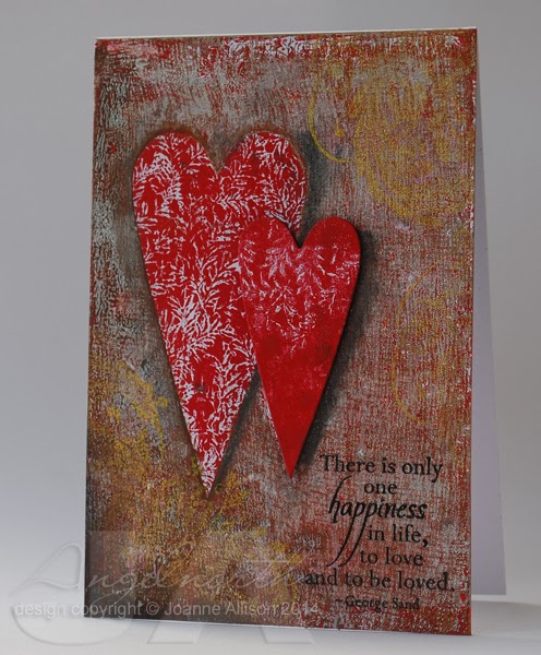
While thinking about mono printing for the current Craft Stamper challenge, I had an idea that might get me round my patterned paper problem - what happens if I incorporate a focal point on the print itself by using masks, I wondered?

This is what happened. I didn't get my masks quite right and ended up adding the small heart as a separate layer cut from another print but it basically worked!

I brayered red paint onto the acrylic block and pressed a background stamp into it then lifted a print. Then I did a layer of burnt umber and burnt sienna textured with plastic canvas and placed my two heart masks on there before pulling the print (I used acetate to cut my masks as it's a bit easier to handle than damp paper!).

Here's where I slipped up - for the final layer (which is white with a smidge of gold, textured with a very open weave, cheesecloth type fabric) I wanted to subdue the background heart by overprinting and leave the foreground one more vivid but I used the wrong mask so the big heart overlapped the small one! To rescue it, I did a second print with the the red paint and stamp (no layering this time) and die cut the smaller heart from that.

The flourish in the corners is stamped with gold ink and shows up differently at different angles (which makes it hard to photograph, sorry!). It's finished with a stamped and heat embossed sentiment, charcoal pencil drop shadows for both hearts and the small heart stuck down with some Pinflair glue gel for a little height.

There's still time to play along in the Craft Stamper challenge to use your acrylic block for some mono printing - you'll find all the details here and we'd love to see you!

Stamps:
Leaves #3 background stamp and sentiment (CHF, retired)
Vintage Flourish (Indigo Blu)

Ink:
Delicata Golden Glitz by Tsukineko, Versamark

Other:
Titanium white, true red, burnt umber, burnt sienna Americana acrylic paints by DecoArt
Dazzling Gold acrylic paint by DecoArt
Charcoal pencil
Detail black embossing powder
Sizzix primitive hearts die
Pinflair glue gel

Tuesday, 11 March 2014

WMS - To Die For


I'm joining in with the Waltzingmouse Stamps Pajama Party for the first time - I finally managed to get things in order to get something made on the right day!

Challenge 1 is "To Die For" - Waltzingmouse has recently added their own Cutting Edge dies alongside the stamps and Claire's challenged us to use them in our creations.

I ended up doing something out of my comfort zone and probably not "typical" of WMS style! I actually intended to make something Christmassy with the lovely Bright Season Lantern die but of course I got distracted along the way - when cutting the lantern from kraft cardstock to use as a template, I noticed the "waste" from the centre of the lantern looked like an elegant vase or plant pot and that set me off in a totally different direction!

I've used a piece of paper that had been used to clean a painty brayer as my background with just a little doodling for a border and some splodgy white dots added through a stencil with a Posca pen (smeared while still wet) at top left.

I cut the top off a second "pot" with some pinking shears and added that as an extra detail, inking all the edges for a bit of depth. The "flower" is a heart cut with the smallest die from the "My Heart" set and coloured with Copic markers. I stamped leaves from Funky Flowers with acrylic paint for a splodgy look, cut them out and added them and a wire stem. Pot, heart and leaves are all stuck on with Pinflair glue gel for some dimension.

The sentiment is all from the Say It Loud set, snipped into individual words and finished with a little more doodling.

If you fancy playing along, you can upload entries for the Pajama Party until midnight tonight and there's a sketch challenge to play with for the rest of the week too - details here.

Supplies:
My Heart and Bright Season Lantern dies (Waltzingmouse Stamps)
Say It Loud and Funky Flowers stamp sets  (Waltzingmouse Stamps)
Acrylic paints
Brilliance Graphite Black ink
Distress Vintage Photo ink
Copic markers
Copic fineliner
Posca white pen
Sequin waste mask (Tando Creative)
Pinking shears
Florist wire 
Pinflair glue gel

Thanks for stopping by!


Friday, 7 March 2014

Experimenting with mono prints!

The Craft Stamper blog challenge has gone monthly so that means it's time for a new one!

This time we're using an acrylic block for mono printing (effectively using the block like a Gelli plate). I've resisted the lure of the Gelli, mostly because I suspected I'd make prints I liked and then my PPP (patterned paper problem) would kick in and I'd have no idea what to do with them.

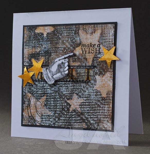
When Trish told us what this month's challenge would be, I decided I'd have a go. Not sure if I set myself up for it but I proved myself right - made prints I liked and then couldn't use them! This is the attempt I'm happiest with.

I used Americana craft acrylic paints on the biggest acrylic block I own. If I remember rightly I did a layer of gold with plastic canvas pressed into it and lifted before taking a print, a layer of burnt umber and black with star masks scattered over and finally a layer of white with a piece of lace pressed in and lifted before taking the print (you can see the large diamond design of the lace as well as the overall texture if you let your eyes relax a bit!).

I've stamped a sentiment in one of the larger stars, some astronomy charts towards the bottom and then stamped and cut out a pointy finger to highlight the sentiment. The gold stars are punched from tomato paste tube metal (with the smaller punch I used when I made masks for the printed layer). A wee snippet of film strip ribbon seemed to tie it all together.

Not very typical for me but it was fun to get painty for a change! It may not be the perfect mono printing surface but the acrylic block made a good play surface if you're anything like me and just fancy a dabble!

Stamps:
Past Times by Hero Arts
Reach for the Stars by CHF (retired)

Other:
Large and small star squeeze punches by Fiskars
Lamp black, burnt umber and titanium white Americana acrylic paints by DecoArt
Dazzlong gold metallic acrylic paint by DecoArt
Tim Holtz Film Strip ribbon
Brilliance ink - Graphite Black
Tomato paste tube metal

As ever, there's the chance of a prize (lovely limited edition paints from PaperArtsy this time!) and of having your card in print in the magazine if you're the winner - we'd love to have you play along! All the details, including the deadline, can be found here.

Monday, 24 February 2014

Atmospherics!

Lydia has set this week's Mixability challenge at Splitcoast Stampers - Through the Mist.

The idea is to clean a painty brayer by rolling on clean cardstock and use the resulting piece as the basis for something.  The brayered prints are often reminiscent of a misty landscape. Lydia's put together a great little video, you can check it out of the SCS thread linked above.

When I watched the video, I kept mentally filling in bare tree shapes on the prints so that's where mine had to go, I'm afraid! I stamped the tree over the brayered base and added a bit of white pen for some moonlight highlights. I smudged a little charcoal pencil along some of those higlights to soften them.

I helped the brayering along just a tiny bit with a pen line under the tree to define the ground a bit more and stamped and white embossed the sentiment. The moon is finger-painted with silver acrylic paint and I added some lowlights with a Copic fine liner once the paint was dry (again smudging with my finger).

I kept the setting really simple, just sticking it slightly offset on the cardbase and running the fineliner round the edge of the panel - I thought the simplicity went with the tranquil feel.

Stamps:
Winter Trees by Stampendous
Scene-it Sentiments by Hobby Art

Paper: smooth white

Other:
Lamp Black Americana acrylic paint by DecoArt
Shimmering Silver metallic acrylic paint by DecoArt
Graphite Black Brilliance ink
Copic fineliner
Posca white pen
Bright white embossing powder by WOW!
Charcoal pencil

Thanks for stopping by!

Wednesday, 19 February 2014

Shabby chic(ish)

This is about as close as I'm likely to get to shabby chic and it just kind of evolved that way. I made the embellishment and then had no end of trouble figuring out how to use it!

If you choose to play along with the DT on the Pan Pastels challenge blog this week, the challenge is to use a stencil to create an embellishment (details here). It sounded like a challenging challenge and I'm up for that so I had a go!

I used a piece of metal from a tomato paste tube, cut with a Cuttlebug die (it started life as a tag but I snipped off the hanging loop as part of the evolution process!). On the back, I drew inside the circles of a sequin waste mask with a knitting needle, flipped it over and squashed the centres of the raised circles and refined it (again with the knitting needle!) to give a sort of rim. The whole lot is stuck to a piece of mount  board and bashed with an embossing stylus for a beaten metal look. I used a bit of Copic ink to colour the centres of the circles and a dot of Glossy Accents for an enamelled finish. So far, so good - I liked the way it turned out.

Then I faffed for a couple of days and nothing looked right. I eventually ended up with this and I'm still not entirely happy but I decided to say enough is enough and call it done!

I used Versamark through the same sequin mask and added Pan Pastel on the card front. Then I added more Versmark and more pastel at the bottom for more solid coverage. The rose has some turquoise Pan Pastel brushed over the edges.

Supplies:
Tomato paste tube
Cuttlebug Tags die
Sequin Waste Mask by Tando Creative
Say It All stamp set by Hero Arts
Delicata Golden Glitz ink by Tsukineko
Copic Various ink (Holiday Blue)
Pan Pastels (Phthalo Green Tint, Turquoise)
Glossy Accents
Vintage Lace Decorative Strip Die by Tim Holtz/Sizzix
Versamark
Rose by Wild Orchid Crafts

Thanks for stopping by!

Friday, 14 February 2014

Can you repeat that?

It's time for a new Take It, Make It challenge on the Craft Stamper blog and this time it's all about repeats! Take a stamp and use it several times over to make your design - it could be a background, a focal point or whatever you can dream up!

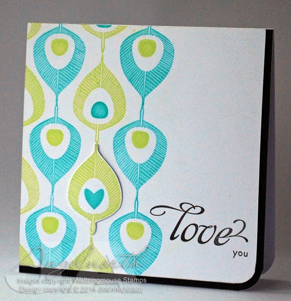
I chose a stylised peacock feather for a lovey-dovey card that could be used for those tricky occasions when hearts and flowers don't seem quite right! The little motif in the centre of the feathers is a separate stamp so I used the "eye" in most and a single heart to go with the love theme. I cut out the feather with the heart and used silicone glue to give it just a tiny bit of height to accentuate it, just sticking it over the one stamped on the base layer.

This is one of those occasions where I'm pleased I have both sizes of Corner Chomper even though it does seem extravagent! Being able to round that corner and have the  white layer "nested" with the black border makes me happier than it should!

Stamps: Funky Feathers and Say It Loud (both Waltzingmouse Stamps)

Paper: Smooth white and black

Ink:
Versamagic by Tsukineko (Key Lime and Turquoise Gem)
Versafine by Tsukineko (Onyx Black)

Other:
Corner Chompers
Silicone glue

Check out the blog for details if you fancy joining the challenge - we'd love to see you and there's a prize of a couple of lovely stamps from Visible Image as well as the chance to see your card published in the magazine if you're the winner!

The challenge is going monthly from March so if you've been used to a two month slot to join in with us, remember you need to get your skates on this time - closing date is midnight on 26th February!

Wednesday, 12 February 2014

Experimental hearts

I had a little play with various bits and pieces today. This week's MixAbility challenge at Splitcoast Stampers calls for the use of hearts (here) and the Pan Pastels challenge blog has another anything goes week with the option to join the DT in using fabric on your project (details here).

Very little stamping on here and more die cuts than I'd usually use! I started with two primitive hearts cut from mount board and lettering to spell the word LOVE (I cut the word twice and stacked the layers for a bit extra depth since Spellbinder dies don't cut thick materials). Then I covered the lot with double sided tape sheet and put fine-weave cotton fabric over it. I ran it through my Big shot with an embossing mat to make sure everything was stuck down well. I'd have liked a few more wrinkles in the fabric but never mind, the texture is still interesting!

Then I went to town with Pan Pastels and a charcoal pencil. The only stamping is some Hero Arts brush strokes stamped in the corners in Versamark and rubbed over with more pastel for slightly more intense colour. I left the edges of the fabric deliberately a bit frayed before sticking it to a card base.

I used my finger to apply the white Pan Pastel over the lettering as it seemed to give me most control.

What I learned - Mod Podge doesn't take Pan Pastel very well (I originally Mod Podged the fabric rather than using sheet adhesive); I love the look of fabric over die cuts; you need to make sure there's a support under the overhang of the second die cut to bring it to the same level as the other one before running it through the Big Shot. I'm also extremely pleased with my new fixative - it's a natural substance (based on casein, the protein found in milk and apparently the fixative preferred by Degas!) and it's in a pump bottle so there's no solvent smell or hazard if you're spraying indoors.

Materials:
Mount board offcuts
White cardstock
White cotton fabric
Primitive Hearts Bigz die by Sizzix
Spellbinders Font One dies
Pan Pastels (Turquoise, Permanent Red, Permanent Red Shade, White)
Charcoal Pencil
Brush Strokes stamps by Hero Arts
Versamark ink
SpectraFix Degas fixative spray

Thanks for stopping by!