Monday, 29 June 2009

Pick your weapon of choice!

Markers? Watercolour pencils? Prismacolors? What's your colouring weapon of choice? I'm a moody type so I don't really have a favourite, I just go with whatever grabs me on the day.

Today is the first day of the CHF Summer Stamp Star contest and the gallery is open for your entries to the colouring challenge - wheeee, we're off!

I decided to show you a watercoloured card in honour of the first challenge. This is July's Stamp of the Month and it's called Harbor Scene.

I used Distress inks as watercolours for this one and kept it absolutely simple so the focus is squarely on the lovely image.

To make a shaped card like this, cut a card base by putting the fold just inside the cutting line at the top of your die (you might need to finish off the cutting job with scissors if the Nestie doesn't go all the way through both layers). Then cut a complete card front and stick it over the top so you get a complete shape rather than one with a missing bit at the top.

Stamps (Cornish Heritage Farms):
Harbor Scene (July Stamp of the Month - releasing 1st July)
Motivational Centers (Mona Lisa Moments Line)

Paper:
Watercolour paper

Ink:
Stazon by Tsukineko (Jet Black)
Various Distress inks used as watercolours plus Adirondack Stonewashed for sky

Other:
Labels One Nestabilites by Spellbinder

If you have CHF stamps and you'd like to play along with the challenges, check out the details by clicking the Sumer Stamp Star "Will it be you?" logo over on the right of my blog. Play all five, not only for the chance of the grand prize but every participant who joins us each week will get a 25% discount code once the challenge is over - worth it if you have a CHF wishlist anything like mine (ahem!)

Thanks for stopping by today, hope your world is a colourful one!

Sunday, 28 June 2009

Spot the well known phrase or saying!

Just a bit of fun, this one! I combined this week's Something Completely Different (object: tag; theme: crowns) and Lots to Do (use Grungeboard) challenges.

My little froggie stamp does actually have a crown and I could have just left the final one as a complete stamping but I fancied something with a bit more dimension so the Grungeboard one seemed perfect! It's coloured with a Krylon pen and has nail art gems (green of course!) at the tips.

The frogs were stamped on green paper, given a little shading with a couple of Copics, the whites of their eyes filled in with an Inkssentials pen and then they were cut out (chopping their crowns off in the process!).

The princely frog also has a little glitteriness courtesy of some Spica pen (green on his eyelids, clear squiggles over his body). He's been given a royal lift so he's above his lowly counterparts, courtesy of some foam pads.

Stamps (Cornish Heritage Farms):
Little Guy (Kim Hughes Collection)

Everyday Petites (Mona Lisa Moments line)

Paper:

Smooth white

Scrapblock Layers (CHF)

Ink:
Adirondack dye ink by Ranger (Espresso)

Tim Holtz Distress by Ranger (Shabby Shutters)


Other:
Copic markers

Inkssentials white pen by Ranger
Copic Spica glitter pens (green and clear)
Grungeboard crown

Nail art gems

Krylon leafing pen (Pale Gold)

Grosgrain ribbon

Embroidery floss
Foam pads


Did you fill out the saying from the visual clues? (You have to kiss a lot of frogs before you find your prince)

Thanks for stopping by!

If you're planning to play the CHF Summer Stamping Star challenges, don't forget the first one launches tomorrow. There's a full week to play though so pick your best shot during the week and upload to the special gallery before next Sunday evening to be in with a chance of the weekly $50 prize! Full details here. Anyone who plays all five challenges will get a 25% discount code to use at the CHF store so it's worth a go, even for challenges you don't feel are your "strong suits" :o)

Wednesday, 24 June 2009

Fleeting dragonflies

Aren't dragonflies spectacular? I love the rare occasions when you actually get to see one and watch it for a while with the light glimmering off its wings.

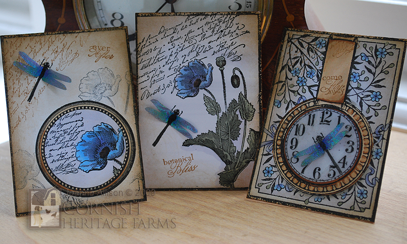
Cornish Heritage Farms recently introduced a new line of art called All Things Considered (ATC). They're perfectly sized for ATCs, as you might expect from the name, but you could use them for all sorts of other things too!

This is a set of ATCs I made with the Botanical Bliss stamps.

I used heat fusible film to make the dragonflies that tie the set together thematically so that the wings have the iridescent shimmer of the real thing. The clock face on the third card was done with the cracked glass technique on a separate circle that was then stuck to the base design. I thought blue poppies would be fun (they really do exist although they're rather rare, I believe).

I used the whole background stamp for the third ATC but for the first and second cards I inked up just the frame of it and used it to give the whole set matching borders.

Stamps:

Botanical Bliss (All Things Considered line at CHF)

Paper:
Smooth white

Ink:
Brilliance by Tsukineko (Graphite Black)
Tim Holtz Distress by Ranger (Vintage Photo)
Versamark by Tsukineko

Other:
Copic markers
Cosmic Shimmer heat fusible film (Blue Lake)
UTEE by Ranger

Thanks for stopping by, hope you liked the project!

Monday, 22 June 2009

Countdown to the Summer Stamping Star contest!

There's just a week to go before the launch of CHF's Summer Stamping Star contest so the DT girls thought we'd have a blog hop to help get you in the mood! We picked a challenge each and had a go ourselves. I picked the One Sheet Wonder (OSW) challenge.

Those of you who know me will probably realise that I have a problem with patterned paper. Not that I don't like it - I look at what other people do with it and it always looks lovely - but even if you give me free run of the latest Basic Grey, Graphic 45 or whoever, I'm almost guaranteed to suffer brain freeze :-/

So, why oh why did I pick the One Sheet Wonder challenge you might be asking. Well, I decided a challenge should be challenging, right?! I've never done a OSW before so I figured I should try it out. I found the first bit easy enough...

Four stamps, two inks and the tiniest touch of Warm Grey 1 Copic - one sheet of patterned paper, yay!

Ack! It's a sheet of patterned paper! Now what?!

I decided to keep it simple and just make a set of multi-purpose cards with a matching box. I drew a few lines on the back of the sheet and chopped it up into a variety of blocks and then paired it up with a strong colour. I decided to keep it simple for a graphic look - just paper, stamps and ink - no fancy embellishments.

I managed eight cards and decoration for a presentation box from my letter sheet. Here they are all together (the teal cardstock really is all the same colour - I was having problems with the sun believe it or not!).

I added "general purpose" sentiments to some of the cards and left the others with no sentiment at all so they could be used just to write a short note or sent for a "no occasion" kind of card.

Here are cards 1 - 4...


...and cards 5 -8

Stamps (Cornish Heritage Farms):
Ornamental Beauty (Rummage Bin line)
Sentiments from various sets

Paper:
Premium weight copy paper
Smooth white
Teal (Prism Papers)

Ink:
Brilliance by Tsukineko (Graphite Black)
Adirondack dye ink by Ranger (Slate)

Other:
Copic marker (Warm Grey 1)
Scor-It
Corner Chomper

Why not take a look and see how the other girls have tackled colouring, paper piecing, resist and scenic stamping? You might even find another One Sheet Wonder! Bek, Jen, Julia, Kristine, Lisa, Sherrie and Lisa are all playing today - have fun!

Thanks for visiting today and if you'd like details of the Summer Stamping Star schedule and rules, you can check those out here.

Tuesday, 16 June 2009

Love in the key of SCD

It's Gez's turn to set the challenge over on Something Completely Different this week so I really couldn't let the week pass without having a go. This month's object is the tag and Gez's theme for the week is "hearts".

I picked up an old book of music in a charity shop (goodwill store for my American friends!) a few weeks ago and thought this would be the perfect project to use a little of it as it gave me the opportunity to pun off the word "key" and although Kathy is the queen of puns I think I may be second in line to the throne ;o) The keys are stamped over the hole in the tag so it looks a bit like they're swinging from the chain and I found the space between the staves was perfect for the sentiment!

My heart is hand cut from some packaging - it had the corrugated texture showing rather than being laminated with another plain sheet which made me save it. I grunged it a little by rubbing some gesso in with my finger. The wire was saved from the 'cage' on a bottle of Rioja, the lace is vintage and the chain is from a broken necklace so all in all I did pretty well on the three Rs here, huh?

Stamps (all Cornish Heritage Farms):
Key Elements (All Things Considered line)
Key Expressions (Mona Lisa Moments line)

Paper:
Vintage sheet music
Recycled packaging

Ink:
Brilliance by Tsukineko (Graphite Black)
Tim Holtz Distress by Ranger (Vintage Photo)

Other:
Vintage lace
Recycled wire
Chain
Nail art gem
Gesso

Thanks for the challenge girls and thanks for stopping by to take a look, hope you liked it! Don't forget to check out CHF's Summer Stamping Star contest if you have CHF stamps to play with!

Friday, 12 June 2009

Aye up, duck - are you the Summer Stamping Star?

There are new Saturday Evening Post releases today and I couldn't resist the pun in the blog post title even if it's one that might need explanation for most! I was brought up in the Midlands region of the UK where the phrase "Aye up, duck!" would translate to something very like "Hello, friend" so the flock of ducks just had to have that sentiment - lol!

I think this is a fun image with the three ducks in detail and the rest just outline sketches. I've watercoloured them and used a green metallic gel pen for their heads. If you scribble on to plastic with the pen, you can use it like watercolour to avoid indentations from the pen nib. It gives a nice sheen and is opaque enough to cover the ink colour of the stamping.

Stamps (all Cornish Heritage Farms):
Flock of Ducks
(Saturday Evening Post line)
Trees backgrounder

Friend Centers (Mona Lisa Moments line)


Paper:

Smooth white

140lb hot press watercolour paper

Ink:
Stazon by Tsukineko (Timber Brown)
Tim Holtz Distress by Ranger (as watercolours - Antique Linen, Vintage Photo, Scattered Straw, Walnut Stain)

Adirondack dye ink by Ranger (As watercolour - Stonewashed)


Other:
Green metallic gel pen

Sewing machine and thread

Now, about this contest...

Summer Stamping Star!
The hunt for a summer stamping star begins on June 29th with a fantastic prize up for grabs - all the CHF stamps released during the month of September and a one month Guest Designer slot on the team, too!

You'll need at least one CHF stamp to be able to participate but other than that you just need lots of imagination! There's a different challenge each week for five weeks with a $50 store credit up for grabs each week for the best project. At the end of the five weeks, anyone who has entered all five challenges will have their projects judged and an overall winner will be chosen on design merit and receive that grand prize - if you keep up with new releases at CHF you'll realise that a whole month's catalogue is a lot of stamps and the variety is second to none! And of course the Design Team are all lovely so a guest slot would be great too ;o)

You can check out all the details of how to participate etc in this post on the Be Creative blog. Hope to see some of you taking part!

Monday, 1 June 2009

Sunset truckin'

I don't know about you but things around here are definitely feeling hot, hot, hot so I decided to go tropical with the truck!

Daring Cardmakers this week asked us to include five of something on our projects. I decided to steer clear of the five flowers and go for something a little more masculine so I've anchored this design with five extra large eyelets. I decided after doing it that they looked kind of like the truck wheels - including the spare! lol!

This is my first Lots to Do challenge entry too - the theme this week is travel and I think truckin' into a tropical sunset should count for that.

I love the graphic lines of this stamp - it looks like a technical or concept drawing and looks great if you just stamp it and don't add any colour or shading at all but here I've given my truck a silver-grey look with a few shades of cool grey Copic marker. The truck was masked while inks were sponged in through an oval negative mask and the horizon lines were stamped.

Stamps:
Keep Truckin' (General Motors line at Cornish Heritage Farms - releasing Tuesday 2nd June)

Paper:
Smooth white

Ink:
Brilliance Graphite Black
Adirondack dye ink by Ranger (Sunshine Yellow, Sunset Orange, Red Pepper)

Other:
Extra large eyelets (We R Memory Keepers, pewter)
Copic markers
Nestabilities by Spellbinder (classic oval)

Thanks for dropping by, hope you enjoyed a little on-screen sunshine!