Another Friday, another challenge from Daring Cardmakers. Shabneez is setting this week's theme and she'd like to see fruit, vegetables or grain on our projects as it's harvest time.
I'm easing myself back in to crafting after a couple of weeks' holiday. I'm never quite satisfied with the first thing I make after a break from my crafty stash but doing a bit of colouring was relaxing so I'll just settle for "hmm, that's OK".
I've combined digi and rubber here and pulled out the kraft cardstock for a rustic base with a bit of scuffing, tearing and wonky piercing done with a tracing wheel.
The kraft means it fits this month's challenge at Power Poppy, too.
Stamps:
Fall Haul digi by Power Poppy
Vintage Flourish by Indigo Blu
Sentiment from old CHF set
Paper: kraft
Ink:
Brilliance by Tsukineko (Pearlescent Chocolate)
Tim Holtz Distress ink by Ranger (Tea Dye)
Other:
Coloured pencils (Prisma and Coloursoft)
White Posca pen
Tracing wheel
Many faith and community groups use their harvest collections these days to boost their local food bank - do consider dropping something off if you possibly can, it will be hugely appreciated.
Thanks for stopping by!
Friday, 29 September 2017
Friday, 8 September 2017
International Literacy Day
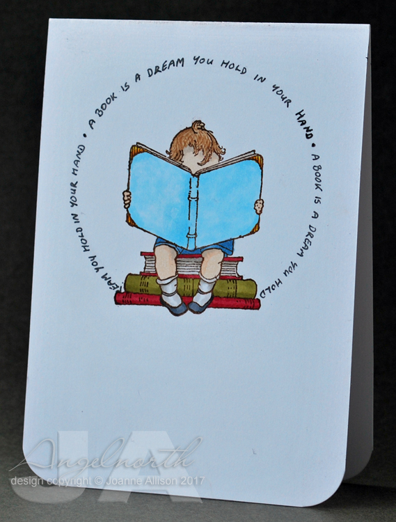
It's International Literacy Day today according to UNESCO - since reading and literacy are close to my heart it seemed the perfect coincidence that it's my turn to set the challenge at Daring Cardmakers. So the challenge is to celebrate the written word - images of books or readers, a favourite literary quote, an author portrait... where will your imagination take you?
I've gone ultra clean and simple with this sweet little image and -eek!- my own handwriting.
The quote is from Neil Gaiman and I've just repeated it to make a circle round the little reader who is, I hope, lost in the world those words are creating.
I'm really happy with the Bristol card I found from a seller on eBay - it's a really good heavy weight for card bases (it's 335gsm) and even the strong shades of Copic marker didn't bleed through so this is a truly one layer card.
Stamps:
Story of Me by Crafty Secrets (no longer with us)
Paper:
Bristol board
Ink:
Adirondack dye ink by Ranger (Espresso)
Other:
Copic markers
Black fineline marker
Corner Chomper
Thanks for stopping by!
I've gone ultra clean and simple with this sweet little image and -eek!- my own handwriting.The quote is from Neil Gaiman and I've just repeated it to make a circle round the little reader who is, I hope, lost in the world those words are creating.
I'm really happy with the Bristol card I found from a seller on eBay - it's a really good heavy weight for card bases (it's 335gsm) and even the strong shades of Copic marker didn't bleed through so this is a truly one layer card.
Stamps:
Story of Me by Crafty Secrets (no longer with us)
Paper:
Bristol board
Ink:
Adirondack dye ink by Ranger (Espresso)
Other:
Copic markers
Black fineline marker
Corner Chomper
Thanks for stopping by!
Labels:
CAS (clean and simple),
copic,
DCM,
olc (one layer card)
Friday, 1 September 2017
September elements
Unbelievably it's September - eek! Kathy has chosen our "elemental inspiration" picture at Daring Cardmakers as it's the first Friday of the month and she found herself unable to resist one last mood board of soft, summery shades. As ever, just choose at least three elements from the picture to kick-start your project.
I'm afraid pastel shades are always difficult for me and I struggled more than usual with this one - the circular file in the craft room saw quite a lot of action!
From the picture, I chose the overall colour palette (making it a bit deeper because, well, pastels!), a frilly flower (I don't have a ranunculus stamp so I went for a poppy instead), the herringbone tiles and a splash of shiny gold.
I raided my scraps folder for bits of cardstock in soft mauve, pink and blue-grey and cut little rectangles to stick onto a chocolate brown base - fiddly but quite satisfying! They're 4x1cm and yes, I really did study the picture to figure out those rectangles were four times as long as wide!
I ended up painting the die cut leaves with acrylic paint because they were already out on my desk but not the right shade of green at all. I could have just cut another out of a different cardstock, I know!
The dots are "waste" circles from various die cuts that were lying about on the desk - I covered them with Zig two-way glue and then added gilding flake before doming them with an embossing stylus. Adding them with glue gel is a good idea as it stops them flattening if you put pressure on them (inevitable if you're posting your card).
Stamps:
Poppycock by Indigo Blu
Sentiment from Say It Loud by Waltzingmouse Stamps (no longer with us)
Paper:
Bristol board
Chocolate brown
Scraps!
Ink:
Brilliance by Tsukineko (Graphite Black and Pearlescent Chocolate)
Other:
Copic markers
Palm Fancy Die by Hero Arts
Acrylic paint
Chariots of Fire Mega Flake by Indigo Blu
Zig two-way glue pen
Pinflair glue gel
Here's the inspiration picture
Thanks for stopping by!
I'm afraid pastel shades are always difficult for me and I struggled more than usual with this one - the circular file in the craft room saw quite a lot of action! From the picture, I chose the overall colour palette (making it a bit deeper because, well, pastels!), a frilly flower (I don't have a ranunculus stamp so I went for a poppy instead), the herringbone tiles and a splash of shiny gold.
I raided my scraps folder for bits of cardstock in soft mauve, pink and blue-grey and cut little rectangles to stick onto a chocolate brown base - fiddly but quite satisfying! They're 4x1cm and yes, I really did study the picture to figure out those rectangles were four times as long as wide!
I ended up painting the die cut leaves with acrylic paint because they were already out on my desk but not the right shade of green at all. I could have just cut another out of a different cardstock, I know!
The dots are "waste" circles from various die cuts that were lying about on the desk - I covered them with Zig two-way glue and then added gilding flake before doming them with an embossing stylus. Adding them with glue gel is a good idea as it stops them flattening if you put pressure on them (inevitable if you're posting your card).
Stamps:
Poppycock by Indigo Blu
Sentiment from Say It Loud by Waltzingmouse Stamps (no longer with us)
Paper:
Bristol board
Chocolate brown
Scraps!
Ink:
Brilliance by Tsukineko (Graphite Black and Pearlescent Chocolate)
Other:
Copic markers
Palm Fancy Die by Hero Arts
Acrylic paint
Chariots of Fire Mega Flake by Indigo Blu
Zig two-way glue pen
Pinflair glue gel
Here's the inspiration picture
Thanks for stopping by!
Labels:
DCM,
die cuts,
feminine,
hero arts,
indigo blu,
rubber stamping
Friday, 25 August 2017
Fast Frankie!
Our challenge today at Daring Cardmakers is "Fast food and coffee to go".
I reckon pizza is perfect food for a party and so this happened!
Fast Food Frankie is a digital image. I printed him on Neenah cardstock (because that will go through my printer OK!) coloured with Copics, cut out and stuck onto an inky background on a DL card. I went dark with the blues to make it look like perhaps night is falling and Frankie is keen to find the party before it's too late!
I'm not sure whether he's pulling a wheelie because he's setting off at speed or whether the weight of all those pizzas is to blame!
Supplies:
Fast Food Frankie by Dr Digi - printed on a laser printer
Neenah cardstock
Copic markers
Posca white paint pen
Tim Holtz Distress inks (Salty Ocean, Blueprint Sketch, Chipped Sapphire)
Triple Thick glaze by DecoArt (on his goggles)
Typeset strip die by Tim Holtz/Sizzix
Fineline black marker
Nail art gems
Pinglair glue gel
Thanks for stopping by!
I reckon pizza is perfect food for a party and so this happened!Fast Food Frankie is a digital image. I printed him on Neenah cardstock (because that will go through my printer OK!) coloured with Copics, cut out and stuck onto an inky background on a DL card. I went dark with the blues to make it look like perhaps night is falling and Frankie is keen to find the party before it's too late!
I'm not sure whether he's pulling a wheelie because he's setting off at speed or whether the weight of all those pizzas is to blame!
Supplies:
Fast Food Frankie by Dr Digi - printed on a laser printer
Neenah cardstock
Copic markers
Posca white paint pen
Tim Holtz Distress inks (Salty Ocean, Blueprint Sketch, Chipped Sapphire)
Triple Thick glaze by DecoArt (on his goggles)
Typeset strip die by Tim Holtz/Sizzix
Fineline black marker
Nail art gems
Pinglair glue gel
Thanks for stopping by!
Labels:
DCM,
digital image,
Male birthday,
masculine
Thursday, 24 August 2017
Summer in the City
I managed to miss last month in the Craft Barn song title challenge so I've tried to be more organised and get it done in plenty of time this month!
This month's song is Summer in the City. I've stuck with my postcard format for this challenge and I seem to be developing a bit of a thing for image transfer!
The background is shaving foam marbling done with alcohol inks in hot colours to go with the theme of the song. Twiggy was the Face of 66, the same year The Lovin' Spoonful had a hit with Summer in the City and I think she'd definitely have been the kind of girl to dance all night. I used one of Andy Skinner's threshold graphics (you can find them all here) and did an image transfer over the background.
The number stamps are already a bit eroded/grungy in style so when they didn't stamp absolutely perfectly first time I decided I liked the way it looked and left it alone. Sadly, the handwritten song title and band name did smudge a little when I added a final coat of satin glaze but I decided they're still legible so I'll grin and bear it - waiting for an image transfer to dry is not my strong point so I didn't want to start again!
Supplies:
Bristol board
Copic reinkers (Cadmium Yellow and Cadmium Orange)
Laser printed image
White acrylic paint
Satin Glaze by DecoArt
Fineline black marker
A & P Number stamps by Ma Vinci's Reliquary (sadly defunct)
Stazon ink (Jet Black)
Thanks for stopping by!
This month's song is Summer in the City. I've stuck with my postcard format for this challenge and I seem to be developing a bit of a thing for image transfer!
The background is shaving foam marbling done with alcohol inks in hot colours to go with the theme of the song. Twiggy was the Face of 66, the same year The Lovin' Spoonful had a hit with Summer in the City and I think she'd definitely have been the kind of girl to dance all night. I used one of Andy Skinner's threshold graphics (you can find them all here) and did an image transfer over the background.
The number stamps are already a bit eroded/grungy in style so when they didn't stamp absolutely perfectly first time I decided I liked the way it looked and left it alone. Sadly, the handwritten song title and band name did smudge a little when I added a final coat of satin glaze but I decided they're still legible so I'll grin and bear it - waiting for an image transfer to dry is not my strong point so I didn't want to start again!
Supplies:
Bristol board
Copic reinkers (Cadmium Yellow and Cadmium Orange)
Laser printed image
White acrylic paint
Satin Glaze by DecoArt
Fineline black marker
A & P Number stamps by Ma Vinci's Reliquary (sadly defunct)
Stazon ink (Jet Black)
Thanks for stopping by!
Friday, 18 August 2017
Action and exciting news!
Kathy has set today's challenge at Daring Cardmakers and she's given us a word prompt: Action! Interpret that any way you choose - an action image, a card with an action element etc.
A quick newsflash first though: I'm excited to have been asked to do a six month tour of duty with the Dirty Dozen (the design team at Splitcoast Stampers). This is my first month and although content is exclusive to SCS fan club members, one of my cards was chosen for the sneak peek artwork so you can see that here if you'd like to!
For the DCM action prompt, I chose to make a yo-yo spinner card, partly because I thought it would be a cute use for the goldfish stamps I bought recently. When you pull the ribbon, the fish swim round in a circle, following each other as they go.
I used this video tutorial as a guide. I found narrow ribbon worked better than string for me, probably because my circle is a bit bigger and the extra surface area of the ribbon creates a bit more "pull" to get it moving.
The background piece was made using the watercolour imprints technique that the lovely Dina demonstrates here - I used various circle dies to make a ring pattern on a piece of watercolour paper with Peacock Feathers Distress ink.
I might try for just a bit more contrast in my ink layering next time but this kind of set is fun for images with areas of fine detail, I think.
Stamps:
Layering Goldfish by Hero Arts
Paper:
Watercolour
Bristol board
Ink:
Adinrondack dye ink by Ranger (Sunset Orange)
Versafine by Tsukineko (Habanero, Onyx Black)
Tim Holtz Distress reinker by Ranger (Peacock Feathers)
Other:
Circle Nestabilities by Spellbinder
Sequins
Ribbon
Fun foam
Acetate
Thanks for stopping by!
A quick newsflash first though: I'm excited to have been asked to do a six month tour of duty with the Dirty Dozen (the design team at Splitcoast Stampers). This is my first month and although content is exclusive to SCS fan club members, one of my cards was chosen for the sneak peek artwork so you can see that here if you'd like to!
For the DCM action prompt, I chose to make a yo-yo spinner card, partly because I thought it would be a cute use for the goldfish stamps I bought recently. When you pull the ribbon, the fish swim round in a circle, following each other as they go.
I used this video tutorial as a guide. I found narrow ribbon worked better than string for me, probably because my circle is a bit bigger and the extra surface area of the ribbon creates a bit more "pull" to get it moving.
The background piece was made using the watercolour imprints technique that the lovely Dina demonstrates here - I used various circle dies to make a ring pattern on a piece of watercolour paper with Peacock Feathers Distress ink.
I might try for just a bit more contrast in my ink layering next time but this kind of set is fun for images with areas of fine detail, I think.
Stamps:
Layering Goldfish by Hero Arts
Paper:
Watercolour
Bristol board
Ink:
Adinrondack dye ink by Ranger (Sunset Orange)
Versafine by Tsukineko (Habanero, Onyx Black)
Tim Holtz Distress reinker by Ranger (Peacock Feathers)
Other:
Circle Nestabilities by Spellbinder
Sequins
Ribbon
Fun foam
Acetate
Thanks for stopping by!
Labels:
DCM,
hero arts,
interactive card,
rubber stamping
Friday, 11 August 2017
Unnatural!
Enfys is setting the challenge this week at Daring Cardmakers and she'd like to see a riot of colour - specifically things in colours they wouldn't have in nature! Pink elephants, purple trees, yellow pigs... you get the picture!
I struggled a bit with this one, every time I thought of a stamp I might use I thought "Hmmm, but that does come in weird colours sometimes". I finally settled on hot pink snowflakes and made my first Christmas card of the year! Silver leafing pen and sequins give it a little festive shine.
It's the first time I've used this die and I have to say that although it's very elegant, I'm not sure I'll be using it much - it was an absolute nightmare to release the wording from the die! I'll try the dryer sheet trick next time and see if that helps.
Stamps:
Grunge Flakes by Tim Holtz/Stampers Anonymous
Paper: Bristol board
Ink:
Tim Holtz Distress ink by Ranger (Picked Raspberry)
Other:
Merry Christmas die from Sara Davies signature collection at Crafter's Companion
Silver Krylon pen
Sequins
Thanks for stopping by!
I struggled a bit with this one, every time I thought of a stamp I might use I thought "Hmmm, but that does come in weird colours sometimes". I finally settled on hot pink snowflakes and made my first Christmas card of the year! Silver leafing pen and sequins give it a little festive shine.
It's the first time I've used this die and I have to say that although it's very elegant, I'm not sure I'll be using it much - it was an absolute nightmare to release the wording from the die! I'll try the dryer sheet trick next time and see if that helps.
Stamps:
Grunge Flakes by Tim Holtz/Stampers Anonymous
Paper: Bristol board
Ink:
Tim Holtz Distress ink by Ranger (Picked Raspberry)
Other:
Merry Christmas die from Sara Davies signature collection at Crafter's Companion
Silver Krylon pen
Sequins
Thanks for stopping by!
Labels:
christmas,
DCM,
die cuts,
rubber stamping
Friday, 4 August 2017
Elements for August
It's the first challenge of August over at Daring Cardmakers and of course that means we have an"elemental" dare - just choose at least three elements from Miri's picture to kickstart your project.
I rebelled against the flamingo trend and chose hibiscus flower, hot pink and turquoise from the color palette and a script style sentiment!
This is a quick and easy card - central panel masked with low tack tape and sponged with inks, splashed with water droplets for some interest and then overstamped with the bold, graphic style hibiscus image. Die cut sentiment and doodled border to finish.
Stamps:
Emerging Hibiscus by Cornish Heritage Farms (no longer with us)
Paper: Bristol board
Ink:
Tim Holtz Distress ink by Ranger (Picked Raspberry)
Adirondack dye ink by Ranger (Pool)
Versafine by Tsukineko (Onyx Black)
Other:
Fine line black marker
Phrases Set 1 by Spellbinder
Low tack tape
Here's the summery picture Miri chose for this month, it would be lovely to see your take on it - the DT cards feature lots of flamingos!
Thanks for stopping by!
I rebelled against the flamingo trend and chose hibiscus flower, hot pink and turquoise from the color palette and a script style sentiment!
This is a quick and easy card - central panel masked with low tack tape and sponged with inks, splashed with water droplets for some interest and then overstamped with the bold, graphic style hibiscus image. Die cut sentiment and doodled border to finish.
Stamps:
Emerging Hibiscus by Cornish Heritage Farms (no longer with us)
Paper: Bristol board
Ink:
Tim Holtz Distress ink by Ranger (Picked Raspberry)
Adirondack dye ink by Ranger (Pool)
Versafine by Tsukineko (Onyx Black)
Other:
Fine line black marker
Phrases Set 1 by Spellbinder
Low tack tape
Here's the summery picture Miri chose for this month, it would be lovely to see your take on it - the DT cards feature lots of flamingos!
Thanks for stopping by!
Labels:
CHF,
DCM,
die cuts,
female birthday,
feminine,
olc (one layer card),
rubber stamping,
spellbinder
Friday, 28 July 2017
Wonderland
It's Svenja's turn to set the challenge over at Daring Cardmakers - the Disney film of Alice in Wonderland celebrates its birthday today so she'd like us to make cards inspired by wonderland or its beloved characters.
I love the original Tenniel illustrations more than the Disney ones. They're old enough I had a hunch they'd be public domain by now so I decided to go down that route. I found this version of the dodo here and had some fun with an image transfer. If you're new to the world of transfer, this video from Andy Skinner is a good introduction to the technique of making areas opaque.
The background is re-inkers on watercolour paper with water droplets and a few circles stenciled in white pigment ink over the top. I didn't decide to stamp the flourishes until after I'd done the image transfer so those are stamped with Stazon as it had to be something that would be OK on the surface that had been coated with satin glaze.
I've absolutely no idea what I'll do with this card but it was fun to make!
Supplies:
Digital image (laser printed)
Cold press watercolour paper
Tim Holtz Distress inks by Ranger (Peacock Feathers, Salty Ocean, Blueprint Sketch)
Adirondack Pigment ink (Snowcap)
Stazon (Teal)
Vintage Flourish stamp by Indigo Blu
Dymo labeller
Font One dies by Spellbinder
Little Stars die (comes with embossing folder) by Marianne Designs
Wink of Stella pen (clear)
White acrylic paint
Satin Glaze by DecoArt
Thanks for stopping by! Do have a look at the ideas from the DT, some of which go to show you don't necessarily need stamps or other "specific" Alice in Wonderland stash to evoke the story!
I love the original Tenniel illustrations more than the Disney ones. They're old enough I had a hunch they'd be public domain by now so I decided to go down that route. I found this version of the dodo here and had some fun with an image transfer. If you're new to the world of transfer, this video from Andy Skinner is a good introduction to the technique of making areas opaque.
The background is re-inkers on watercolour paper with water droplets and a few circles stenciled in white pigment ink over the top. I didn't decide to stamp the flourishes until after I'd done the image transfer so those are stamped with Stazon as it had to be something that would be OK on the surface that had been coated with satin glaze.
I've absolutely no idea what I'll do with this card but it was fun to make!
Supplies:
Digital image (laser printed)
Cold press watercolour paper
Tim Holtz Distress inks by Ranger (Peacock Feathers, Salty Ocean, Blueprint Sketch)
Adirondack Pigment ink (Snowcap)
Stazon (Teal)
Vintage Flourish stamp by Indigo Blu
Dymo labeller
Font One dies by Spellbinder
Little Stars die (comes with embossing folder) by Marianne Designs
Wink of Stella pen (clear)
White acrylic paint
Satin Glaze by DecoArt
Thanks for stopping by! Do have a look at the ideas from the DT, some of which go to show you don't necessarily need stamps or other "specific" Alice in Wonderland stash to evoke the story!
Labels:
DCM,
image transfer,
indigo blu,
mixed media,
rubber stamping
Friday, 21 July 2017
String theory
Kathy has set the challenge over at Daring Cardmakers this week and she'd like us to get tied up - use any sort of string, fibres, yarn etc on our projects.
I needed a baby card and as I didn't have any baby clothes stamps for my first thought of doing a washing line, I took the easy option of just using some white crochet cotton as a bit of an accent.
This bear is super-cute and the photographic detail stamps beautifully.
I was lucky enough to have my name come out of the hat for a challenge at The Craft Barn recently and I chose the Little Stars embossing folder plus as part of my prize - there's a matching die with the folder. I embossed the white section, used die cut stars on the pink for a slightly more scattered look and I have a border of outline stars to use on another project!
Stamps:
Hello Baby Vol 1 by Darkroom Door
Paper:
Bristol board
DCWV textured
Ink:
Brilliance by Tsukineko (Pearlescent Chocolate and Pearlescent Orchid)
Other:
Little Stars embossing folder plus by Marianne Design
Tags dies by Sizzix/Tim Holtz
Crochet cotton
Baby feet charm
Copic marker
Corner Chomper
Thanks for stopping by!
I needed a baby card and as I didn't have any baby clothes stamps for my first thought of doing a washing line, I took the easy option of just using some white crochet cotton as a bit of an accent.
This bear is super-cute and the photographic detail stamps beautifully.
I was lucky enough to have my name come out of the hat for a challenge at The Craft Barn recently and I chose the Little Stars embossing folder plus as part of my prize - there's a matching die with the folder. I embossed the white section, used die cut stars on the pink for a slightly more scattered look and I have a border of outline stars to use on another project!
Stamps:
Hello Baby Vol 1 by Darkroom Door
Paper:
Bristol board
DCWV textured
Ink:
Brilliance by Tsukineko (Pearlescent Chocolate and Pearlescent Orchid)
Other:
Little Stars embossing folder plus by Marianne Design
Tags dies by Sizzix/Tim Holtz
Crochet cotton
Baby feet charm
Copic marker
Corner Chomper
Thanks for stopping by!
Labels:
baby,
darkroom door,
DCM,
embossing,
rubber stamping
Subscribe to:
Posts (Atom)