Showing posts with label tomato paste tube. Show all posts

Thursday, 24 September 2026

A robot celebration

I'm not typically a sticker user but recently the lovely Jo at Dotty Pudding sent me a few to play with, including a couple of cute robots. This week I was struggling to come up with an idea for a friend’s birthday card — remembering that her academic research includes software for robotics at about the time I moved Jo's card to a new spot gave me my eureka moment.

The flow chart elements (computer generated) are a riff on something in one of our friend's research papers (yes, I went looking for extra inspiration!), background elements are a circuit board stamp; Jo’s cute robot is part of a set she got here. He’s raised up a little with some cardstock scraps. 

I used up a few extra stars left over from the tomato paste tube embellishments I cut recently for the Die Cut Divas "recycle" challenge (on this card) so I'm linking up again there. They form part of the celebratory explosion of shiny things (nail art gems being the others).

Stamps: Circuit board backgrounder (Cornish Heritage Farms, no longer with us)

Paper: Cryogen white

Ink: Tim Holtz Distress ink by Ranger (Rusty Hinge)

Other:
Robot sticker
Fineliner
Tomato paste tube metal 
Confetti die (Mama Elephant)
Nail art gems
Computer generated text

Thanks for stopping by!

Monday, 7 September 2026

Recyled rustic reindeer

Christmas Kickstart this month is all about the reindeer with host Jo and guest elf Loll looking forward to some reindeer games filling up the gallery. Meanwhile, the Die Cut Divas are focusing on the three Rs — recycle, reuse, repurpose!

I've combined those two challenges and come up with three Rs of my own — a recycled rustic reindeer! All the die cut parts other than the stars are cut from a board envelope (you know, the ones that come from that global giant online retailer). I wasn't sure the wafer thin dies would go through but it cut perfectly and obviously it posed no problem for the steel rule die used for the banner and laurel wreath.

The gold stars are the other bit of recycling — they're die cut from a tomato paste tube, one of my favourite materials for homemade metallic embellishments.

The reindeer has a strip of card behind the top of his head to push it forward slightly and the antlers are not stuck down at all. I curved the sentiment slightly to match the curve of the banner before stamping, added some stamped plaid tone on tone for an extra rustic touch, then assembled it all.

Stamps:
Plaid Scrapblock stamp (Cornish Heritage Farms, no longer with us)
Sentiment from an old Technique Tuesday stamp set

Ink: 
Tim Holtz Distress ink by Ranger (Vintage Photo)
Memento Luxe ink by Tsukineko (Love Letter)
Adirondack pigment ink by Ranger (Snowcap)

Paper:
Red, ivory and board envelope

Other:
Cool Yule thinlets dies (Tim Holtz/Sizzix)
Regal Crest bigz die (Tim Holtz/Sizzix)
Confetti die (Mama Elephant)
Copic markers
Coloured pencil (pale pink)
Glossy Accents by Ranger
Tomato paste tube metal
White paint pen by Posca

Thanks for stopping by! You can find details of both challenges by clicking the graphics below:


Friday, 16 June 2023

Make it masculine

Dawn is setting our challenge at Daring Cardmakers this week and she’d like to see some more masculine makes.

The Tim Holtz lumber folder makes a good base for a masculine card, I think. I cut an extra “plank” to extend it for the proportions of the card. As there’s a join between each plank in any case, it’s not too difficult to make it look fairly seamless.

I rubbed a Neocolour water soluble crayon over the embossing (keeping it on the folder so it has support underneath is a good idea) and then smudged with a damp finger. 

Simple white die cut foliage tied with a tomato paste dot and a scripty sentiment finish it off. 

Supplies:
Tim Holtz/Sizzix embossing folder (Lumber)
Tim Holtz/Sizzix Wildflower dies
Poppystamps die (Happy Birthday Poe Script)
Neocolour crayons
Bristol board
Kraft card
Brown fineliner
Tomato past tube


Friday, 13 January 2023

New year, new crafty things

Miri is setting our challenge over at Daring Cardmakers today — it's a new year and so she'd like to see something you've not used before on your card. It might be newly acquired, or just something in your stash that you haven’t got round to using yet!

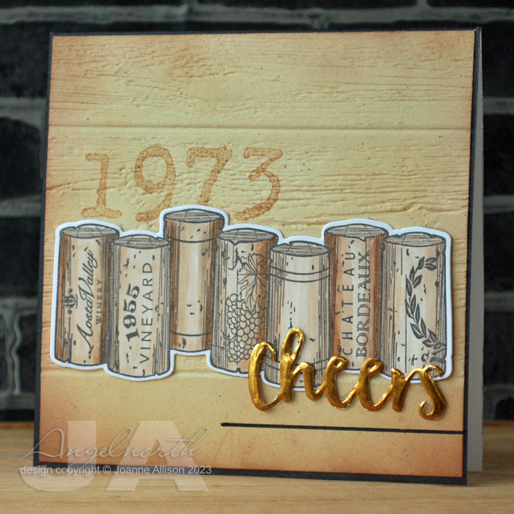
I've used this row of corks stamp before but not the die that coordinates with it. The real "new" element though is the embossing folder - I've seen lots of cards with this Tim Holtz folder and find it hard to resist woodgrain so it made it on to my Christmas wish list and I was lucky enough to find it under the tree! I thought it would make a good wine crate background for the corks. To personalise the card, I stamped the vintage before embossing in the folder. For some reason the camera has made it more prominent than it looks in real life where it’s more of a background element. 

Oh, I used a new square die as well! Perhaps not the most exciting shape but I got a new set for Christmas that gives me bigger squares as well as more options than the Nesties I’ve had for a long time. 

Stamps:
Row of corks (Spellbinder, set with dies)
My Type (Ma Vinci's Reliquary, no longer with us)

Paper:
Bristol board
Ivory flecked

Ink:
Brilliance by Tsukineko (Graphite Black)
Adirondack dye ink by Ranger (Latte, Espresso)

Other:
Lumber embossing folder (Tim Holtz/Sizzix)
Plain square nesting dies (Presscut)
Copic markers
Tomato paste tube
Fineline marker


Friday, 2 September 2022

September elements and link in the chain

A two-in-one post today since the second of the month (reveal day at Card Chain Challenge) coincides with the first Friday (our “elemental” challenge at Daring Cardmakers). 

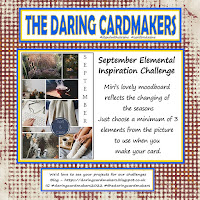
Miri has chosen our DCM mood board for September — as ever, just chose at least three elements to kickstart your project. I chose the surface rings on the puddle, the autumn leaves and a circle. I used Pan Pastels to colour the die cut leaves and added the framing for the circle as an afterthought so it’s drawn on with a fineliner and a Copic marker. The dots are my trusty tomato paste tube and a few tiny nail art gems.

Just realised Die Cut Divas have an autumn theme this time around so I’m linking this card up there, too. 

Stamps:
Sentiment from Say It All (Hero Arts, retired)

Paper:
Bristol board

Ink:
Versafine by Tsukineko (Vintage Sepia)

Other:
Retro circles embossing folder  (Tim Holtz/Sizzix) 
Pan pastels
Circles dies (Spellbinder)
Leaves dies (Impression Obsession)
Stitched rectangles A6 size (Paper Rose)
Tomato paste tube
Nail art gems

My Card Chain Challenge card went to Pat in Texas this time. From the options on offer I chose the theme of fruit and flowers and gave this lovely lemon set its first outing (I have blogged another card with it already but this one was made and sent before that was made). It’s almost my usual one layer card for CCC, just the little blossom is die cut and added over the base layer. 

There’s still time to sign up for the September chain if you fancy it, details here.

Stamps:
Lemon Blossom (The Greetery, plus matching dies)

Paper:
Bristol board

Ink:
Brilliance by Tsukineko (Pearlescent Chocolate)
Various yellow, green and pink inks (I failed to keep note!)

Other:
Copic marker
Nail art gems
Corner Chomper


Thursday, 9 June 2022

Make it Manly

It’s time for a new challenge at Let’s Squash It and I’m delighted to be joining Gail and Jo as guest designer for this one. You can use any embossing folder you like as long as your card is manly! All the details are here.

My hubby is a bit of a wine buff so when I saw this stamp and die set at a bargain price a few months ago I knew I had to get it! Several other family members and friends will likely be seeing it too. There’s a die as well but I actually cut the row of corks out by hand as I wanted to make it shorter by cutting one off the end - it's an easy shape to cut. The word is die cut from tomato paste tube and has come out very shiny on the photo! 

The embossing folder seemed appropriate as I thought the circles might be a bit reminiscent of cork ends and the optical illusion of them bulging in the centre might be an indication of a glass too many!

I find keeping a limited, neutral colour palette is always useful when you’re trying to make a more masculine card.

Stamps:
Wine corks (Spellbinder, stamp and die set)

Paper:
Bristol board and smooth black

Ink:
Brilliance by Tsukineko (Graphite Black)

Other:
Copic markers
3D Circles embossing folder (cArt-US)
Stitched rectangles dies, A6 size (Paper Rose)

Thanks for stopping by - we'd love to see you over at Let's Squash It with some manly makes!


Friday, 29 April 2022

Celebrate

We're celebrating at Daring Cardmakers this week - create a card for any occasion and include the word "celebrate" in your make.

I've combined with the current challenge at Let's Squash It which wants geometric or repeating patterns in our embossing.

I embossed a piece of engraving board (scraperboard when I was a kid!) in an old Spellbinders folder then sanded away the black coating to reveal the copper foil. Some white die cut flowers, a heat embossed sentiment and a little dome made from tomato paste tube metal and call it done.

Supplies:
Bristol board
Birthday (Letter It stamp range by Ranger)
So Trendy (Mbossibilities by Spellbinder)
Wildflower Stems I (Tim Holtz/Sizzix)
Copper engraving board
Versmark by Tsukineko
Detail embossing powder (copper)
Tomato paste tube


Friday, 20 August 2021

Ten green bottles

Ruth is setting the challenge for us at Daring Cardmakers this week and she'd like to see bottles - any sort, any quantity!

I decided to go not only for 10 green bottles but the wall as well! The bottles (eight of them) are all in a row on one stamp but I decided it would be fun to have them a bit more random so I cut them out individually.

The current challenge at Let's Squash It wants us to emboss something other than paper or card to include on our cards so my wall is made of the metal from a tomato paste tube, I painted it with gesso and then wiped back to leave white "mortar" and slightly glamorous bricks! Gel glue is pretty much essential here as the 3D embossing folder leaves such a deeply textured impression you need something that will stick securely despite all the cragginess.

Stamps:
Hot Picks 1109 (Paper Artsy)
Letter It range Birthday (Ranger)

Paper:
Bristol board

Ink:
Adirondack dye ink by Ranger (Pitch Black)
Versafine by Tsukineko (Onyx Black)

Other:
Tomato paste tube
Brickwork 3D embossing folder (Tim Holtz/Sizzix)
Gesso
Copic markers
Pinflair glue gel
Black fineliner

Thanks for stopping by!


Wednesday, 21 April 2021

Nature walk

With the early morning light bathing everything in a soft glow, Molly set off along the woodland path, enjoying the sunbeams slanting through the gently swaying leaves. At the top of the cliffs, a single perfect feather lay across the path, pointing to the beach. Smiling quietly, Molly followed its suggestion, snaking through the dunes. High tide had left a jumble of shells on the sand, each glistening with highlights of gold as the sun climbed higher in the sky. 

Molly’s nature walk was prompted by the current challenge at Let’s Squash It - use at least three embossing folders and a person. She enjoyed the peace and quiet, just the sounds of surf and gulls!

For some reason the Pumice Stone ink has come out looking rather blotchy in the photo, it’s much smoother in real life, honest!

Stamps:
Molly (Beeswax Stamps)
Landscape sentiments (HobbyCraft)

Paper:
Bristol board
Strathmore toned grey

Ink:
Hero Arts Shadow ink (Soft Granite)
Tim Holtz Distress ink by Ranger (Pumice Stone)
Versafine by Tsukineko (Onyx Black)

Other:
Fallen Leaves embossing folder (Sizzix)
Shell Beauty embossing folder (Spellbinder)
Feather Duo die/embossing folder (Tim Holtz/Sizzix)
Tomato paste tube 
Enchanted gold wax (Cosmic Shimmer)

Thanks for joining me and Molly on our nature walk! If you fancy rising to the challenge and dusting off multiple folders, here's the challenge link


Friday, 22 March 2019

Recycle it

The lovely Svenja is setting our challenge this week at Daring Cardmakers and she'd like us to do a bit of recycling. It could be a failed project that you've given a makeover to turn it into something fabulous or it could be bits and pieces you rescue from the recyle bin and put to good crafty use.

I used three bits of "recylcing" here: a magazine page to make a print using a gel plate, my sentiment word is cut from a piece of tomato paste tube and I used a "stencil" that is actually a piece of plastic that came on a computer keyboard as a protector while in transit.

If you have a gel plate and haven't played with the magazine transfer technique it's a fun thing to do - this video is a good introduction if you want to have a play! Premium weight copy paper seems to make a good surface to pull prints and it's not expensive so it doesn't feel too awful if something doesn't work!

I used a white pencil to add some gentle highlighting and a charcoal pencil for some grounding shadows.

This is for a friend with whom we enjoy the odd wine tasting!

Supplies:
Page from Decanter magazine
Gelli plate
Acrylic paints (black, yellow green, turquoise)
White pencil
Charcoal pencil
Happy Stamp n Cut (Hero Arts)
Tomato paste tube
Keyboard “stencil”
Tim Holtz Distress ink (Mowed Grass) 
Versafine by Tsukineko (Onyx Black)
Black Copic marker
Corner chomper

Thanks for stopping by!

Friday, 14 December 2018

Snow

The theme at Daring Cardmakers this week is snow - a few flakes, a blizzard, a snowman or peaceful snowy landscape - anything as long as it features snow!

I've gone retro with a bit of recyling thrown in for good measure (tomato paste tube metal is great for embossing and makes lovely metal embellishment dots if you dome out circles with a stylus). I’ve used an embossing folder that suggests swirls and some die cut flakes to finish.

Supplies:
Metal from a tomato paste tube
Retro Circles embossing folder
Gesso
Snowflake die (Waltzingmouse stamps, no longer with us)
Brilliance ink by Tsukineko (Pearlescent Chocolate)
Memento Luxe ink by Tsukineko (Love Letter)
Crop a Dile and small circle punch
Pinflair glue gel
White and chocolate brown card stock


Thanks for stopping by!

Friday, 3 August 2018

August Elements

It's the first Friday of a new month so that means an elemental challenge over at Daring Cardmakers. It's my turn to provide the inspiration picture this month - you'll find it at the end of this post if you haven't arrived from the DCM blog.

I chose lemon slice, raised and self-coloured writing (inspired by the tonic bottle), gold accents and bubbles.

I thought this would be a fun card for a G&T-drinking friend!

The lemon slice is from a bundle of vintage botanical images I got from a seller on Etsy. They'd be ideal for vintage work as they're "raw" scans from very old books so they have background colour but you can do some digital clean-up or get the scissors out and use them for collage etc. At under £4 for over 500 images I decided it was worth a punt!

I printed the slice and coloured it with Copic markers and a white paint pen, cut it out and popped it up slightly. Gold lines are done freehand with a glue pen and covered in MegaFlake once tacky. The gold "bubbles" are metal from a tomato paste tube, punched out with the two sides of my Crop-a-Dile. Rest the circles on some craft foam and dome with a stylus for cheap and cheerful embellishments!

Supplies:

Vintage printable (Botanicals from Etsy seller)
Happy Stamp & Cut and part sentiment from Essential Messages (Hero Arts)
Copic markers
White paint pen by Posca
Wink of Stella pen (clear)
Metal from tomato paste tube
Flitter Glu and Chariot of Fire Mega Flake (Indigo Blu)
Sakura Quickie glue pen
Pinflair glue gel
Corner Chomper

Here's our inspiration picture this month.

Thanks for stopping by!

Friday, 6 April 2018

April elements

It's the first Friday of another new month and Kathy is setting our "elemental" challenge over at Daring Cardmakers - just choose at least three elements from the inspiration picture to kickstart your project.

I chose the colours, an embossed white feather, overlapping rectangles of different sizes, gold accents (some metal dots, some doodled gel pen) and a white script style sentiment.

The smaller rectangles are made with an acrylic block tapped onto a blue ink pad and spritzed with water before pressing it onto the card base.

Stamps:
My Island (mine is the original Waltzingmouse Stamps set, the same is now available from Gina K)
Happy Stamp & Cut by Hero Arts (die cut sentiment as well)

Paper:
Bristol board

Ink:
Shadow Ink by Hero Arts (Mint Julep)
Tim Holtz Distress ink by Ranger (Chipped Sapphire)

Other:
Tom Holtz/Sizzix Feather duo die/folder
Circles punched from tomato paste tube metal
Gold gel pen
Pinflair glue gel
Corner Chomper

Here's the inspiration picture - we'd love to have you play along!


Thanks for stopping by!

Friday, 31 March 2017

Grocer Jack?

Enfys is setting today's dare over at Daring Cardmakers and she's asking us to use packaging from a grocery item in our makes.

I used a bit of card from a box that held lasagne sheets to stamp the main image.

Thankfully I'd decided to use the MISTI so that I could paint the face and collar and then stamp again so the detail wasn't obscured. I say thankfully because (as I should have anticipated) the card was coated which meant it took several goes to get decent coverage on areas like his hat. Brilliance ink is great though - it will dry on a slick surface, no problem.

A couple of grocery extras round this out - my age-old trick of using tomato paste tubes gave me the frame (embossed in a folder and swiped with black acrylic paint). I also stuck some textured foil from the inner seal of a pot of spreadable cheese onto a scrap of card and punched out the star. A wee bit of "aging" with the paint brought out the texture nicely - might be more obvious on the detail photo.

A snippet of film ribbon and the "scrap" from between strips of stickers on a Tim Holtz "industrial" sheet finish it off.

The song "Grocer Jack" (proper name "Excerpt from a teenage opera", I believe) started running through my head as I edited the photos for this - who knows, maybe this gentleman really was!

Stamps:
Dashing Gents by Darkroom Door

Ink:
Brilliance by Tsukineko (Graphite Black)
Tim Holtz Distress ink by Ranger (Vintage Photo)

Paper:
Smooth white
"Kraft" from a lasagne box

Other:
Tomato paste tube
Foil seal from pot of spreadable cheese 
Diamonds embossing folder (Sizzix/Basic Grey)
Star punch (Fiskars)
Rectangle Nestabilities (Spellbinder)
Filmstrip ribbon (Tim Holtz)
Scrap from Industrious stickers (Tim Holtz)
White acrylic paint 

Thanks for stopping by!

Saturday, 22 March 2014

Passage of time

Another slightly messier style card from me today - I did balance out a bit with a wide border though! This is a 6" square card and the mixed media panel is 4" square in the middle.

I've combined this week's Splitcoast Stampers Mixability challenge (use book print on your project) with the current Pan Pastel UK Challenge blog challenge to use three textures.

I used modelling paste with some plastic canvas. Once it was dry, I stamped the time sentiment with Versamark and used  Pan Pastel to colour over the paste and the stamping.

My second texture is the part circle cut from gold mountboard and dry embossed and the third is the star which is punched from tomato paste tube and beaten up with an embossing stylus then coloured with a Copic marker for a more copper tone. I used the same marker to make some neutral sequins and tiny pearls look coppery, too.

My French primer text came from the pack of paper ephemera I bought ages ago from a local trader who makes them up by putting together pages from books that are beyond hope in terms of being sold whole.

Stamps:
Clocks 3 by PaperArtsy
Essential Messages by Hero Arts

Paper: white and bitter chocolate

Ink: Versamark and Versafine Vintage Sepia

Other:
Maimeri Light Modelling Paste
Tomato paste tube metal
Fiskars squeeze punch - star
Uber embossing folder
Watch face
Sequins
Nail art pearls
Pan Pastel - Burnt Sienna Shade
Old book page
Scor-It board
Corner Chomper

Thanks for stopping by!


Friday, 7 March 2014

Experimenting with mono prints!

The Craft Stamper blog challenge has gone monthly so that means it's time for a new one!

This time we're using an acrylic block for mono printing (effectively using the block like a Gelli plate). I've resisted the lure of the Gelli, mostly because I suspected I'd make prints I liked and then my PPP (patterned paper problem) would kick in and I'd have no idea what to do with them.

When Trish told us what this month's challenge would be, I decided I'd have a go. Not sure if I set myself up for it but I proved myself right - made prints I liked and then couldn't use them! This is the attempt I'm happiest with.

I used Americana craft acrylic paints on the biggest acrylic block I own. If I remember rightly I did a layer of gold with plastic canvas pressed into it and lifted before taking a print, a layer of burnt umber and black with star masks scattered over and finally a layer of white with a piece of lace pressed in and lifted before taking the print (you can see the large diamond design of the lace as well as the overall texture if you let your eyes relax a bit!).

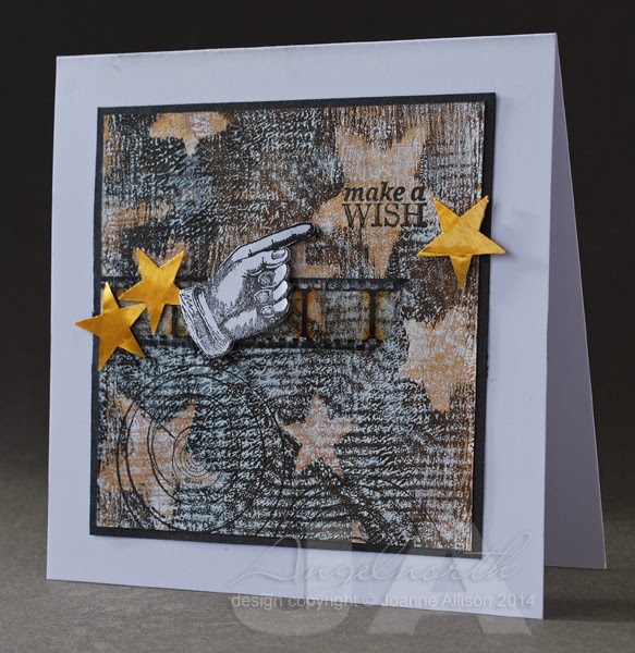
I've stamped a sentiment in one of the larger stars, some astronomy charts towards the bottom and then stamped and cut out a pointy finger to highlight the sentiment. The gold stars are punched from tomato paste tube metal (with the smaller punch I used when I made masks for the printed layer). A wee snippet of film strip ribbon seemed to tie it all together.

Not very typical for me but it was fun to get painty for a change! It may not be the perfect mono printing surface but the acrylic block made a good play surface if you're anything like me and just fancy a dabble!

Stamps:
Past Times by Hero Arts
Reach for the Stars by CHF (retired)

Other:
Large and small star squeeze punches by Fiskars
Lamp black, burnt umber and titanium white Americana acrylic paints by DecoArt
Dazzlong gold metallic acrylic paint by DecoArt
Tim Holtz Film Strip ribbon
Brilliance ink - Graphite Black
Tomato paste tube metal

As ever, there's the chance of a prize (lovely limited edition paints from PaperArtsy this time!) and of having your card in print in the magazine if you're the winner - we'd love to have you play along! All the details, including the deadline, can be found here.

Wednesday, 19 February 2014

Shabby chic(ish)

This is about as close as I'm likely to get to shabby chic and it just kind of evolved that way. I made the embellishment and then had no end of trouble figuring out how to use it!

If you choose to play along with the DT on the Pan Pastels challenge blog this week, the challenge is to use a stencil to create an embellishment (details here). It sounded like a challenging challenge and I'm up for that so I had a go!

I used a piece of metal from a tomato paste tube, cut with a Cuttlebug die (it started life as a tag but I snipped off the hanging loop as part of the evolution process!). On the back, I drew inside the circles of a sequin waste mask with a knitting needle, flipped it over and squashed the centres of the raised circles and refined it (again with the knitting needle!) to give a sort of rim. The whole lot is stuck to a piece of mount  board and bashed with an embossing stylus for a beaten metal look. I used a bit of Copic ink to colour the centres of the circles and a dot of Glossy Accents for an enamelled finish. So far, so good - I liked the way it turned out.

Then I faffed for a couple of days and nothing looked right. I eventually ended up with this and I'm still not entirely happy but I decided to say enough is enough and call it done!

I used Versamark through the same sequin mask and added Pan Pastel on the card front. Then I added more Versmark and more pastel at the bottom for more solid coverage. The rose has some turquoise Pan Pastel brushed over the edges.

Supplies:
Tomato paste tube
Cuttlebug Tags die
Sequin Waste Mask by Tando Creative
Say It All stamp set by Hero Arts
Delicata Golden Glitz ink by Tsukineko
Copic Various ink (Holiday Blue)
Pan Pastels (Phthalo Green Tint, Turquoise)
Glossy Accents
Vintage Lace Decorative Strip Die by Tim Holtz/Sizzix
Versamark
Rose by Wild Orchid Crafts

Thanks for stopping by!

Thursday, 17 March 2011

Golden Santa

I've combined a couple of challenges today - Hazel's Christmas challenge this week is to "go for gold" and I used the sketch from Splitcoast Stampers' regular Wednesday challenge. I did a mirror image of the sketch provided as my Santa needed to face into the card to look right.

My background piece was made by sponging ink onto milky white cardstock and then dragging the edge of an old credit card over an ink pad and onto the panel. I used some variegated metal leaf to make a random frame round the Santa image and rubbed some Rub n Buff wax over it to blend the colours a little and make it a bit more subtly golden rather than very bright in-your-face metallic! As it is, the golden splodge combined with the glitter framing made it very difficult to get a decent photograph.

The sentiment is embossed with white powder onto a piece of metal from a tomato paste tube cut with a Spellbinder die and aged with a Copic marker and a little more Rub n Buff.

I was aiming for a bit random and worn with the glittered border but I'm not sure that it doesn't just look a bit slapdash- ah well!

Stamps:
Noel 2 (Paperartsy)
Sentiment from Season's Greetings (Technique Tuesday)

Paper:
Cryogen White

Ink:
Adirondack by Ranger (Espresso)
Distress ink by Ranger (Vintage Photo)
Versamark by Tsukineko

Other:
Detail white embossing powder
Rub n Buff by Amaco (Gold Leaf)
Copic markers (Santa is slightly tinted with Eggshell, Pale Cherry Pink and Warm Grey 1)
Easy Metal by Eberhard Faber
Tomato paste tube
Fancy labels dies by Spellbinder
Sewing machine and thread
Spica glitter pen (red and green)
Fine gold glitter


Thanks for stopping by!

Thursday, 5 March 2009

Make a Wish

Over on the Bubbly Funk forum, Karen has decided we need to be challenged out of our pure papercraft zone! The first challenge is to alter a tin. I scratched my head for a while as I didn't fancy tackling the great big tin that had amaretti biscuits in it last Christmas and then remembered I'd bought a little candle in a tin in Poundstretcher a while ago, intending to turn it into a little Christmas gift but didn't get round to it.

I'm going to start here with "things I have learned about tomato paste". I made a card last week using a tomato paste tube and uploaded it to Splitcoaststampers. I was feeling quite pleased with myself as I remembered to call in "tomato paste" rather than the more typically British term "tomato puree". Little did I realise that its name was the least of the differences!

Tomato paste in the US typically comes in cans so most people had no clue what I'd used. I did a little research and apparently some Italian grocery stores stock it in tubes and I even tracked it down on Amazon.com in the "gourmet foods" section - so, if you're reading this in North America and want to get your hands on this stuff, you now know where to try! It's much less wasteful than a can if you're cooking for small numbers, BTW - just pop the top back on and put it in the fridge for next time.

So, all that was by way of telling you that I used a tomato paste tube here! Just snip the top and bottom off your empty tube with kitchen scissors then slit up one side. Flatten it out and wash it and you're ready to go. I have yet to meet a tube that was not a rich gold colour inside - the acid from the tomatoes apparently oxidises the metal and turns it that colour. The circle for the lid here is cut with a Nestie and the whole lot is embossed and then sponged with Stazon which is then polished off the high spots. It's all glued down with Bostick.

I stamped a plain Prima hydrangea with a script stamp and sponged the edges with Vintage Photo ink.

Stamps (Cornish Heritage Farms):
Spanish Script backgrounder
Birthday Centers

Ink:
Stazon by Tsukineko (Timber Brown)
Tim Holtz Distress by Ranger (Vintage Photo)

Other:
Candle tin
Tomato paste tube

Cuttlebug Embossing folder (Textile Texture)
Hydrangea by Prima Marketing
Vintage button
Classic Circle Nestabilities by Spellbinder
Linen thread


If you're blowing out a candle today, don't forget to make a wish! Thanks for stopping by!