Showing posts with label masculine. Show all posts

Monday, 20 July 2026

Summertime

It seems to have been Christmas for some time on the blog so I thought I should try to change gear! This month’s challenge at We Love Stamping has a focus on summer. As it’s the classic season for travel, I’ve gone that way as I needed a birthday card for someone who does quite a lot of travelling.

It’s personalised by having a destination hand written on the ticket. I hope he gets to fly in something a bit more comfortable than an open bi-plane, though! 

I used torn paper to create fluffy clouds in my blue summer sky, masking all the various elements first (including the edges masked with low tack tape). I would probably have added some colour to the globe but hubby liked it without and as he requested the card I went with leaving it black and white. The ticket has just a touch of pencil colouring and there’s a drop shadow added to the globe with a marker.

Stamps:
Vintage Transport (Tanda Stamps, no longer with us)
Be Happy Today (Hero Arts, retired I think)
Travel (Crafty Secrets, no longer with us)

Paper:
Bristol board

Ink:
Brilliance by Tsukineko (Graphite Black)
Tim Holtz Distress ink by Ranger (Salty Ocean, Blueprint Sketch)

Other:
Coloured pencils
Grey Copic
Fineliner 

Thanks for stopping by!


Thursday, 18 June 2026

Rustic Pear

I made a card this morning (well, I say this morning - it took so long I actually finished it after lunch) using lots of die cuts. I may share that soon if I can convince myself I like it! As an antidote, I felt the need to return to my "stampy stamper" roots so I combined a couple of challenges for a rustic "just because" card.

Lost Coast Designs is asking for Fruit, Flowers and Foliage this month and Retro Rubber's Taste of Summer challenge has a fruit theme so those two played nicely together. As my ripe pear still has leaves attached I guess I can count both fruit and foliage for LCD!

I stamped the pear (one of my very early stamp purchases, grey unmounted rubber from an unknown maker), masked it and then stamped the Perspective Floor as a sort of tablecloth grounding. Everything is coloured with pencils and it's finished with a simple sentiment and my usual rounded corner.

Stamps:
Pear (unknown maker, I've had it since 2007)
Perspective Floor (Lost Coast Designs, had mine since 2023)
Sentiment from Petite Posies (Technique Tuesday, no longer with us, 2011)

Paper: kraft

Ink: 
Versafine by Tsukineko (Vintage Sepia)
Brilliance by Tsukineko (Pearlescent Chocolate)

Other:
Coloured pencils
Corner Chomper  

Thanks for stopping by!


Thursday, 26 March 2026

What’s new pussycat?

I needed a new home card and this happened. It really did just go its own way! I initially stencilled the background and added the die cut lettering to make a masculine-looking card and intended to leave it at that. I did use two shades of Copic on the lettering for a slightly ombre effect as I liked the way it looked on a Christmas card I made a while back (here). 

The card just didn’t look finished though so I went on the hunt for something to put bottom left as I thought that would help. I thought something like a lamp or a house plant would be ideal but couldn’t find anything suitable. While flicking through a basket of stamps in what felt like an increasingly forlorn hope, this chap presented himself and seemed pretty determined to have his time in the spotlight. Much better!

He’s stamped on the card base and then stamped again and fussy cut to stick over the top. His whiskers and fuzzy furry bits stay looking intact that way! I changed his facial expression with just a couple of very small pen strokes so he’s a bit happier-looking. He has been a bit mischievous though. Can you spot the boo-boo?*

Stamps:
Ignace, Les Gros Chats (Katzelkraft, no longer with us)

Paper:
Bristol board 

Ink:
Brilliance by Tsukineko (Graphite Black)

Other:
Copic markers
Posca paint pen (white)
Bricks stencil (I think it’s Dutch Dubadoo)
Black fineliner
Alphanumeric Classic Lower dies (Tim Holtz/Sizzix)

* I managed to stick the O on upside down. By the time I realised the glue had set pretty firmly so I decided to just live with it, I’m guessing it will go unnoticed but I can always blame it on the cat!

Thanks for stopping by!

Friday, 18 October 2024

Wheely good fun

I'm setting today's challenge at Daring Cardmakers— we’re having wheely good fun this week, featuring anything with wheels on our projects.

I’m still separated from my craft supplies so this is something I made earlier in the year. I hadn’t used my Copics in ages so I pulled out some shades of red and grey and went bright on this old CHF stamp (had to be car-themed to tie in with the gift of a driving experience!). Personalised registration plate is lettered with a fineliner and I did a little bit of masking so the car is coming out of the frame. 

Stamps:
Chevy Camaro Front View (CHF, no longer with us)
A&P
Numbers (Ma Vinci’s Reliquary, no longer with us)
Essential Messages (Hero Arts, retired)

Paper:
Bristol board 

Ink:
Tim Holtz Distress ink by Ranger (various blues)
Brilliance by Tsukineko (Graphite Black)

Other:
Time Tunnel Stencil (Visible Image)
Copic markers
Fineliner

Thanks for stopping by!

Friday, 12 July 2024

Cheers!

It's my turn to set our challenge at Daring Cardmakers and we’re raising our glasses to our shared hobby this week. Cocktail, mocktail, beer or orange juice — show us what you’re drinking!

My hubby is somewhat of a wine buff so this is the card I made for his birthday.   It’s one layer, no frills which is pretty much how all the men I make cards for like their cards!

Stamps:
Wine Corks (Spellbinder)
Ink Splats (Visible Image)
Celebrate (Letter It range by Ranger)
Essential Messages (Hero Arts)

Paper:
Bristol

Ink:
Adirondack dye ink by Ranger (Espresso, Cranberry)
Versafine by Tsukineko (Onyx Black)

Other:
Copic markers
Charcoal pencil
Corner Chomper

Thanks for stopping by!

Friday, 17 May 2024

M is for...

Rizwana is setting today's challenge at Daring Cardmakers and we’re focusing on the letter M.

I have Meerkats coloured with Markers on a Masculine card. I picked up these Katzelkraft stamps on eBay a while back (most of them unused), who can resist a cheeky meerkat?!

The recipient plays for a football team who have a red and black strip so I made appropriate “scarf stripes” with markers along the base of the card. The dancing meerkat has a chalk halo because it was a quick and easy way to add some colour there.

Stamps:
Surikats (Katzelkraft)
Celebrate (Letter It line by Ranger)

Paper:
Bristol board 

Ink:
Adirondack by Ranger (Espresso)
Versafine by Tsukineko (Onyx Black)

Other:
Copic markers

Thanks for stopping by!

Let's hear it for the boys!

Shabneez is setting our challenge over at Daring Cardmakers this week and she'd like to see some ideas for masculine cards.

I’ve gone for a teen boy card. He’s a guitar player (got his Grade 7 a few months back) and likes a bit of classic rock. It’s a one layer card, achieved with masking and reverse masking so the guitar could be stamped as a design on the shirt with ink blending and stencilling for the background. 

Stamps:
Nothing to Wear and Rock Out (Visible Image)
Say It All (Hero Arts, retired)

Paper:
Bristol board

Ink:
Tim Holtz Distress ink by Ranger (various blues)
Hero Arts Shadow ink (Charcoal)
Brilliance by Tsukineko (Graphite Black)

Other:
Copic markers
Corner Chomper
Play Guitar Stencil (Visible Image)

Thanks for stopping by!

Friday, 20 October 2023

Spell it out

Nat is setting our challenge at Daring Cardmakers this week — she'd like to see us use alphabet dies or stamps to spell out a sentiment.

I made this to congratulate my nephew on his GCSE results, using an old alphabet stamp set in a font style that contrasted nicely with the big numbers. The little fill-in numbers tie in with his mathematical interests.  

I masked the strip for the sentiment with a piece of low tack tape, stamped numbers to reflect the grades he achieved, added some background stamping and brushed on a bit of ink before removing the tape and stamping the sentiment. I added just a tiny bit of shading to the lettering with a Copic and defined the edge of the strip with a doodled line.

Stamps:
Journal Letters (Hero Arts)
A&P Numbers (Ma Vinci's Reliquary, no longer with us)
Numbers (Katzelkraft)

Paper:

Bristol board

Ink:
Tim Holtz Distress ink by Ranger (Peacock Feathers, Salty Ocean, Blueprint Sketch)
Brilliance by Tsukineko (Graphite Black)

Other:
Fineliner
Copic marker

Friday, 13 October 2023

Fun and Games

It’s my turn to set the challenge at Daring Cardmakers this week and I'd like to challenge you to a game — indoor games, outdoor games, whatever sort of game you like!

I chose chess and used another of the Katzelkraft bargains I scored a while ago. I picked this set because hubby and eldest grandson sometimes play chess when they get together — the tables have turned and grandad’s experience doesn’t always mean he wins these days! 

This needed to go airmail so my preferred one-layer aesthetic was perfect, a bit of masking to place the pieces on the board and protect them from the inks (smooshed on with acetate), a doodled border and a few glossy dots keep it all light and flat. 

Stamps:
King’s Gambit (Katzelkraft)
Essential Messages (Hero Arts, retired)

Paper:
Bristol board

Ink:
Shadow Ink by Hero Arts (Charcoal and Soft Granite)
Versafine by Tsukineko (Onyx Black)
Tim Holtz Distress and Oxide ink by Ranger (various blues, I lost track)

Other:
Pearl pen by Viva Decor (Anthracite)
Fineliner

Thanks for stopping by. 

Friday, 16 June 2023

Make it masculine

Dawn is setting our challenge at Daring Cardmakers this week and she’d like to see some more masculine makes.

The Tim Holtz lumber folder makes a good base for a masculine card, I think. I cut an extra “plank” to extend it for the proportions of the card. As there’s a join between each plank in any case, it’s not too difficult to make it look fairly seamless.

I rubbed a Neocolour water soluble crayon over the embossing (keeping it on the folder so it has support underneath is a good idea) and then smudged with a damp finger. 

Simple white die cut foliage tied with a tomato paste dot and a scripty sentiment finish it off. 

Supplies:
Tim Holtz/Sizzix embossing folder (Lumber)
Tim Holtz/Sizzix Wildflower dies
Poppystamps die (Happy Birthday Poe Script)
Neocolour crayons
Bristol board
Kraft card
Brown fineliner
Tomato past tube


Friday, 10 February 2023

All loved up

As Valentine’s Day is almost upon us, Dawn has set us a challenge with the theme of "all loved up" at Daring Cardmakers this week. 

I’ve gone for hearts and made a fairly masculine card. I’ve also tied in with a couple of other challenges — Lost Coast Designs where the theme is love and hearts along with stamping and Die Cut Divas who would like to see some gold along with using your die cutter. 

I was lucky enough to have my name come out of the LCD challenge hat recently and chose the fabulous Perspective Floor stamp as part of my prize. Of course, being me the first thing I did was something other than use it as a floor! I’ve stamped in a vertical orientation, turned and matched up the pattern (there’s actually a stamp in the LCD catalogue that would do the job for you — it’s called Fourth Dimension — but I’m never one for making things easy for myself, am I?!).

I haven’t used these primitive hearts for ages so it was nice to revisit those. The design sort of evolved a bit, I messed up what I originally planned for the smaller heart and then remembered the Die Cut Divas challenge and covered it all up with gold leafing! I used a two way glue pen and deliberately tried to introduce some texture. It's very shiny and reflective and difficult to photograph!

Stamps:
Perspective Floor  (Lost Coast Designs)
Everyday Petites (Cornish Heritage Farms, no longer with us)

Paper:
Bristol board

Ink:
Versafine by Tsukineko (Onyx Black)
Tim Holtz Distress ink by Ranger (Barn Door, Fired Brick)

Other:
Mega Flake by Indigo Blu (Chariot of Fire)
Zig two way glue pen
Primitive Hearts Bigz die (Sizzix)
Stitched rectangles dies A6 size (Paper Rose)
Fineliner


Friday, 17 June 2022

Life's a beach

Miri is setting our challenge at Daring Cardmakers this week — Life's a beach. Sea, sand, flip flops, surf boards, palm trees or a bucket and spade — what do you associate with the beach?

I made a masculine card with one of my all-time favourite stamp sets, some card that made me think of sand and a die cut net. 

The shells have the tiniest touch of sparkle, courtesy of Spica glitter pen.

Stamps:
Antique Engravings (Hero Arts, retired)
Father’s Day Centers (Cornish Heritage Farms, no longer with us)

Paper:
Bristol board
Kraft selection pack

Ink:
Brilliance by Tsukineko (Pearlescent Chocolate)

Other:
Copic markers
Spica glitter pens (gold and turquoise)
Stitched rectangle dies
Netting die cut
Gel glue

Thanks for stopping by!

Friday, 10 June 2022

Pearls of widsom

It's my turn to set the challenge at Daring Cardmakers and as one of June’s birth stones is pearl I thought we’d take our inspiration from all things pearly.

I started with a piece of pearlescent cardstock in a pale silvery grey, embossed and sprayed it with some ink and then polished some of that off the high spots of the embossing. 

I decided I wanted to stamp a sentiment round the curve of the shell which was a bit fiddly but made possible with the MISTI. I couldn’t get it quite as dark as I wanted though so I ended up going over it (very carefully) with a very fine marker.

I gave the whole thing a bit extra pearliness by adding some dots in different sizes along the bottom with a pearl pen and finished by drawing a wonky frame round the square with a metallic pencil. 

I’m guest designing with Let’s Squash It for the month of June and took inspiration from the challenge there too — hop over to see what it is! The sample I made in advance is here.

Supplies:
Shell Beauty embossing folder (Spellbinder)
Pearlescent silver and black cardstock
Adirondack dye ink spray (Stream)
Brilliance by Tsukineko (Graphite Black)
Sentiment stamp from Seaside set (Crafty Secrets, no longer with us)
Viva Decor pearl pen (Ice White)
Fineline marker
Metallic pencil (Lyra)

Thanks for stopping by!


Thursday, 9 June 2022

Make it Manly

It’s time for a new challenge at Let’s Squash It and I’m delighted to be joining Gail and Jo as guest designer for this one. You can use any embossing folder you like as long as your card is manly! All the details are here.

My hubby is a bit of a wine buff so when I saw this stamp and die set at a bargain price a few months ago I knew I had to get it! Several other family members and friends will likely be seeing it too. There’s a die as well but I actually cut the row of corks out by hand as I wanted to make it shorter by cutting one off the end - it's an easy shape to cut. The word is die cut from tomato paste tube and has come out very shiny on the photo! 

The embossing folder seemed appropriate as I thought the circles might be a bit reminiscent of cork ends and the optical illusion of them bulging in the centre might be an indication of a glass too many!

I find keeping a limited, neutral colour palette is always useful when you’re trying to make a more masculine card.

Stamps:
Wine corks (Spellbinder, stamp and die set)

Paper:
Bristol board and smooth black

Ink:
Brilliance by Tsukineko (Graphite Black)

Other:
Copic markers
3D Circles embossing folder (cArt-US)
Stitched rectangles dies, A6 size (Paper Rose)

Thanks for stopping by - we'd love to see you over at Let's Squash It with some manly makes!


Friday, 21 January 2022

Think of a number

Over at Daring Cardmakers this week, Kathy is asking us to think of a number - it could be a big number for a birthday or anniversary, a background of numbers, even a number shaped card.

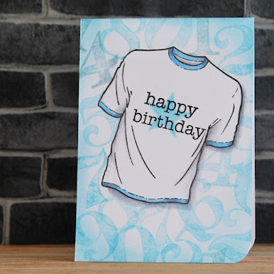
I opted to combine with the current challenge at Lost Coast Designs which is sending us to the Man Cave and made a one layer masculine card - suitable for one of those pesky in-betweeners!

I stamped and masked the T-shirt and then stamped numbers randomly to make a background. A sentiment and star on the shirt and a tiny bit of Copic colouring, some ink brused around the edges of the card and call it done. I don't know about you but I find most of the men (and boys) I send cards to tend to like them plain!

Stamps:
Nothing to Wear (Visible Image)
A&P Numbers (Ma Vinci's Reliquary, no longer with us)
Essential Messages (Hero Arts, retired)

Paper:
Bristol board

Ink:
Brilliance by Tsukineko (Graphite Black)
Tim Holtz Distress ink by Ranger (Tumbled Glass, Speckled Egg)

Other:
Copic markers
Corner Chomper

Thanks for stopping by!


Wednesday, 22 September 2021

Got your number

The current challenge at Let’s Squash It wants us to use an embossing folder featuring numbers or letters and then sand the embossed surface. 

I went back to an offcut of the heavyweight disposable aluminium platter I used for the last challenge, embossed a square of it in the part of the folder that has numbers (and the Roman numerals on the clock face, too) then painted it with gesso.  Once it was dry, I added drops of alcohol ink in various greens and blues and spread them into all the nooks and crannies. More drying time and then bring out the sanding block to expose the silver metal of the high spots. 

I did a bit of stamping on the card base, messed up the sentiment and so added a separate strip to cover the booboo. Finished with some Enamel Accents dots and I have a masculine birthday card to add to the stash.

Stamps:
Numbers border (Kaisercraft)
Essential Messages (Hero Arts, retired)

Paper:
Bristol board

Ink:
Versafine by Tsukineko (Onyx Black)

Other:
Aluminium platter
Patchwork embossing folder (Tim Holtz/Sizzix)
Gesso
Alcohol inks
Black Enamel Accents by Ranger
Black fineliner
Corner Chomp
er 

Thanks for stopping by!


Wednesday, 25 August 2021

Fearless and powerful

I’d been meaning to play along with the current challenge at Lost Coast Designs which is asking us to feature a human face. A couple of projects got started but ended up in the circular file. Then Gail, who facilitated me getting him as part of my recent prize when my name came out of the hat on a Lost Coast challenge, suggested using Frankie. It was an idea I’d already considered but got no further with, but something about her suggestion made this idea emerge and refuse to go away. 

I guess some might argue that Frankenstein’s monster is not human (I’m sure Mary Shelley would approve of the philosophical debate arising from that) but I think it’s easily countered in this case by arguing that it’s Boris Karloff playing Frankenstein’s monster in any case. Of course the English Literature graduate in me balks slightly at the fact the stamp is called “Frankenstein” but others might use the word “pedant”!

Let’s Squash It is currently asking us to emboss something other than paper or card and I decided to combine challenges by putting Frankie on a backdrop made from a thick aluminium tray (the sort you might get to serve food at a big party - remember those? Your local pound shop probably has the trays if you’re in the UK). I dabbed a thin coat of black acrylic paint on there and wiped back over the high spots to bring out the design. As the novel has unease at industrialisation as an underlying theme, I thought this folder would be appropriate. 

The quote is actually from the novel, done with a Dymo label maker. 

ETA - I've corrected an earlier "oops"  where I stuck the words down in the wrong order, changing the meaning entirely. Why don't you see these things until you're looking at a photo of the finished project?! Apologies to Shelley and to the monster (and to you if you saw an image with an incorrect quote!). I'm afraid that means there's now sun glare off one corner but I'm happier to live with that!

Stamps:
Frankenstein (Carmen’s Veranda)

Paper:
Bristol board

Ink:
Brilliance by Tsukineko  (Graphite Black)

Other:
Aluminium tray
Uber embossing folder (Couture Creations)
Black acrylic paint
Copic markers
White paint pen by Posca
Pinflair glue gel
Dymo label maker


Thanks for stopping by!


Friday, 20 August 2021

Ten green bottles

Ruth is setting the challenge for us at Daring Cardmakers this week and she'd like to see bottles - any sort, any quantity!

I decided to go not only for 10 green bottles but the wall as well! The bottles (eight of them) are all in a row on one stamp but I decided it would be fun to have them a bit more random so I cut them out individually.

The current challenge at Let's Squash It wants us to emboss something other than paper or card to include on our cards so my wall is made of the metal from a tomato paste tube, I painted it with gesso and then wiped back to leave white "mortar" and slightly glamorous bricks! Gel glue is pretty much essential here as the 3D embossing folder leaves such a deeply textured impression you need something that will stick securely despite all the cragginess.

Stamps:
Hot Picks 1109 (Paper Artsy)
Letter It range Birthday (Ranger)

Paper:
Bristol board

Ink:
Adirondack dye ink by Ranger (Pitch Black)
Versafine by Tsukineko (Onyx Black)

Other:
Tomato paste tube
Brickwork 3D embossing folder (Tim Holtz/Sizzix)
Gesso
Copic markers
Pinflair glue gel
Black fineliner

Thanks for stopping by!


Friday, 30 April 2021

Vellum

Dawn has set the challenge for us at Daring Cardmakers this week. She says she finds vellum tricky to work with so she'd like to see some ideas.

My instinct with vellum is to go for soft and pretty so I decided to challenge myself a bit extra and see if I could do something more masculine. I ended up using it as an overlay to tone down a busy background to make more of a feature of a sentiment. 

I couldn't actually find my vellum so I used a sheet of heavyweight tracing paper - this is some that has draughstman's markings on it so I kept that part as a sort of base line for my piece.

The age old question of how to attach vellum is solved here by wrapping it round the panel and sticking to the back . I also added a few dots of glue and then used black enamel dots to hide those spots.

The background has been in my scraps box for years - it was part of a masterboard for resist techniques but I stand little chance of remembering what was on it - spray inks, acrylic paint, white embossing powder and gesso at a guess! 

Stamps:
Numbers border (Kaisercraft)
Birthday (Letter It range by Ranger)
Essential Message (Hero Arts)

Paper:
Bristol board
Black
Mixed media piece from scraps box
Heavyweight tracing paper

Ink:
Brilliance by Tsukieko (Graphite Black)

Other:
Pearl pen by Viva Decor (Anthracite)

Thanks for stopping by!

Friday, 26 March 2021

Say it loud

Nat has set our challenge over at Daring Cardmakers today and she’d like to see words take centre stage - oversized, mixed fonts, negative die cuts, just choose a way to make the words the focal point of your design. 

I opted for a subtle image in the background with a bold word on top for a card with a masculine feel. I added some grounding with a regular pencil, a few pearl dots and some white highlights on the lettering just to accentuate it a bit more.  

Stamps:
Birthday (Letter It range by Ranger)
Champagne Celebration (Crafters Companion)

Paper:
Bristol board

Strathmore toned grey

Ink:
Shadow ink by Hero Arts (Soft Granite)
Versafine by Tsukineko (Onyx Black)

Other:
Stitched rectangle dies A6 size (Paper Rose)
Black fineliner
Pearl pen by Viva Decor (Ice White)
White paint pen by Posca

Thanks for stopping by!