Showing posts with label gift. Show all posts

Saturday, 31 January 2026

Coffee companion

Kathy commented on the tea fairy card I made recently asking about the possibility of a coffee fairy. Tee-Hee was keen to prove her credentials as an accommodating sort (but points out she’s actually a pixie). As Kathy’s been doing battle with a nasty lurgy recently, I figured an easy cuppa might be just the job so Tee-Hee got her way and upped the level of caffeination!

Coffee bags are not something I’ve tried but thinking about whether they existed (they do, there’s one in this card in the same way there was a tea bag in the tea card) triggered the memory of little individual “over cup” filters in the first place I ever worked. Those had what was essentially a big round coffee bag in the base of a filter basket that sat on top of a cup — you filled the basket and let the coffee drip through. Totally wasteful plastic-wise but I guess every person got freshly brewed coffee. My 14 year old waitress self didn’t really appreciate the faff though!

The cup is the bottom one from a stacked tower. That meant I couldn’t do this as a genuine one layer card as it’s pretty much impossible to stamp that one cup so I fussy cut and stuck it in place.

I’ll add this to the January Lost Coast Designs challenge as my final entry this month.

Stamps:
TeeHee HLP (Lost Coast Designs)
Coffee and Tea (Crafty Secrets, no longer with us)
Tea time (I think that's what it's called)(Crafter's Companion)

Paper:
Bristol board 

Ink:
Brilliance by Tsukineko (Graphite Black)

Other:
Copic markers
Coloured pencils
Wink of Stella pen
Gift card dies (Waltzingmouse Stamps, no longer with us)
Corner Chomper


Friday, 27 November 2020

Boxes and bags

The theme in this week's Christmas countdown over at Daring Cardmakers is “boxes and bags” - make something to present a gift in.

I hope Kathy will forgive a slight stretching of the brief - I used a little tin and prettied it up with some paper crafting supplies. The tin originally contained travel sweets and came from a car showroom as a freebie. Die cutting a circle to exactly the right size hides the car branding quite nicely!

I'm afraid my camera battery died just as I needed to take my last minute photos so I had to made do with my phone - apologies for the photo quality!

I made a coordinating card as well so I’m playing again at Let’s Squash It. The challenge is totally to blame for this embossing folder in any case - I saw it on a couple of earlier entries and thought it looked lovely and then found it on a well known auction site for under three quid. Since you can pay that much for a single greeting card I decided I could justify buying it!


Stamps:
Festive Foliage, Compliments of the Season and Noel (all Waltzingmouse Stamps, no longer with us)

Paper:
Bristol board

Ink:
Brilliance by Tsukineko (Pearlescent Chocolate)
Tim Holtz Distress Oxide by Ranger  (Evergreen Bough
)

Other:
Pine Needles embossing folder by Richard Garay
Circle Nestability by Spellbinder
Stitched rectangle dies A6 size by Paper Rose
Corner Chomper 


Friday, 8 August 2014

Paperbabe summer blog hop!

Welcome to  the Paperbabe Stamps Summer Blog Hop featuring new stamps... Kim is Paperbabe's owner and designer and she's invited some of her stampy friends to play with some new stamp designs!

The new release includes "Folk Fabrique", "Doll Face", "Mayleedee Little Red", "Mayleedee Frost Fairy" and "Dillon Frost Sprite" which are available at Etsy and the WebShop.

Be sure to stop by PAPERBABE if you are just beginning the hop to see the endless possibilities with these new stamps and to leave your comments along the way... as there are some fabby prizes to be had! To celebrate there will be the ENTIRE release and a very special not yet released rubber stamp up for grabs to a very lucky winner! 

I've been playing with the lovely Folk Fabrique set and have three projects to share with you - all quite different from each other!

First up, of course I had to make a card. I experimented with stamping the peacock outline in a light coloured ink and then stamping the more solid coloured shapes. I liked the result but then hit on an even "cleaner" way to use the outline - I stamped in black on a sheet of paper and then put it on a lightbox with my cardstock over the top. Hey presto - visible outline to guide the solid stamps but no actual marks on the cardstock! Of course, I did my own thing a bit, extending some of the tail feathers and adding an extra little flourish at the side. Thats one of the beauties of stamps like these - infinite possibilities!

I used a Spica glitter pen to add the lighter turquoise colours so there's some sparkle, too.

The elegant little sprigs looked perfect for a bit of faux cloisonne to me so my second project is a pendant made with three layers of black UTEE, Perfect Pearls in Sour Apple and Blue Raspberry and a bit of gold ink. I finished off with a layer of Triple Thick (I find it better that Glossy Accents over an embossing enamel surface).

The base is a simple chipboard shape cut with a steel rule die and hole punched with a Crop-a- Dile. Scrap mountboard is perfect for this kind of thing and can often be obtained very cheaply or even for nothing if you catch your local framing shop in the right mood - just ask if they have any spare offcuts.

And finally I couldn't resist taking the name of the set at face value and stamping on fabric. Lots of the stamps in the set lend themselves to pattern building - I chose the lotus flower and made a lavendar bag (it could just as easily be a little gift bag though - you could make a faux cloisonne pendant and pop it inside!). 

I used a Memento marker to shade the inner part of each petal just slightly and finished with a row of gold dimensional paint dots across the middle row.

From here, the next stop along the way is the talented Kim Dellow.  

If you didn't "begin at the beginning" and you'd like to see what everyone else has been up to, here's where you want to be to follow the hop:

Kim Costello
Chris (DT)
Kerrie (DT)
Lady (DT)  
Delphine (DT)
Jackie (DT)  
Sandie 
Katy  
Joanne (you are here!)  
Kim Dellow
Tricia  
Paperbabe Stamps 

Thanks for joining us! Winners will be announced on the Paperbabe Blog on the 15th when the newest challenge will also be starting! You have until the 13th to hop along leaving comments for the chance to win!

Sunday, 1 December 2013

Notecards

I made some notecard sets for last week's sale at the new village hall...

There are six cards in each pack (two fish, two seahorse and two scallop shell) with a variety of sentiments on the front so they'd make a good selection for people to dip in to whenever the need arose. I thought they'd make nice little gifts and indeed, a lady who who was about to pay for one set then said "Oooh, I'll have two more sets I think, they'd make lovely gifts" without any prompting from me!

These are simply stamped with just a hint of Copic colouring on the images (very pale and very light-handed so there's no bleed-through on the single layer cards). I die cut a square in a piece of acetate to use as a mask and sponged on the ink for a block of colour. Acetate's great for this as it means you can see exactly where you're positioning the mask's aperture in relation to the image and the edges of the card.

I sold enough stuff that I was able to put just over £40 (my profits) into the village hall fund which was good. The fair seemed busy most of the day, with Santa's grotto doing a particularly brisk trade!

Stamps:
Under the Sea by Darkroom Door (fish and seahorse)
Antique Engravings by Hero Arts (scallop shell)
Say It All by Hero Arts (mixed sentiments)

Paper: Smooth white

Ink:
Pearlescent Chocolate Brilliance by Tsukineko
Blue-toned dye inks (Distess Salty Ocean, Adirondack Stonewashed and Pool if I remember rightly)

Other:
Copic markers (Eggshell and Cool Grey 1)
Cello bags and sheer ribbon for packaging

Wednesday, 13 November 2013

Magnetic

We have a brand new village hall for our community and at the end of the month we're having our first ever craft fair. I've agreed to do some bits and pieces for a friend's stall and these fridge magnet sets are the first things I've made.

Click any photo to enbiggan!
I used glass cabochons and various paper ephemera cut with a circle die and stuck with Glossy Accents. I tidied up the backs with some acrylic paint and strong magnets were epoxied on once everything was dry.

An out of date road atlas provided plenty of options for the map-based sets - I've gone local for three of them (Tynedale, Northumberland castles and coast and Newcastle upon Tyne) and done a London set as well.

A local business sells paper packs made up of pages salvaged from books that are past being sold as complete items (because of damaged bindings, kids' crayon scribbles etc). I used sheet music from one of those packs for two sets.

You might recognise the patterns on the other sets in this photo if you look carefully - they're the insides of "security" envelopes (the sort that contain bank statements etc - the patterns stop people reading through the envelope). I managed to find five different patterns for these. I think these were my hubby's favourites!

And finally I did a couple of cartoon sets. Denis the Menace came from the same ephemera pack as the sheet music and I had a Doctor Who magazine lying around that came from a charity shop so the cartoon strip from that got used here.

Packaging posed a bit of a challenge until I hit on the idea of cutting strips from the lids of soup tins and sandwiching them inside some cardstck - hey presto, magnets will stick no problem! I think they'd make nice little stocking filler gifts.

Profits from anything I sell will be going in to the village hall fund, it's such a great resource for the community to have that I  think a little support as it gets going is in order!

Thanks for stopping by!

Tuesday, 3 April 2012

Inspired by Klimt

Our challenge for March over on UKStampers is to take inspiration from a modern (fairly abstract) painter and alter something.

I've altered a chipboard domino to make a pendant inspired by Gustav Klimt. I didn't look at a particular work of his, I just worked on my association of him with rich green and gold and fluid curved lines.

I didn't have black UTEE which is the ideal for this "faux cloisonne" technique so I used three coats of clear with black pigment ink and then a coat of black detail embossing powder just to make sure! The final surface is coated with Versamark and dusted with a couple of colours of Perfect Pearls, reheated to melt before pressing the stamp into the soft surface.

Once it was cool, I used a Versamark pen and added a little more Perfect Pearls to a few circles. I gave the whole thing a couple of coats of Klear floor polish to give it some sheen. This is take two - the first one had a coat of Glossy Accents on it which I left to dry overnight. This morning it was cloudy in the middle and had deep splits in three or four places - I guess it didn't like the non-porous surface!

The edges and the back are finished with gold acrylic paint and I rounded the corners with the ⅛th inch Corner Chomper.

Stamps: Bubble Border (Lost Coast Designs)
Paper: Chipboard domino by Tando Creative
Ink: Brilliance by Tsukineko (Graphite Black)
Other:
Clear UTEE by Ranger
Detail black embossing powder
Perfect Pearls by Ranger (Forever Green and Sunflower Sparkle)
Gold acrylic paint
Versamark pen and fine paint brush
Corner Chomper
Klear floor polish
Jewellery findings


Thanks for stopping by!

Wednesday, 7 March 2012

Seeds of Friendship

I've been playing with some delightful Chocolate Baroque florals - you can see my guest post on the CB Design Team blog here.

I used a computer generated seed packet "framework" along with the stamp. Glenda has made a pdf of the packet available to download, you'll find the link in the blog post if you'd like a quick starting point to make something similar - it's free and includes some instructions for putting the project together.

Here's the inside of the project, an insert with a fold at the bottom that slips into the stamped sleeve. You can stamp a sentiment or handwrite a message to the recipient (or both!) on this. The ribbon through the top keeps it closed as well as looking pretty.

Mine has an actual packet of flower seeds inside as a little gift but you could use it for any small, flat gift item (jewellery, for example, or it would make a good way to dress up a garden centre gift voucher).

Stamps: The Rose Tree (Chocolate Baroque)

Paper: Smooth white

Ink:
Adirondack by Ranger (Espresso)
Jenni Bowlin by Ranger (Soap Powder)

Other:
Copic markers
Prismacolor pencils
Computer and printer
Silk ribbon
Circle punch


Thanks for stopping by - do take a look at the Chocolate Baroque Design Team Blog if you get chance, there's lots of inspiration there!

Friday, 9 December 2011

White Christmas

Glenda Waterworth is hosting a "white Christmas" challenge on her blog with a great prize up for grabs. For each entry to the challenge, she's adding £1 value to a gift voucher to spend on Chocolate Baroque stamps - check out the blog for full details here.

I was in the mood to play with some polymer clay so I've taken a completely left-field approach here and made something white to give as a Christmas gift - hope that's within the spirit of the challenge!

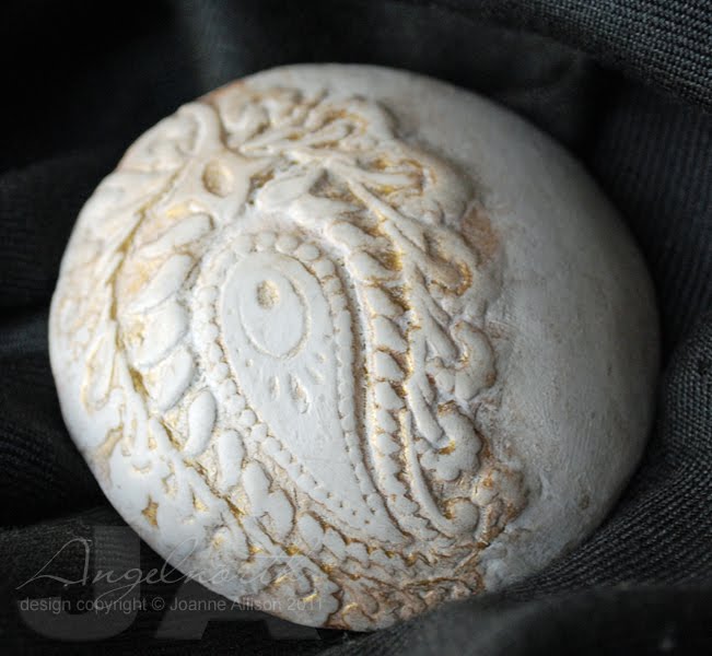
I had some fun trying out something new with this - making a mould from a stamp to get an "outy" rather than an "inny" on my finished piece. When you press a stamp into polymer clay you get depressions where you would have ink if you stamped on paper. With this technique, you press the stamp into some scrap clay and bake it and then use that to make the textured impression on your finished piece. I pressed mine into white clay, cut it out with a cookie cutter and then baked it over a dud lightbulb to get a dished shape on the finished piece. You need to add a little "platform" of clay inside so that there's a flat surface if you want to add a brooch back when you do this but you could also make a hole and use it as a pendant piece if you wanted.

I spritzed some Glimmer Mist on and let it pool in the crevices. I think the finished piece has a bit the look of something you'd see on ornate plasterwork ceilings!

Materials:
Nature's Paisley stamp set (Chocolate Baroque)
Sculpey Premo polymer clay
Glimmer mist (Antique Brass)
Clay tools (acrylic roller, cookie cutter)
Brooch back


There's nearly a week left to have a play if you fancy joining in with the White Christmas challenge - remember the more players there are, the bigger the prize pot for the random draw! Details here.

Thanks for stopping by!

Tuesday, 18 October 2011

Sweet bee

It's my turn to host the challenge in the Crafty Secrets member forum over at Splitcoast Stampers. I'm asking people to go back to their ABCs - in stamper language that means Anything But a Card.

I made this little vintagey lavender sachet, stamped with the branches and bee and a touch of colour added with Copics. Cotton curtain lining makes a good base to stamp on for this kind of thing - close woven and smooth but inexpensive.

My experience has been that Copics don't stand up well to washing but for this kind of project that won't be washed, it's a quick and convenient way of adding colour. You do need a light touch though as the ink tends to travel along the fibres of the fabric.

I added some vintage lace, mother of pearl button and a seam binding hanging loop to finish it off.

Stamps: Queen Bee (Crafty Secrets)

Ink: Versacraft by Tsukineko (black)

Other:
Cotton fabric
Copic markers
Vintage lace
Vintage button
Seam binding
Lavender


Thanks for stopping by!

Wednesday, 20 April 2011

Make an impression!

Carol and I decided to dry emboss our Tando chipboard for our technique pieces this week. Do pop over to the Tando blog to see what Carol has made too!

I have two projects to share with you, a little jewellery piece one at one end of the size spectrum and a notebook at the other!

The domino pieces are a nice scale for jewellery, being 1" x 2". I put this one in the Cuttlebug Jamara folder, lining it up against the bit of the design I wanted before I closed the folder and ran it through the Big Shot. I ran it through a couple of times for good measure but you don't need to do anything special to get a good embossed impression.

I coated the piece with Rub n Buff and then with acrylic paint to accentuate the design. I wiped most of the paint off and then dabbed a little more RnB over the high spots.

The bail to thread the chain through is, believe it or not, a piece from a video cassette! I dismantled an old one a while ago to see if there were any "useful" bits and pieces in there. A little Krylon pen to key the surface and then a little RnB to match the pendant et voila! If you wanted it silver it would be good to go with no effort at all.

Materials:
Domino chipboard by Tando Creative

Jamara embossing folder

Rub n Buff by Amaco (Gold Leaf)

Acrylic paint (Raw Umber)

Divided tube from an old video cassette

Krylon pen (Pale Gold)


At 7" x 5" the notebook is less detailed but lots of fun to work with! As it's bigger than the embossing folder I turned the folder sideways to emboss the top part then turned the whole lot around and embossed the bottom part. Adding a band across the design hides the "join" in the embossed areas.

I then used a technique I saw a while ago on somebody's blog but I'm afraid I can't remember whose - let me know if it was you and I can pop a link in!

Wax pastels are soft enough that they lay colour down really easily on the raised part of the embossing. I used several shades of blue and green for this. You then add gesso over the whole surface and leave it to dry thoroughly. Gently sanding back the gesso exposes the colour and gives a shabby, weathered effect. I sprayed mine with some matt sealant to make sure the colour wouldn't rub off and the notebook would stand up to being handled.

I covered a piece of cardstock and a Dymo strip with aluminium tape, "tarnished" it with some black acrylic paint and stamped a fountain pen before adding a couple of screw head brads that have been in my stash forever!

I don't have anything like a Bind it All or Cinch, for the few projects I do that would need it it's not worth either the expense or the storage space. For something like this, I just punch holes with a Crop a Dile and use a coil from an old notebook (use the covers of the old book to line up where to punch holes in your new cover).

Materials:
Chipboard sheet from Tando Creative
Tim Holtz Texture Fade (Retro Circles)
Wax pastels
Gesso
Dymo
Aluminium tape
Black acrylic paint
Pen from On the Desk stamp set (CHF, retired)
Stazon by Tsukineko (Jet Black)
Screw head brads
Krylon Matt spray sealant


Thanks for stopping by!

Wednesday, 23 June 2010

A promising tutorial...

My turn to post a tutorial over on the CHF Be Creative blog this week. I've used the Haute Couture stamp set to create a little booklet full of "coupons" that the recipient can trade in for treats (a dozen freshly baked muffins, a night of babysitting etc).

Hop on over if you'd like the full step-by-step on how I put it together - {here}.

Stamps (Cornish Heritage Farms)
Haute Couture (All Things Considered line - if you are shopping in the UK, Bubbly Funk has this set in stock {here})

Paper:
Simply Smooth white
Simply Linen Black
Copy paper

Ink:
Versafine by Tsukineko (Onyx Black)
Tim Holtz Distress by Ranger (Weathered Wood)

Other:
Silver mini brads by Making Memories
Scor It
Crop-a-Dile


Thanks for stopping by!

Tuesday, 9 February 2010

Spring Song

Perhaps it's because I have always been an avid reader but as soon as I saw this stamp I thought "Perfect bookmark!". I guess it's just the proportions of the image.

I decided to go with the delicacy of the image by using inks as watercolours to give a soft and subtle look to the colouring. I'm a great reader of fiction, I really don't get on with biographies etc, and what is fiction but dreams, really?

This really doesn't take a lot of time or materials so I think it would make a nice little gift for things like teacher thank yous. You could even slip one inside a book you were giving as a gift to make it even more personal.

Stamps (Cornish Heritage Farms):
Spring Song (February Stamp of the Month)
Motivational Centers (Mona Lisa Moments line)

Paper:
140lb hot press watercolor paper
Simply Heavy Black (CHF)

Ink:
Stazon by Tsukineko (Timber Brown)
Various Tim Holtz Distress inks by Ranger (as watercolors)

Other:
Sewing machine and thread


Thanks for stopping by!

Sunday, 29 November 2009

Soak away the ills!

It's the season of coughs and sniffles, isn't it? I've been having fun with some new images from the Saturday Evening Post line to make some pick-me up projects.

Masculine get well cards are even more difficult that average, I reckon - flowers are an easy fall back for feminine ones but the blokes are a bit more tricky. I think this would work though!

I was so pleased to find the sentiment fits perfectly on the end of the bath tub and I stamped the "Sorry you are ill" phrase to make a pattern on the paper at the top. A small scale Basic Grey pattern that's slightly reminiscent of old-fashioned tiling and a little Glossy Accents on the tub's feet and rim and you're done!

Stamps (Cornish Heritage Farms): Common Cold (Saturday Evening Post line - releasing Friday 4th December)

Paper:

Prism Island Mist Medium

Simply Smooth

Offbeat patterned paper by Basic Grey


Ink:

Brilliance by Tsukineko (Graphite Black)

Tim Holtz Distress by Ranger (Weathered Wood)

Adirondack dye ink by Ranger (Espresso)


Other:

Copic markers

Glossy Accents

Paper frill (Doodlebug)

Corner Chomper

Labels Four Nestabilities by spellbinder


Then I thought it would be fun to try using the same image for something other than a get-well project. This would make a great way to present a spa treatment token or dress up a little bottle of bath bubbles or massage oil.

I used an empty ribbon spool to make the base of the tube and stuck a strip of corrugated card (found at my local pound shop - any sturdy card would do) around it. Just tuck tissue in to finish off the top.

The bubbles are doodled and have dots of Glossy Accents over them to make them shiny.

Stamps (Cornish Heritage Farms): Common Cold (Saturday Evening Post line - releasing Friday 4th December)

Paper:
Simply Smooth
Corrugated blue

Ink:
Brilliance by Tsukineko (Graphite Black)
Fluid Chalk ink by Clearsnap (Ice Blue)

Other:
Copic markers and Multiliner
Glossy Accents
Silk ribbon
Dymo label maker
Labels Four Nestabilities by Spellbinder
Empty ribbon spool

Thanks for stopping by, hope you are not in need of a get-well wish yourself but take plenty if you are!

Thursday, 29 October 2009

Tea for Two?

Tea bag holders make cute little gifts when you want something to give just as a "token". I used these instructions for my holder but turned it so that the ribbon is at the top. The kind of tea bags that come in their own sachets are best for this and they're bulky and light enough that the belly band holds it all together tightly enough that they won't slip out, even though they're pointing downwards.

You can substitute anything you can think of for tea bags in these - how about a couple of After Eight mints or those little squares of Green and Blacks chocolate that often appear in the shops round about Christmas time? You can also make a small square message card and pop that into one of the pockets if you prefer not to write on the insert itself. If you go for heavier contents like chocolate, it's probably best to keep the "book spine" orientation though to make sure nothing falls out!

Stamps (Cornish Heritage Farms):
Domestic Love (All Things Considered line - releasing Tuesday 3 November)
Fine Houndstooth Scrapblock

Paper:
Teal medium, Razzleberry medium (Prism Papers)
Cryogen white
Black

Ink:
Brilliance by Tsukineko (Graphite Black)
Adirondack dye ink by Ranger (Pool)

Other:
Copic markers
Copic Multiliner
Fiskars edge punch (Threading Water/Scalloped Lace)
Labels Four Nestabilities by Spellbinder
Gingham ribbon

Thanks for stopping by!

Saturday, 29 August 2009

ATC without the ATCs this time!

Here are a couple more projects using the upcoming sets from the All Things Considered (ATC) line. The stamps are the perfect scale to work on smaller projects that could make great little gift items.
Here's a Post-It Note cover which is very quick to make and would make a handy little pad for reminders around the kitchen. It uses two stamps from the Can It set.

Using just a couple if Copics to accentuate the shading that the stamp already does for you means that this is a really quick project since there's no intensive colouring required. Just stamp the pear randomly over your cardstock and score it to fold around your Post-It Note pad. Stamp the containers onto Vanilla , add that touch of shading with your markers, sponge some Vintage Photo ink around all your edges and then machine stitch the image strip to the folder. You can add a piece of plain cardstock to the inside if you prefer not to see the stitching line. It's a 10 minute gift and I think they'd be great as stocking fillers or just to slip in with a "hello" kind of card.

Stamps (Cornish Heritage Farms):
Can It (All Things Considered line - releasing 1st September)

Paper:
Kraft
Simply Smooth Vanilla

Ink:
Adirondack dye ink by Ranger (Espresso)
Tim Holtz Distress ink by Ranger (Vintage Photo)

Other:
Copic markers
Sewing machine and thread

Speaking of "no reason" kind of cards and quick projects - here's a clean and simple project that showcases an image and a sentiment from the Fall Harvest set.

The leaves are stamped on the same layer as the sentiment and trimmed to be "out of the box" (very little cutting required with this technique - way easier than cuting out the whole image and sticking it on!). I gave them the appearance of being separate by way of a shadow added with a couple of shades of grey Copic marker.

Stamps (Cornish Heritage Farms):
Fall Harvest (All Things Considered line - releasing 1st September)

Paper:
Watercolour
Bazzill Monochromatics pack (Yellow Green)

Ink:
Adirondack dye ink by Ranger (Espresso)

Other:
Copic markers

It's beginning to feel a lot like autumn, isn't it?! Thanks for stopping by!

Monday, 22 June 2009

Countdown to the Summer Stamping Star contest!

There's just a week to go before the launch of CHF's Summer Stamping Star contest so the DT girls thought we'd have a blog hop to help get you in the mood! We picked a challenge each and had a go ourselves. I picked the One Sheet Wonder (OSW) challenge.

Those of you who know me will probably realise that I have a problem with patterned paper. Not that I don't like it - I look at what other people do with it and it always looks lovely - but even if you give me free run of the latest Basic Grey, Graphic 45 or whoever, I'm almost guaranteed to suffer brain freeze :-/

So, why oh why did I pick the One Sheet Wonder challenge you might be asking. Well, I decided a challenge should be challenging, right?! I've never done a OSW before so I figured I should try it out. I found the first bit easy enough...

Four stamps, two inks and the tiniest touch of Warm Grey 1 Copic - one sheet of patterned paper, yay!

Ack! It's a sheet of patterned paper! Now what?!

I decided to keep it simple and just make a set of multi-purpose cards with a matching box. I drew a few lines on the back of the sheet and chopped it up into a variety of blocks and then paired it up with a strong colour. I decided to keep it simple for a graphic look - just paper, stamps and ink - no fancy embellishments.

I managed eight cards and decoration for a presentation box from my letter sheet. Here they are all together (the teal cardstock really is all the same colour - I was having problems with the sun believe it or not!).

I added "general purpose" sentiments to some of the cards and left the others with no sentiment at all so they could be used just to write a short note or sent for a "no occasion" kind of card.

Here are cards 1 - 4...


...and cards 5 -8

Stamps (Cornish Heritage Farms):
Ornamental Beauty (Rummage Bin line)
Sentiments from various sets

Paper:
Premium weight copy paper
Smooth white
Teal (Prism Papers)

Ink:
Brilliance by Tsukineko (Graphite Black)
Adirondack dye ink by Ranger (Slate)

Other:
Copic marker (Warm Grey 1)
Scor-It
Corner Chomper

Why not take a look and see how the other girls have tackled colouring, paper piecing, resist and scenic stamping? You might even find another One Sheet Wonder! Bek, Jen, Julia, Kristine, Lisa, Sherrie and Lisa are all playing today - have fun!

Thanks for visiting today and if you'd like details of the Summer Stamping Star schedule and rules, you can check those out here.

Sunday, 3 May 2009

Cuteasaurous Brother!

My friend Ann just had her second baby, a little brother for their three year old daughter. There's a knitted blanket on the way for them but he arrived a few days early and beat me to it (the lining still needs stitching in!) so I made this little set as a "welcome" gift in the meantime.

The baby vests (onesies if you're reading this in North America!) started life as plain white ones from M&S - nice smooth close-knit fabric that gives a great surface for stamping on.

I used Versacraft ink for the stamping, it's permanent if you iron it and gives a nice clear impression. The colouring is done with Copics. You need to colour carefully, keeping well inside the lines as the colour tends to travel a little along the knit of the fabric so you need to allow for the spread - just three colours is fine for this kind of simple design, no need to try for too much shading (which would probably result in soaking the fabric too much and having the colour bleed further).

I made a coordinating gift tote just by following the basic bag-a-lope method and then trimming the top to make a deep handle shape.

Ann's reaction? "Ooooh great, he'll be able to have t-shirts with the same things on as he gets bigger!"

Stamps (Cornish Heritage Farms):
Little Guy and Baby Love sets (Kim Hughes Collection)

Ink: Versacraft by Tsukineko (black)

Other:
Cotton baby vests Copic markers (Putty, Raw Silk and Cool Gray 1) Envelope and ribbon for tote

Thanks for stopping by!

Thursday, 5 March 2009

Make a Wish

Over on the Bubbly Funk forum, Karen has decided we need to be challenged out of our pure papercraft zone! The first challenge is to alter a tin. I scratched my head for a while as I didn't fancy tackling the great big tin that had amaretti biscuits in it last Christmas and then remembered I'd bought a little candle in a tin in Poundstretcher a while ago, intending to turn it into a little Christmas gift but didn't get round to it.

I'm going to start here with "things I have learned about tomato paste". I made a card last week using a tomato paste tube and uploaded it to Splitcoaststampers. I was feeling quite pleased with myself as I remembered to call in "tomato paste" rather than the more typically British term "tomato puree". Little did I realise that its name was the least of the differences!

Tomato paste in the US typically comes in cans so most people had no clue what I'd used. I did a little research and apparently some Italian grocery stores stock it in tubes and I even tracked it down on Amazon.com in the "gourmet foods" section - so, if you're reading this in North America and want to get your hands on this stuff, you now know where to try! It's much less wasteful than a can if you're cooking for small numbers, BTW - just pop the top back on and put it in the fridge for next time.

So, all that was by way of telling you that I used a tomato paste tube here! Just snip the top and bottom off your empty tube with kitchen scissors then slit up one side. Flatten it out and wash it and you're ready to go. I have yet to meet a tube that was not a rich gold colour inside - the acid from the tomatoes apparently oxidises the metal and turns it that colour. The circle for the lid here is cut with a Nestie and the whole lot is embossed and then sponged with Stazon which is then polished off the high spots. It's all glued down with Bostick.

I stamped a plain Prima hydrangea with a script stamp and sponged the edges with Vintage Photo ink.

Stamps (Cornish Heritage Farms):
Spanish Script backgrounder
Birthday Centers

Ink:
Stazon by Tsukineko (Timber Brown)
Tim Holtz Distress by Ranger (Vintage Photo)

Other:
Candle tin
Tomato paste tube

Cuttlebug Embossing folder (Textile Texture)
Hydrangea by Prima Marketing
Vintage button
Classic Circle Nestabilities by Spellbinder
Linen thread


If you're blowing out a candle today, don't forget to make a wish! Thanks for stopping by!

Monday, 1 December 2008

Fade into the background?

One of the things I love about background stamps is that they're so versatile so when Julia told us that this week's CHF Challenge Chicks would focus on backgrounders my problem was choosing an idea from many rather than coming up with just one! I decided to make my background stamp the star of the project and use it to add texture as well as colour. The pendant is polymer clay cut to shape with the lid from a small jar and the barrel of a pen! I dusted Perfect Pearls onto a sheet of paper and laid my stamp on to pick up the powder (I find there's less chance of getting it into the crevices of the stamp and therefore onto bits of the clay where you didn't want it if you do this rather than brush the powder directly onto the stamp). If you have a small piece of baking parchment under your clay shape, you can handle it without distorting. I pressed the pendant gently onto the stamp and then baked. I think these would make nice Christmas gifts and with a limited supplies list it won't break the bank, either! I think one small block of polymer clay would make 8-10 pendants of this size (this one is just under 2" across). Stamps: Tiled Scallops backgrounder Other: Sculpey Premo polymer clay (black) Perfect Pearls (Perfect Copper from the Metallics kit) Leather thong Thanks for stopping by! For more backgrounder ideas, check out the other girls playing along today: Carole ~ Dawn ~ Julia ~ Kim ~ Kristine ~ Lisa Strahl ~ Michele ~ Val

Tuesday, 21 October 2008

Harvest home

The Canadians have just celebrated Thanksgiving and the Americans are running up to their celebration which kind of had me wondering - why don't we do this in the UK? I know we have harvest festival services in churches and schools still but we don't really have a national day of celebration do we? Odd!

Anyway, the thing that got me thinking about this was this gorgeous new image from the Saturday Evening Post line at Cornish Heritage Farms. It's set for release next Tuesday (28th October) and as soon as I saw it I said "I think I'm in love!". I coloured this one with pencils but I've done a couple of others too with watercolours and markers and it's an absolute joy to colour with all of them!

I thought a notebook would be a great way to enjoy this image for a bit longer than a card. I removed the covers by gently prising open the spine and made some new, sturdier ones from some chipboard using the originals as a guide to punch the holes. The burlap background stamp was used on the inside of the covers too so the texture carries over.

Stamps (all Cornish Heritage Farms):
Autumn Harvest (Saturday Evening Post line - due for release 28th October 2008)
Burlap backgrounder
Live-Laugh-Love (Rummage Bin line)

Paper: Suede Brown Medium (Prism) and smooth white, chipboard for covers

Ink:
Adirondack dye ink by Ranger (Espresso)
Tim Holtz Distress ink by Ranger (Antique Linen, Tea Dye, Vintage Photo, Walnut Stain)

Other:
Prismacolor pencils/OMS/stump
Wire bound notebook
Cropodile to make holes through covers


Thanks for visiting today, hope your day is a good one!