Shabneez is setting the challenge over at Daring Cardmakers today and she'd like us to go nautical.
A few years back my hubby spotted some interesting printing blocks on a stall in Covent Garden and bought a couple for me including this ship. I'm not sure how they're intended to be used but I found that with a little bit of jiggery-pokery it's possible to run them through the Big Shot as a kind of letterpress. The printing lines are etched into a metal plate so you can't just use it like a rubber stamp, it needs some pressure.
I've added just the slightest hint of colour around the ship using dots of Copic marker that get more widely space as they get further out. I thought the plank embossing could represent the ship's deck.
Supplies:
Printing block
Sentiment words from Say It Loud (Waltzingmouse Stamps, no longer with us)
Bristol board
Versafine by Tsukienko (Onyx Black)
Memento Luxe by Tsukineko (Love Letter)
Copic marker
Silver mirror card
Pinewood Planks embossing folder (Stampin' Up!)
Rectangle Nestabilities by Spellbinder
White Enamel Accents by Ranger
Corner Chomper
Thanks for stopping by!
Friday, 10 August 2018
Friday, 3 August 2018
August Elements
I chose lemon slice, raised and self-coloured writing (inspired by the tonic bottle), gold accents and bubbles.
I thought this would be a fun card for a G&T-drinking friend!
The lemon slice is from a bundle of vintage botanical images I got from a seller on Etsy. They'd be ideal for vintage work as they're "raw" scans from very old books so they have background colour but you can do some digital clean-up or get the scissors out and use them for collage etc. At under £4 for over 500 images I decided it was worth a punt!
I printed the slice and coloured it with Copic markers and a white paint pen, cut it out and popped it up slightly. Gold lines are done freehand with a glue pen and covered in MegaFlake once tacky. The gold "bubbles" are metal from a tomato paste tube, punched out with the two sides of my Crop-a-Dile. Rest the circles on some craft foam and dome with a stylus for cheap and cheerful embellishments!
Supplies:
Vintage printable (Botanicals from Etsy seller)
Happy Stamp & Cut and part sentiment from Essential Messages (Hero Arts)
Copic markers
White paint pen by Posca
Wink of Stella pen (clear)
Metal from tomato paste tube
Flitter Glu and Chariot of Fire Mega Flake (Indigo Blu)
Sakura Quickie glue pen
Pinflair glue gel
Corner Chomper
Here's our inspiration picture this month.
Thanks for stopping by!
Labels:
CAS (clean and simple),
DCM,
digital image,
hero arts,
tomato paste tube
Friday, 27 July 2018
Hello and welcome!
It’s Svenja’s turn to challenge us over at Daring Cardmakers this week and she’d like us to focus on welcomes - a new baby, new colleague, new neighbour etc.
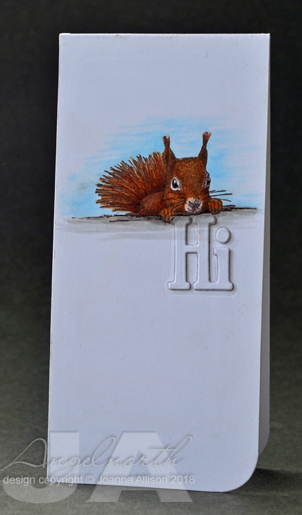
I’ve gone clean and simple with a scrapling (I’m determined to make a dent on the pile of scrapling-sized trimmings I have!). We live right on the edge of an area that still has red squirrels even though the greys are making inroads into the territory. We’re encouraged to report sightings of greys and one of our neighbours is a squirrel warden!
All of which made this stamp a perfect choice for a card to say “hello, welcome to the neighbourhood”! I’m sure he’s a red squirrel as he has those lovely little tufty bits on his ears and the greys don’t have those! Sadly I don’t have a die to cut the word welcome so I settled for stamping it on the inside.
Stamps:
Squirrel by Carabelle Studio
Paper:
Bristol board
Ink:
Brilliance by Tsukineko (Pearlescent Chocolate)
Other:
Copic markers
Black fineliner
Phrases 2 dies by Spellbinder
Corner Chomper
Thanks for stopping by!
I’ve gone clean and simple with a scrapling (I’m determined to make a dent on the pile of scrapling-sized trimmings I have!). We live right on the edge of an area that still has red squirrels even though the greys are making inroads into the territory. We’re encouraged to report sightings of greys and one of our neighbours is a squirrel warden!
All of which made this stamp a perfect choice for a card to say “hello, welcome to the neighbourhood”! I’m sure he’s a red squirrel as he has those lovely little tufty bits on his ears and the greys don’t have those! Sadly I don’t have a die to cut the word welcome so I settled for stamping it on the inside.
Stamps:
Squirrel by Carabelle Studio
Paper:
Bristol board
Ink:
Brilliance by Tsukineko (Pearlescent Chocolate)
Other:
Copic markers
Black fineliner
Phrases 2 dies by Spellbinder
Corner Chomper
Thanks for stopping by!
Friday, 20 July 2018
Summertime
Miri is setting the challenge for us this week at Daring Cardmakers - she’d like us to take advantage of the summer weather and get outdoors. Picnics, sunbathing, tennis, waterskiing, a stroll along the prom with an ice cream... what would you choose to do?
I’ve opted for a spot of beach combing with some stamped shells and die cut netting. A piece from my scraps pile provides a splashy blue background and a smattering of sequins finishes it off.
Stamps:
Antique Engravings and Say It All by Hero Arts (I suspect both sets are retired)
Seaside by Crafty Secrets (no longer with us)
Paper:
Bristol board
Unidentified inky piece from scraps pile!
Ink:
Brilliance by Tsukineko (Pearlescent Chocolate)
Other:
Copic markers
Netting die cut (Marianne Design Craftables)
Sequins
Corner Chomper
Thanks for stopping by!
I’ve opted for a spot of beach combing with some stamped shells and die cut netting. A piece from my scraps pile provides a splashy blue background and a smattering of sequins finishes it off.Stamps:
Antique Engravings and Say It All by Hero Arts (I suspect both sets are retired)
Seaside by Crafty Secrets (no longer with us)
Paper:
Bristol board
Unidentified inky piece from scraps pile!
Ink:
Brilliance by Tsukineko (Pearlescent Chocolate)
Other:
Copic markers
Netting die cut (Marianne Design Craftables)
Sequins
Corner Chomper
Thanks for stopping by!
Labels:
CAS (clean and simple),
DCM,
die cuts,
hero arts,
mixed media,
seaside
Friday, 13 July 2018
A sporting chance
Kathy has set this week's challenge over at Daring Cardmakers. She's like us to be inspired by the summer of sport happnening and make a card with a sporting theme.
I'm possibly the least sports-oriented person ever. DH's grandsons, however, play football, cricket, ice hockey etc and I have a nephew and friend's son who do martial arts so kids card it was...
The football was simple clip art, I shaded it with Copic markers, cut out with a circle die and popped up slightly with gel glue. Other than that it's just a bit of inking on the green panel and a heat embossed sentiment.
Supplies:
Clip art football
Sentiment from Essential Messages (Hero Arts)
Green cardstock
Bristol board
Tim Holtz Distress ink by Ranger (Peeled Paint)
Versamark by Tsukineo
Detail white emobssing powder
Copic markers
White gel pen
Black fineliner
Thanks for stopping by!
I'm possibly the least sports-oriented person ever. DH's grandsons, however, play football, cricket, ice hockey etc and I have a nephew and friend's son who do martial arts so kids card it was...
The football was simple clip art, I shaded it with Copic markers, cut out with a circle die and popped up slightly with gel glue. Other than that it's just a bit of inking on the green panel and a heat embossed sentiment.
Supplies:
Clip art football
Sentiment from Essential Messages (Hero Arts)
Green cardstock
Bristol board
Tim Holtz Distress ink by Ranger (Peeled Paint)
Versamark by Tsukineo
Detail white emobssing powder
Copic markers
White gel pen
Black fineliner
Thanks for stopping by!
Labels:
DCM,
hybrid,
kids,
Male birthday
Friday, 6 July 2018
July elemental
Enfys has chosen the inspiration for the first challenge of July over at Daring Cardmakers which is our usual "elemental" dare. Just choose at least three elements from the inspiration picture as the basis of your project.
I chose the colour scheme, the black and white stripes of one of the vases and the eggs.
A hand-drawn wonky square coloured with Copic markers and bordered with a fineliner combined with a stamped image and some glitter card shapes.
This started off as a much more clean and simple design but I mis-stamped some chicken footprints under the sentiment and ended up using the "embesllishment opportunity" to add stars rather than start again! I'm not quite sure about the result but maybe it will grow on me!
Stamps:
Farm Chicks (Craft Secrets, no longer with us)
Paper:
Bristol board
Glitter paper (local £1 shop)
Ink:
Brilliance by Tsukineko (Graphite Black)
Other:
Fiskars squeeze punches (stars)
Copic markers
Black fineliner
Pinflair glue gel
Corner Chomper
Here's the inspiration picture - check out what the other DT girls were inspired by. We'd love to see your take on it, too!
Thanks for stopping by!
I chose the colour scheme, the black and white stripes of one of the vases and the eggs.
A hand-drawn wonky square coloured with Copic markers and bordered with a fineliner combined with a stamped image and some glitter card shapes.
This started off as a much more clean and simple design but I mis-stamped some chicken footprints under the sentiment and ended up using the "embesllishment opportunity" to add stars rather than start again! I'm not quite sure about the result but maybe it will grow on me!
Stamps:
Farm Chicks (Craft Secrets, no longer with us)
Paper:
Bristol board
Glitter paper (local £1 shop)
Ink:
Brilliance by Tsukineko (Graphite Black)
Other:
Fiskars squeeze punches (stars)
Copic markers
Black fineliner
Pinflair glue gel
Corner Chomper
Here's the inspiration picture - check out what the other DT girls were inspired by. We'd love to see your take on it, too!
Thanks for stopping by!
Labels:
Crafty Secrets,
DCM,
rubber stamping
Friday, 29 June 2018
Tying the knot
It’s that time of year and Ruth is getting into the wedding mood on Daring Cardmakers this week - our challenge is to make a card with a wedding or anniversary theme.
I needed a card for a friend’s civil partnership - the couple in question has been together over 20 years! At the start of their time together they wouldn’t have been allowed to marry so at least we can say hurray for progress in that department.
With two grooms I didn’t want anything too flowery and since one is Irish and “tying the knot” is something we say to mean getting married I thought maybe a Celtic knot would do the trick. I embossed black cardstock, cut out the central knot from the bigger design and gilded with some silver Rub n Buff wax.
Some Brusho splatters and a simple stamped sentiment are the only other things going on here. I think it’s suitably understated (they were keen to keep the whole thing low key)!
Stamps:
Say It All by Hero Arts
Paper:
Bamboo Mixed Media by Hannemuhl
Smooth black
Ink:
Versafine by Tsukineko (Onyx Black)
Other:
Brusho crystals (Turquoise)
M-bossabilities folder by Spellbinder (Celtic Knot)
Rub n Buff by Amaco (Silver Leaf)
Thanks for stopping by!
I needed a card for a friend’s civil partnership - the couple in question has been together over 20 years! At the start of their time together they wouldn’t have been allowed to marry so at least we can say hurray for progress in that department.With two grooms I didn’t want anything too flowery and since one is Irish and “tying the knot” is something we say to mean getting married I thought maybe a Celtic knot would do the trick. I embossed black cardstock, cut out the central knot from the bigger design and gilded with some silver Rub n Buff wax.
Some Brusho splatters and a simple stamped sentiment are the only other things going on here. I think it’s suitably understated (they were keen to keep the whole thing low key)!
Stamps:
Say It All by Hero Arts
Paper:
Bamboo Mixed Media by Hannemuhl
Smooth black
Ink:
Versafine by Tsukineko (Onyx Black)
Other:
Brusho crystals (Turquoise)
M-bossabilities folder by Spellbinder (Celtic Knot)
Rub n Buff by Amaco (Silver Leaf)
Thanks for stopping by!
Labels:
Brusho,
DCM,
embossing,
masculine,
mixed media,
rub n buff,
spellbinder,
wedding
Friday, 22 June 2018
Wonderful world
Kathy has set the challenge for us at Daring Cardmakers this week - she'd like us to be inspired by the words of the song What a Wonderful World - pop over to the blog to see all the lyrics!
I've done a super-quick scrapling this week with inspiration from the blue sky and green trees mentioned in the song. I inked the trunk in brown and the foliage in green before stamping then added some Distress inks as watercolours - it really was a super-quick process since you can randomly dab in a couple of shades of green and get a lovely tree canopy in full summer leaf!
I die cut the word from the card front as well as a couple of extras from scrap card for an integrated look.
Stamps:
Lovely as a Tree (Stampin' Up)
Paper:
Bristol board
Ink:
Brilliance by Tsukineko (Pearlescent Ivy, Coffee Bean)
Tim Holtz Distress ink by Ranger (Shabby Shutters, Peeled Paint, Vintage Photo, Walnut Stain)
Other:
Hello die (Waltingmouse Stamps, no longer with us)
Zig Clean Colour marker (light blue)
Corner Chomper
Thanks for stopping by!
I've done a super-quick scrapling this week with inspiration from the blue sky and green trees mentioned in the song. I inked the trunk in brown and the foliage in green before stamping then added some Distress inks as watercolours - it really was a super-quick process since you can randomly dab in a couple of shades of green and get a lovely tree canopy in full summer leaf!
I die cut the word from the card front as well as a couple of extras from scrap card for an integrated look.
Stamps:
Lovely as a Tree (Stampin' Up)
Paper:
Bristol board
Ink:
Brilliance by Tsukineko (Pearlescent Ivy, Coffee Bean)
Tim Holtz Distress ink by Ranger (Shabby Shutters, Peeled Paint, Vintage Photo, Walnut Stain)
Other:
Hello die (Waltingmouse Stamps, no longer with us)
Zig Clean Colour marker (light blue)
Corner Chomper
Thanks for stopping by!
Friday, 15 June 2018
ABW!
It's my turn to set the challenge over at Daring Cardmakers this week and I'd like to see ABW - anything but white! I've fallen into the habit of using white as my card base so I thought I should challenge myself at least.
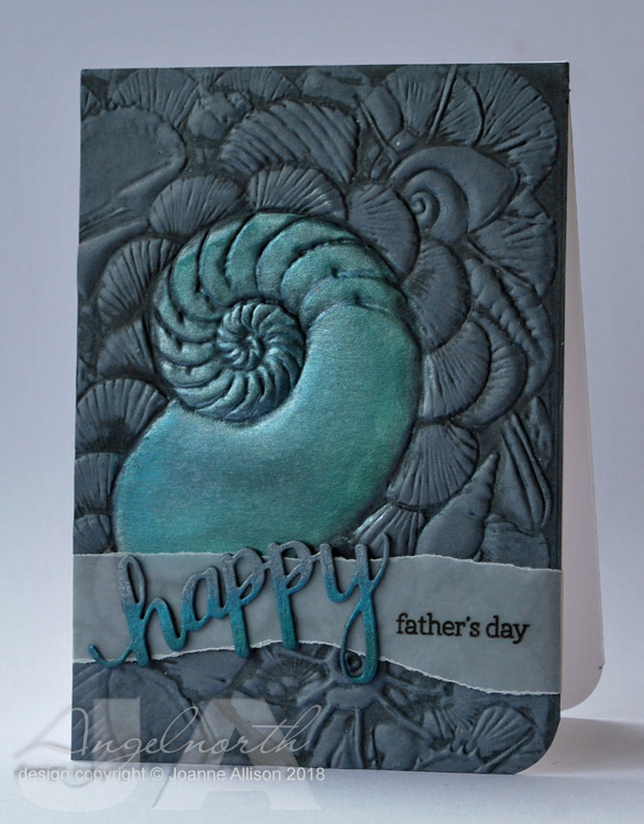
Of course, being a last minute minnie it had to be a father's day card. I was in the mood for texture so I decided to emboss rather than stamp this week.
I swiped charcoal grey ink onto the folder before embossing some mid grey cardstock and then rubbed silver ink and two shades of Perfect Pearls over the large shell.
The embossing is deep enough that it's really easy to reseat the piece in exactly the same place on the folder so I swiped the inkpad around the large shell area again and put it back through the Big Shot to redefine the inking after adding the pearl effect.
The die cut word has the same Perfect Pearls and silver ink treatment and the rest of the sentiment is stamped onto the torn vellum strip to finish it off.
Stamps:
Happy Stamp & Cut (Hero Arts)
Ink:
Delicata by Tsukineko (Silver Shimmer)
Shadow ink by Hero Arts (Charcoal)
Brilliance by Tsukineko (Graphite Black)
Paper:
Stormy Medium (an ancient Prism papers one!)
Vellum
Other:
M-bossabilities folder by Spellbinder (Shell Beauty)
Perfect Pearls by Ranger (Blue Patina and Blue Raspberry)
Here's a close up that shows the depth and detail of the embossing a bit more clearly.
We'd love to have you join us with your ABW creations - just have a look at the lovelies the rest of the team came up with if you're looking for ideas to get you started!
Of course, being a last minute minnie it had to be a father's day card. I was in the mood for texture so I decided to emboss rather than stamp this week.
I swiped charcoal grey ink onto the folder before embossing some mid grey cardstock and then rubbed silver ink and two shades of Perfect Pearls over the large shell.
The embossing is deep enough that it's really easy to reseat the piece in exactly the same place on the folder so I swiped the inkpad around the large shell area again and put it back through the Big Shot to redefine the inking after adding the pearl effect.
The die cut word has the same Perfect Pearls and silver ink treatment and the rest of the sentiment is stamped onto the torn vellum strip to finish it off.
Stamps:
Happy Stamp & Cut (Hero Arts)
Ink:
Delicata by Tsukineko (Silver Shimmer)
Shadow ink by Hero Arts (Charcoal)
Brilliance by Tsukineko (Graphite Black)
Paper:
Stormy Medium (an ancient Prism papers one!)
Vellum
Other:
M-bossabilities folder by Spellbinder (Shell Beauty)
Perfect Pearls by Ranger (Blue Patina and Blue Raspberry)
Here's a close up that shows the depth and detail of the embossing a bit more clearly.
We'd love to have you join us with your ABW creations - just have a look at the lovelies the rest of the team came up with if you're looking for ideas to get you started!
Labels:
DCM,
embossing,
father's day,
masculine,
sea,
seaside,
spellbinder
Friday, 8 June 2018
Totally tropical
It's Shabneez's turn to set the challenge this week at Daring Cardmakers and she'd like to see us go tropical - bright colours, clashing patterns, tropical motifs - just right for summer!
It's a quick one layer creation from me using hot colours and a silhouette style hibiscus image in two sizes with a glittery die cut and stamped sentiment and a few tiny gems to finish it off. I think I might have been happier with a darker colour for the “happy” - maybe I’ll try it out and see but I’d run out of time for Friday deadline!
I’ve held out against Distress Oxides until now but I caved and bought a few this week. The orange here is a first play with one of them, I like the way it layered over the pink (which is regular Distress).
Stamps:
Emerging Hibiscus and Emerging Dragonfly (both Cornish Heritage Farms, no longer with us)
Hero Arts Essential Messages
Paper:
Bristol Board
Green glitter card
Ink:
Tim Holtz Distress ink (Picked Raspberry)
Tim Holtz Distress Oxide ink (Carved Pumpkin)
Versafine by Tsukineko (Onyx Black)
Other:
Happy Stamp & Cut by Hero Arts
Corner Chomper
Nail art gems
Thanks for stopping by!
It's a quick one layer creation from me using hot colours and a silhouette style hibiscus image in two sizes with a glittery die cut and stamped sentiment and a few tiny gems to finish it off. I think I might have been happier with a darker colour for the “happy” - maybe I’ll try it out and see but I’d run out of time for Friday deadline!I’ve held out against Distress Oxides until now but I caved and bought a few this week. The orange here is a first play with one of them, I like the way it layered over the pink (which is regular Distress).
Stamps:
Emerging Hibiscus and Emerging Dragonfly (both Cornish Heritage Farms, no longer with us)
Hero Arts Essential Messages
Paper:
Bristol Board
Green glitter card
Ink:
Tim Holtz Distress ink (Picked Raspberry)
Tim Holtz Distress Oxide ink (Carved Pumpkin)
Versafine by Tsukineko (Onyx Black)
Other:
Happy Stamp & Cut by Hero Arts
Corner Chomper
Nail art gems
Thanks for stopping by!
Labels:
CAS (clean and simple),
CHF,
DCM,
female birthday,
feminine,
olc (one layer card)
Subscribe to:
Posts (Atom)