Tuesday 17 December 2013

'Tis the season

I haven't played in the Splitcoast Stampers Mixed Media challenge for ages so I thought I'd get a Christmas card done using Birgit's challenge to go bright.  I've used pigment ink, dye ink, glitter and sequins to add bright colours to my card - the green glitter and green stars are a better match in real life, it just proved impossible to get them matching on a photo.

It was only after I'd finished that it occurred to me the only stamping is the sentiment which is unusual for me!

I punched the stars in a sheet of acetate and used it as a stencil to sponge on green and pink inks and then doodled round them with both black and silver. The fancy lattice die cuts are stuck onto double sided tape sheet and the glitter burnished into the sticky apertures.

Stamps:
Sentiment from Miracle of the Holidays by Hero Arts

Paper: smooth white and black

Ink:
Brilliance Graphite Black by Tsukineko
Shadow ink Mint Julep by Hero Arts
Adirondack Raspberry by Ranger

Other:
Fancy lattice die by Spellbinder
Fiskars squeeze punches (small and medium star)
Hot pink and mint green glitter
Silver gel  pen
Black fineliner
Sequins
Double sided tape sheet
Corner Chomper

Thanks for stopping by!

Friday 13 December 2013

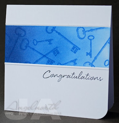
Ombre challenge!

It's time for a new challenge on the Craft Stamper blog. As there are several projects in the January issue featuring an ombré look we'd like you to explore ombré on your stamped project this time.

I made a quick one layer card using the technique described by Sylvia Blum on pp.6-8 of the magazine. I just used low-tack tape to mask off my strip to adapt the technique to a single layer rather than using a separate piece of cardstock.

It's a "new home" card but my stash didn't yield a sentiment in a font I liked with this look so I went with a "congratulations" sentiment and I hope the keys will convey the "on your new home" for me!

I think the grauated colour helps to create a sense of movement, not only pulling the eye in the same direction as the sentiment but also going with the "moving" theme for a family getting a new home.

Stamps:
Keys from Antiques by Cornish Heritage Farms
Sentiment from Say It All by Hero Arts

Paper: Smooth white

Ink:
Adirondack ink by Ranger - Stonewashed
Distress ink by Ranger - Faded Jeans, Chipped Sapphire
Brilliance by Tsukineko - Graphite Black

Other:
Scor-It
Corner Chomper

You'll find lots more lovely samples and all the details of how to enter here on the Craft Stamper blog. The winner gets the chance to have the project published in an upcoming issue of the magazine as well as a prize of some great Kate Crane DVDs - we'd love to see your entry!

Thursday 5 December 2013

Little monster

I needed a light and flat card (it needs to go trans-Atlantic) for a young man celebrating his seventh birthday. None of the kids I send cards to are really little monsters but he probaby comes closest!

He's certainly not the tidiest of children so what started out as a very clean and crisp design (just the lettering and the monster) looked a bit too tidy somehow. Once I'd added the splotches it seemed much more "in character". Being able to stamp them gave me a sense of still being in control though!

Stamping individual letters might seem a bit of a pain but I like the bigger format for the sentiment and the fact you could do any wording you liked. I gave mine a sort of "ombre" shading to go with the funky lettering style and deliberately didn't try to stamp on a straight base line.

I used Glossy Accents to give the eyes some sheen and dimension and rounded one corner for a casual feel. The inside of the front is lined with plain paper to hide the bleed-through of the Copics that's pretty much inevitable when you add shading as it tends to soak the cardstock.

Stamps:
Monsters Ink by Technique Tuesday
Brush Strokes by Hero Arts
Journal Letters by Hero Arts

Paper: Smooth white

Ink: 
Brilliance Graphite Black by Tsukineko
Adirondack Sunset Orange by Ranger


Other:
Copic markers
Corner Chomper
Glossy Accents

Thanks for stopping by!

Sunday 1 December 2013

Notecards

I made some notecard sets for last week's sale at the new village hall...

There are six cards in each pack (two fish, two seahorse and two scallop shell) with a variety of sentiments on the front so they'd make a good selection for people to dip in to whenever the need arose. I thought they'd make nice little gifts and indeed, a lady who who was about to pay for one set then said "Oooh, I'll have two more sets I think, they'd make lovely gifts" without any prompting from me!

These are simply stamped with just a hint of Copic colouring on the images (very pale and very light-handed so there's no bleed-through on the single layer cards). I die cut a square in a piece of acetate to use as a mask and sponged on the ink for a block of colour. Acetate's great for this as it means you can see exactly where you're positioning the mask's aperture in relation to the image and the edges of the card.

I sold enough stuff that I was able to put just over £40 (my profits) into the village hall fund which was good. The fair seemed busy most of the day, with Santa's grotto doing a particularly brisk trade!

Stamps:
Under the Sea by Darkroom Door (fish and seahorse)
Antique Engravings by Hero Arts (scallop shell)
Say It All by Hero Arts (mixed sentiments)

Paper: Smooth white

Ink:
Pearlescent Chocolate Brilliance by Tsukineko
Blue-toned dye inks (Distess Salty Ocean, Adirondack Stonewashed and Pool if I remember rightly)

Other:
Copic markers (Eggshell and Cool Grey 1)
Cello bags and sheer ribbon for packaging